How to break the rules of the website grid
The grid may be a key element of good web design but you can enhance it by breaking its own rules, says Matthew Smith.
The grid isn't primarily a visual design tool, it's a user-experience aid - like lanes on a street. A good grid will establish a norm, and a rhythm of viewing a website so that users aren't thinking about where to read or view next, they're intuiting it because of the order and hierarchy you've established on the grid. You can learn more from our Designer's Guide to Grid Theory.
If everything followed the regimen of the grid, though, we'd all go cuckoo from visual boredom. Sometimes we want a design to have elements that pop out of the lines and say, "Hey, look at me! I'm cool for breakin' the rules".
Define the grid
If you don't first define a strong grid, then breaking it won't mean anything. A strong clean grid with a clear structure and plenty of white space for breathing room is one of the most important parts of a good visual structure for your content.
A subtle breaking of the rules can be a great way to draw attention to a detail in your design. Done right, it can help your design break away from that constrained and boxy look - a common critique of web design.
An image pulled out beyond a border, or a sticker label stuck over a bit of content will go a long way to add a nice, defiant detail to your design. Too much of this technique will kill the nuance, though, and you'll lose the interest. Choose your rule breaking carefully.
Four great examples
01. Apple

A couple of years back Apple.com made its iMacs pop over the well-defined edge of the main frame of content, giving the sense that these Macs will not be constrained.
02. Gene's Sausage Shop

You can use a badge, sticker, banner or ribbon to break the grid and deliver a little fun as Gene's Sausage Shop & Delicatessen does here.
Get the Creative Bloq Newsletter
Daily design news, reviews, how-tos and more, as picked by the editors.
03. Andy Clarke

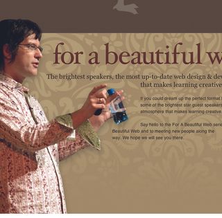
A subtle but effective image overlapping on a past iteration of designer Andy Clarke's portfolio. This technique is a great way to keep an image stack fresh.
04. The Style Spy

Images aren't the only way to break the grid. Fashion blog thestylespy.com's headline script flies out to suggest energy and fun.
If you've seen any examples of sites subtly breaking the grid, why not mention them in the comments?
Words: Matthew Smith
This article was originally published in net magazine.

Thank you for reading 5 articles this month* Join now for unlimited access
Enjoy your first month for just £1 / $1 / €1
*Read 5 free articles per month without a subscription

Join now for unlimited access
Try first month for just £1 / $1 / €1
The Creative Bloq team is made up of a group of design fans, and has changed and evolved since Creative Bloq began back in 2012. The current website team consists of eight full-time members of staff: Editor Georgia Coggan, Deputy Editor Rosie Hilder, Ecommerce Editor Beren Neale, Senior News Editor Daniel Piper, Editor, Digital Art and 3D Ian Dean, Tech Reviews Editor Erlingur Einarsson, Ecommerce Writer Beth Nicholls and Staff Writer Natalie Fear, as well as a roster of freelancers from around the world. The ImagineFX magazine team also pitch in, ensuring that content from leading digital art publication ImagineFX is represented on Creative Bloq.
