Hover is dead, long live hover
Hover is a useful UI element for desktop users, but it doesn't work with touch devices. How can we prevent losing it?
It started with a conversation three years ago when the iPad came out.
The product director for a large UK online retailer said, “Of course we’ll have to fix the product selection page. It relies on hover to show important details about the product, iPad users won’t be able to see it.”
Using hover, a visual cue to indicate a possible interaction or to show further information, was no longer an approach for iPad and other touch screen users.
What had previously been a reliable tool in an interaction designer’s toolkit suddenly lost its shine.
Hover is dead
Fast-forward to 2013. Sales for touchscreen devices have increased significantly. They are now expected to outnumber sales of desktop and traditional laptop computers by 2014.
Windows 8 has taken the Metro interface from mobile. Mac OSX is increasingly taking its cues from the mobile operating system iOS. Neither OS has wholly embraced touch but both have begun to move away from a point and click approach to one of having large click-based targets and buttons.
Touch screen interfaces are setting expectation. Guerrilla arm or not, there's a desire for touchscreens on devices.
Get the Creative Bloq Newsletter
Daily design news, reviews, how-tos and more, as picked by the editors.
Scrolling through menus, moving between options with cursor keys or by voice control, smart TVs, games consoles, Google Glasses and other internet appliances don’t rely on a mouse pointer. Hover has no place in this world.
The trend is clear; point and click is in decline, click (be that with a finger, stylus, keyboard shortcut, remote control, voice control) is on the increase. We as designers can no longer rely on a pointer being used. Therefore, we can’t rely on the ubiquity of hover on the web.
Using hover to display more information about a hyperlink, either to give context or to activate a drop down menu on a desktop has been good practice for many years. Touchscreen devices do not handle hover well or indeed at all.
Apple have attempted to apply hover in iOS. Click once to activate hover, click again to activate the link but somehow it doesn’t feel like the best approach. Or in the case of Android, click, see the hover behaviour as the browser is loading the hyperlinked page.
Hover also assumes we are using a mouse, using :focus alongside hover means we can address users who can’t, for perhaps accessibility reasons, use a mouse.
If we are developing a responsive design website, the use of hover seem like an anathema. We should be developing an experience that will work on any device, the design must be device agnostic.
Long live hover
It’s been a design staple for years. Using hover to show an item is clickable, to quickly reveal helpful information and, of course, to drive the drop down navigation menu.
Desktop, non-touch interfaces are still the major way to access the web at least in the US and Europe with 87 per cent of web usage on desktop.
Hover can be used for the vast majority of the audience who, over the years, have gotten used it.
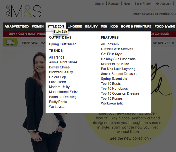
The standard approach for many years when designing a drop down navigation menu has been to show the options on hover to aid discoverability and mimic the way that menus behave in Windows.

They are common place on websites like Best Buy, Marks and Spencer and others.
We could change the approach. Activating the drop down on click rather than hover. But it doesn’t feel right, it goes against the discoverability inherent with hover. You ask a user in testing what will happen when they click an option in the top level of menu and they’ll say they expect to be taken to the page matching that option, not be shown a drop down menu.
Hover is also used to show the controls possible for a particular element. For example, in hovering over the name of document link would show the delete or rename options, hovering over a star rating would show you how to add rating. Rather than bombarding the user with the same set of options for each item in a list we user hover to remove visual noise. These kinds of patterns have been used for years and our users are used to them.
Why rob the majority of users of an interaction method that's so useful and often an expectation?
What’s a designer to do?
Right now, we're at a turning point. Whatever we do it’ll be wrong, either in the short term or the long term.
Looking to the future and not using hover will cause pain to the majority of users today or cause pain to the increasing touchscreen user base. Offering hover interactions to only those using desktop/laptops we could consider to be a progressive enhancement.
But what about hybrid devices like the Microsoft Surface that offer both touch and mouse/keyboard? Can we accurately know what input method is being used?
Simple media queries are not enough to know what interaction is possible. There is a proposal to identify if a user agent can use hover put forward by the W3C, but right now in 2013 we can’t be sure if someone is using a mouse or a finger or a combination of the two.
Ethan Marcotte in his original Responsive Design article says that “we're designing work meant to be viewed along a gradient of different experiences.”
Offering different interaction styles dependent on device feels like the dark days of browser targeting. We want our designs to be device agnostic. If we build a website we want to do the minimum to make sure it works across device. We can tweak designs at different sizes to meet needs but changing an interaction style by device seems like old-fashioned thinking.
Alternative design patterns
We, as designers, need to look for alternative design approaches.
Brad Frost has discussed the possible navigation patterns we could use in responsive design. But, as Frost says, many of these are not only complex but also novel ways of interacting, requiring users to learn a new way of doing things.

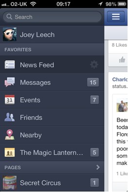
Each option that's suggested suits a different set of menu items and audience. Recommending one approach as the future of the web menu isn’t possible. A Facebook style slide-in-from-the-left menu works in the context of website where the primary focus of the user is the stream of posts in the centre of the screen. Navigating to another page is a secondary action. This approach wouldn’t work for a content rich site like a newspaper that requires interaction with a menu to find the article being looked for. Although the proposed new New York Time's redesign reduces the focus on navigation.
A prudent approach would be to select at least two alternatives that suit and conduct user research for each, choosing the one that works best for the audience. Multivalent or A|B testing could also be used to help choose the best approach.
As with web navigation there is no single pattern that will work in all situations. Select 2 to 3 options, then design, research and refine.

Using hover to reveal controls doesn’t require such a dramatic change in approach. Activating these controls with a click would work on touchscreen devices but isn’t immediately obvious that a click would show more information rather than simple taking the user to a different page.
We need to ensure the element has something that indicates that an action is possible. Each element needs affordance. We’re used to do this for links, an underline or different colour, but, for a click-based reveal, we don’t have common visual approach.
There are options such as using an icon. Developing an icon that conveys the message clicking here will show you a greater number of options is a challenge. We could use more abstract icons like a cog but it doesn’t convey meaning as well. We could try and define an icon that indicates clicking will reveal more actions, but we’d need to educate our users the function behind that icon.

This has been tried with the Share This icon. The icon is many sites, but understanding of its meaning is still relatively low.
HTML has the tag that we can use to define the meaning of an enclosed abbreviation or acronym. It’s not been used enough that the dashed underline that results is widely understood by users.
Whatever approach we use to indicate click-to-reveal-controls will take time before it’s widely understood. As Brandon Harris from Wikipedia said recently when talking about redesign "Can we afford to re-train half a billion users?"
We also need alternate ways of progressively disclosing information. We can no longer be sure hovering the mouse pointer over a link will show further details. Thankfully here we have existing approaches to offering affordance.
Displaying the expanded information based on a click, using different visual cues such as the right caret or plus icon to indicate expansion are tried and tested. Click and jump to a page section, as seen in the Bootstrap web framework is an alternative. We could also use an "i-based" information icon, but overusing this can lead to excess visual noise.
May you live in interesting times
As Apple’s Tim Cook said last year:
“Through the last quarter, I should say, which is just two years after we shipped the initial iPad, we’ve sold 67m. And to put that in some context, it took us 24 years to sell that many Macs, and five years for that many iPods and over three years for that many iPhones.”
Whatever happens it’s going to happen quickly. We can’t rely on the interaction styles we used two years ago to work in the increasingly touch-based world.
I’d love for you to share your experiences and thoughts in the comments. What should we designers do?
A recovering neuroscientist, Joe embarked on a UX career 10 years ago. As a user experience director Joe heads up a team of UX consultants. He specialises in designing every aspect of the user experience from initial research to developing online strategies to producing wireframes and managing a design team. www.cxpartners.co.uk/
Liked this? Read these!
- The ultimate guide to logo design
- Our favourite web fonts - and they don't cost a penny
- Discover what's next for Augmented Reality

Thank you for reading 5 articles this month* Join now for unlimited access
Enjoy your first month for just £1 / $1 / €1
*Read 5 free articles per month without a subscription

Join now for unlimited access
Try first month for just £1 / $1 / €1

The Creative Bloq team is made up of a group of art and design enthusiasts, and has changed and evolved since Creative Bloq began back in 2012. The current website team consists of eight full-time members of staff: Editor Georgia Coggan, Deputy Editor Rosie Hilder, Ecommerce Editor Beren Neale, Senior News Editor Daniel Piper, Editor, Digital Art and 3D Ian Dean, Tech Reviews Editor Erlingur Einarsson, Ecommerce Writer Beth Nicholls and Staff Writer Natalie Fear, as well as a roster of freelancers from around the world. The ImagineFX magazine team also pitch in, ensuring that content from leading digital art publication ImagineFX is represented on Creative Bloq.
