Happy Cog talks Webby win
Agency head honchos reveal the thinking behind the award-winning Zappos.com website

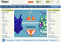
The 15th Webby Award winners have been revealed, and while arguments rage about what the awards themselves mean to the wider design community, the winners are rightfully celebrating. Happy Cog was one such winner, grabbing itself a gong for its work on Zappos.com, securing the People's Voice Winner award in the Best Navigation/Structure category. We asked what the company had done to create its award-winning work.
"We worked with Zappos.com to refine the user experience and site aesthetic, or what is known as the 'presentation layer'," explained Happy Cog president Greg Hoy. He told us that when Happy Cog first engaged with Zappos.com, its business growth had outpaced the slowly-evolving aesthetic of the company's website: "While the site enabled customers to make purchases quickly, it didn't capture and embrace the hallmarks of the Zappos.com culture and the site lacked personality."
Initially brought in to assist in a comprehensive 're-skin' effort, Happy Cog found the old site lacked a core defining visual style and a consistent visual language. It was decided that a re-skin was only part of the solution: "The Zappos.com web team needed something different: not just a bunch of newly designed pages, but a design system." Happy Cog therefore created a system of typographic rules, versatile grids and flexible modules enabling the Zappos.com internal teams to "better react to the ever-changing e-commerce landscape".
Part of the process entailed exploration and refinement of the navigation implementation for the site—largely what Happy Cog was awarded its Webby for. "Together with the Zappos.com team, we explored faced navigation strategies and browse structures, and scrutinised how we could implement smart decisions that, together with a streamlined, consistent design system, could significantly enhance the customer experience," said Hoy. "At the end of the engagement, we provided them with a detailed style guide to use as a reference in expanding and maintaining the design system."
The finished site is clearly considered a big improvement on what existed before, but we asked Hoy why in particular he thought Happy Cog was nominated for a Webby. "Zappos.com has a lot of products in a lot of categories. Browsing through myriad choices in an intuitive way requires a lot of taxonomy work and a lot of testing. Zappos.com's in-house team championed this process over the years. Our job as a design/user experience consultancy was to add an external set of eyes to the implementation, and offer recommendations on how the process of navigating categories and products could be streamlined and made consistent, in part through the implementation of a design system. We think our work together improved the way people find products and interact with the Zappos.com brand," he explained, adding: "Navigation isn't only categorisation, hierarchies and breadcrumbs. Happy Cog recognised that there needed to be a common style for the multitude of product showcase modules. Our modules solutions were based on a universal five-column grid and could be expanded horizontally or vertically as content dictated. Such flexibility enabled the Zappos.com team to add mini-product showcases to gaps in page structures when up-sell and cross-sell were needed."
We also asked Jeffrey Zeldman, founder and executive creative director of Happy Cog, for his comments on the Webby Award. "I am skeptical of awards shows and delighted when we win," he quipped. And on this particular award, he said it "reflects the love people have for Zappos.com and its amazing customer support, and indicates that people notice and appreciate improvements we've been able to bring to the Zappos.com web experience. When we do our job well, it makes great companies look even better. We are like personal trainers that way. Nobody says, 'Wow, your trainer must be highly skilled'. They say, 'You look great!' If, as a result of our work, people love Zappos.com even a tiny amount more than they already did, we are happy cogs indeed."
Get the Creative Bloq Newsletter
Daily design news, reviews, how-tos and more, as picked by the editors.

Thank you for reading 5 articles this month* Join now for unlimited access
Enjoy your first month for just £1 / $1 / €1
*Read 5 free articles per month without a subscription

Join now for unlimited access
Try first month for just £1 / $1 / €1

The Creative Bloq team is made up of a group of art and design enthusiasts, and has changed and evolved since Creative Bloq began back in 2012. The current website team consists of eight full-time members of staff: Editor Georgia Coggan, Deputy Editor Rosie Hilder, Ecommerce Editor Beren Neale, Senior News Editor Daniel Piper, Editor, Digital Art and 3D Ian Dean, Tech Reviews Editor Erlingur Einarsson, Ecommerce Writer Beth Nicholls and Staff Writer Natalie Fear, as well as a roster of freelancers from around the world. The ImagineFX magazine team also pitch in, ensuring that content from leading digital art publication ImagineFX is represented on Creative Bloq.
