What is colour gamut?

Sign up to Creative Bloq's daily newsletter, which brings you the latest news and inspiration from the worlds of art, design and technology.
You are now subscribed
Your newsletter sign-up was successful
Want to add more newsletters?
"What is colour gamut?" is a question people often ask after reading our guides, from the best monitors for graphic artists to the best monitors for photo editing. Well, simply put, colour gamut describes the range of colours a device can produce or record.
Why is this important? Well, imagine crafting a stunning design, only to discover the colours look different when printed, or displayed on another screen. How frustrating would that be? The same principle applies to photography and filming. If you've captured a beautifully colourful scene out in the wild, you'll want your camera to capture as much of that colour information as possible.
All of which means that, if you're a creative professional, it's good to pay attention to the colour gamut when shopping for a device such as a laptop, computer monitor, TV, phone, tablet, camera or printer.
Article continues below1. Three dimensions

In simple terms, the higher the colour gamut, the larger the range of colours the device can record or produce, resulting in more vibrant and accurate images. However, it gets a little more complicated than that.
Colour gamut is actually measured across three dimensions. That's because there are three fundamental aspects to colour:
1. Hue: This is the basic colour we perceive, such as red or blue. It's often represented as a position on a colour wheel.
2. Saturation: This refers to the intensity or purity of a colour. A fully saturated colour is vivid and free of greyness, while a less saturated colour is more muted or pastel-like.
Sign up to Creative Bloq's daily newsletter, which brings you the latest news and inspiration from the worlds of art, design and technology.
3. Brightness (aka luminance or value): Fairly obviously, this is the lightness or darkness of a colour.
To fully describe a colour, you need to specify all three of these attributes. However, it's challenging to visualise a true three-dimensional colour gamut, so in practice, the industry often uses 2D representations such as chromaticity diagrams. These diagrams show the range of colours a device can produce in terms of hue and saturation, but they don't directly incorporate brightness.
(Note: You don't actually need to understand these diagrams, which often confuse people more than they illuminate. But if you encounter them in marketing material, it's worth knowing what they are, and why they're there.)
2. Different standards

Different classes of device perform at different levels when it comes to colour gamut. You wouldn't necessarily expect, for example, a laptop to output the same range of colours as one of the best printers for art prints. Consequently, there are a few different measures of colour gamut for different types of device. A bit like how you might measure beer in pints but rainfall in millimetres.
Here are the main ways to measure colour gamut and the differences between them. Note: these are commonly referred to as "colour spaces".
sRGB: This is the most widely used standard, especially for consumer electronics such as monitors, TVs and digital cameras. It was purposely designed to be a compromise, covering a range of colours that most devices can reproduce accurately in practice. Ideally, creative professionals shopping for a monitor should aim for an sRGB of at least 99%. (The top five models on our list of the best monitors for graphic artists all offer sRGB of 99-100%.) Note that it's possible to have an sRGB rating above 100%: for example, the MacBook Pro 16-inch (M4, 2024)'s display offers colour accuracy of 110% sRGB.
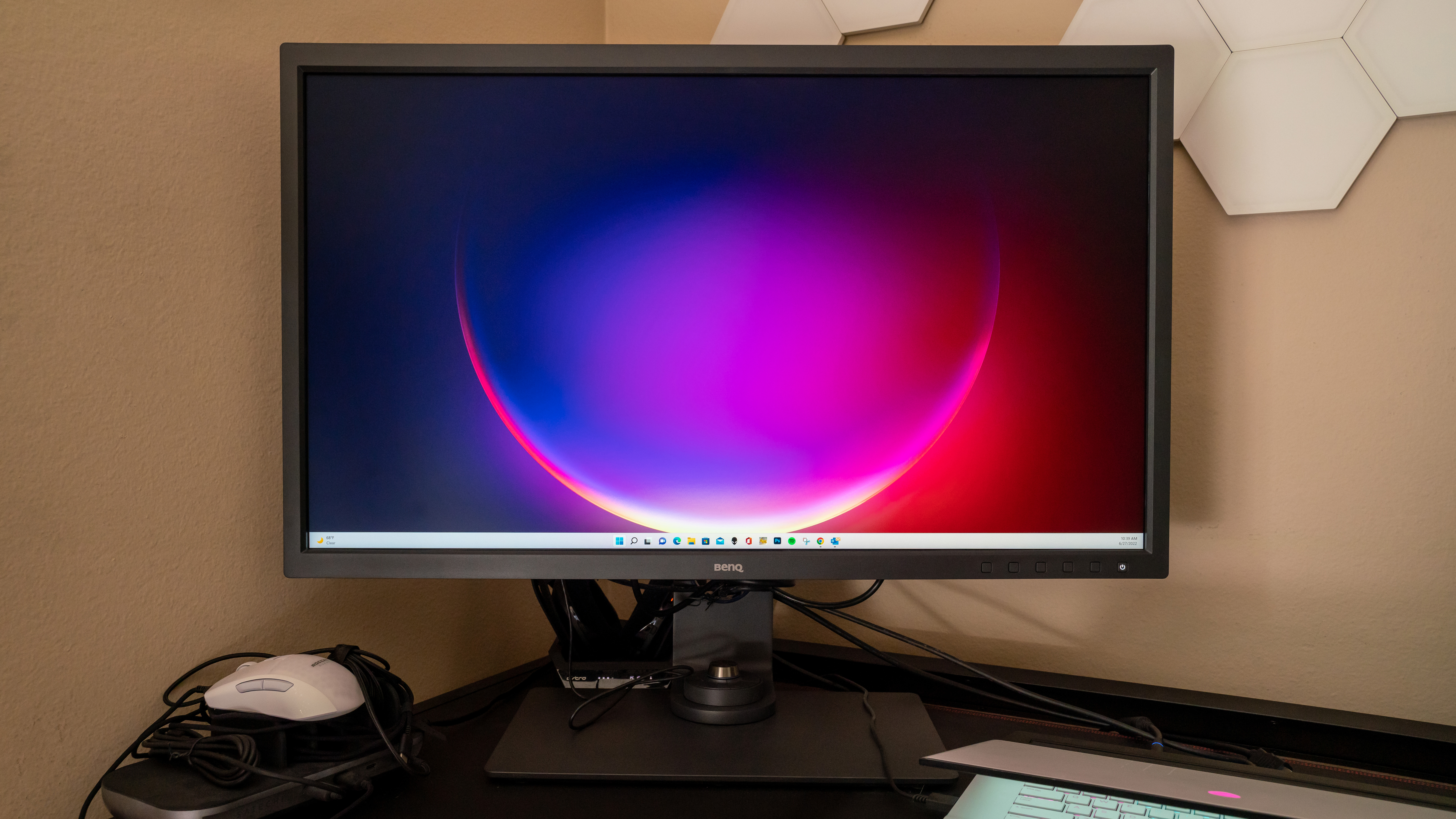
Adobe RGB: This standard offers a wider colour gamut than sRGB, particularly in the green and blue regions. So for example, while the BenQ DesignVue PD3220U monitor offers 100% sRGB coverage, its Adobe RGB score is much lower at 83%. However, in truth, not many people see Adobe RGB as a crucial measure of colour gamut. The main exception is for making prints of your photography, especially if you shoot landscapes scenes with lots of rich greens and blues. If so, you'll ideally be shopping for a professional-grade printer that offers 90%-100% of the Adobe RGB colour space.

DCI-P3: This cinema-optimised standard (the letters stand for Digital Cinema Initiatives Protocol 3) is increasingly being used in high-end devices such as monitors, mobile devices and TVs. It covers a significantly larger colour gamut than sRGB, so a high score is impressive indeed. As you might expect, this measure is especially worth paying attention to if you're involved in film-making and video editing. If you're shopping for the best video editing monitor, we'd recommend a model with at least 95% DCI-P3 colour space coverage, as you'll find on the BenQ SW321C.
Rec. 2020: This is the latest and largest colour gamut standard, covering a much wider range of colours than any other. It's currently used in some high-end TVs and is the target for future display technologies. With the notable exception of ASUS ProArt OLED PA32DC monitor, you won't find most manufacturers covering this standard yet, though; so it's more a "nice to have" than one to specifically look for.
3. Older standards
Other, lesser known colour gamut standards include:
Rec. 709: Formally known as ITU-R BT.709, this international standard specifies the range of colours that can be reproduced by HDTV displays.
EBU: This is the European Broadcasting Union's own standard. It often closely resembles Rec. 709, but with have slight variations in primary colours or white point to accommodate specific regional requirements.
P3: Also known as Display P3, this is a wide colour gamut used in iPhones, iPads, and MacBooks, as well as some high-end displays and digital cameras. It offers a significantly larger range of colours compared to the sRGB colour space.
Apple RGB: This colour gamut was historically used in Apple's Macintosh computers, but which has become less relevant today following the shift towards wider colour spaces such as P3 in modern Apple devices.

Tom May is an award-winning journalist specialising in art, design, photography and technology. His latest book, The 50 Greatest Designers (Arcturus Publishing), was published this June. He's also author of Great TED Talks: Creativity (Pavilion Books). Tom was previously editor of Professional Photography magazine, associate editor at Creative Bloq, and deputy editor at net magazine.
