For a moment back there, minimalism was everywhere. The unstoppable march towards flat, sans serif wordmarks and logos seemed to encompass brands in every sector in the mid 2010s, from cars to fashion to tech. Then came the inevitable U-turn back towards maximalism, with its sensory overload of big, bright and colourful patterns and shapes. But now that maximalism has had its moment, what comes next? Why, minimal maximalism, of course. Or maximal minimalism. Or bold minimalism. It seems to go by a few names.
One of the biggest design trends for 2025 has been the rise of not-quite-minimalism – that is, minimalism with maximalist elements thrown in. Think clean and simple designs, with bold elements such as bright, oversized typography. (Looking for design inspiration? Take a look at the best print ads of all time.)
Nike's Winning Isn't for Everyone campaign (Image credit: Nike)
Back in December, Andy Harris, joint head of design at M&C Saatchi UK, described the aesthetic to Creative Bloq. "Simplicity and clarity combined with impactful typography and strong colour palettes; this is minimalism on acid." He adds, "Burger King’s rebrand at the start of the year is an excellent example, showing how a distinctive pairing of typography and colour in a stripped-back, graphic brand-world can cut through in the marketplace. In August, Nike’s Winning isn’t for everyone launched. Eye-catching, impactful and concise, this campaign cemented Bold Minimalism as one to watch for 2025."
Latest Videos From Creative Bloq
(Image credit: Asylum, Atlantic Records and Warner UK)
And this year, Patrick Llewellyn, CEO of 99designs by Vista, described the look as "the new age of minimalism: it’s simple, but it’s definitely not boring. While maximalist in its use of vibrant colours and bold typography, the ‘not quite minimalism’ trend retains a focus on negative space, clean lines, and uncluttered layouts."
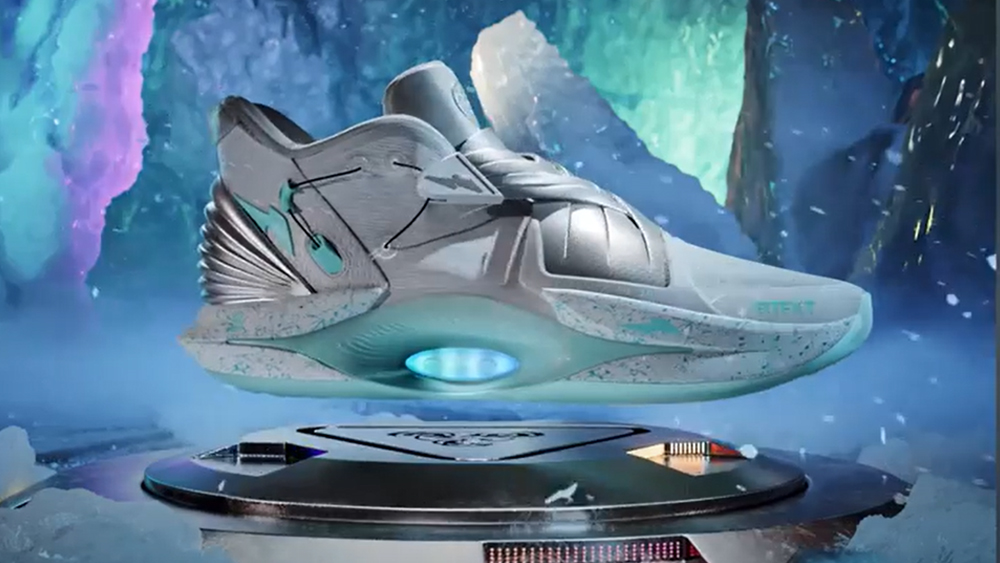
Minimal Maximalism is all about clean design and bright, bold colours (Image credit: goopanic)
In short, it's all about simple designs with strikingly loud individual elements. An obvious example that entered the cultural mainstream last year is the cover for Charli XCX's 'brat'. On the face of it the design was deceptively simple, with its lo-fi, lowercase text on a single-colour background. But the lime green of that background was anything but plain, and spawned countless imitations.
With brands from Burberry to Burger King resurrecting old logos, the rise of heritage branding has served as an antithetical response to minimalism. But a little like the soft return of skeuomorphism, minimalism seems to be stepping back onto the stage – if only to share it with maximalism. For more about the state of design, take a look at our roundup of the hottest 2025 graphic design trends.
Get the Creative Bloq Newsletter
Daily design news, reviews, how-tos and more, as picked by the editors.
Thank you for reading 5 articles this month* Join now for unlimited access
Daniel John is Design Editor at Creative Bloq. He reports on the worlds of design, branding and lifestyle tech, and has covered several industry events including Milan Design Week, OFFF Barcelona and Adobe Max in Los Angeles. He has interviewed leaders and designers at brands including Apple, Microsoft and Adobe. Daniel's debut book of short stories and poems was published in 2018, and his comedy newsletter is a Substack Bestseller.
You must confirm your public display name before commenting
Please logout and then login again, you will then be prompted to enter your display name.