With Paris 2024 about to commence, we look back at the history of the Olympic rings design.
(Image credit: International Olympic Committee)
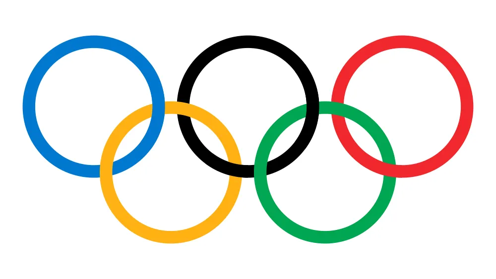
The Paris 2024 Olympic Games are about to commence, and we'll soon be seeing a lot of the Olympic rings, the emblem that has accompanied the world's greatest sporting spectacle for over a century.
The Olympic rings have long been one of the most recognised sports logos in the world. But many people are surprised to learn that they haven't always looked exactly as they do today (the image above) The design has been tweaked twice since the rings were created back in 1913 (also see our pieces on the first Olympics logo and the best Olympics logos of all time). They've also been interpreted in different ways in some of the best Olympics posters.
The history of the Olympic rings design
The original version of the Olympic rings design used different shades of the colours we're familiar with today (Image credit: International Olympic Committee)
The first Olympic rings design featuring five interlocking rings, coloured blue, yellow, black, green, and red was created in 1913 by Pierre de Coubertin, the co-founder and second president of the International Olympic Committee. They were used for the first time at the 1920 Summer Olympics in Antwerp after the 1914 games were cancelled due to World War I.
Latest Videos From Creative Bloq
Coubertin's original design for the Olympic rings (Image credit: International Olympic Committee)
It's likely that Coubertin was inspired by the logo of the French sports association USFSA, which he was also involved in founding. The USFSA used two rings in the French colours of red and blue. For the Olympics, Coubertin chose five rings as a simplified representation of the five inhabited continents: Africa, America, Asia, Europe, and Oceania. He also ensured the colours (including the white background) included those of every competing country's flag (only twenty-eight nations participated at that time), making it a truly international emblem.
The original design is immediately recognisable today, but compared closely, the colours and the composition are slightly different. The blue and yellow in particular much starker hues, while the rings are thicker.
From 1986 until 2010, there were gaps where the Olympic rings interlink (Image credit: International Olympic Committee)
The first tweak came when the International Olympic Committee standardised the design of the Olympic rings in 1981 with thinner lines, a lighter shade of blue and a darker shade of yellow. Spaces were also added between the rings. In 2010, the spaces were removed, making the rings today more similar to Coubertin's original design.
What to the Olympic rings mean?
Do the Olympic rings have any connection with ancient Greece? Sadly no. This was a myth that began in the 1950s when two American authors came across a milestone in Delphi that had been used in a torchbearers' ceremony for the 1936 Berlin Olympic games. They mistakenly believed it to date back to the times of ancient Greece.
Get the Creative Bloq Newsletter
Daily design news, reviews, how-tos and more, as picked by the editors.
Nor does each ring have a specific meaning. The 1949–50 edition of the IOC's Green Booklet stated that each colour corresponded to a particular continent: "blue for Europe, yellow for Asia, black for Africa, green for Australia, and red for America". That claim was dropped in 1951 owing to a lack of evidence that this was what Coubertin had intended. Olympic Charter, Rule 8 merely states that “The Olympic symbol expresses the activity of the Olympic Movement and represents the union of the five continents and the meeting of athletes from throughout the world at the Olympic Games.”
Joe is a regular freelance journalist and editor at Creative Bloq. He writes news, features and buying guides and keeps track of the best equipment and software for creatives, from video editing programs to monitors and accessories. A veteran news writer and photographer, he now works as a project manager at the London and Buenos Aires-based design, production and branding agency Hermana Creatives. There he manages a team of designers, photographers and video editors who specialise in producing visual content and design assets for the hospitality sector. He also dances Argentine tango.