These are the hottest logo design trends of 2024
From optical illusions to AI stars.
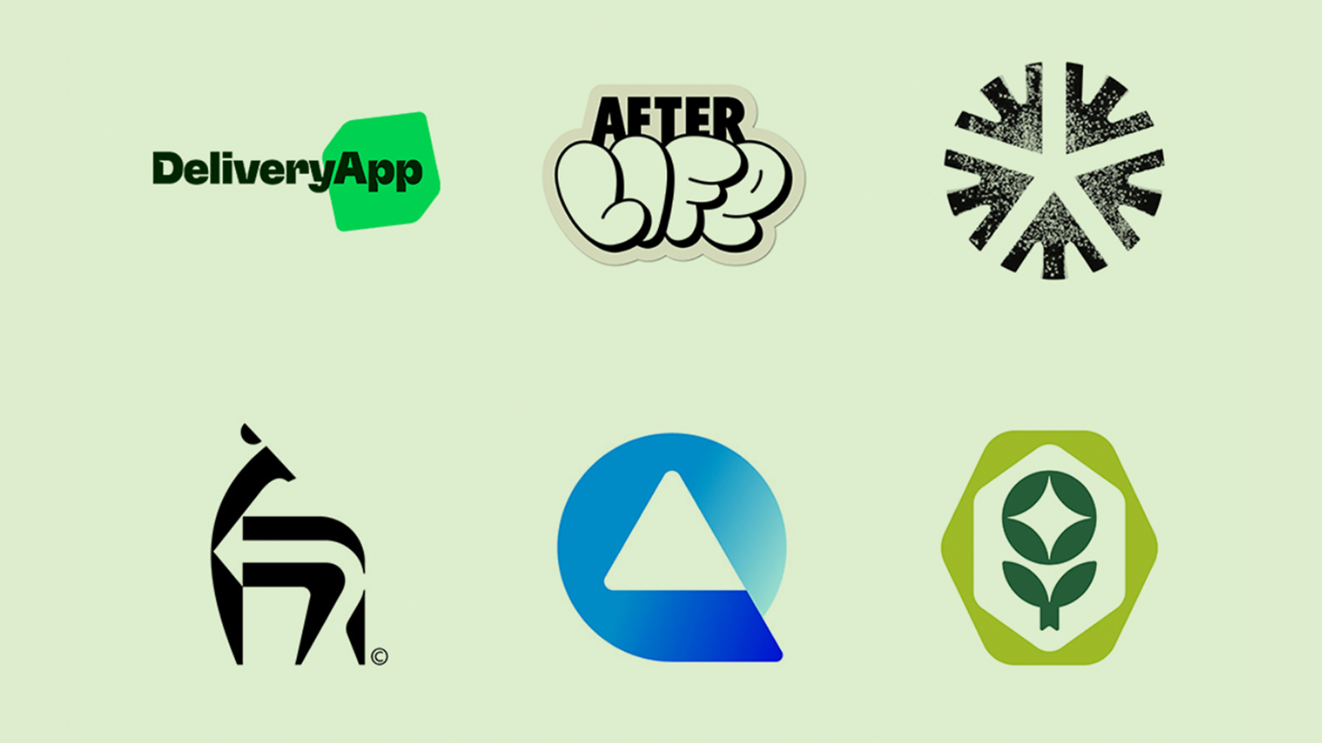
As we reach the halfway point of 2024, LogoLounge has released its much anticipated logo trend report for the year so far, revealing the design language that has dominated the world of wordmarks and symbols over the last 12 months.
As ever, the report focuses on 15 trends. In the name of experimentation, logos are getting "boxed, chopped, dropped, liquified, and sticker-ified' in 2024. And, curiously, the report claims in some cases, logos are even starting to take a back seat to other elements in the graphic family. (Looking for design inspiration? Check out the best logos of all time.)
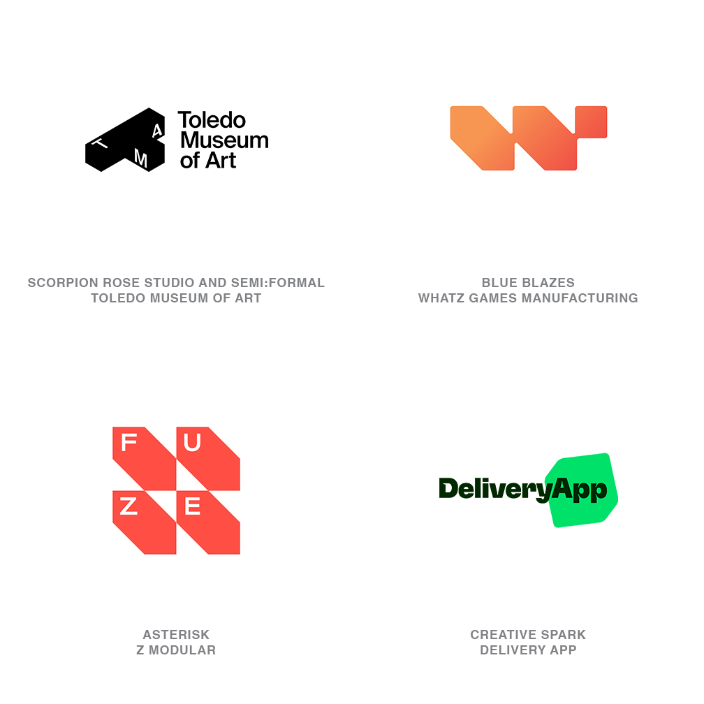
"Gradients are still a big deal and animation is literally moving and blending these gradients together to create this static haziness of forms and colours," reads the introduction by LogoLounge founder Bill Gardner. "Traditional linear gradients have morphed into more organic blending of three, four, or even more colours."
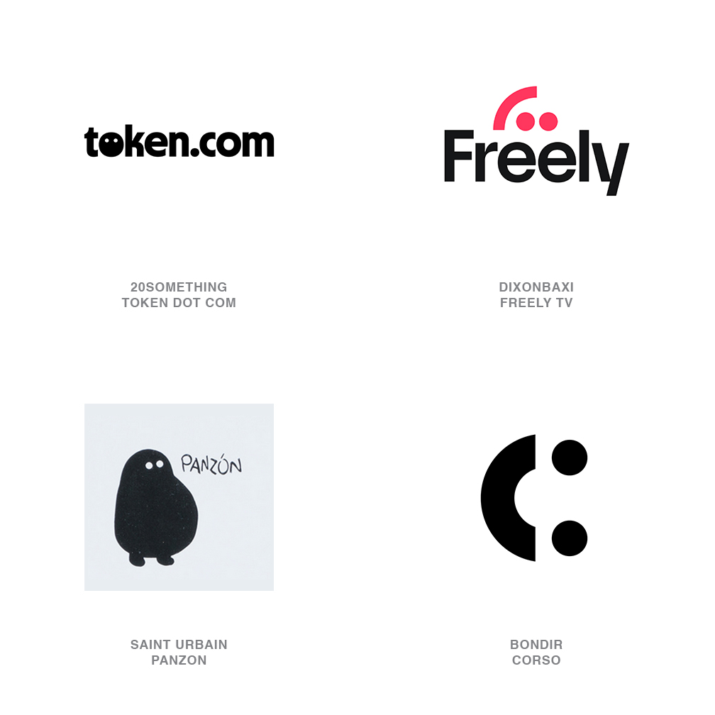
"Beyond gradients, there’s this trend where basic icons and letterforms are continuously morphing into different iterations. Imagine a single mark rendered in an endless array of 3D, 2D, and every other dimension of materials and texture. Either AI is getting a real work out here or some conscious thought is going into these—the possibilities are endless."
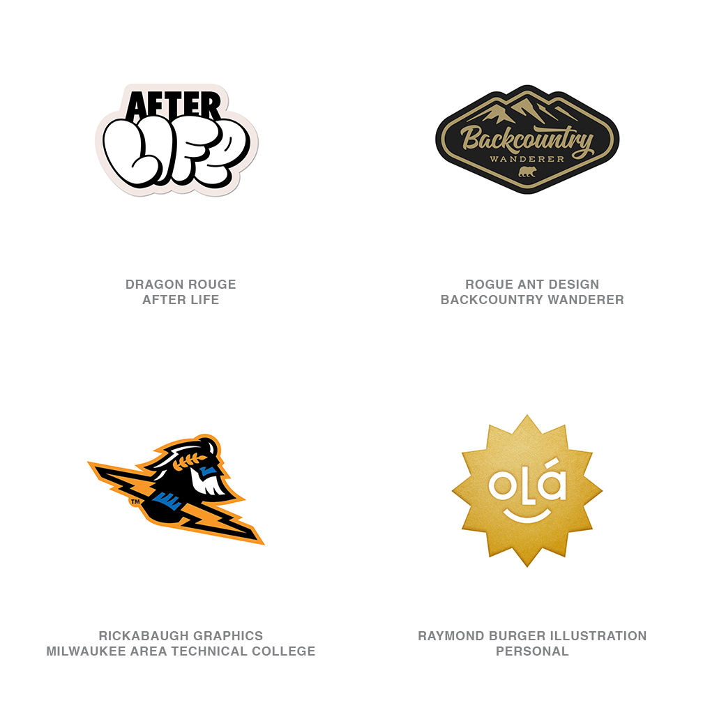
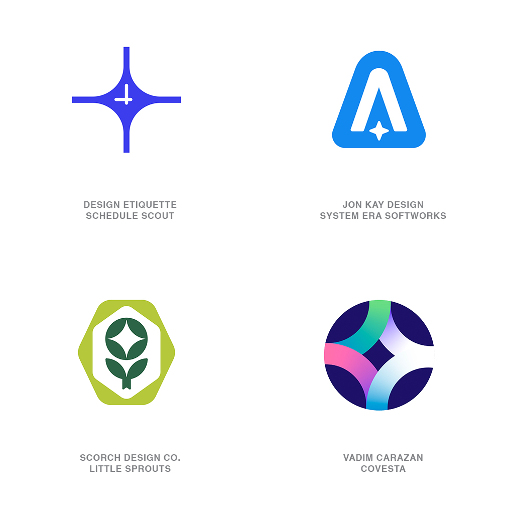
Trends this year include 'flat box', an illusion of sorts in which cube shapes are rendered in isometric perspective. Smiley faces are in, as are sticker or badge-style designs. And perhaps most interestingly, AI is being repeatedly represented by stars, which "hint at a magical or mystical quality, a shorthand for, 'Trust us, you wouldn’t get it if we explained.'"
Check out the full list of 2024 trends in the report at the LogoLounge website. And if you're inspired to create a logo of your own, take a look at our guide on how to download Photoshop.
Sign up to Creative Bloq's daily newsletter, which brings you the latest news and inspiration from the worlds of art, design and technology.

Daniel John is Design Editor at Creative Bloq. He reports on the worlds of design, branding and lifestyle tech, and has covered several industry events including Milan Design Week, OFFF Barcelona and Adobe Max in Los Angeles. He has interviewed leaders and designers at brands including Apple, Microsoft and Adobe. Daniel's debut book of short stories and poems was published in 2018, and his comedy newsletter is a Substack Bestseller.

