The new Speedo logo is a bit of a stretch
Updated branding is built to 'perform' on swimwear.
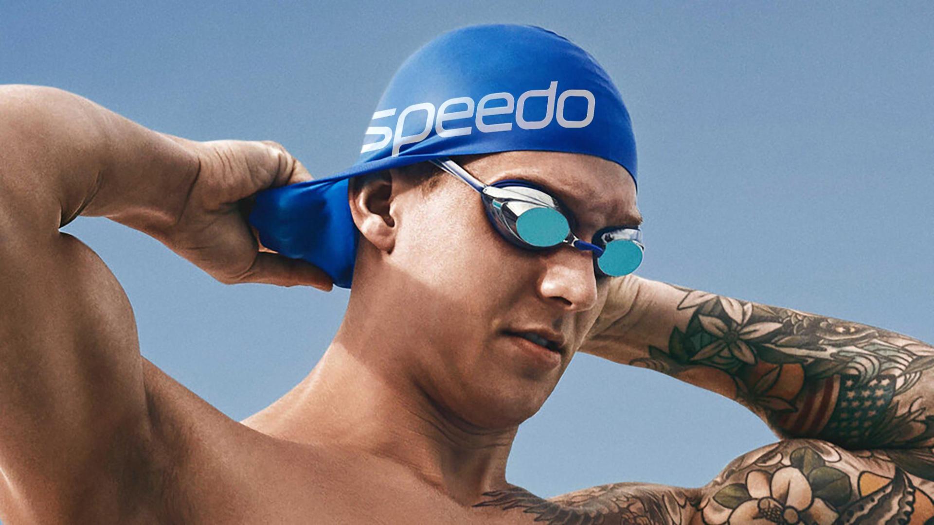
Leading swimwear brand Speedo has unveiled a brand refresh involving a new logo, a swimming-inspired typeface and, of course, the shade of green that research has proven to be most visible underwater.
Design agency Anomaly utilised the design idea ''for the love of swim' as a jumping-off point for the brand refresh, which aims to revitalise Speedo's inconsistent and overlooked branding. And at the heart of the new identity is a wordmark designed to 'perform' on swimwear. Many of the best logos of all time are versatile and adaptable – but here's one that can literally stretch.
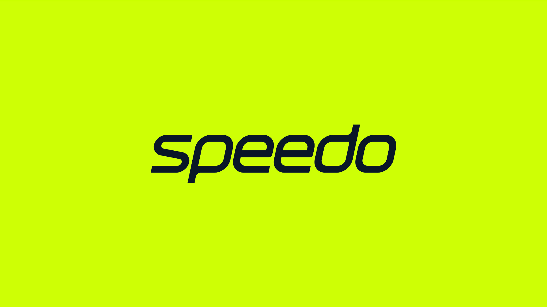
The new wordmark features shortened ascenders and descenders and streamlined curves designed to help it stretch on swimwear fabrics. Anomaly's UK head of design Behrad Taherparvar told Creative Bloq, "Keeping with our goal of putting the swimmer at the heart of our decisions, we wanted to evolve the logo with the core idea that its primary application would be on swimwear. We went into great detail on how an evolution of the wordmark would need to 'perform', stretching and molding around the swimmer's body. The result is a new logo that retains its iconicity and legibility, whilst happily swimming in its natural habitat and beyond."
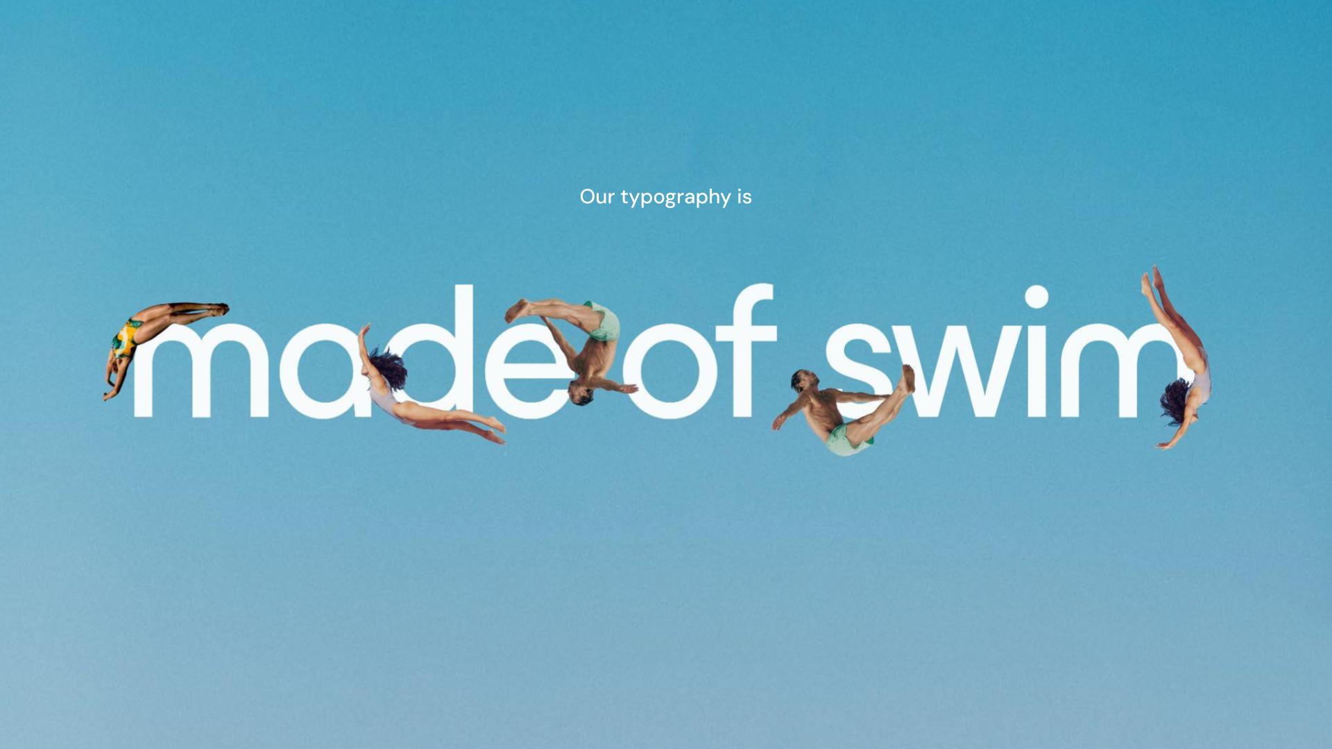
Meanwhile, the aforementioned green colour is juxtaposed with 'medal gold' to create a new brand colour for Speedo. And the new bespoke typographic style uses mixed fonts, inspired by 'swimming forms', to create a look that Anomaly calls "trusted and knowledgeable yet modern and distinctive".
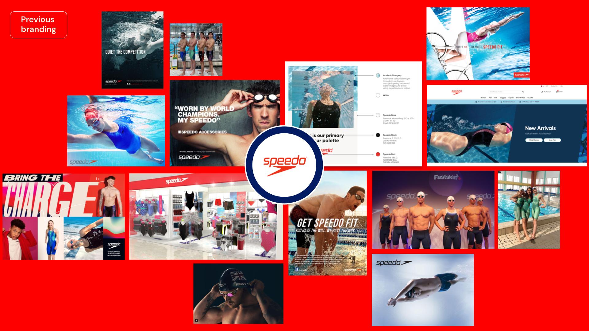
"The brief was to reposition the swim categories biggest player, Speedo, in order to propel swim culture forward as a whole, says Clara Mulligan, Anomaly's European head of design. We partnered with the brand to create products for every body; through product innovation and trend-forward designs. From elite athletes to beginners in swimming - our work embraced all audiences, allowing them to fall in love with swimming in a way that was personal and meaningful to them."
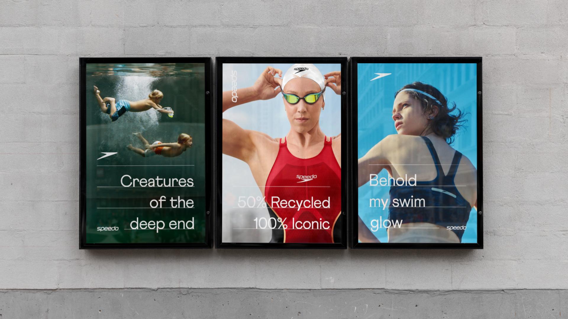
The new identity makes its debut at the 2024 Paris Olympics, where it is proudly emblazoned across Australia's swimming team kit. For more Olympic content, check out our interview with the LA artist whose powerful sculpture is taking centre stage.
Get the Creative Bloq Newsletter
Daily design news, reviews, how-tos and more, as picked by the editors.

Thank you for reading 5 articles this month* Join now for unlimited access
Enjoy your first month for just £1 / $1 / €1
*Read 5 free articles per month without a subscription

Join now for unlimited access
Try first month for just £1 / $1 / €1

Daniel John is Design Editor at Creative Bloq. He reports on the worlds of design, branding and lifestyle tech, and has covered several industry events including Milan Design Week, OFFF Barcelona and Adobe Max in Los Angeles. He has interviewed leaders and designers at brands including Apple, Microsoft and Adobe. Daniel's debut book of short stories and poems was published in 2018, and his comedy newsletter is a Substack Bestseller.
