How the internet killed design
If the designers from the 1990s knew what was coming, what would they have said?

It’s been said that modern communication began with Gutenberg and his press in the 15th century. By comparison, desktop publishing only started with Pagemaker in 1985. The time between those two milestones took us from hand set lead type, to digital typography with stunning controls, and beautiful colour printing. And it only took 545 years!
The digital revolution began at the tail-end of the 20th Century. Before that, most of that century was put together with rubber bands, string and spit. Analog technology, like simple chemistry and vacuum tubes from the 1800s, were combined in clever ways to create brand new forms of communications. Like photography, radio and television.
Very Rube Goldberg, but hey, it worked. And ushered in the first century of mass communications, which ended up killing design. See how web design trends have evolved, then change my mind.
The 20th century: design as king

Yes, much of the 20th century was a primitive time. But oh, the ART & DESIGN were spectacular! From the glorious days of the Victorian era, through the German Bauhaus and Art Deco periods. Combined with contemporary aesthetics and Asian minimalism, high-level design was front and centre across most of the century.
“The joys to be alive in a time when art and design are king”, read one magazine editorial from the 1930s. When creatives of the day were known by everyone, and could be seen on the covers of magazines like Life, Look, Time and the ubiquitous Saturday Evening Post. Visual design icons like Milton Glaser and Paul Rand could even be found interviewed on TV.
By the 1980s chains like Barnes & Noble were putting bookstores in almost every town. And their shelves were filled with “Best of Graphic Design” collections and gorgeous design magazines (many from our parent, Future Publishing!). There seemed no end to the world’s enthusiasm for design.
Then the tsunami that was digital design and publishing hit. Its promise of putting a high-end studio, and millions worth of typesetting/graphics tools within anyone’s reach, was intoxicating.
Get the Creative Bloq Newsletter
Daily design news, reviews, how-tos and more, as picked by the editors.
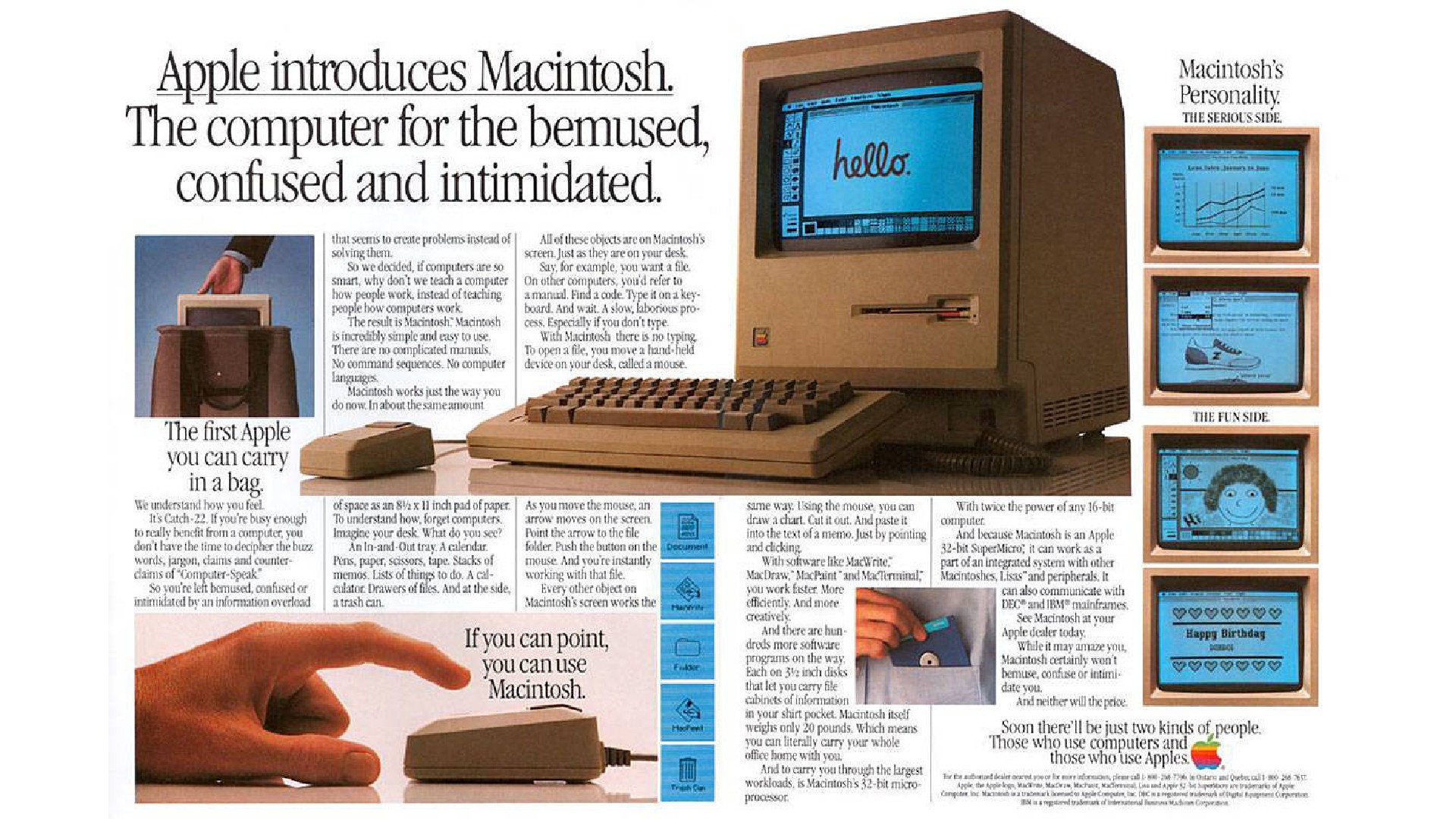
And by the 1990s digital design was exploding. New Macintosh Computers were being installed on every designer’s desk. Drafting tables and T-squares were beginning to collect dust. And traditional type houses and reprographics shops began to feel the pinch. Their days would soon be numbered.
But for visual, print and graphics designers, it was a glorious time. Technology was allowing us to create amazing things. With either great precision, or with great abandon; whichever was your style. And visual design stars were being born, like progressive designer Rudy Vanderlans and his Emigre magazine, which influenced everyone.
But all this good did not come without problems.
Design is not ubiquitous | The digital decline

Graphics-ready computers were also getting into the hands of folks that had never designed a page, or set any type. So as the talented few were creating genius, much of the '90s DTP was dreadful. Before long, dullards across the globe were producing their own magazines and newspapers and books, with tragic design choices, and illegible typography. All of this converged en mass to bring down the quality of design.
But hot on the heels of DTP was "Printing On Demand" (POD). A brilliant technology that helped bring our content – good and bad – to the printed page even faster and cheaper. Allowing for short-run productions, and the further rise of niche publishing. Dullards notwithstanding, as designers, we couldn’t have been happier.
And then all at once, it again changed in the blink of an eye.
Help Wanted: Web Designer
Some time in the mid '90s a new help wanted ad began to appear in classifieds around the world: “Web Designer Wanted” it would say. And the more we saw these new ads, the less we were seeing jobs for print design.
As designers we were excited! And we just assumed that we would be provided with tools like QuarkXpress to work in. But they never arrived.
Questions started to bubble up from studios. The tools being provided for our web designs were not what we were used to. Not at all. We could no longer choose from our library of typefaces. We could no longer drop in imagery with reckless abandon. It needed to be small and compressed because of something called “bandwidth”. And we kept having to deal with this thing called HTML.
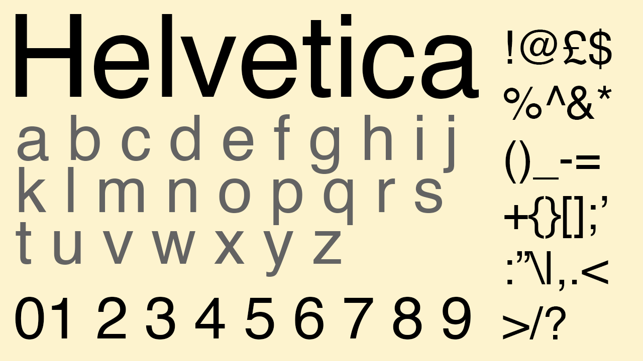
Kerning, gone. Tracking, gone. Even set page sizes, gone. How could a page size be gone, our 20th century designer minds could not grasp this. It was like designing in quicksand! And man were we getting sick of Times New Roman, Helvetica and Courier (see some better web fonts here)!
Clearly, HTML was never created to provide the kind of creative control that Postscript had given to DTP. But however different from print, and however more complicated and annoying web design was, designers were adjusting. Until the final nail in the coffin began to appear.
Help Wanted: Designer/Developer
Almost overnight, all those ads for designers started to be for designers that knew how to code. Companies were looking for designers who could code HTML. Then we saw ads for designers who could code HTML and CSS, and knew how to admin an Apache server. And run C-Panel.
By nature, creatives tend to be aesthetic, not technical. Besides, there simply were no artists who had taken programming courses at that time.
Many designers went scampering back to that dwindling pool of print jobs, if they could. And many simply left the design world altogether.
Web’s creative peak
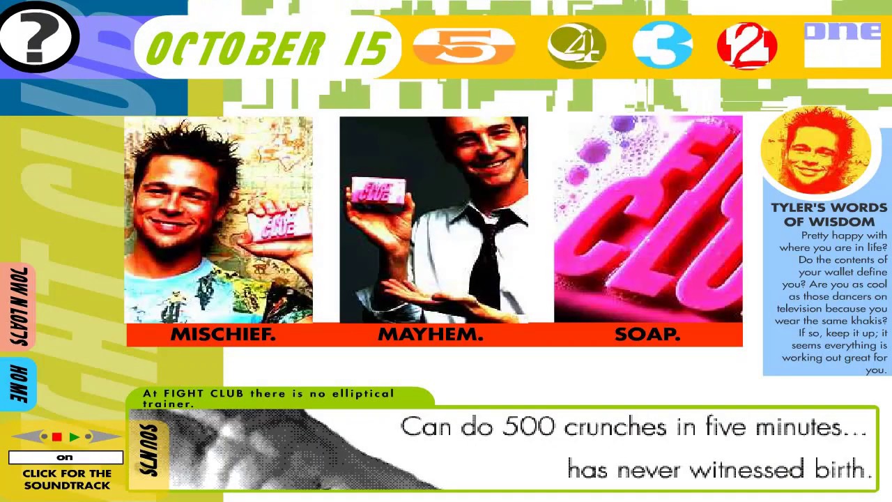
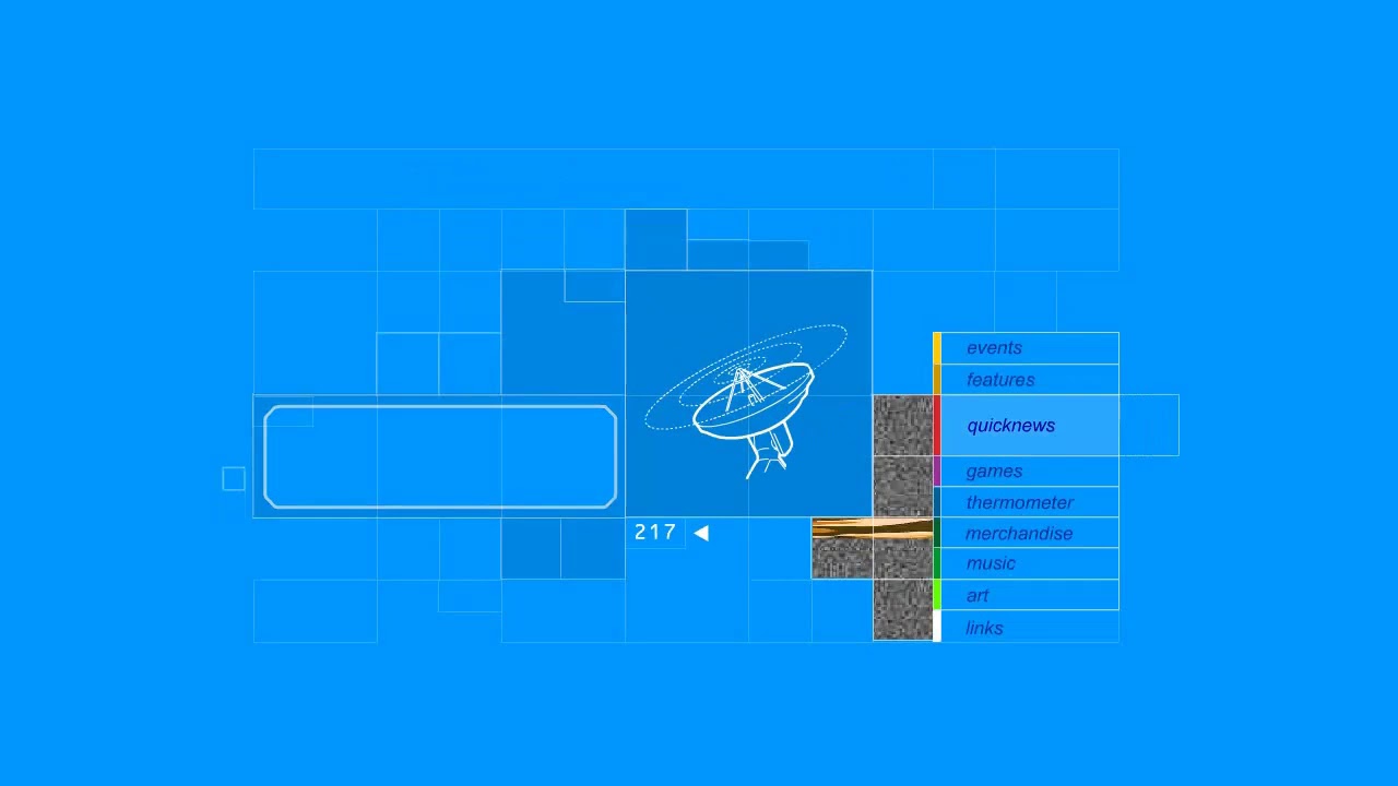
The web is at its best when designers are allowed to do what they do best. Unencumbered by technology or bandwidth. Then along came Macromedia Flash which single-handedly allowed designers to customise any page almost as if it were a printed page.
More static page sizes, drag and drop interface and objects actually stayed where they were placed. And while there was this powerful coding language behind it called Actionscript, we designers didn’t need to touch it for any of our work.
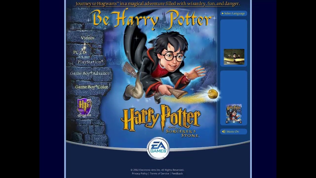
Flash opened the doors to those magnificent sites we began seeing by the mid 2000s. The blockbuster movie websites, particularly those for Harry Potter. Museums on the web, and other Flash sites that we visited with amazement.
Finally, the web was beginning to feel like a combination of the best of TV and glossy magazines combined. Maybe, just maybe this web-thing would work out for we designers. Maybe.
And much like the 1990s did to applaud print design, we began seeing articles with names like “Best of Web Design”, showing us truly amazing creations. Until...
Hit with a double-whammy!
By the time 2010 rolled around, so did a perfect storm. A pissing match between Adobe and Steve Jobs ended with Adobe nonsensically backing down and killing off Flash. Adobe’s response to designers? Use Dreamweaver and learn to code. Because we all know how well that went last time, right?
But no matter our tools, as the 20-teens rolled in, so did tablets and mobile devices! Wonderful and fun for everyone, except web designers. For we now had to design sites that could be rendered on 50+ differently sized screens!
How could we possibly design a page or site for desktop, tablets and mobile phone screens? The only solution at that time was to actually design three websites instead of one. So designers worked late into the nights, designing a desktop site. And then adapting it to a tablet, and then mobile.
The amount of time to create a client’s site ballooned. And of course, nobody wanted to pay for it.
The final nail
What could be argued were the final two nails in creating quality web design came soon after. Neither meant any harm, and both were solutions to real problems. But as often happens, the solutions created new problems.
The solution to needing to design three sizes for each website was to design one “responsive” site instead. Responsive tech was rolling out. Clearly better in some implementations that others.
But realistically, how could we expect to design just one desktop site and have the computer responsively create the other two formats, tablet and mobile? Let alone all of the various sizes needed for each? The answer is we couldn’t. But we did.
And down went the quality of websites, another notch.
And as the internet and our society evolved, people began spending more time on their phones than their desktops. So “Mobile First” became the rally cry of the new generation!
Add any two things, like 2+2 and you get something greater. But add responsive design and mobile first together and you end up with much less.
Without a whole lot of tweaking, which also may involve code, our mobile web designs have devolved into largely stacked blocks of a site’s essential information. In other words, ugly.
Worse yet, since fewer and fewer people visit desktop sites, they get less love as well. And every little trade-off made in this process was another arrow in the designer’s back.
The writing was on the wall. As we watched the quality of the annual “Best of Web” round-ups go downhill year after year.
I can’t help but wonder if the designers from the 1990s knew what was coming, what would they have said?
The next generation
If you are a young web designer who grew up surrounded by Wordpress page designers like Elementor, and the recent explosion of proprietary offerings like Webflow, you may read this and think I’m insane. And that would be fair enough. Things have gotten a bit better as of late (see the best and worst web design trends of this year).
But hop on a copy of Quark or InDesign and see what design used to be like. See what the web should have been as well, had Tim Berners-Lee who invented HTML, had the same foresight as John Warnock who created Adobe’s Postscript language.
The web would have been a better place for everyone. Especially its designers.

Thank you for reading 5 articles this month* Join now for unlimited access
Enjoy your first month for just £1 / $1 / €1
*Read 5 free articles per month without a subscription

Join now for unlimited access
Try first month for just £1 / $1 / €1

Lance Evans is creative director of Graphlink Media, a boutique creative marketing agency that specialises in building brands and has worked with such high-profile clients as Olive Garden, Miller Beer and AMEX. Lance was an early adopter of digital tools, and was on the original beta team for Photoshop. Lance has written for Creative Bloq on a wide range of topics, from technical photography tips to the ins and outs of branding.
