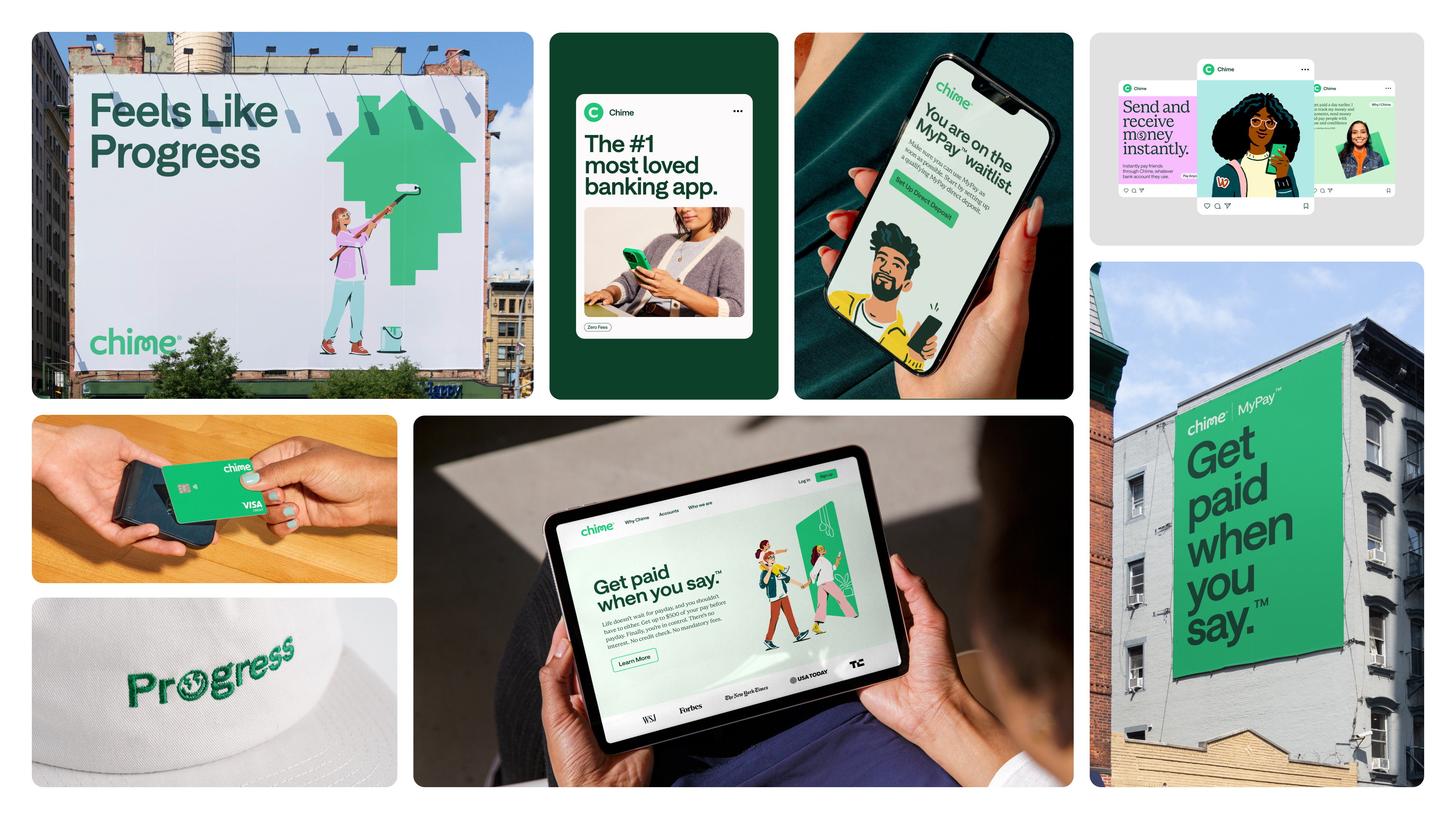
The topic of mobile banking doesn't typically get the creative juices flowing, so when financial tech company Chime unveiled its recent brand refresh, I was pleasantly surprised to find a new visual identity brimming with personality. It's no easy task to transform a brand in the finance field into something comforting, accessible and fresh, yet Chime's visual revamp disrupts the trends of corporate conformity to deliver a refresh that radiates playfulness.
When we look at the best rebrands across the years, a crucial element is ensuring that the brand's unique essence isn't lost. By refining key features of its existing identity, Chime's new visual identity is an embodiment of its progression – a triumphant evolution that never loses the brand's spirit of empowerment.
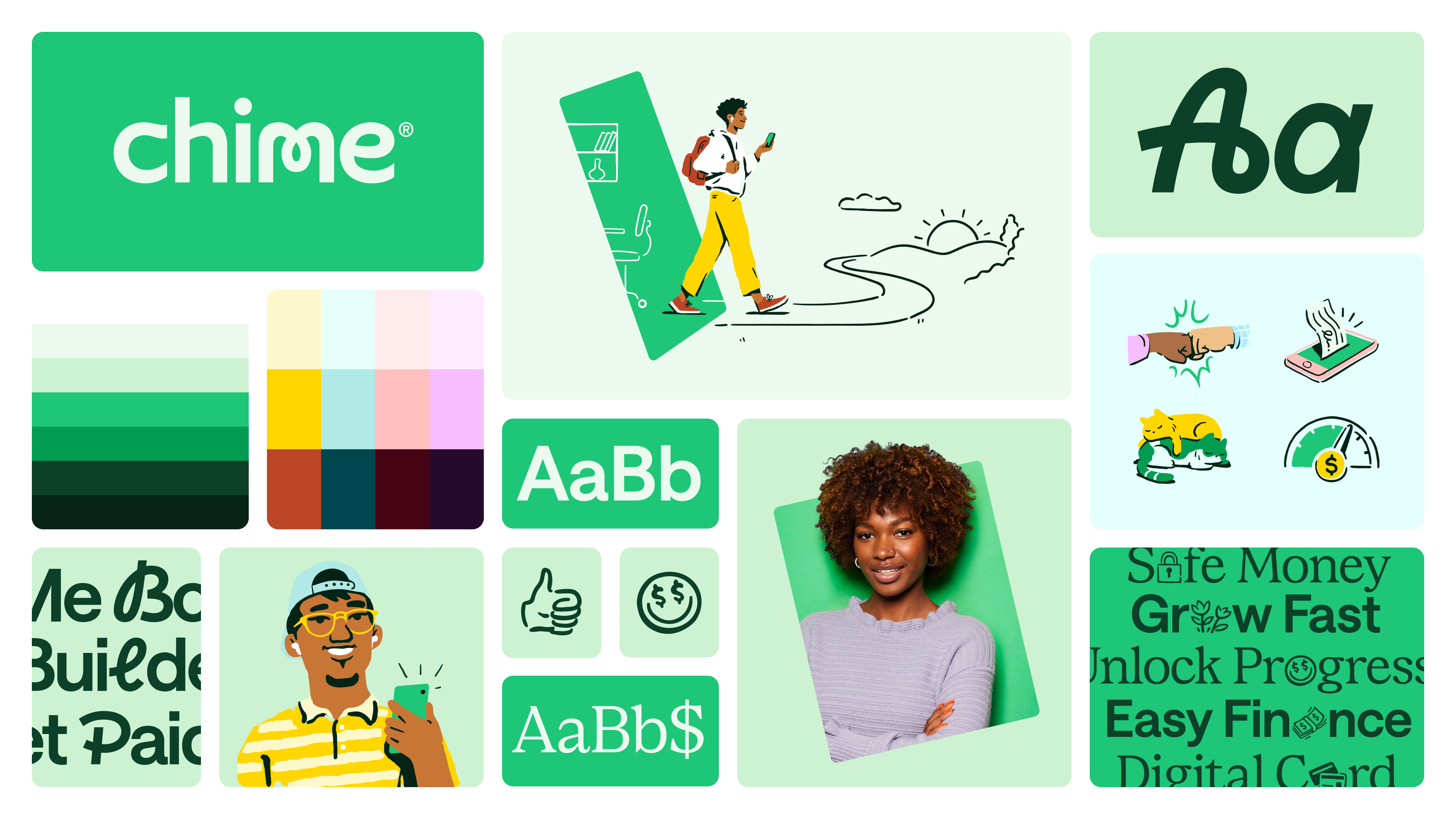
(Image credit: Chime/JKR)
Created by design agency Jones Knowles Ritchie (JKR), Chime's refresh centres around its two key features: the card and the app. Speaking to Creative Bloq, JKR's executive creative director Jason Little shared that the project began by "looking for a way to demonstrate the ease and simplicity of banking with Chime, whilst also reflecting the community at the heart of its brand success." The result is a simple yet personable design informed by Chime's core tools, positioning them as "windows of forward progress."
Latest Videos From Creative Bloq
Chime's existing identity was suspended in a more juvenile brand voice and "faced the challenge of evolving with its audience’s financial journey while appealing to new demographics—maturing without losing its soul," Jason says. To target this, JKR focussed on refreshing the brand using "typography that exudes trust and clarity, expressive lettering with a personal touch, intuitive iconography woven into messaging, motion behaviours that emphasize progress, and illustrations that celebrate diversity," he adds.
(Image credit: Chime/JKR)
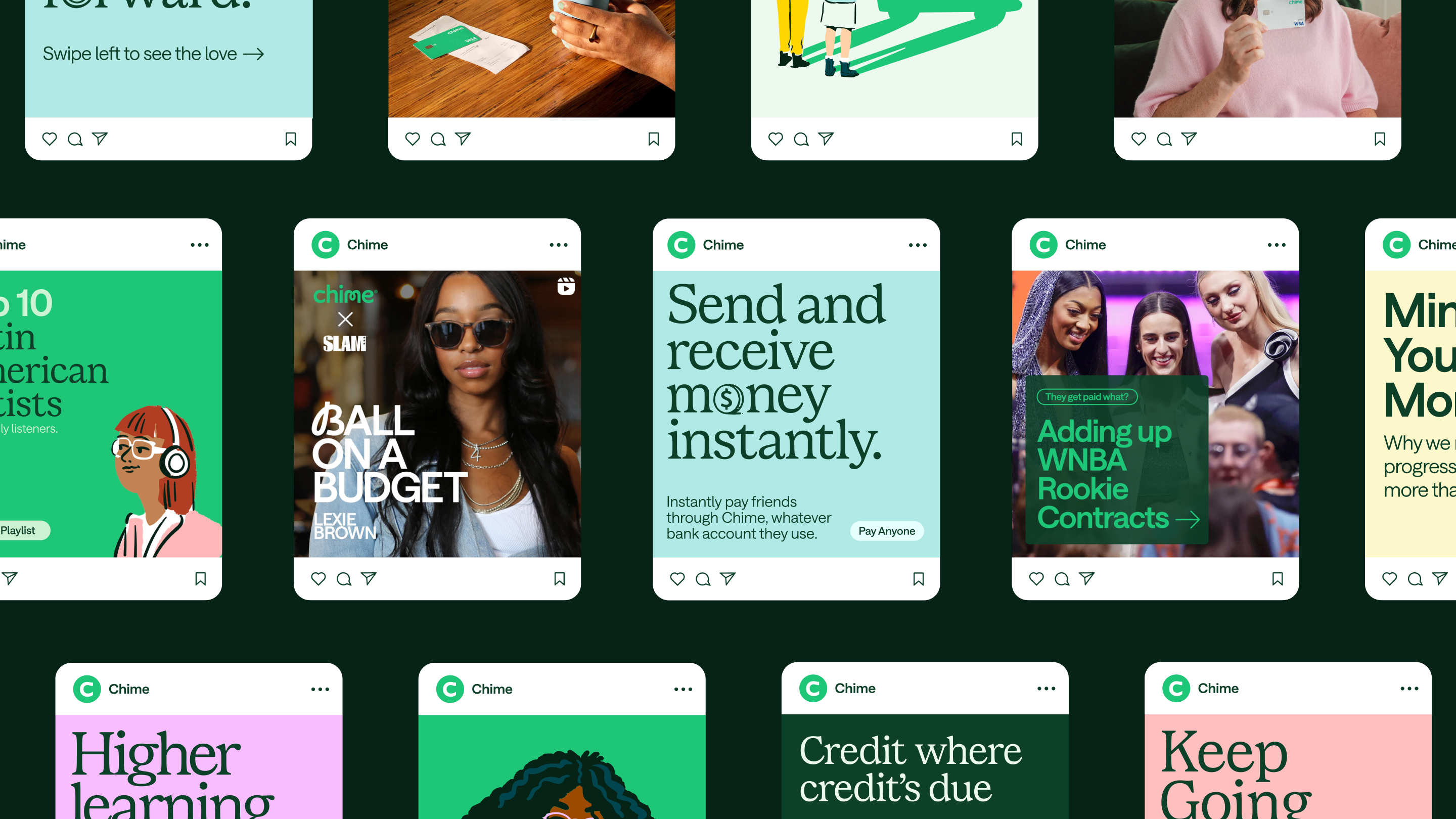
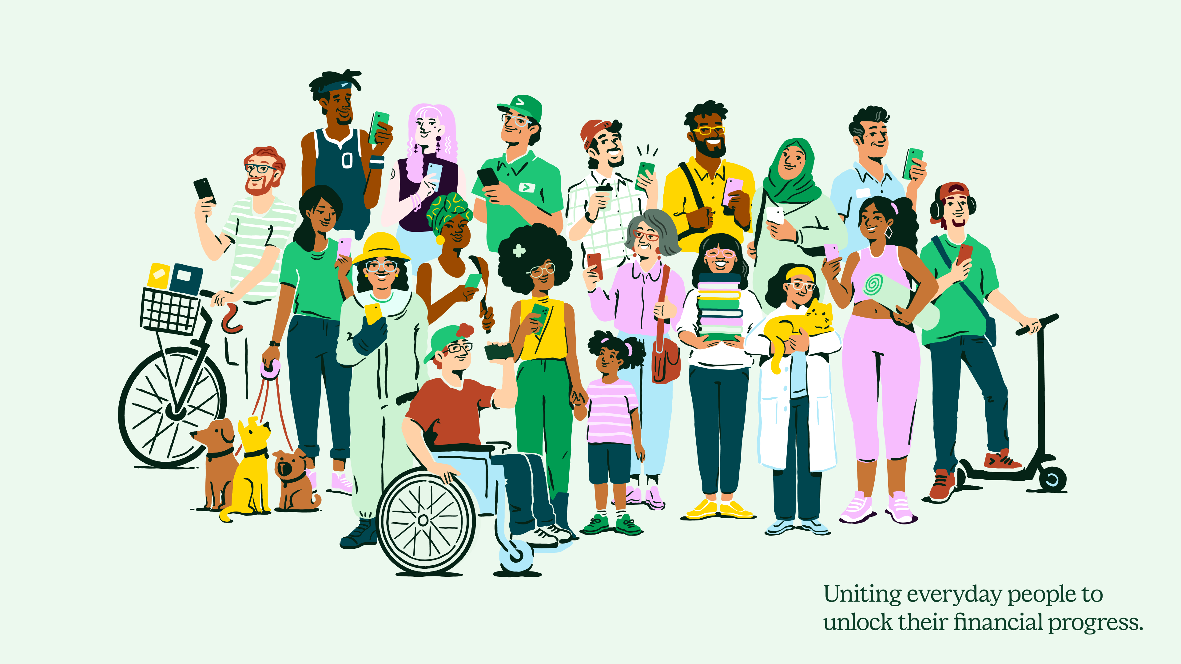
With a design concept centring the brand as a "portal to progress", the refreshed system evokes the ease with which Chime's customers can manage their finances while treating them as "real people not caricatures." According to Jason, "The green ‘portal’ represents how Chime’s products work together to simplify everyday progress," while the "Illustrated vignettes interacting with the card/phone portal shape represent the Chime community through these everyday scenarios."
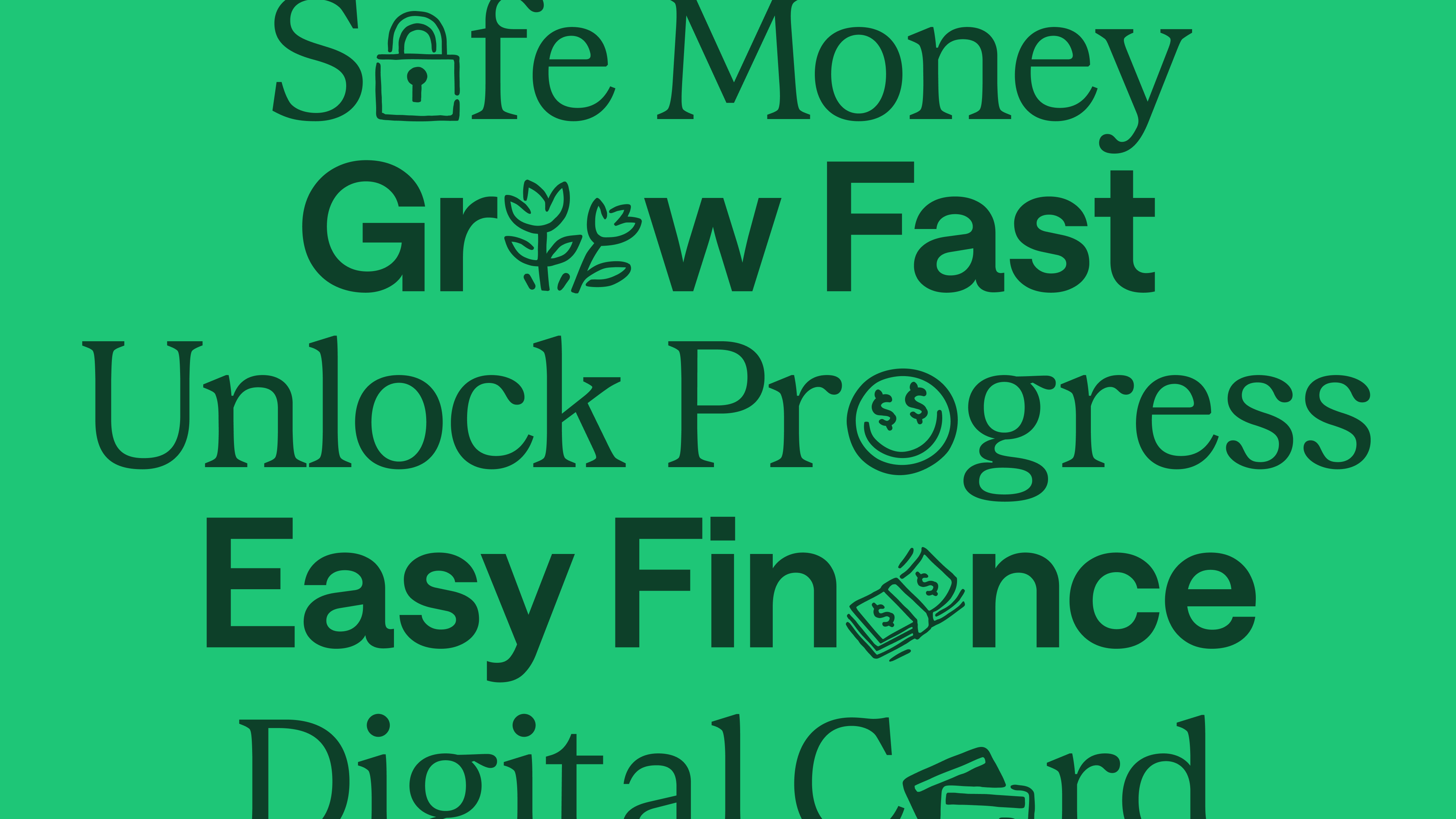
While the visual refresh aims to mature the brand's identity, Chime's playful essence lives on with a new illustration approach, integrating interactive elements such as emojis and inclusive illustrations. "For Chime, the ability to unlock letters and replace them with pictograms or expressive hand script alternates was a way to stay true to its friendlier, non-corporate origins, and allow for personality to come through, as the brand grows up," Jason says.
(Image credit: Chime/JKR)
With a focus on inclusivity and accessibility, the existing green colour palette was strengthened to maximise contrast and legibility while maintaining the "security and trust" of the brand's previous identity. A secondary palette creates a sense of "freedom, ease, and aspiration," while the shift to a realistic illustration style ensures that the brand is "more relatable and inclusive of its community". To communicate effectively and inclusively with its audience, Chime's custom typography consists of Chime Serif and Chime Saans (with modifications applied to Saans to provide accessible alternatives).
Get the Creative Bloq Newsletter
Daily design news, reviews, how-tos and more, as picked by the editors.
(Image credit: Chime/JKR)
When asked what he was most proud of throughout the creative process, Jason tells Creative Bloq: "Building a more relatable, more inclusive, and more seamless experience for consumers without sacrificing the brand personality is a definite source of pride. Especially in a sector that avoids colouring outside of the lines." The result is a sleek and unfussy contemporary brand identity that doesn't fall back on the safety of corporate financial branding. Bursting with character, Chime's brand refresh features an unpretentious design that speaks for the ease and simplicity of its services.
Natalie Fear is Creative Bloq's staff writer. With an eye for trending topics and a passion for internet culture, she brings you the latest in art and design news. Natalie also runs Creative Bloq’s Day in the Life series, spotlighting diverse talent across the creative industries. Outside of work, she loves all things literature and music (although she’s partial to a spot of TikTok brain rot).