This artists alphabet is the most beautiful thing you’ll see all day
The Artphabet explores the diversity of modern art.
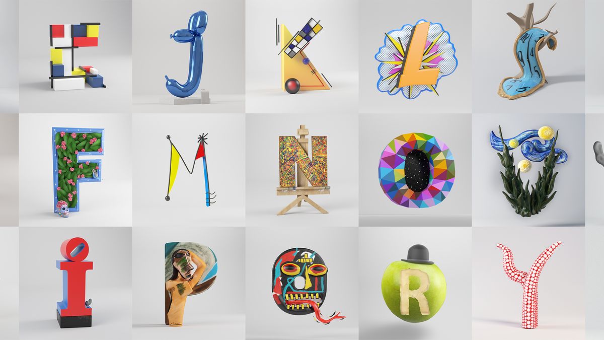
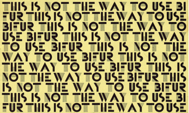
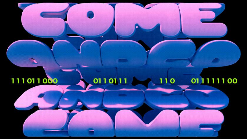
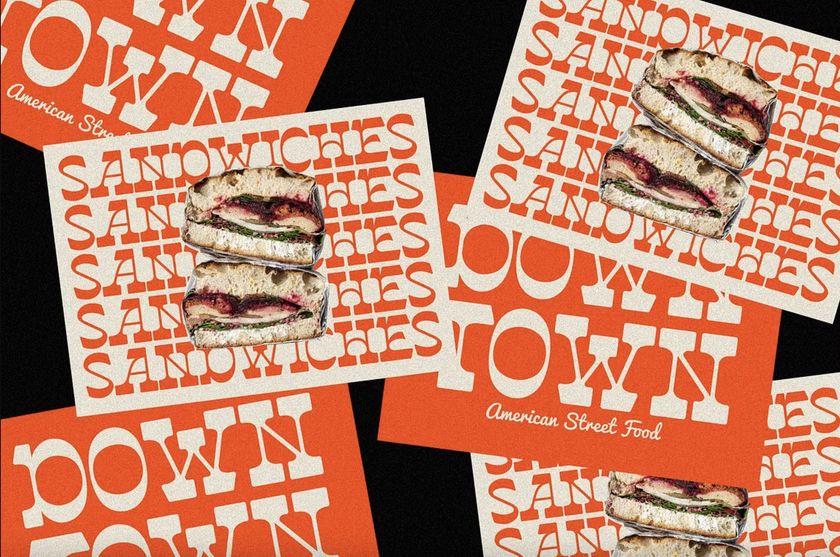
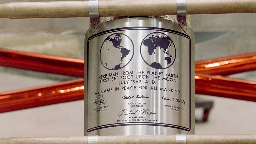
Think you know your contemporary artists? This project might just put your skills to the test. Celebrating the intersection of art and typography, The Artphabet is a stunning typographic project that pays homage to some of the greatest modern and contemporary artists from across the decades.
While there are countless types of typography, this intricate project demonstrates the diversity of the craft, with each letter boasting its own character and story. From Basquiat to Frida Kahlo, the project is a playful and dynamic tribute to the greats, demonstrating how culturally influential contemporary art has become.
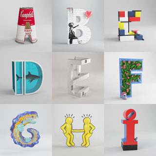
Created by César Cid, creative director at 3D motion and illustration studio CESS, the project began as somewhat of a love letter to the art world. "I have always liked the art world in general and it occurred to me that a good way to pay tribute was to participate in the 36 Days of Type event with an alphabet dedicated to the greats of modern and contemporary art," César tells Creative Bloq.
Paying homage to the greats has its challenges, as selecting one artist per letter proved a tough decision for César. "It wasn't easy for several reasons. It was clear that some artists would have to be left out," he says. "When choosing which letter to assign to each artist, some of them correspond to the surname, others to the first name... it was not possible to make them all match. I also took into account the shape of the letter itself and the work I wanted to pay homage to when choosing," César adds.
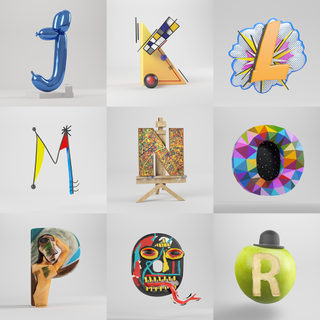
To create each unique letter, César used a variety of tools. "I made sketches and textures by hand and in Photoshop, with ZBrush I created many of the letters with digital sculpting. Finally, I used Cinema 4D to bring the compositions to life with materials and lighting," he says. While it's hard to pick a standout design, César adds "B for Banksy and P for Picasso are my favourites."
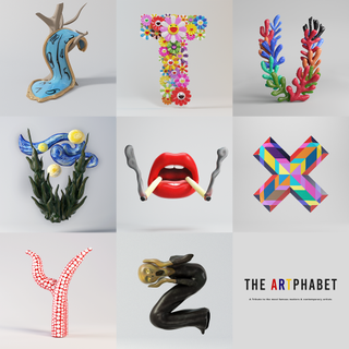
Despite the project's initial success, César still has aspirations for the project, seeing its potential as an educational tool for students. "The general idea is a mini-book, in which each page would have an illustration of the alphabet on one side and other interesting biographical information about the artist on the other," he says. "I think it is a timeless project and I would like to see it making waves again."
To stay ahead of the curve take a look at the typography trends to watch in 2025. For more creative inspiration, take a look at our font design guide for expert tips on how to create your own custom typography.
Get the Creative Bloq Newsletter
Daily design news, reviews, how-tos and more, as picked by the editors.

Thank you for reading 5 articles this month* Join now for unlimited access
Enjoy your first month for just £1 / $1 / €1
*Read 5 free articles per month without a subscription

Join now for unlimited access
Try first month for just £1 / $1 / €1

Natalie is Creative Bloq's staff writer. With an eye for trending topics and a passion for internet culture, she brings you the latest in art and design news. A recent English Literature graduate, Natalie enjoys covering the lighter side of the news and brings a fresh and fun take to her articles. Outside of work (if she’s not glued to her phone), she loves all things music and enjoys singing sweet folky tunes.
