The ultimate guide to kerning
What is kerning, and does it really matter?
Sign up to Creative Bloq's daily newsletter, which brings you the latest news and inspiration from the worlds of art, design and technology.
You are now subscribed
Your newsletter sign-up was successful
Want to add more newsletters?

Five times a week
CreativeBloq
Sign up to Creative Bloq's daily newsletter, which brings you the latest news and inspiration from the worlds of art, design and technology.

Once a week
By Design
Sign up to Creative Bloq's daily newsletter, which brings you the latest news and inspiration from the worlds of art, design and technology.
Once a week
State of the Art
Sign up to Creative Bloq's daily newsletter, which brings you the latest news and inspiration from the worlds of art, design and technology.
Seasonal (around events)
Brand Impact Awards
Sign up to Creative Bloq's daily newsletter, which brings you the latest news and inspiration from the worlds of art, design and technology.
Somewhere right now a designer is silently screaming at an example of bad kerning, whether on a sign, website, magazine or menu. Have you ever noticed words where some letters are closer together while others are further apart? A warning – once you open this can of worms you will never unsee it – kerning will haunt you wherever you go.
The aim of a type designer is to create a visually uniform flow across letters that reads as one undisturbed line rather than stopping the eye at every gap. Handwritten fonts naturally tend to flow together, but typesetting requires adjustment. Some letter combinations have too much or little space between them, which can make the text harder to read. This is remedied with kerning – adjusting the space between two letters to balance the negative space. In the days of metal typesetting, kerning was the overhanging parts of a sort (lead block or type) that helped letters flow, but in the digital age designers have a lot more control over kerning.
Types of kerning
Automatic kerning
Most design software will have automatic kerning applied to text. Metric kerning is typically the default setting. Most type foundries will incorporate kerning values into their fonts, calculated either visually by the designer or using algorithms. Metric kerning uses these font pair values to control whether the spacing between letters should be increased or decreased, usually expressed in font units (a fraction of the em or current font size), in particular focussing on problem letters such as A, V, W, Y, T, F, L, or P.
In contrast to this, Optical kerning uses an algorithm to control the spacing between adjacent characters, based on the shapes of the letterforms and the white spaces between them. The spacing is more precise in each instance compared to Metric, leading to a more visually appealing flow.
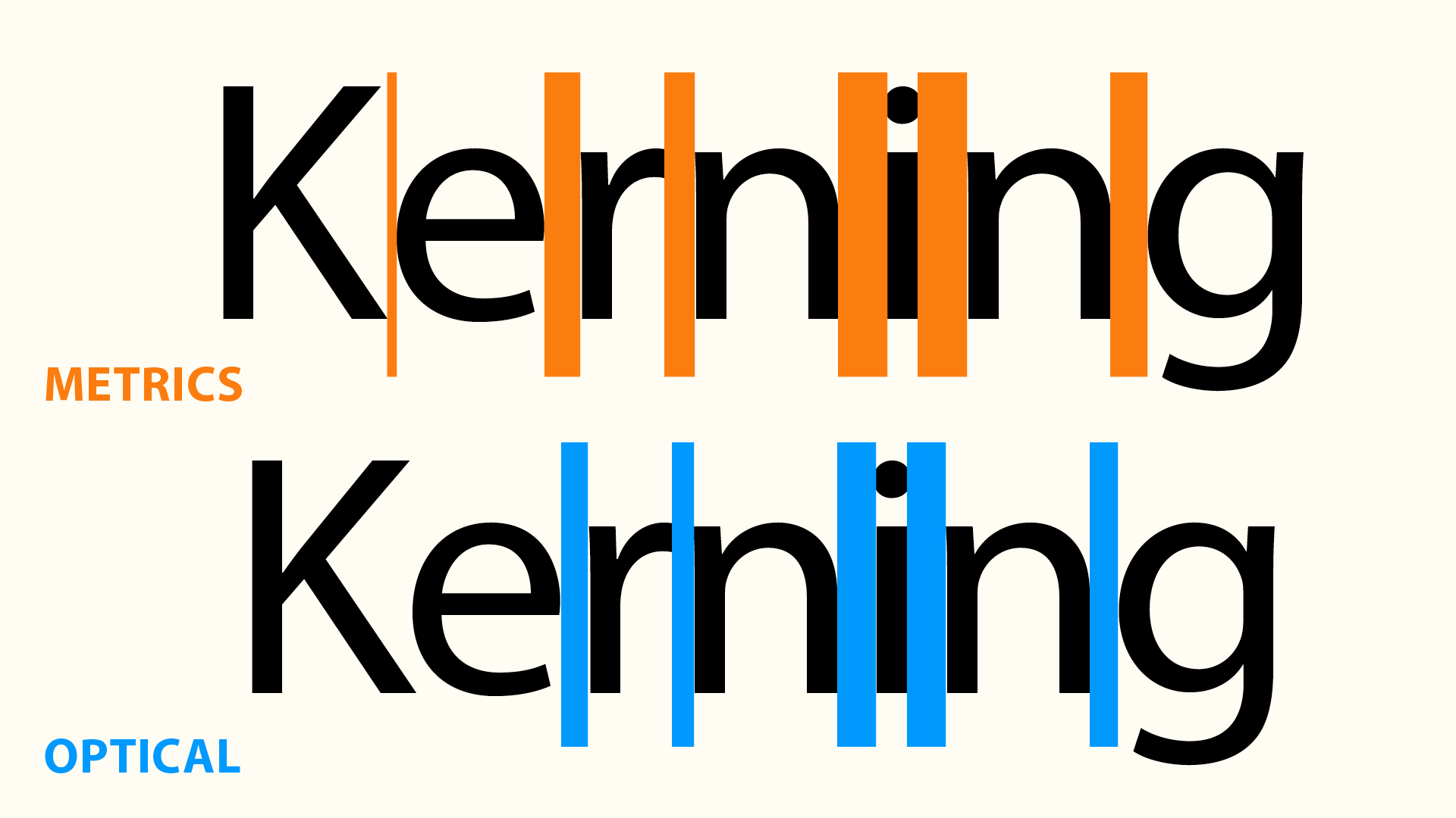
Opinion is divided over which kerning to use in each situation. Some designers will use metric for small body copy and optical for headlines. Optical tends to be tighter overall, which lends itself to header fonts. Metric kerning is less precise than optical, as it uses predetermined spacing and can be an issue when using free fonts or fonts with limited font pairs.
Manual Kerning
Text at smaller sizes requires more space between letters to maintain legibility. Therefore if you scale it up, you may need to manually reduce the spaces in between, as larger sizes should be tighter to improve readability. It’s rare to kern large bodies of copy or small sizes of text.
Most professional design apps provide the option of manual kerning. In InDesign you can adjust the spacing in the Character tab, the Character toolbar or by pressing opt+left/right arrows, which increases or decreases it in increments of 20 units. In InDesign you can use GREP styles to create global kerning changes throughout a document. It’s worth noting that tracking is different to kerning, as it adjusts the amount of space of an entire selection of text in equal increments. Tracking can be used in the publishing industry to fit text to the space required (most designers restrict tracking to -20 / +20 either way).
Sign up to Creative Bloq's daily newsletter, which brings you the latest news and inspiration from the worlds of art, design and technology.
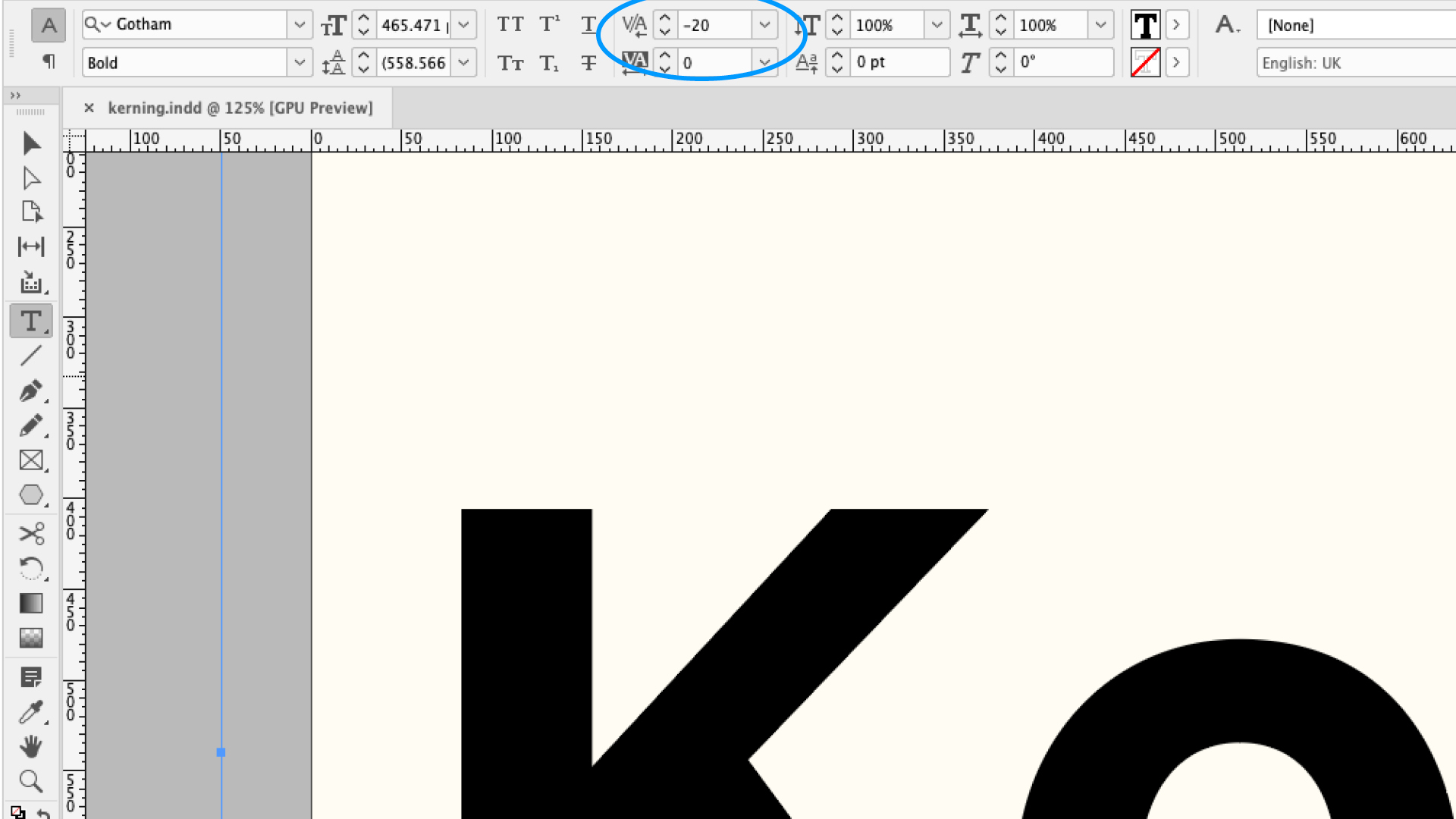
Kerning is, to some degree, subjective. What looks good to one person can look very different to another, especially when considering conditions such as reading disorders. Most attention goes into headlines and logos. Logos will be used in all kinds of places, at different sizes, so you need to consider this when designing – a logo that looks good on a large billboard might be unreadable in the header of a website. You can also get creative with kerning – probably the most famous is the FedEx logo with its hidden arrow.
Manual kerning can have its problems too. In the quest to find the perfect kerning, designers have a tendency to over-kern, moving further away from the metric or optical suggestions and ending with very tight text. While this style can be applied for effect, the digital age gives more attention to accessibility and readability than previously.
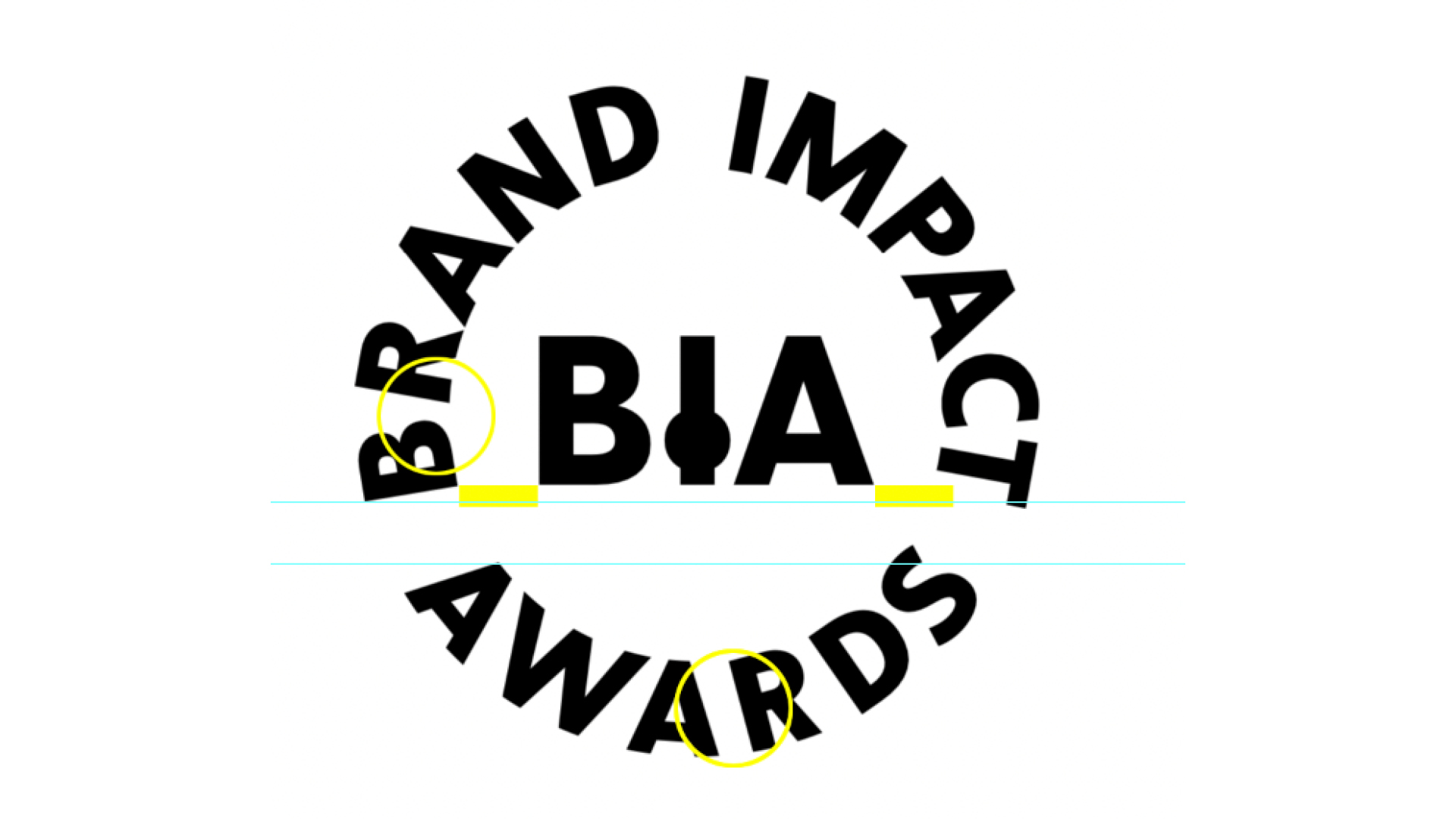
You may have read about the branding of the Brand Impact Awards, where we had particular issues with kerning around a circle. This presents problems, as the top of letters have a much wider negative space between them than the bottom of letters. This is an example where you might track the letters more widely than normal and use a typography expert to look into subtle changes, such as rounding the edges of letters.
Kerning tips
– You might find it useful to turn the text upside down or blur it. This can help focus less on the exact letter forms and more on the shape and flow of the words as a whole.
– Break the text apart. Rather than focus on the spacing of two letters, try looking at three or more. Some situations depend on more than two glyphs, based on their context in a word and these are called contextual kerning (this is particularly an issue with ligatures and punctuation glyphs).

– Taking a break from your desk can help, as well as zooming out to look at the word as a whole, rather than getting bogged down in individual letter pairs. You can also try printing it out to get a different perspective on it.
– Practise your kerning with the popular design game Kern Type. It’s fun and addictive, but also lets you test out your abilities against typography masters.
– Watch out for problematic pairs eg. LA, To, Tr, Ta, Tu, Te, Ty, Wa, WA, We.
Web kerning
Almost all browsers support kerning, which is generally switched on in the CSS by default (for fonts that include kerning data), but you can turn it on and off with the code:
font-kerning: auto; // The browser decides
font-kerning: normal; // Enable kerning
font-kerning: none; // Disable kerning
To enable it in all browsers, you have to use a combination of text-rendering and font-feature-settings in CSS properties.
Does kerning matter?
I once pointed out some bad kerning on a menu to my father. “Kerning, what’s that?” he replied. I tried to explain in that infantile way, always trying to legitimise my career choice to a parent, but with no success. He simply couldn’t understand how a small gap in the text made any difference, when he could read it anyway. So if 99% of the population is immune to bad kerning, does it really matter? In a world when the youth are so used to engaging with text on socials and absorbing information in a heartbeat, perhaps kerning is less of an issue.
Design is fundamentally about the presentation of information and kerning can help that by making it more readable and legible. The automatic kerning built into fonts and algorithms is usually good enough for most situations, but fine kerning on branding is where a designer really earns their salt. As with any good design, you never notice it until it's done badly and then it's all you can see.
For more on fonts, see our types of fonts guide and typography tutorials.

Matt has worked for various publishing houses and design agencies, covering studio photography, video production, editorial design, branding, illustration and motion graphics. He currently works for Future PLC with brands such as T3, Woman&Home, Marie Claire, Music Week, TechRadar, Golden Joysticks, Cycling Weekly, Brand Impact Awards, Horse&Hound and Tech&Learning. In the past he has designed titles including Mac|Life, IQ, Bow International, Drummer, iDrum, Acoustic, Clay Shooting, Sea Fishing and GunTradeNews. He has experience across the full Adobe Suite and is currently spending a lot of time creating projects in Blender and After Effects.
