The hottest typography trends to watch in 2025
From lo-fi and experimental to elegant and psychedelic, these are next year’s key trends in type.
Sign up to Creative Bloq's daily newsletter, which brings you the latest news and inspiration from the worlds of art, design and technology.
You are now subscribed
Your newsletter sign-up was successful
Want to add more newsletters?
As AI and digital tools develop, transforming many elements of design, the battle for balance between innovation and tradition, the tech-driven and the nostalgic. However typographers choose to combine these elements – or not – many of this year’s entries underscore human-centred processes, techniques and mindsets, from creating bespoke or highly decorative type to developing an anti-establishment aesthetic.
So let's jump in – here, in no particular order, typographers, designers and other industry experts highlight the typography trends to watch in 2025. To see how things have developed since this time last year, check out the type trend predictions for 2024.
01. Anti-minimalist
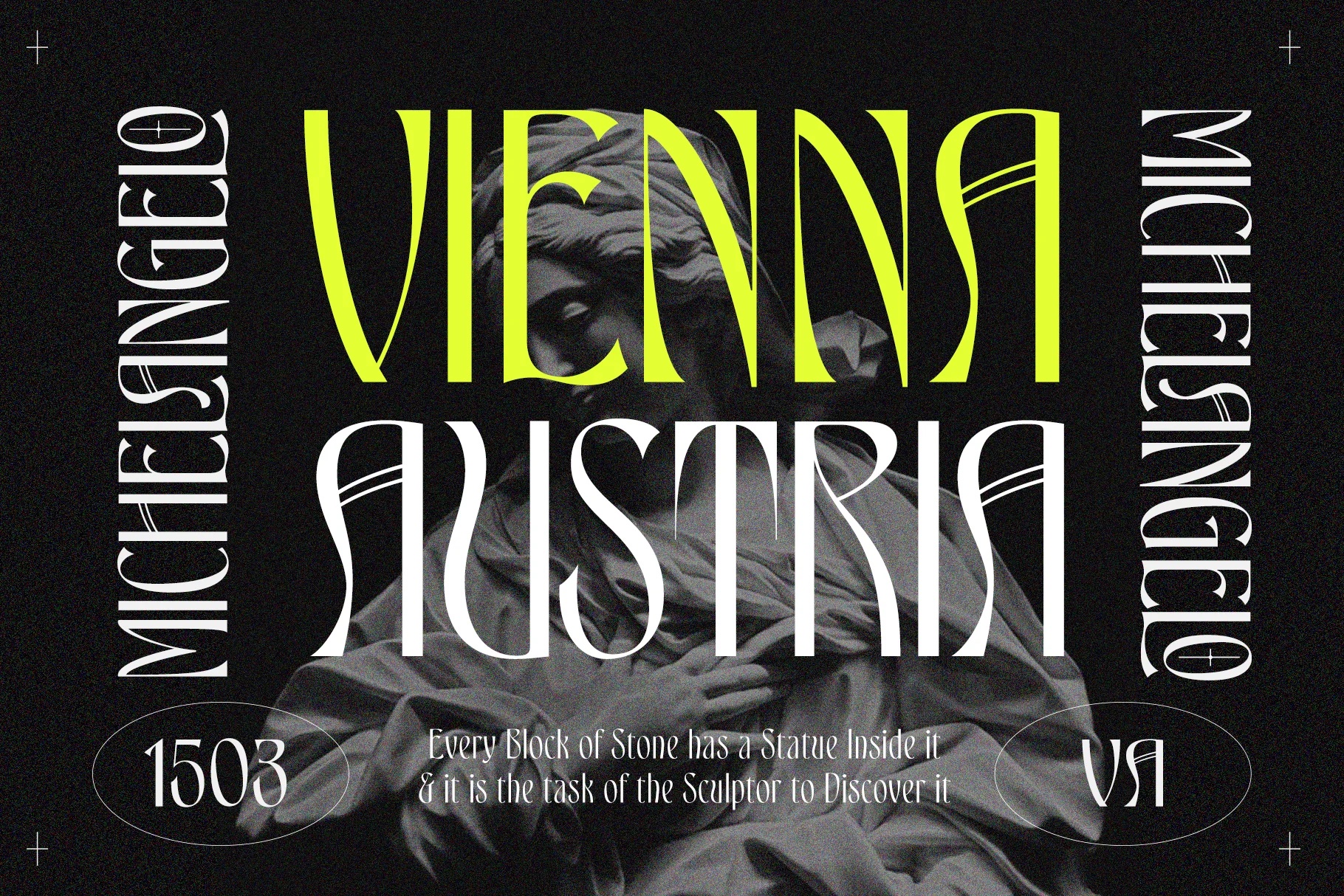
“The impending typography landscape of 2025 signals a decisive shift away from minimalism’s long-standing dominance, with momentum building toward a fascinating resurrection of 1960s psychedelic aesthetics,” says Raymond Larabie , founder of type foundry Typodermic Fonts. “Rejection of minimalist design principles has transcended mere irritation to become a powerful countermovement, particularly evident in the widespread criticism of recent corporate rebrands that feel out-of-step.”
“As this anti-minimalist fury gains traction, I’m predicting renewed interest in the ornate complexity of Edwardian and Victorian typefaces. However, while the world has already worn out certain aspects of 1960s design (notably Art Nouveau and relaxed serif styles) there remains a wealth of unexplored territory from this era ripe for rediscovery.” Raymond highlights underutilised design elements such as narrow inverse slab serifs, exemplified by typefaces like Playbill, popular in the ‘flower-power’ era; and Milton Glaser’s innovative interpretation of art deco principles.
Article continues below“Perhaps most intriguing are the non-traditional, experimental letterforms from the period that diverged from the more commonly referenced Art Nouveau style designs that haven’t seen significant revival since the late 1990s and are primed for a sophisticated reexamination and reinvention through a modern lens.”
02. Nuanced Nouveau
The appeal of antique was high on our list for type trends in 2024, with late-19th century decorative grandeur influencing a turn away from sans serif types that had been dominating branding. And It’s a trend that looks set to develop throughout 2025.
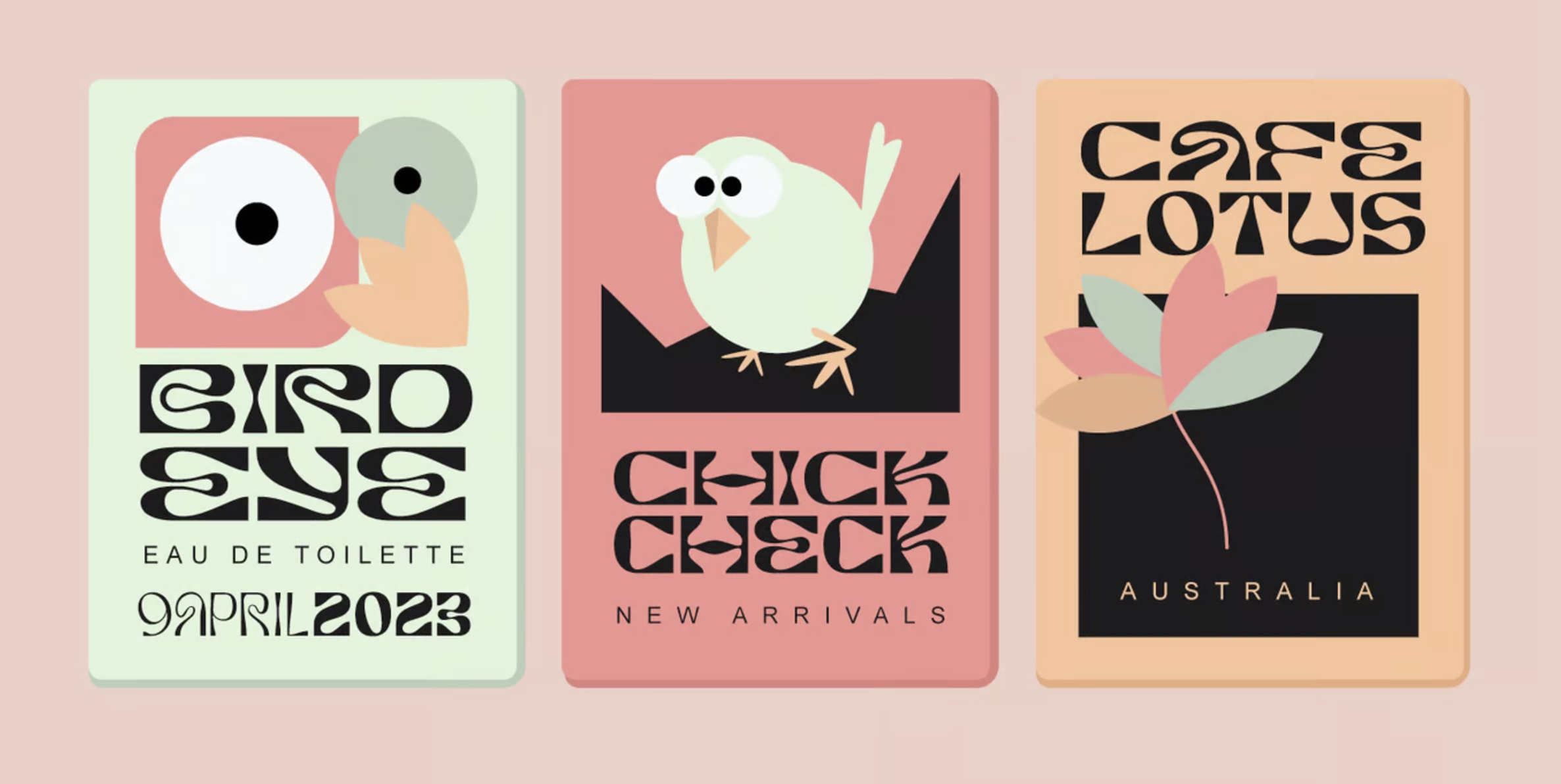
“While 2024 was dominated by a resurgence of Art Nouveau-inspired typefaces, I don’t think we’re ready to move on just yet. Instead, I see this trend evolving into more subtle and sophisticated interpretations in 2025,” says lettering artist and type designer Jamie Clarke. “These nuanced designs may begin to influence other genres, including sans serifs and styles that have largely remained unaffected so far, blending the organic charm of Art Nouveau with modern sensibilities.”
03. Experimental
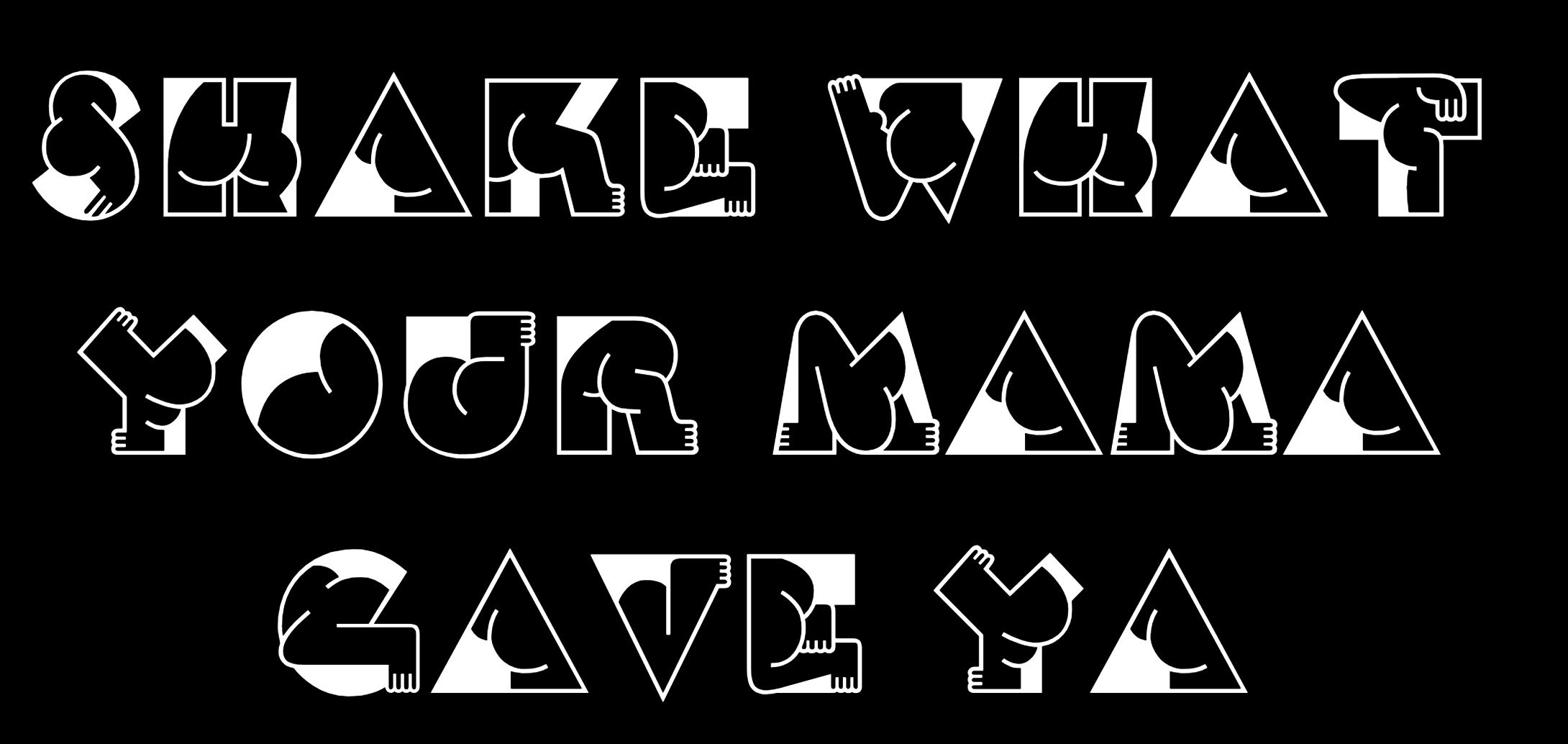
“I suspect that there will be many more sans-serif publications in 2025. Sans-serifs are here to stay, and I’m excited to see the new developments. On the other hand, I expect to see very experimental and playful type designs that will find more and more relevance in branding,” says Julien Fincker of Fincker Font Cuisine.
Sign up to Creative Bloq's daily newsletter, which brings you the latest news and inspiration from the worlds of art, design and technology.
Dina Benbrahim, multi-disciplinary creative and founder of experimental design programme Hello Departures, also predicts a rise in unconventional, exploratory and subversive typography.
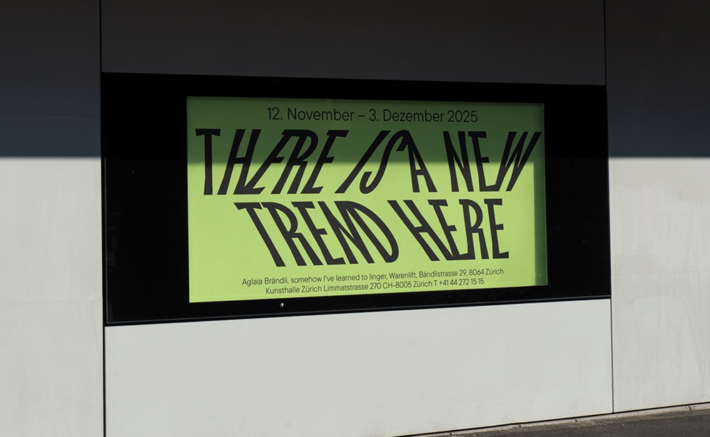
“I’ve observed that more and more experimental display typefaces pop up to challenge the traditional norms of ‘good design’ and embed a political dimension to typeface design,” she says. “My favourite go-to to find open source expressive typefaces are at Velvetyne and Badass Libre Fonts by Womxn. I think we will definitely see more of this in 2025 as typeface design is getting more democratised with online programmes like Type Electives and Practica Program.”
04. Bespoke
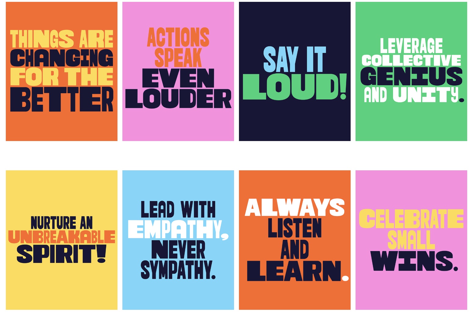
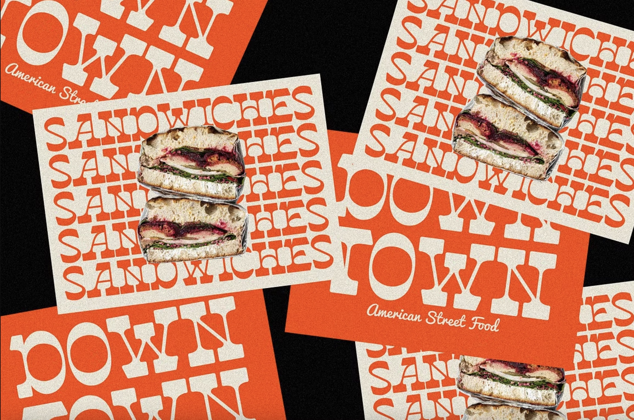
Making a re-entry for 2025, custom fonts are continuing to make an impact. Typographer Justin Poulter says it remains a great move for any brands looking to stand out. “Bespoke display fonts with interchangeable styles are a great way to inject personality into a brand,” he says. “This can be achieved by either using an existing typeface that has letter variations or editing a typeface to introduce unique and playful characteristics.”
One example is a recent project for South African youth brand JiK’iZiNTO, an offshoot of Girl Effect. “Each typeface was hand drawn to ensure the lettering retained a tactile feel to each character,” says Justin. “‘Jiki Poster’ was created in both a bold and narrow weight with alternate characters added in to allow for unique combinations and enhanced personality. The typefaces were designed to be interchanged mid-sentence, to give a sense of disruption and character to the messaging and reflect the brand’s positive and bold nature.”
05. The human touch
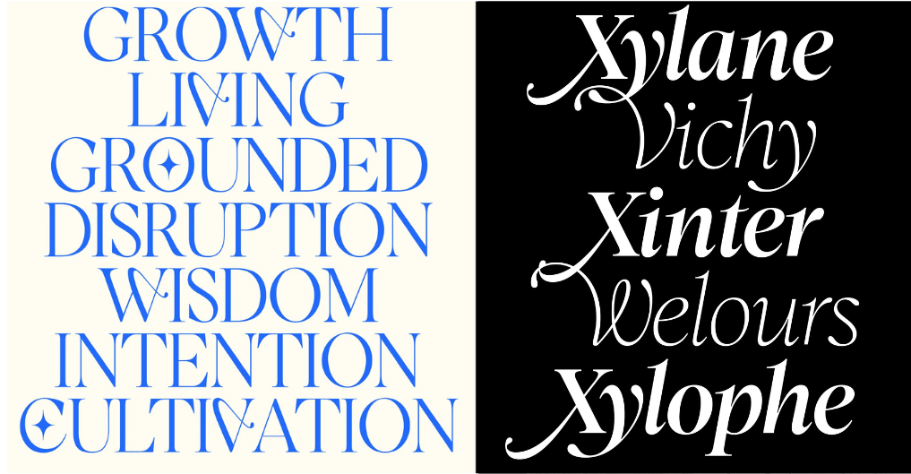
“We’re expecting to see answers to the widespread adoption of AI as designers search for typography that feels humane, earnest and emotive” says Danielle LaRoy and Jessica Strelioff, founders of brand studio Goodside Studio. “We’d be particularly excited to see hand-drawn typography on our screens with perfectly imperfect, almost-nostalgic feeling features.”
“Crafting is having a positive resurgence. Analogue and organic typography is a reaction against AI-generated visuals – designers long for a more handmade aesthetic,” says Abigail Baldwin, director at design agency Buttercrumble, who points to Romie, a new calligraphy-inspired font created by Margot Lévêque. “It has a humanist and elegant feeling that contrasts with computer terminal fonts.”
Given that AI was such a predominant topic in 2024, including in design, although the future might be uncertain, it’s time for rebalancing digital and analogue techniques. “The development of AI is progressing rapidly, so it is hard to predict what we will be facing in 2025,” says Julian. “The important thing is not to be overrun by developments, to pause sometimes and to keep the progress human-centred. This is the responsibility we all have to face.”
06. Skeuomorphism
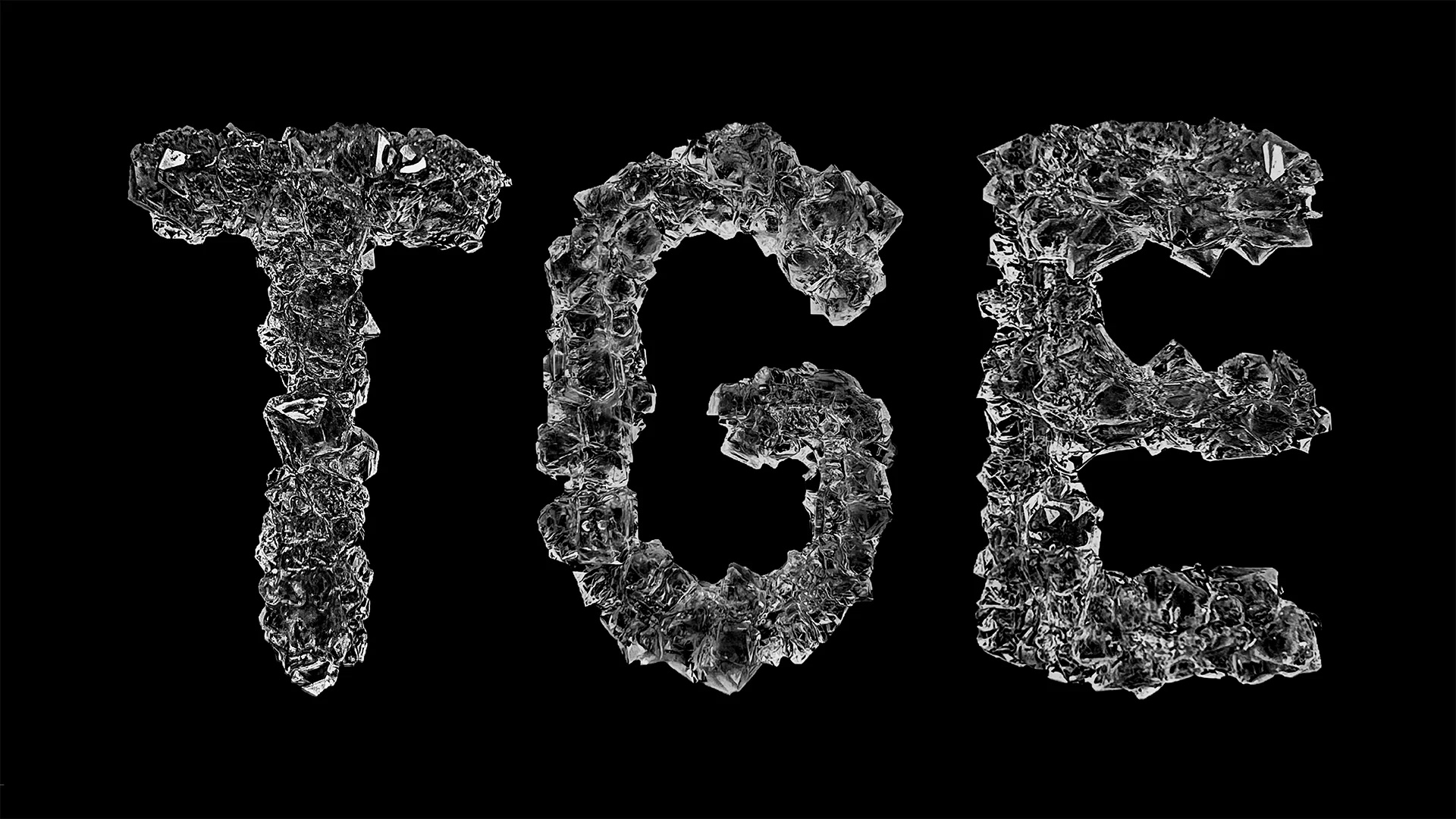
This next entry uses visual cues to imitate or infer familiar real-world objects and materials, and is part of the anti-flat design trend that looks set to grow in popularity in 2025. Elements such as texture, depth and shadow, can be used to communicate emotion, incite intrigue or create a fantasy.
“We think skeuomorphism could make a big comeback this year as design trends swing away from flat design,” Danielle and Jessica say. “Bring on the dimensional, the grabable, and the tactile!”
07. Lo-fi

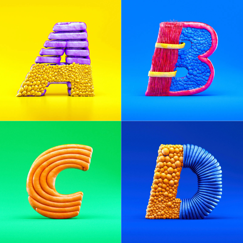
Anti-fashion and anti-design, this next trend took hold in 2024 and is expected to further impact design and typography in 2025. Techniques such as deliberate “ugliness”, distortion, excess, clashing colours and seemingly random elements all aim to directly challenge the idea that design must be conventionally attractive to be impactful. It’s a flaws-and-all, divisive trend that often hopes to resonate authenticity.
“I’d predict stretching type in a lo-fi way, à la ‘brat’ (for better or worse), is something we’ll see more of,” says Cody Fenske, associate creative director of VSA Partners. “Punk aesthetics typically get co-opted by the big dogs, and you could argue that because Charli XCX is mainstream, it already has been.”
Upping the ante on the brat aesthetic, David Kerkhoff of Hanoded Fonts foresees a “Dr Jekyll & Mr Hyde trend”, which, alongside an increased interest in clean, futuristic fonts, will bring a “run for whacky, anti-establishment designs”.
08. Super-rounded
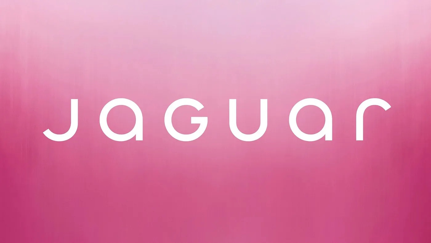
If David is right, what are these futuristic new fonts likely to bring in 2025? Abigail point to the recent Jaguar rebrand as a prime example, thanks to its super-rounded, clean font. The design team switched out its former squared all-cap type for this lowercase design, bar the ‘G’. With an emphasis on symmetry and the mirrored ‘j’ and ‘r’ also appearing in its new monogram, its a “complete reset” the company says, to mark its move into electric-only vehicles.
“Jaguar’s rebrand has been big news. Their rounded, geometric logotype is perfectly engineered and futuristic,” says Abigail. “Rounded fonts are soft and gentle, conveying a greener and better future for the planet.”

Antonia Wilson is a freelance writer and editor. Previous roles have included staff writer for Creative Review magazine, travel reporter for the Guardian, deputy editor of Beau Monde Traveller magazine, alongside writing for The Observer, National Geographic Traveller, Essentialist and Eco-Age, among others. She has also been a freelance editor for Vogue and Google, and works with a variety of global and emerging brands on sustainability messaging and other copywriting and editing projects — from Ugg and Ferragamo to Microsoft and Tate Galleries.
