The best typography of the 2020s (so far)
Variable is the focus of the decade so far, along with handwritten, multilingual and nostalgic.
Whether making the most of new tech tools transforming the world of typography, or creating something by hand IRL, the 2020s, so far, has been a time for both experimentation and embracing heritage. In a largely digital-first world, many of the most recently created typefaces are highly variable with multiple personalities for a huge variety of projects and settings.
We’ve been watching this space closely, particularly in the run up to our Typography Week in September. For this piece, we asked typographers, designers and other industry experts for their top typography picks of the decade so far. This is a bumper edition to kick off our best typography of the decade series, with 16 entries (in no particular order) to give you all the inspiration you need for your next type project. You can also check out the typography trends we predicted for 2024 here.
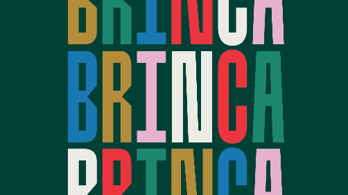
01. Brinca

“In terms of personalisation, I think perhaps this is a reaction to the homogenisation that happened in the 2010s where so many brands ditched their heritage and opted for some kind of sans-serif geometric typeface,” says Adam G, co-founder and creative director of LA-based design studio TRÜF. “Or it’s merely a result of the ongoing democratisation of everything creative. Although the options are endless at this point, we think Brinca feels like a bridge between flexible and personalised. Fun, funky and usable.”
Brinca, released in 2023, was designed by Alexander Wright and Rodrigo Fuenzalida with Michu Benaim Steiner for In-House Int’l type foundry, it was then developed by Rodrigo Fuenzalida at FragType. The Highly versatile, variable typeface is described by the foundry, as having “chameleon-like range of styles” and a “full-spectrum typeface with emotional range and a dynamic heart”, as well as being “named after its jumping extremes of the type’s styles; from coiled spring to stuffed and bouncy”.
02. Gimme Mechatron

“The 2020s marked a revolutionary shift in the world of typography, fundamentally altering how fonts are commissioned, created and licensed. This transformation is largely due to the introduction of variable font technology in 2016, which has redefined the possibilities of type design and usage,” says Eleni Beveratou, creative director of typeface design studio, Dalton Maag Ltd. “Variable fonts offer a level of flexibility and dynamism previously unimaginable. Unlike static fonts, which come in a fixed number of weights and styles, variable fonts allow for a continuous range of variations within a single font file. In digital environments, these fonts can enhance brand or campaign expression by reacting to sound, face recognition, weather conditions, or other criteria.
"Adding to this excitement, colour font technology has also gained prominence in recent years. These fonts allow for the inclusion of multiple colours, gradients, and textures within a single glyph. While this was possible before, it was never in such a sleek and advanced way.”
“Could one have a variable colour font? Absolutely! That’s why one of my favourite fonts from the 2020s is the totally crazy, incredibly cool typeface Gimme Mechatron by Arthur Reinders Folmer,” Eleni says of the font, released in 2020, which is part of a larger font family inspired by childhood toys. “I love the greyish mechanical colours baked into the caps and numerals of this Transformers-inspired typeface, as well as the unexpected red used in the punctuation for text intonation.
Get the Creative Bloq Newsletter
Daily design news, reviews, how-tos and more, as picked by the editors.
“But are variable fonts all about wild designs? The answer is no. While the wild designs are what excite me the most, the type geek in me loves that, finally, in the 2020s, variable fonts excel in digital microtypography, a previously neglected field. They can also perfectly adjust design and spacing based on size and background modes (dark or light). As we look to the future, this adaptability will be crucial for AR, VR, and MR environments.”
03. Letterpress Sans

“I often find that fonts made to look hand drawn or distressed, don’t achieve it in a convincing way. However, it’s not the case for Letterpress Sans by Ulysses Design Co, a studio based in Sydney, Australia,” says illustrator and typographer Justin Poulter. The hand-drawn digital typeface, released in 2024 was inspired by vintage letterpress printing and was the first typeface from brand identity design studio Ulysses.
“It’s available in four weights and has a classic retro feel to it, like a type you might expect to see painted on the side of an old mechanics van or hammered into the facet of a Vietnam War-era Zippo lighter.”
04. Axalp Grotesk

“Recent trends in fonts have seen designers look back to the past for inspiration and nostalgia, with display fonts that gravitate slightly towards design styles of times-gone-by. This is combined with a light touch to bring levity while maintaining the class that gives designers the chance to make brands look uplifting,” says Chris Page, founder of design agency Jelly and head of the company’s type department.
“For me, a great example of a font that has been used extensively since Covid has been Axalp Grotesk, designed by Roch Modrzejewski and published by ROHH in January 2022. Axalp’s clean, bold design is great for tech logos, brand identities, and websites and sums up this modern look. It’s extremely versatile and looks great in its boldest form or as a thin, all caps font.”
The minimalist, modernist Axalp Grotesk aims to offer a contemporary alternative to the classics of Swiss Design School such as Akzidenz-Grotesk, Univers and Helvetica.
05. Editorial New
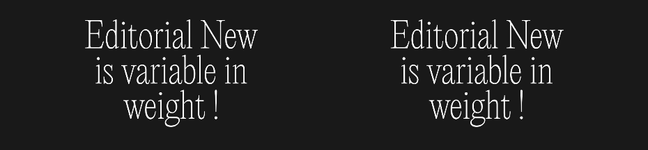
“Hello funky serifs, how I love thee!” says Jessica Strelioff of Goodside Studio. “I think by 2020, we all started to get over the flood of just-quirky-enough sans serifs in the digital-first blanding world and took a hard pivot to the weirdest serifs we could find. Nothing is too condensed or too wonky for us. Plus, we’ve all got giant retina displays, so rendering issues became a thing of the past (that was true in the late 2010s but we’re really leaning into it now). “The wonkiest, fun loving italic? Swear Display by Oh no Type Co,” says Jessica, which was designed by James Edmondson in 2020.
However, Jessica highlights one particular serif typeface “taking the early 2020s by storm” – “big-personality super-narrow serif, Editorial New,” she says. Editorial New, from Pangram Pangram Foundary’s designers Francesca Bolognini and Mathieu Desjardins, was designed for long-form copy but has enough character to make a statement as a title font, too.
06. Degular
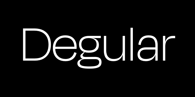
“So far, it seems what’s happening to typography this decade is a trend towards variable and personalised type. With so many different mediums, screen sizes and aspect ratios, etc, a variable and flexible typeface really addresses that constant flux,” says Adam. “We love Degular for its understatement, cleanliness and utility. It doesn’t scream ‘Hey, look at me!’ – instead, it provides designers the power to define the vibe of their layouts.”

The low-contrast sans-serif typeface, also designed by James Edmondson in 2020, was created as a twist on a classic genre, making an established style feel fresh yet familiar and usable. James says of the project: “My studio mate and long-time buddy Kel and I were walking out of Sparky’s Giant Burgers in Oakland, California. We had just polished off an extremely affordable lunch, and were singing the praises of this legendary East Bay eatery. Kel summed it up by saying, ‘The burgers are pretty good here, nothing incredible, just a good, regular degular burger.’ Kel’s affinity for and impeccable use of slang had stopped me in my tracks before, but nothing hit quite like this. Immediately, I knew I had to return to that unfinished sans project, and bring it to the finish line.”
07. Allrounder superfamily
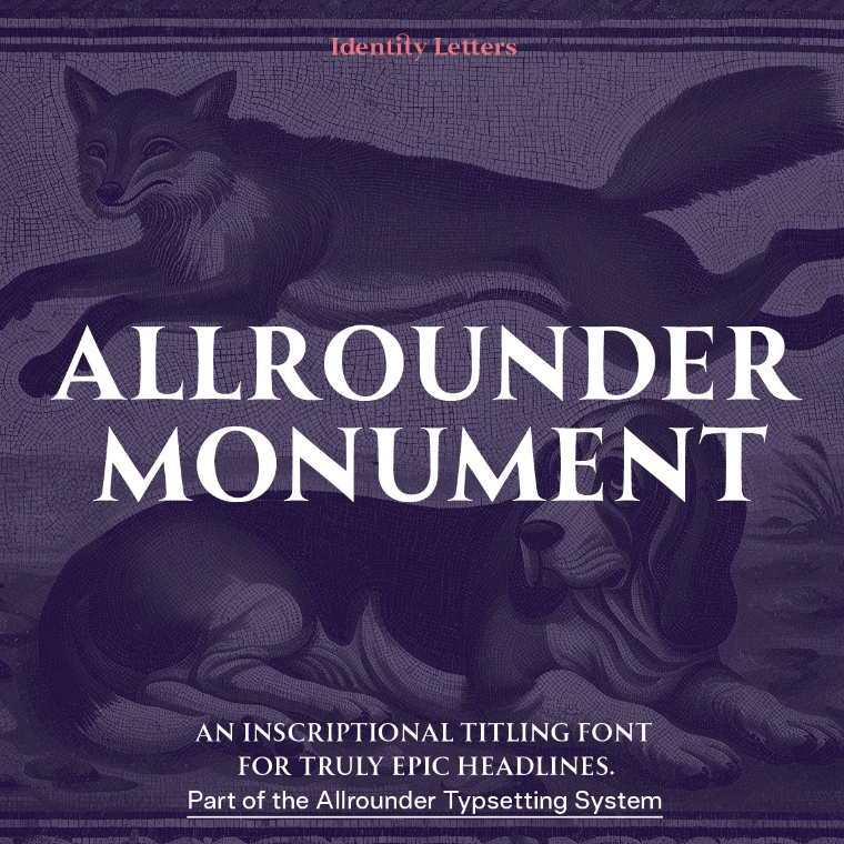
“The Allrounder superfamily by Moritz Kleinsorge is a real hidden champion in the type world,” says Julien Fincker, designer and typesetter, who recently launched type foundry Fincker Font Cuisine. “What characterises this super family is that it is already available in five versions – Grotesk, Grotesk Mono, Antiqua, Didone and Monument. They are all based on the same basic characteristics and can be ideally combined with each other across genres. Further versions are also in the pipeline. This concept is truly unique and deserves much more attention.”
Allrounder superfamily was released by German boutique foundry Identity Letters in 2020, and, like any type superfamily, includes a variety of styles united by a shared basic structure, and each with its one unique detailing – making it a great option for combining different typefaces within the same layout.
08. Neue DIN
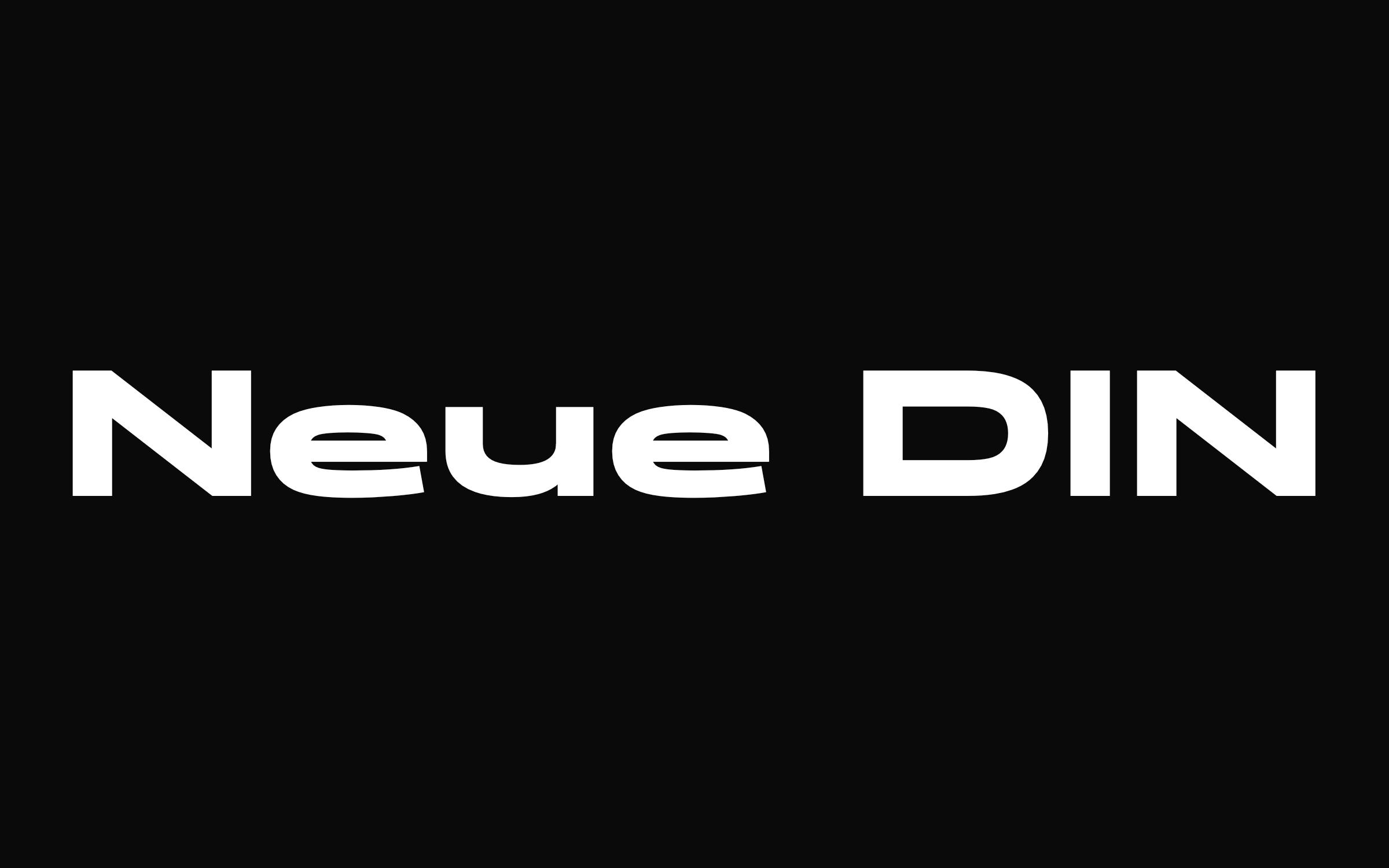
“Many consider DIN to be the German typeface. In Germany, it is an integral part of everyday life on road, town and licence plates, postmarks, technical drawings and documentation, traffic signs and signposts, and even former railroad lettering. The design has transcended national borders for decades: over 50 other countries have adapted the design for similar purposes. No wonder that the font continued its global triumph in general graphic design with digitalisation in the 1990s,” says Ivo Gabrowitsch, founder of Fontwerk.
For Neue DIN in 2023, Berlin-based designers, Hendrik Weber, Andreas Frohloff and Olli Meier, aimed to rethink and redesign the DIN type concept after around a hundred years since it was originally conceived by engineers, particularly given the responsive design environments of today. (DIN stands for Deutsches Institut fur Nomung, the German Institute for Standardisation.)
“They not only brought their individual strengths, but above all managed the difficult balancing act of staying close to the norm in terms of design and yet creating something ‘neu’. Many creatives confirm that such an update was necessary in order to increase the typeface’s range of application and to make the straightforward, constructed and timeless aesthetics of the German design icon fit for the future,” says Ivo.
09. ITC Souvenir

“What I like about the 2020s is a return to more experimental design and type. There has been a huge surge in 1970s-style artwork, branding (see Burger King) and illustration. I also find a strong Gothic type style with exaggerated serifs – fonts like Garfield by Masahiro Naruse. For this reason, ITC Souvenir is one of my favourite fonts,” says Johnny Kotzé, founder of Studio Gummi. “It was originally designed by Morris Benton in 1914 and it was very popular in the 1970s in films and on book covers, alongside advertising.”
ITC Souvenir was a reworking of Benton’s original, designed by Edward Benguiat and published by ITC in 1972, but we’ve included here as it’s a great example of one of the retro fonts making a comeback in the 2020s as part of the 1970s revivalist type trend, and has recently appeared on everything from magazine covers to album artwork.
Johnny also acknowledges several other favourites – Futura by Paul Renner, which he says he uses on most of type projects. He also likes experimental fonts such as Pilowlava, Picnic, Basteleur. He also regularly uses sites such as Velvetyne, Future Fonts and Dinamo, and follows the work of German-based foundry Rüdiger.
10. Armany

“A few years ago, the Monotype type trends report pointed to the green shoots of a trend we called Neue Nouveau," says Monotype's Charles Nix, and quotes the report: “It’s a retelling of the Art Nouveau typographic story, but with some new plot points. Its organic lines and dramatic curves speak to nature and the environment. And at its legibility-challenging extremes it speaks to the push-pull, looping flow of pandemic time – twisting, looping and folding back on itself over and over again.”
“It’s now hit the mainstream,” Charles says with examples showing up across the brand landscape – no place more apparent this summer than at the Olympics in Paris.” Of these, Charles highlights Armany, in particular, designed by Indonesian-based Alfin Weniardi and published by Lone Army. He also nods to several others in the trend, including Farm Wave, Chaviera Pro and Raks – and check out the report (above) for many more examples of the trend, including a dazzling array of IPA packaging.
11. Qandus

“Qandus is a multi-script typeface that is tailored for Arabic, Tifinagh and Latin writing systems. It’s a brilliant collaborative effort to honour the calligraphy of Al-Qandusi and Maghrebi scripts, but also meaningfully include Amazigh indigenous culture,” says Dina Benbrahim, Moroccan multi-disciplinary creative and founder and director of experimental design programme Hello Departures.
Qandus was part of the Typographic Matchmaking in the Maghrib project, launched in order to create a typographic family that combined three writing systems of Maghreb and Al-Andalus – Latin, Arabic and Tifinagh. It was designed by a trio of typographers, Lebanese-born Amsterdam-based Kristyan Sarkis (Arabic), Laura Meseguer from Barcelona (Latin) and Juan Luis Blanco based in Zumaia in Spain (Tifinagh).
12. Flexible

“It’s difficult to choose a font from the 2020s, but I would like to mention Flexible as part of a trend in typographic style that allows for living systems with great results when animated,” says Diego Limberti, chief design officer at Soko. “We are in the era of movement, where variable formats and applications help create sensations when reading phrases and messages. Try writing OMG! with Flexible Condensed."
Released by Art Grootfontein in 2021, the variable all-caps Flexible typeface was inspired by late 19th-century’s gothic typefaces from broadsides (single sheet news or announcement posters).
13. Helvetica Now
“We live in a time of typographic plenty. There are so many variations in typographic form to choose from. It’s testimony to the timeless nature of neo-grotesques – of which Helvetica is the godfather – that they remain not only popular but flourishing. Purposely devoid of emotion and meaning, they’re a counterpoint to the highly-noticeable flair of other trends of the decade, such as Neue Nouveau and Reverse-contrast faces.”
“Four of the top 50 best sellers on MyFonts are versions of Helvetica (and 15 are grotesques or neo-grotesques),” Charles adds. Planning and design for the Helvetica Now project began in 2014, and the typeface was released in 2019. It’s been hugely popular into this decade so far, and the variable edition was launched in 2021, with new compressed and condensed widths for millions of variations on the family theme.
Charles also gives a special mention to Aptos, a recent neo-grotesque released in 2023, which is the new default font for Microsoft Office, and has been “causing a stir”, he says. “Designed by the prolific and talented Steve Matteson, it became one of the most used typefaces in the world practically overnight.”
14. Everett

“Nolan Paparelli’s Everett is a modern grotesque that not only feels digital but also contains moments of expressiveness,” says Mark Wolfe, designer at Team, of the typeface, released in 2021 by Type.Weltkern. “The sharp symmetrical details look perfect on digital applications, while high-contrast cutouts used sparingly create new focal points that are refreshing moments of intrigue without feeling too decorative. The result is a versatile typeface that stands out without feeling trendy.”
“When it feels increasingly more difficult to create new type in this decade and everyone is doing a refresh of existing type, Paparelli has given us a truly unique take on a familiar category, offering a new futuristic face designed for this era.”
15. GT Alpina

“GT Alpina, released by Grilli Type is a serif typeface with a contemporary twist, combining classic elegance with modern versatility. Grilli Type describes the font as a ‘workhorse serif with a twist’ due to its incredible range of 70 individual styles,” says Abigail Baldwin, director at design agency Buttercrumble, of the font, which was designed by Reto Moser and released in 2020. It currently includes a family of 70 styles across seven subfamilies, supports more than 50 languages, and includes non-alphabetic characters such as emojis, arrows and box-building elements.
“It began in 2011 as a custom typeface created for a book commemorating the 75th anniversary of the Swiss Foundation for Alpine Research. Due to this, its origins are deeply embedded in classic book typography. Over eight years, it was refined and developed into a complete typography suite.
16. Gerard Unger

This next entry, chosen by type designer Jeremy Tankard, is an honourable mention to the work of the late Dutch type designer Gerard Unger, and a recent illustrated book of his work, Life in Letters by Christopher Burke. He was known for pioneering digital type design, and grappled with the rapid technological transition that took place in his lifetime, to create legible, dynamic and beautiful letterforms. His work can still be found adorning newspapers, books and road signs, with well-known typefaces including Swift and Argo.
“I see Unger’s legacy and thoughts as important and vital to how type needs to develop in the coming years,” Jeremy says. “The life and work of Gerard Unger demonstrates the level of commitment and inquiry required to address the ever-changing needs as our cultures develop. I hope that Christopher Burke’s book on Unger’s work (used in conjunction with Unger’s own ‘Theory of Type Design’) will inspire designers to consider the mechanics of type and discover new textures to push type design forward.”
For more on type, see our top typography tutorials and the best fantasy fonts.

Thank you for reading 5 articles this month* Join now for unlimited access
Enjoy your first month for just £1 / $1 / €1
*Read 5 free articles per month without a subscription
Join now for unlimited access
Try first month for just £1 / $1 / €1

Antonia Wilson is a freelance writer and editor. Previous roles have included staff writer for Creative Review magazine, travel reporter for the Guardian, deputy editor of Beau Monde Traveller magazine, alongside writing for The Observer, National Geographic Traveller, Essentialist and Eco-Age, among others. She has also been a freelance editor for Vogue and Google, and works with a variety of global and emerging brands on sustainability messaging and other copywriting and editing projects — from Ugg and Ferragamo to Microsoft and Tate Galleries.