The 1960s was a time of both cultural and literal revolution, and design was by no means immune. This was a tumultous period in typography, defined by bold experimentation and a dramatic shift towards geometric forms.
As electronic phototypesetting emerged and modernist principles reached their peak, designers embraced both the limitations and possibilities of new tech and new ways of thinking. The decade's typography trends also reflected broader cultural shifts, including space exploration, political movements, and radical departures from tradition.
We've spoken to leading typography experts to compile this definitive list of the decade's most influential typefaces, examining how they shaped our history and continue to influence contemporary visual culture today. For more, see our full best typography of the decade series.
01. New Alphabet
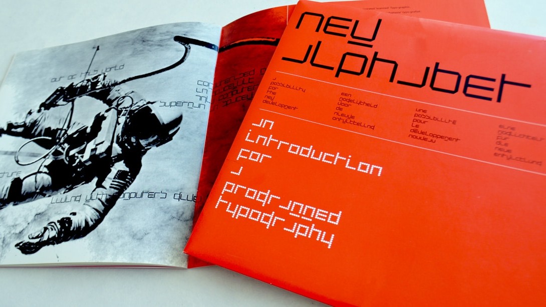
Released in 1967, New Alphabet emerged as one of the most radical typographic experiments of the decade. As Landor's design director Gianluca Ciancaglini explains: "Instead of trying to force traditional typefaces onto the primitive screens of the 60s, creator Wim Crouwel embraced the limitations and created a typeface made entirely of straight lines."
Gone, then, were the curvy serifs and elegant flourishes of classic typefaces. "His innovative approach adapted design to the constraints of the technology, rather than forcing the technology to conform to traditional typographic standards," continues Gianluca. "The result – a simple typeface composed entirely of horizontal and vertical lines, creating a stark, geometric aesthetic."
A great example of how design can be born from constraints, this typeface continues to inspire and challenge us today." As Gary Whitworth, designer at The Chase, explains: "Part alphabet, part hieroglyph, New Alphabet always felt to me like it had appeared from another dimension – a typeface that should exist in 2967, rather than 1967. Ironically, in adapting to the technology of the time, Wim Crouwel created something that would appear more at home for the technology of the future.
"His minimalist approach to the structure of the letterforms is so pure," he adds. "An exercise in how far you can strip back what makes a letter recognisable to the human eye. Like many, my first exposure to it was through Peter Saville and Brett Wickens' design for the cover of Substance by Joy Division – a combination that felt like a perfect match of being contemporary, unconventional and thought-provoking. Timeless is a word often overused, but for a typeface born in the 1960s that remarkably feels equally at home on an 1980s album cover, or on the side of a speed-racing spaceship, then timeless seems perfect."
Get the Creative Bloq Newsletter
Daily design news, reviews, how-tos and more, as picked by the editors.
02. Microgramma
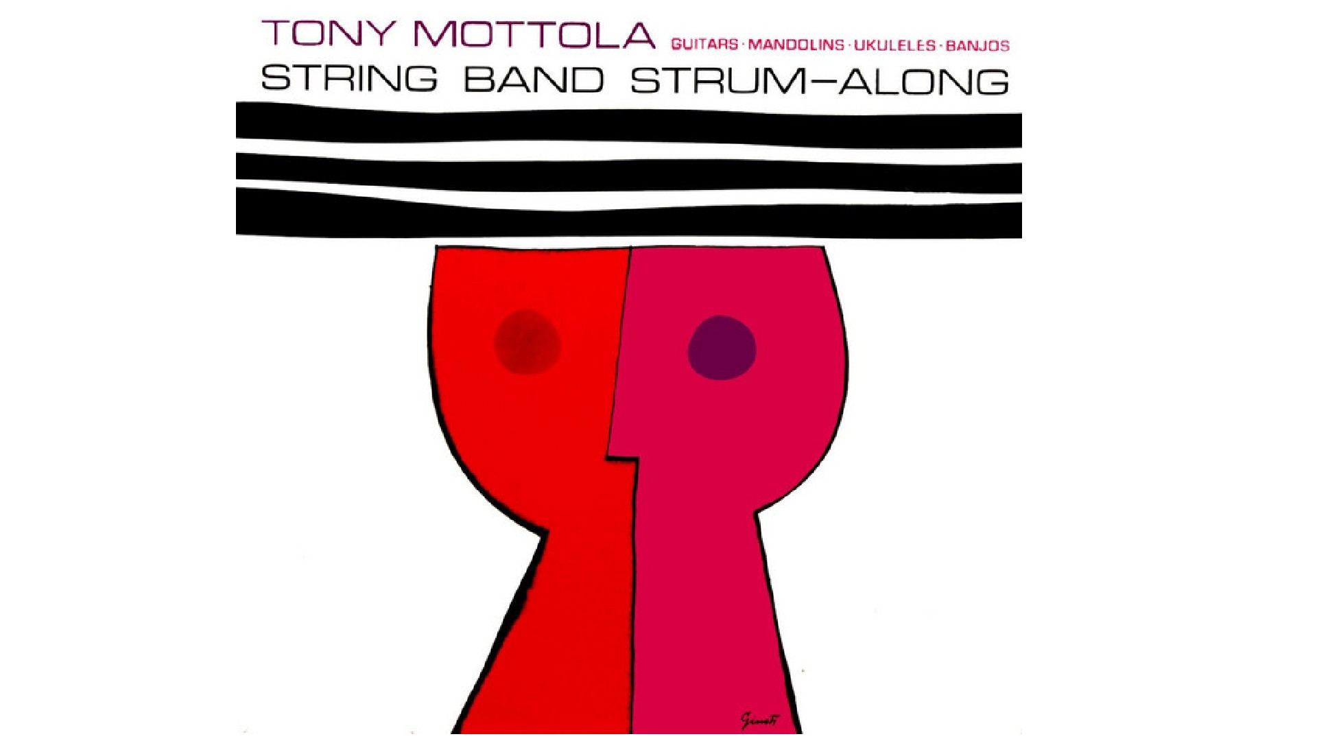
Microgramma was originally designed by Aldo Novarese and Alessandro Butti in 1952, and developed for the Nebiolo Type Foundry. But it reached its zenith of popularity in the 1960s.
As Matteo Alabiso, design director at Droga5 London, explains: "A geometric typeface defined by its sturdy, square-like features, Microgramma became a favourite among graphic designers for technical illustrations, publicity and packaging. Its widespread adoption was partly due to its availability as a Letraset typeface and its incorporation into early typesetters such as AM Varityper."
The font remains popular today, especially in niche areas like science fiction, technology branding and architectural design. Its clean, geometric lines and futuristic appeal continue to resonate with designers, and make it a go-to choice for projects that require a modern, industrial feel.
03. Eurostile
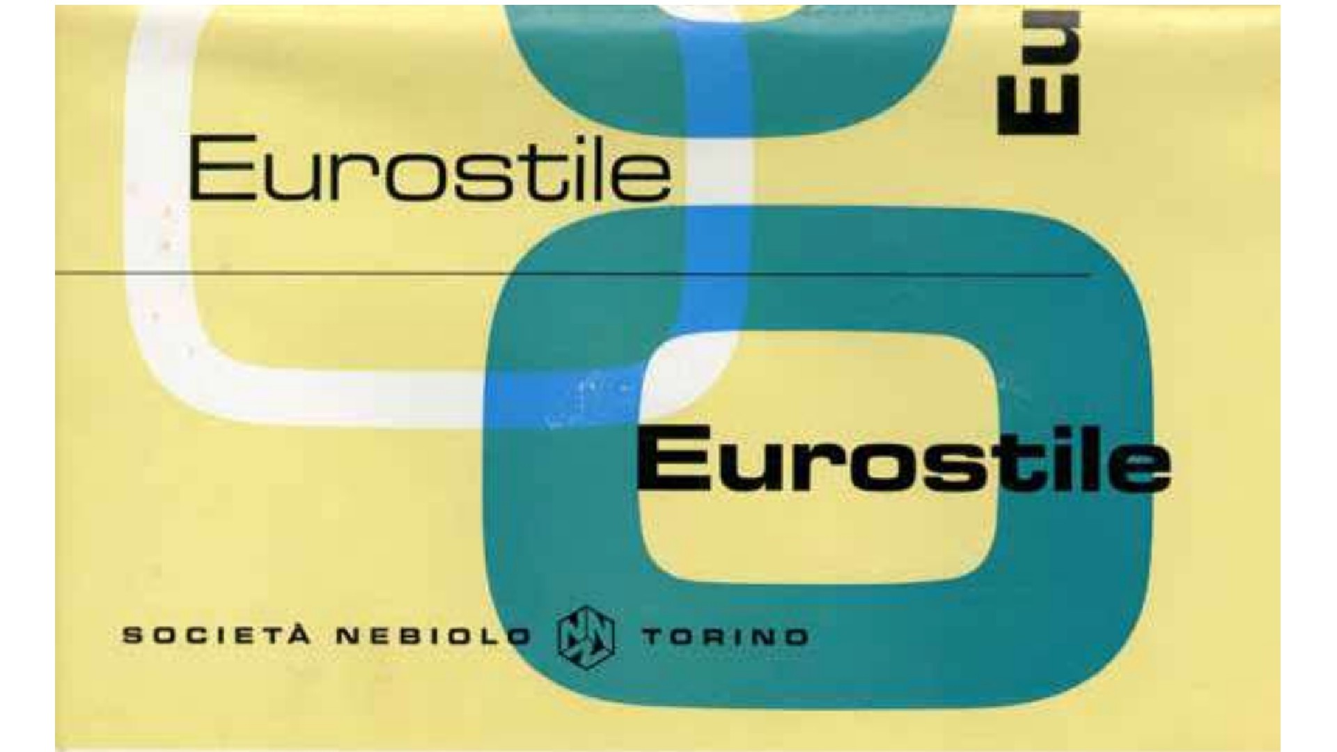
That's not the end of the Microgramma story, though. As Matteo continues: "In 1962, Aldo Novarese revisited and refined his earlier work, giving rise to Eurostile; a more polished evolution that introduced lowercase letters alongside the familiar uppercase, enhancing its versatility and broadening its appeal."
Influenced by industrial design with clean lines and balanced proportions, Eurostile is now regarded as Novarese's masterwork of geometric modernism. As Gianluca observes: "What makes Eurostile so special is its versatility. It can be used for everything from book covers to movie posters, from tech manuals to album art. It's a typeface that can be both serious and playful, classic and cutting-edge. Eurostile has even made its mark in pop culture. It's the go-to typeface for sci-fi movies like 2001: A Space Odyssey and video games like Homeworld. Its futuristic aesthetic perfectly captures the spirit of these genres."
Eleni Beveratou, creative director at Dalton Maag, connects the typeface to another big 1960s moment: "With the first man walking on the moon in 1969, lunar bases, Martian colonies, computers, automated homes, robots and utopian cities were some of the first ideas that someone living in the 1960s might mention when imagining life in the 2000s," she explains. "These visions were reinforced and shaped by popular films and TV shows such as Star Trek and The Jetsons. And the type industry responded to this aspiration, with Eurostile becoming a quintessential representation of the Space Age."
She notes that its most recognisable feature is the squared design of otherwise typically round forms like the 'o'. "This typeface comes in many weights and widths, making it easy to create fully justified type compositions that evoke a sense of precision and 'robotic' typesetting," she adds. "What I find particularly interesting is the rhythm that is created between the black and white spaces of the letter, creating a very interesting pattern of the paragraphs on the page."
All this makes it a great typeface to use in the world of the 2020s; Matteo has personally used it on numerous occasions. "What draws me to it is its ability to effortlessly straddle the line between a bold display typeface and a utilitarian sans-serif; a balance that feels both practical and visually compelling," he says.
This adaptability has been proven time and again, particularly in the world of music. "From Radiohead and Metallica to Eminem and Tame Impala, Eurostile’s charm transcends genres, making it a staple in album artwork and band visuals. One of my favourite contemporary examples is Porto Rocha’s work for PAC NYC, which employs a custom typeface that echoes Eurostile’s timeless squareness and industrial elegance."
04. OCR-A
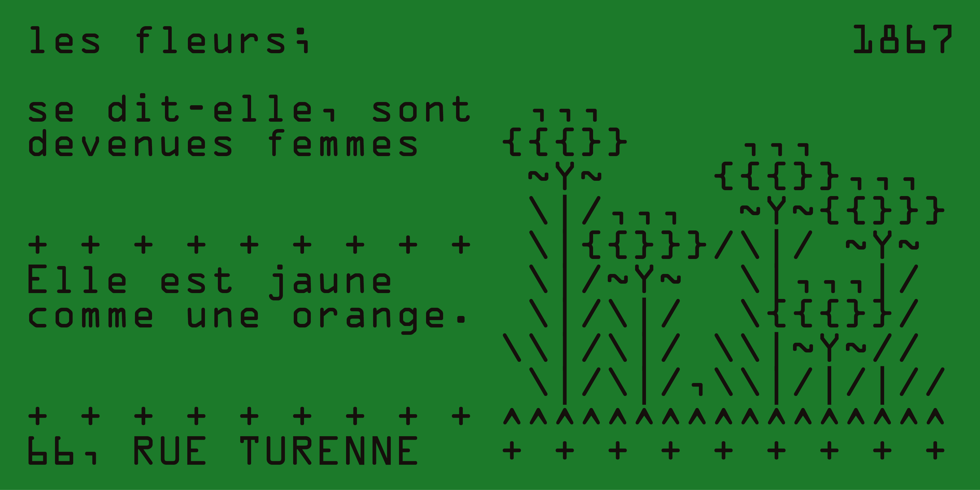
Produced by American Type Founders in 1968, OCR-A was a significant technological breakthrough as one of the first optical character recognition typefaces to meet the U.S. Bureau of Standards criteria. As Lucas Luz, art director at Type of Feeling, reflects: "It might not seem like much at first glance, but it's way more important than we give it credit for.
"Unlike most typefaces we know, which are usually about style or printing technique, OCR-A had a totally different job," he explains. "It was made for machines to read, so computers at the time could scan printed documents without getting confused by the quirks of other typefaces.
"What I love about OCR-A is how it was designed to work for both humans and machines," he says. "It's simple enough for us to read, but also super precise and functional for computers." And that feels super-relevant today, give how AI is becoming a bigger part of our world. "Just like OCR-A helped us design in a way that connected people and machines, I think we're now figuring out how to create in collaboration with AI, and that's a pretty exciting space to explore."
05. Mistral
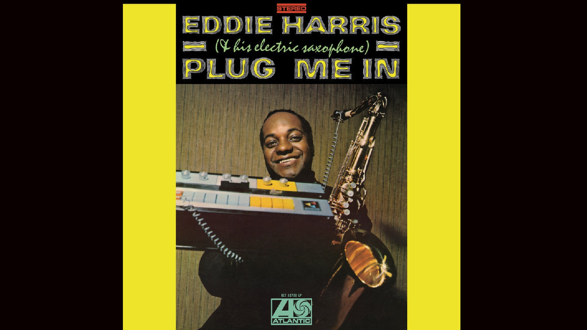
Mistral is a signature script typeface, designed by Roger Excoffon for the Fonderie Olive type foundry, and released in 1953. The Amsterdam Type foundry then released a version in 1955. But ultimately, it found its cultural moment in the following decade.
As Simon Manchipp, founding partner at SomeOne, explains: "It was the 60s when Mistral really kicked off. The original cut had ligatures, optional characters and a rough edged finish that's been sadly lost on more recent digital cuts. Derived by many, it's actually a very clever and technically advanced bit of work."
In the decades since, it's become a leviathan of the lettering world. "A global sensation found on almost every continent, the letterforms have appealed to brands like Sandals and bands like NWA," explains Simon. "If it's cool enough for Easy-E, it's cool enough for you. Still not convinced? Even Ryan Gosling sits next to it on the movie poster for Drive. Exactly. Like Ryan, Mistral is sexy AF."
06. Futura
Futura is a sans-serif designed by Paul Renner and released in 1927, as a contribution to the New Frankfurt-project. It is based on geometric shapes, especially the circle, similar in spirit to the Bauhaus design style of the period, and it was developed as a typeface by the Bauer Type Foundry, in competition with Ludwig & Mayer's seminal Erbar typeface of 1926.
It was during the Space Age of the 1960s, though, that Futura became particularly significant. Rosie Garschina, executive creative director of Trollbäck+Company, notes how this geometric sans-serif captured the decade's optimistic spirit.
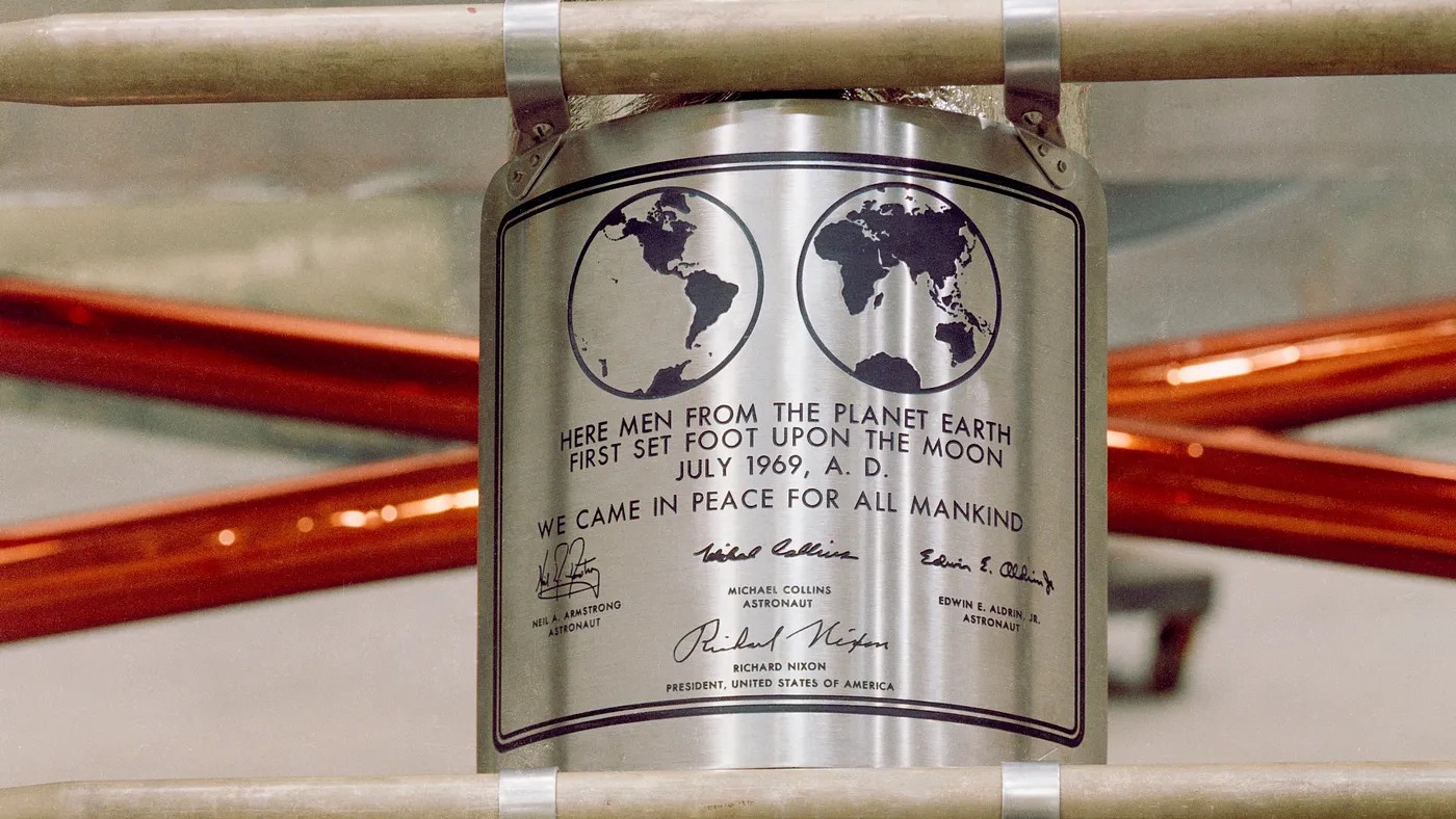
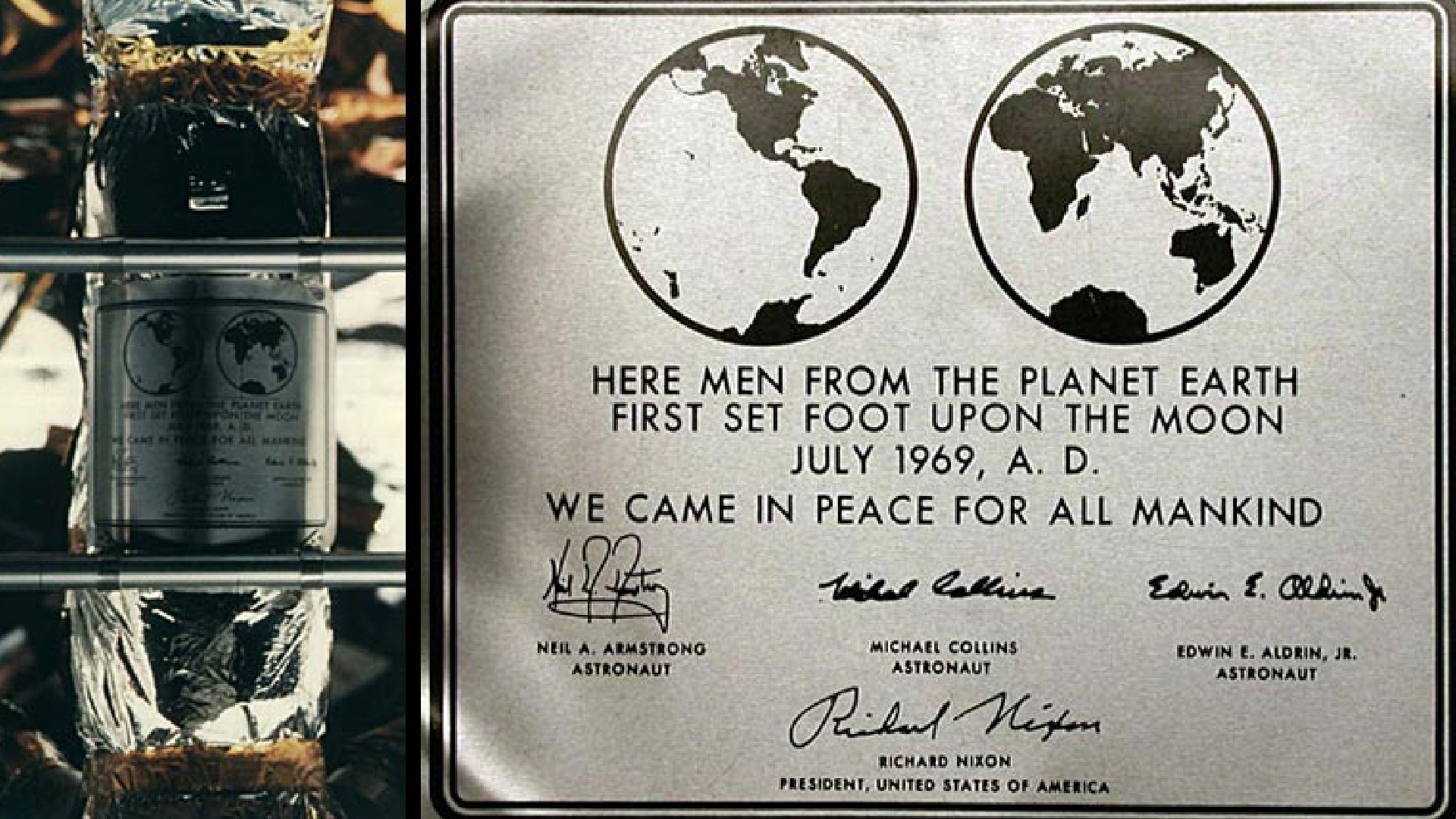
"Inspired by the Bauhaus design aesthetic, Futura was intended to represent a modern and unembellished depiction of function over form," she explains. "Volkswagen was one of the first brands to incorporate the typeface into its logo as it evoked a warm friendliness that mirrored the round curves of their iconic Beetle. In the late 60s it was used by NASA and was on the plaque that Neil Armstrong and the Apollo 11 mission left on the Moon."
Futura is equally popular today, with its clean, geometric lines fitting nicely into the modern aesthetic, despite being almost a century old.
07. Times Modern
Say the words "Times Modern" to a typographer and they'll doubtless think of the font family designed for The Times newspaper by Luke Prowse and Neville Brody's Research Studios in 2006. But there was another typeface of the same name, which emerged during the phototype era as a distinctive reinterpretation of Times, although its origins remain fairly obscure. This high-contrast display typeface was designed as a more narrow titling version of the original Times, featuring a much taller x-height and shorter descenders.
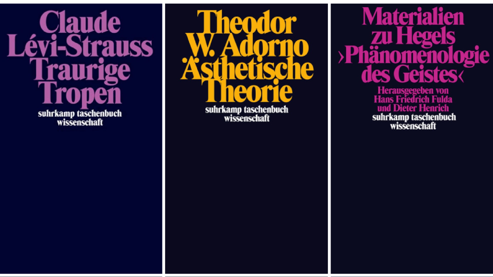
Noël Leu, co-founder of Grilli Type, is among its fans. "Times Modern was inspired by Times, but with distinct proportions and a unique character," he explains. "It has a strong 1960s aesthetic, evoking the era of phototypesetting. For German speakers, it is often associated with the iconic book covers designed by Willy Fleckhaus for the Suhrkamp publishing house."
This design system, featuring tightly spaced Times Modern Black in just two sizes centred at the top, would define the publisher's visual identity for over three decades. Plus its influence extended beyond publishing, later finding its way into fashion through its adaptation for the original Acne Jeans logo. For more on this lost typeface, read this blog post by Fonts in Use.
08. Helvetica
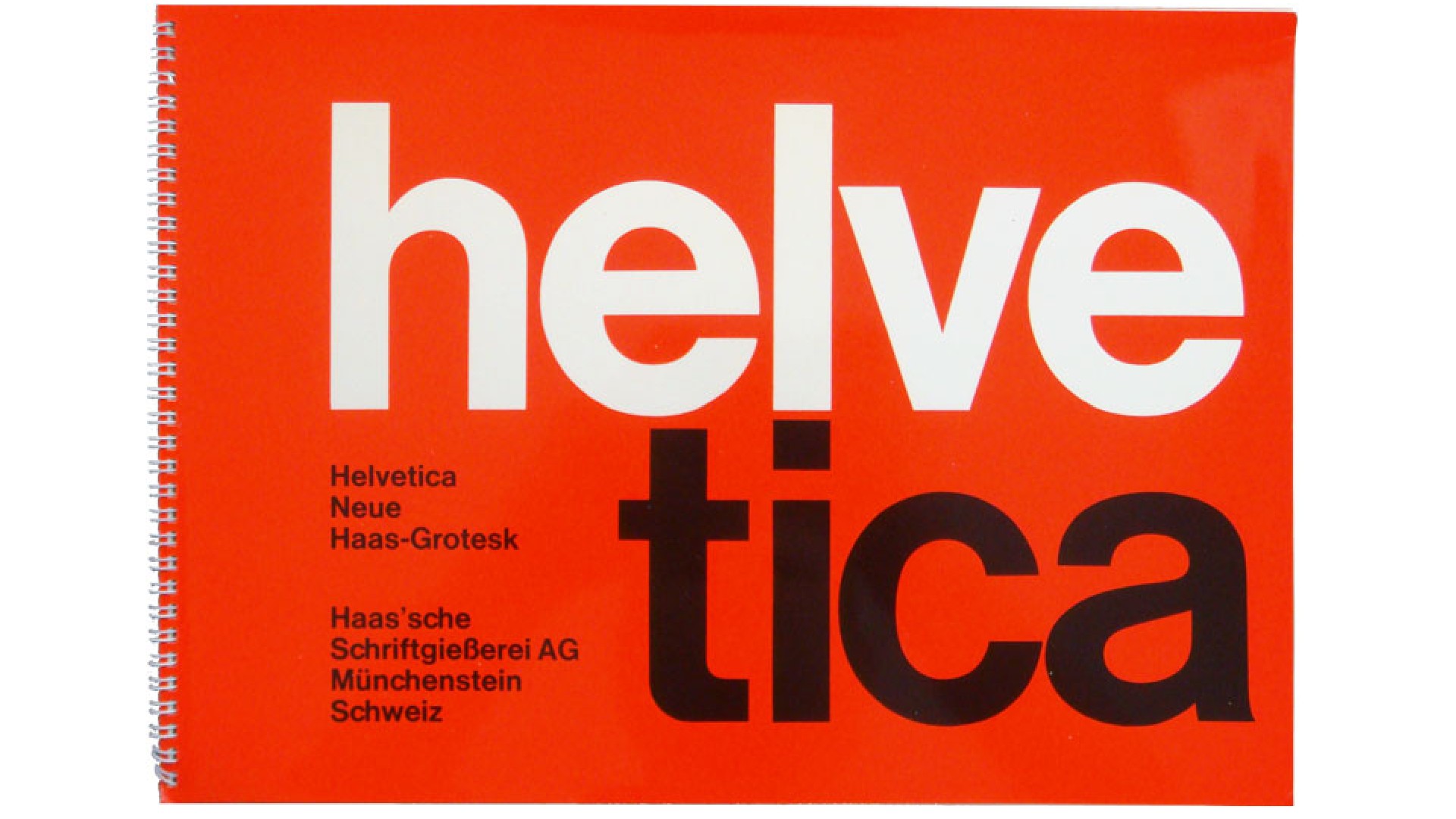
We couldn't complete this list without mentioning Helvetica. Originally designed by Max Miedinger and Eduard Hoffmann in 1957, this neo-groteque sans-serif was originally called Neue Haas Grotesk, but was renamed Helvetica in 1960 to make it more marketable internationally. And it became a defining typeface of the 1960s due to its versatility and clean, modern aesthetic.
Rooted in the Swiss design philosophy of simplicity and functionality, Helvetica gained widespread popularity across corporate branding, advertising and transportation systems during this decade, largely due to its legibility and readability. It was also felt to portray accessibility, transparency and accountability; making it the perfect font for large corporations in an era of business consolidation and mass media.
For these reasons, iconic designer Massimo Vignelli used Helvetica in the 1960s for several of his projects, including the New York City Subway system and the American Airlines identity. It remains equally popular today, despite many other designers complaining of its blandness. For Vignelli, though, that was not a bug but a feature.
"There are people that think that type should be expressive," he said in Gary Hustwit's 2007 documentary Helvetica. "They have a different point of view from mine... You can say, 'I love you' in Helvetica. And you can say it with Helvetica Extra Light, if you want to be really fancy. Or you can say it with the Extra Bold if it's really intensive and passionate, you know, and it might work.
“There are two ways of doing it, a good way and a bad way," he continued. "The good way is structured by typography, and the bad way is happenstance, done without knowledge. New typography, in the sense of trendiness—it doesn’t interest me. [...] Trends are shallow. Architects are not affected by trends, neither are good graphic designers.”
For more retro design see our best logos by decade and best ads by decade content.

Thank you for reading 5 articles this month* Join now for unlimited access
Enjoy your first month for just £1 / $1 / €1
*Read 5 free articles per month without a subscription

Join now for unlimited access
Try first month for just £1 / $1 / €1

Tom May is an award-winning journalist and editor specialising in design, photography and technology. Author of the Amazon #1 bestseller Great TED Talks: Creativity, published by Pavilion Books, Tom was previously editor of Professional Photography magazine, associate editor at Creative Bloq, and deputy editor at net magazine. Today, he is a regular contributor to Creative Bloq and its sister sites Digital Camera World, T3.com and Tech Radar. He also writes for Creative Boom and works on content marketing projects.
