The most remembered and celebrated type of the '40s.
(Image credit: Laurence King)
The 1940s was a decade shaped by global conflict, post-war reconstruction, and the rise of Modernist ideals. And the typography of the era reflects these dramatic contrasts neatly, with the best typefaces of the 1940s forged between the twin pulls of tradition and forward-thinking.
But looking at the typography trends of the time isn't just an academic exercise; it’s also a resource for modern-day inspiration. Whether you’re creating branding, editorial layouts or experimental art, studying these iconic typefaces offers lessons in design principles and adaptability that remain relevant.
We've spoken to leading typography experts to compile this definitive list of the 1940s' most influential typefaces, examining how they shaped our history and continue to influence contemporary visual culture today. To learn more, read our full typography of the decade series. Or to see what's trending right now, see our typography trends for 2025 predictions.
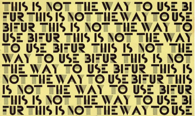
Ne-Po (which stands for Negative-Positive) was a dual-system design of positive and negative blocks that can be combined to form letters, patterns and decorative borders. The NE series features negative-space lettering, while the PO series focuses on positive, line-based forms. And its adaptability as a modular type made it a popular choice for experimental typography in the 1940s.
Simon Manchipp, co-founder of SomeOne describes it as: "A modular marvel of negative and positive interplay. Born in the early 1930s from the German foundry Brüder Butter – later rebranded as Schriftguss – this typeface wasn’t just letters; it was a system. A concept. A blueprint for endless creativity. The Negative series: 17 meticulously crafted modules forming letters in the void. The Positive series: a gang requiring just 15. Together, they weren’t just type, they were tools. For borders, for patterns, for pushing the boundaries of visual communication."
While initially crafted for the Latin alphabet, its modular system also inspired adaptations in non-Latin scripts, notably in India. "There, it transformed," notes Simon. "Not just Latin letters any more, but Gujarati and Marathi too – a bold, inventive move to bridge cultures and scripts. A typeface turned storyteller. Display type elevated to art."
Daily design news, reviews, how-tos and more, as picked by the editors.
02. Futura
Spread from the book Futura: The Typeface by Petra Eisele, Annette Ludwig and Isabel Naegele (Laurence King Publishing) (Image credit: Sherbyte)
The brainchild of Paul Renner, Futura is a geometric sans-serif typeface initially released in 1927. By the 1940s, it had firmly established itself as a hallmark of Modernist typography, blending the clean lines and geometric precision of the Bauhaus aesthetic with practical usability.
Futura's design rejected ornate or historical influences, favouring simple geometric shapes like circles, triangles, and rectangles. Its tall ascenders, low contrast strokes, and near-perfect circular forms for letters such as 'o' and 'a' made it ideal for both body text and display purposes.
"For the 1940s, Futura stands out," enthuses Harry Sandhu, senior creative director at Jung von Matt London. "Its clean geometry wasn’t just Modernist; it was a declaration. In a world craving order amidst chaos, Futura became the face of progress. From propaganda to publishing, it didn’t just sit on the page, it led the conversation." To learn more, read our review of the book Futura: The Typeface.
03. Garamond
(Image credit: MyFonts)
Named after 16th-century French engraver Claude Garamond, Garamond is a timeless serif typeface that saw renewed popularity in the 1940s, particularly for books and printed materials. Its graceful, humanist forms and balanced proportions make it one of the most readable and elegant typefaces in history.
In this turbulent decade, Garamond symbolised tradition and reliability amidst a world undergoing rapid change. Its widespread use in newspapers, magazines and official documents underscored its versatility and enduring appeal. "Garamond was the balance to the progressive nature of Futura," notes Harry. "Particularly its ATF and Monotype revivals, which brought timeless elegance to the decade.
"Where Futura pushed forward, Garamond grounded us. Its humanist strokes gave warmth to books, magazines, and advertising, a quiet confidence that spoke to tradition and permanence. Together, they captured the tension of the 1940s: the need for stability while striving for something new."
04. Palatino
(Image credit: Geared Bull)
Palatino is a classic serif typeface, designed by Hermann Zapf and released in 1948. Drawing inspiration from the serifs of the Italian Renaissance, it's known for its excellent readability and versatility, making it a popular choice for both body text and headlines. Its moderate stroke contrast and flared serifs contribute to its classic, traditional aesthetic.
Brendán Murphy, global creative director at Lippincott, has a particular soft spot for the typeface. "Coming out of high school in Dublin, Ireland, one of my first jobs in the design trade was working for a small design firm specialising in Annual Reports," he recalls. "We shared the office with a typesetting firm who worked on a Linotype phototypeset machine. They taught me the simple math of type specification, using Palatino. I never asked why that particular font: perhaps it was a little more human, less formal than Times. And most likely one of the few font films they owned."
Either way, it was a match made in heaven for Brendan. "Palatino was open and calligraphic, with a bigger X height," he explains. "Its italics, used for quotes and captions, had a very different texture, more suggestive of fine penmanship than the wider calligraphic Roman. Palatino has a confident and amorphous voice that worked across every industry in our portfolio of clients, from agriculture to oil and manufacturing."
That said, he admits he hasn't used it in over 40 years. "When I came to America to design school, my teachers preferred Garamond and Frutiger. Perhaps it’s time to give it a fresh look and another try?"
05. Franklin Gothic Condensed
(Image credit: Fontke)
Franklin Gothic Condensed is a sans-serif typeface known for its strong, geometric forms and condensed letterforms. With its clean lines and bold presence, it embodies the spirit of the Art Deco era, and is often used for headlines, posters and signage due to its high impact and ability to command attention.
"Designed by Morris Fuller Benton in 1948, Franklin Gothic Condensed is a typeface that means business," says Wayne Deakin, global principal at Wolff Olins. "With its bold, tight letterforms, it became a go-to for getting the message across loud and clear. Think of it as the workhorse of the post-war design world – used in everything from newspapers to industrial posters. Even General Electric leaned on its clean, punchy vibe to radiate confidence during a time of innovation and growth."
And it remains highly popular to this day. "In more recent years, The Guardian embraced Franklin Gothic as part of its print and digital identity, using its clarity and authority to modernise its typographic language while maintaining a strong editorial voice," Wayne notes. "Franklin’s versatility has made it a timeless choice for brands balancing tradition and contemporary appeal."
06. Brush Script
(Image credit: Geared Bull)
Brush Script is a script typeface that mimics the look of handwritten calligraphy. Its flowing, expressive forms and connected letters create a sense of informality and elegance. For this reason, Brush Script is widely used for invitations, logos, and other applications where a handwritten aesthetic is desired.
"Created by Robert E. Smith in 1942, Brush Script was the new vibe in a more traditional time," explains Wayne. "Its flowing, handwritten style brought a dose of personality and warmth that brands couldn’t get enough of."
He shares a couple of examples. "Butlin’s, the holiday resort, famously adopted Brush Script as a cornerstone of its visual identity in the mid-20th century. Its cheerful and approachable aesthetic perfectly aligned with the brand’s promise of fun family holidays. More recently, Kärcher, the German cleaning equipment brand, incorporated Brush Script in product labelling for a retro-inspired line, showing the font’s enduring charm across decades and industries."
07. Trade Gothic
(Image credit: Astonmartini)
Trade Gothic is a sans-serif designed in 1948 by Jackson Burke. Like many gothic fonts of the 19th and early 20th centuries, it's more irregular than many other sans-serifs that came later, such as Helvetica and Univers. This variety makes it a good choice for those looking for a more characterful effect.
"This font embodies the industrious spirit of its era," says Ryan Spence, senior creative at Born Ugly. "Its large x-height and humanist traits reflect clarity and craftsmanship, essential for its original use in 1940s newspaper typesetting."
More broadly, the font family captures the qualities we love in mid-century design, being efficient, purposeful and robust. "The blocky nature of the uppercase lettering conjure feelings of the hum and clatter of busy machine presses, and in an age where we long for tactility and nostalgia, mid-century designs like Trade Gothic offer comfort," says Ryan. "They provide a tangible connection to a time when design prioritised function and humanity, evoking warmth and authenticity amid today’s digital sleekness."
08. Highway Gothic
(Image credit: Inferno986return)
Highway Gothic, more formally known as the FHWA Series fonts, is a sans-serif font developed by the US Federal Highway Administration (FHWA). "First published in the FHWA's Standard Alphabets for Traffic Control Devices in 1948 and later updated in 2000, the series is used for road signage in the States and many other countries," says Rose Stewart, design director at The Frameworks.
"As someone who appreciates motorway signage typography, this is a personal favourite," she adds. "This type of application demands a high level of legibility, viewed at distance and high speed. The series consists of six fonts providing variations tailored to different uses, from highway signage to ground-mounted and illuminated signs."
09. Lydian
(Image credit: Psiĥedelisto)
Lydian is a calligraphic humanist sans-serif designed by Warren Chappell for American Type Founders in 1938. It was most famously used for the end credits on the TV show Friends. But as Peter Gaskell, design project lead at Dalziel & Pow notes, it was in the 1940s that it first made its mark.
"Lydian has been a constant inspiration in my life, especially as a kid, devouring science and pulp fiction from the 40s and 50s," he recalls. "It seemed to be full of mystery and character yet never over-the-top, appearing on a myriad of applications from book covers, hotel branding, galleries, and public institutions, even TV credits for popular shows, it was everywhere.
"The diverse cultural reference points mean it’s very hard to place it in one specific time and character," Peter adds. "Is it witchy? Is it academic? Is it whimsical? It’s incredibly difficult to pigeonhole. And as a designer, that flexibility is part of the draw that makes it timeless."
Tom May is an award-winning journalist and editor specialising in design, photography and technology. Author of the Amazon #1 bestseller Great TED Talks: Creativity, published by Pavilion Books, Tom was previously editor of Professional Photography magazine, associate editor at Creative Bloq, and deputy editor at net magazine. Today, he is a regular contributor to Creative Bloq and its sister sites Digital Camera World, T3.com and Tech Radar. He also writes for Creative Boom and works on content marketing projects.