19 brilliant resume fonts that make a real impact
These fonts will elevate your resume.
The font you choose for your resume sets the tone for your entire first impression on a potential employer. This is why you should never overlook the importance of design when it comes to your resume. A good impression isn’t just about content; it’s also about presentation, and like it or not; people unconsciously read into every single detail. Font is no exception.
That’s why we’ve compiled a list of the 19 best fonts to use on your resume. There are lots of lists out there on the internet, but we’ve done some serious research and come up with the ultimate list; making this your complete, definitive guide to choosing a font for your CV. For extending your font choices outside of your CV, we also have a list of the best free fonts for designers, as well as a guide to the best free web fonts. And if you've already got the job, it might be time to take a look at the best presentation fonts.
1. Times New Roman
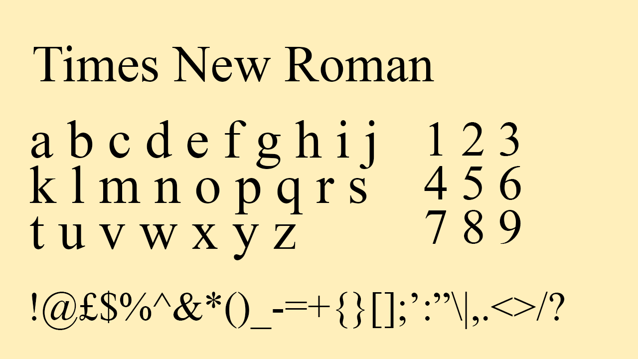
Designed for the British newspaper The Times, Times New Roman was the staple font of the Times font family created by Stanley Morison. At the time he was the art advisor at Monotype, a company founded by Steve Matteson, another notorious font designer. Times New Roman is the standard serif typeface used in professional contexts, especially in British publishing, making it perfect for a classic, traditional touch to your resume.
2. Times
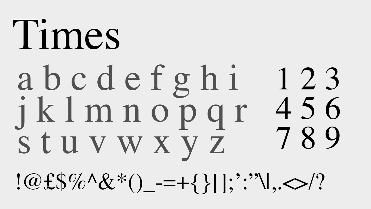
Similar to Times New Roman but created with thicker lines, Times is a friendlier font to look at while staying in line with the tone of the British newspaper. Times was not, however, always a part of the same font family as Times New Roman. It was first created by Monotype’s competitor, Linotype. However, since a merge between Monotype and Linotype, the font family now named ‘Times’ includes both Times and Times New Roman. For those interested in the traditional elements of Times New Roman and the professionalism of a classic serif font, Times offers your resume a friendlier serif still inkeeping with the traditional feel.
3. Helvetica
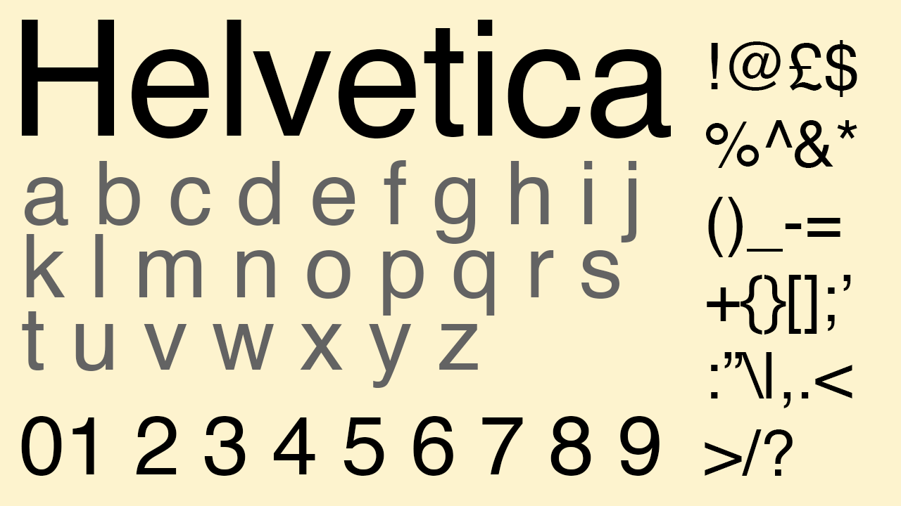
Created by Max Meidinger inspired by Greek, German and Swiss designs, Helvetica was bought by Linotype. Given the company’s merge with its competitor, this now makes Helvetica another Monotype font. Helvetica has also always been one of the most commonly used fonts for Lettraset, given its appealing condensed letter spacing and legibility. Almost immediately from its creation, Helvetica quickly became the sans serif font as ubiquitous as the Times family. It would create a modern-looking, sharp resume, as it was designed specifically for legibility and ease of printing, as well as for sharpness on screens.
4. Georgia
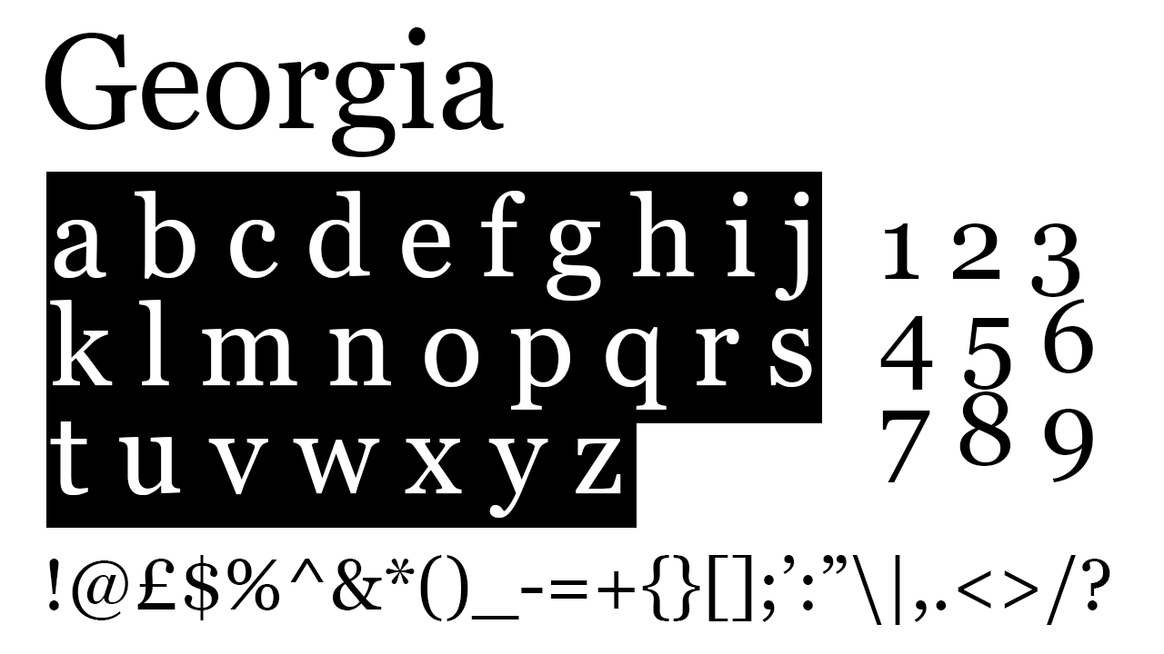
Often used in body copy on websites, Georgia was popular upon its first release due to its ease of legibility and consistency across both Mac and Windows computers. It was initially published by Microsoft and became so widespread due to its ability to make text legible on low resolutions as well as high. This makes it a safe font choice for a resume, as it means whatever screen or device your resume is opened on and however well or poorly your resume is printed, Georgia ensures one of the highest levels of legibility achieved with a serif font.
5. Baskerville
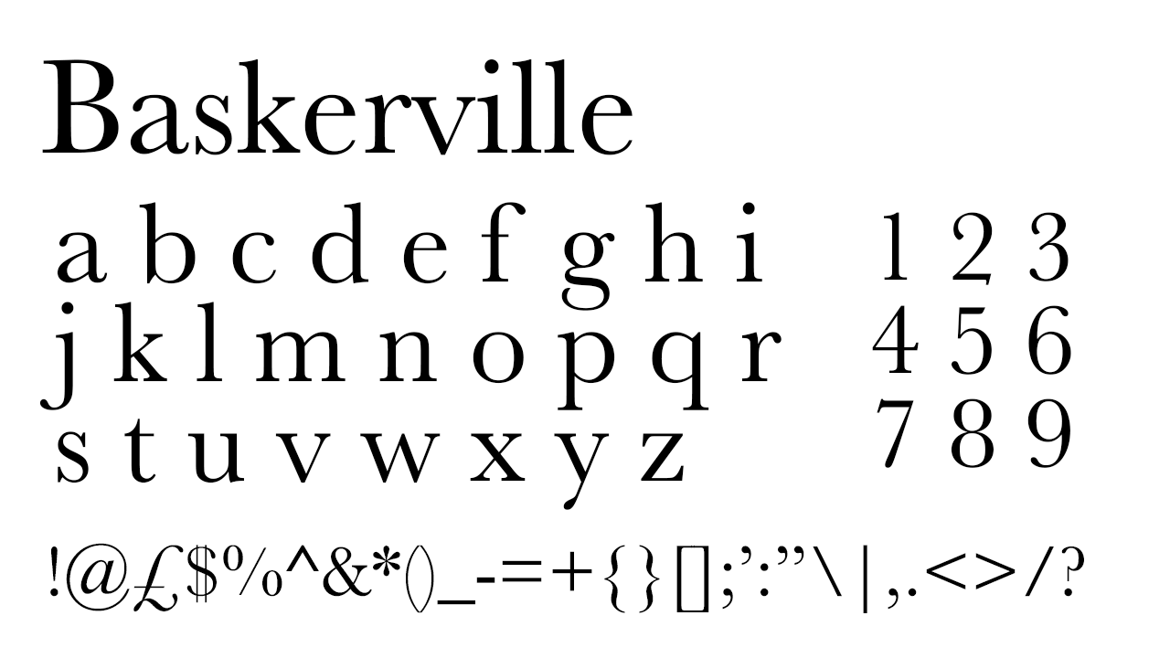
Named after its creator, Baskerville was originally created in the 1700s and published by Linotype. Now, in the modern day, Monotype owns Baskerville and have created their own updated version. Baskerville is a successful serif font because it combines professionalism and strong legibility with a stylised design, meaning that professional situations – such as your resume – can have an added touch of personal style. With a particularly low x-height and pronounced serifs, Baskerville is often used in professional contexts that require a feminine touch, such as for Penguin, in Vogue and inThe New Yorker Magazine. If your resume needs to get across a professional feel as well the style of classic, feminine publishing, Baskerville conveys the message.
6. Aptos
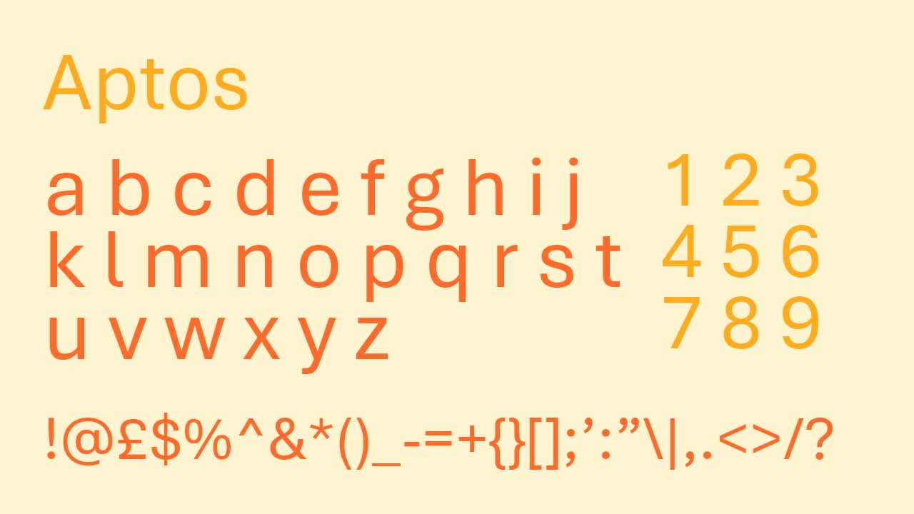
Aptos is a divisive font that has sparked arguments between designers recently. A Microsoft typeface created by the founder of Monotype, Aptos was introduced as the new default font in Microsoft Word, replacing Calibri. This turned into a controversial decision, given Calibri’s long reign as the Word standard, but many designers have now given Aptos their blessing. Only created in 2023, it may well become a rival to Helvetica as well as Calibri, as it’s an attractive sans serif typeface with hints of Avenir but with thicker strokes and letters that are far more condensed. Using Aptos for your resume could be an incredibly modern touch and might even show your adaptability to change with the times. Still fresh to many people’s eyes, your potential employer might feel refreshed reading your resume with a clear, standard typeface they don’t recognise as well and haven’t come across on every other resume.
7. Hoefler
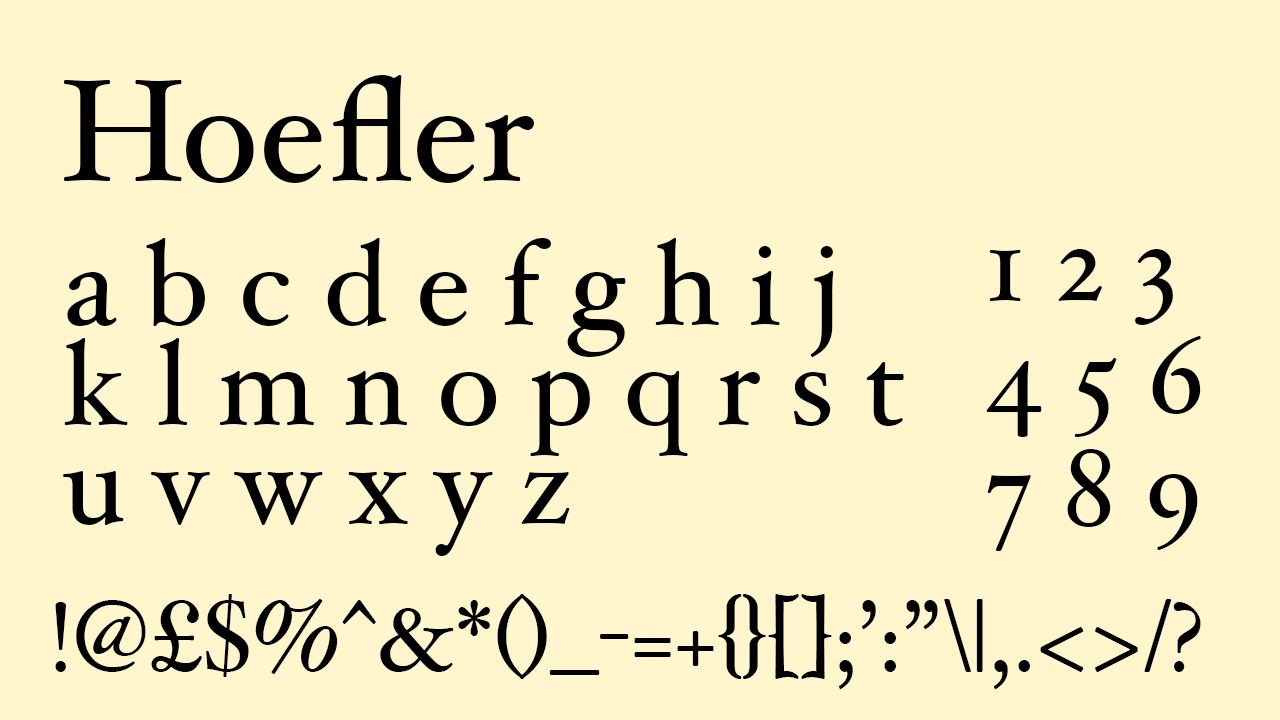
Another font that inherited its name from its designer, Hoefler is the also the name of the designer’s type foundry, Hoefler and Co. One of the first fonts specifically created for digital typography use rather than printing, it is now yet another font acquired by Monotype – a move that is surely by now a signpost of a font's relevance in the design and publishing industry. Hoefler is a dramatic serif typeface, so will give your CV a very stylised look but given its universal nature, will stay in line with the necessary amounts of professionalism.
8. Arial
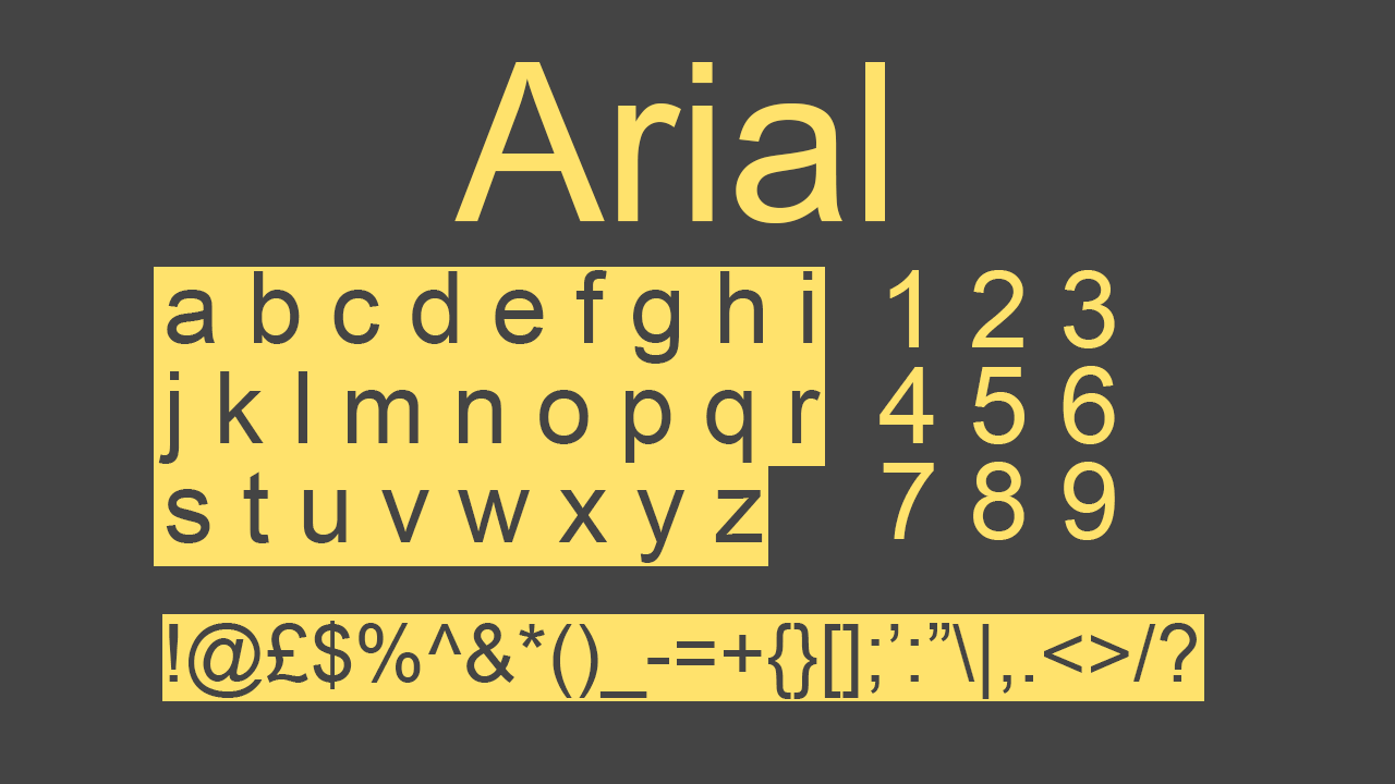
Arial was created especially for Monotype for use specifically with a printer used at the time, and then quickly became a standard typeface in Windows computers. Arial is now a standard font included in all computers and is above all, a type founded on practicality. Originally created for the process of a specific printer of its time, its strokes are harsh, thick and sharp for efficient printing, and now works perfectly for universal legibility and clarity on screens. A convenience of Arial is its range of variations, including many versions of Arial ‘narrow’ as well as many different 'bold' styles. This makes it a versatile font for your resume as it will cover all bases – it's a fully equipped family ready to create variety in your headings, subheadings and body text, while allowing you to maintain consistency in font throughout your whole resume.
9. Helvetica Neue
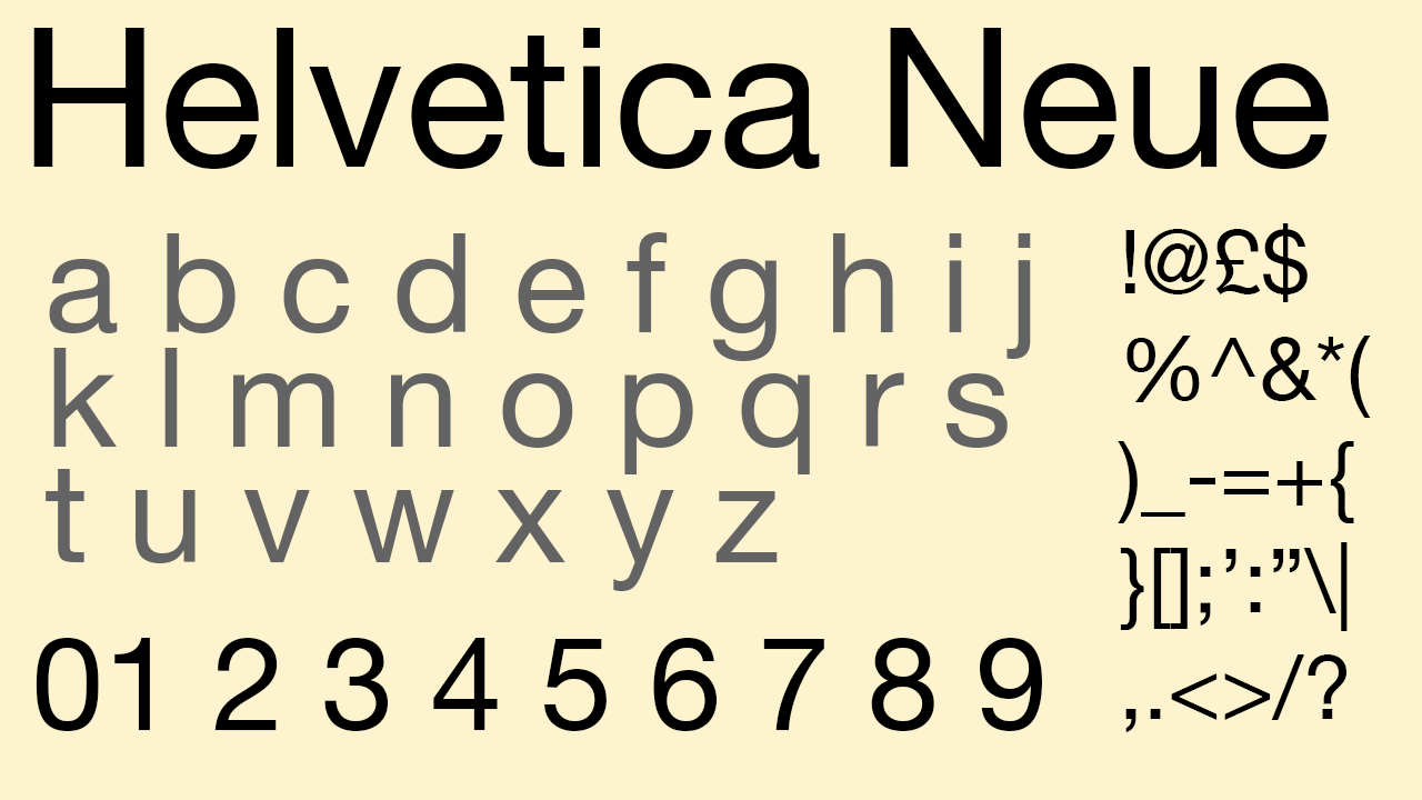
Helvetica Neue is a subtly updated version of Helvetica published in the 1980s by the daughter company of Linotype. The more pronounced punctuation marks of Helvetica Neue as well as more consistent x and y heights are both noticeable changes that Helvetica Neue adopted. To the untrained eye, the difference is not too noticeable, but Helvetica Neue qualifies as an equally practical and professional font to use in a resume. It is technically an improved reworking of Helvetica and does boast higher consistency in letter design, so if anything, it might even qualify as a more professional choice than Helvetica.
10. Avenir
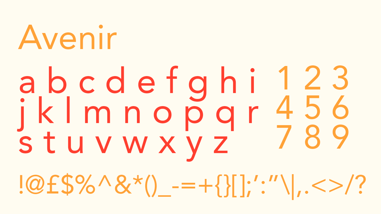
The 1980s clearly functioned as a font industry boom! Yet another standard sans-serif typeface released in the 1980s by Linotype, Avenir is a clean, modern font that dramatically adjusts any text into a strong, contemporary design. Another popular sans-serif font designed with Swiss typography in mind, its lightweight, rounded letters create a refined look that depicts an unusual, future-focussed design. Avenir is a standard typeface that is safely professional but not too commonly used on resumes due to its contemporary feel. It's a choice you’ve got to be certain about, but if you are, it should perfectly depict your personality and will stand out from the rest of the stack.
11. Belgiano Serif
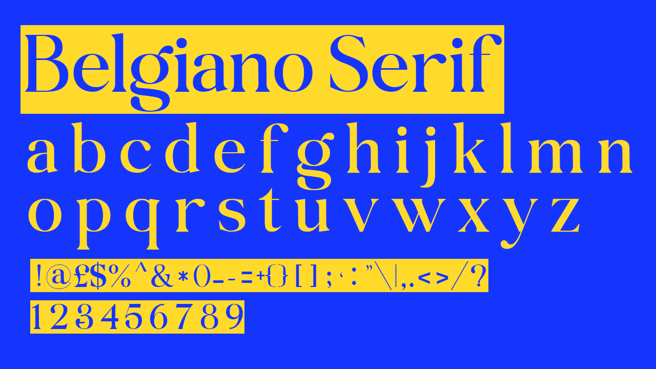
Belgiano Serif is probably the least commonly used font on this list, given its publication by a much smaller company and the fact that its most prominent source for downloading is via DaFonts, but I believe it’s a typeface that is very overlooked and needs a more significant platform. Possibly one of the most feminine serif font out there that still maintains professionalism, its serifs are extremely pronounced and make for a distinctive look. On your resume it might fare well to simply use it for headings, but it’s a less commonly seen touch that adds connotations of old-school New York publishing and old-fashioned feminine publications. It’s not a font that comes as a standard in either Microsoft or Apple, so it’s worth downloading to use for your own personal touch of elegance on your resume.
12. Didot
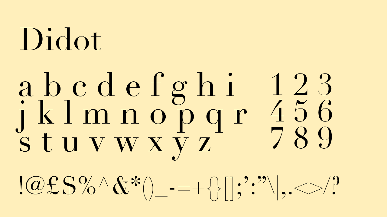
Didot is an old font created by a French printer and publisher and used in the company's own books, with its lettering becoming the most infamous part of the company's legacy that has stood the test of time. The lighter strokes of Didot are just distinguishable enough to cut an elegant typeface reminiscent of when books were designed by hand pre-digital-age. It is a timeless font now, and was a contemporary and forward-focussed typeface for its time of creation, the 1700s. Its serifs are not as dramatically pronounced as a font like Belgiano Serif, making it a practical serif choice for a resume, but it also combines thicker and lighter strokes that keep its classic, timeless origination in mind.
13. Microsoft Sans Serif
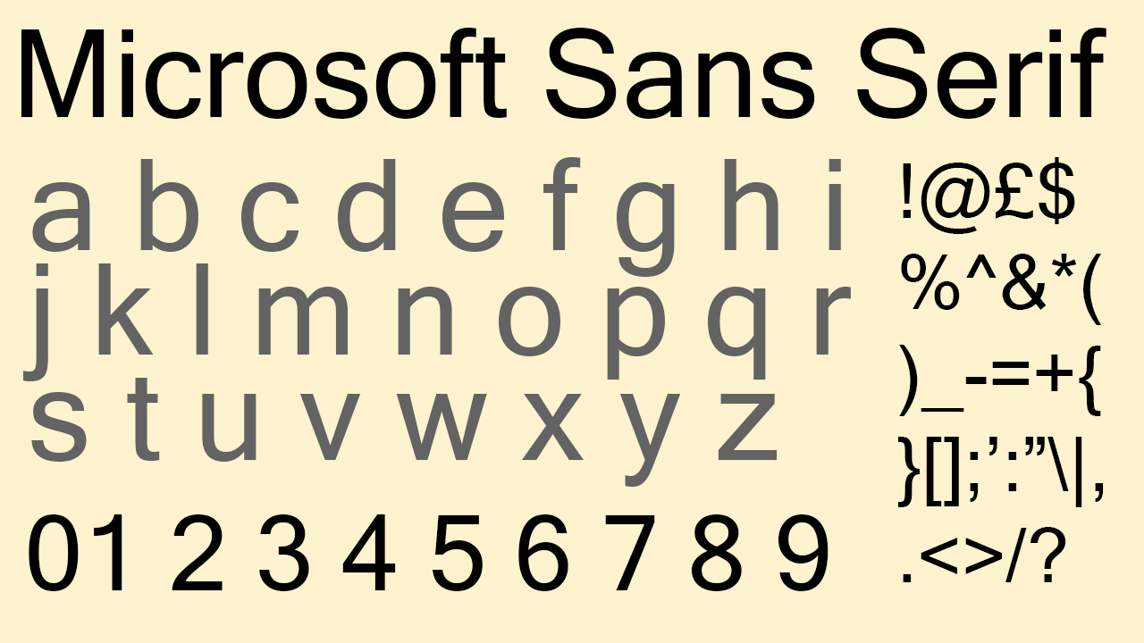
Similarities between Microsoft Sans Serif and Aptos can be easily drawn in its thinner, straight strokes and low contrast between the x and y-heights. Given its use for the same company, it’s highly likely that Microsoft Sans Serif is where some of Aptos’s inspiration was drawn. If you’re looking for an easy sans-serif font that is slightly different to Helvetica but still covers all the same bases, Microsoft Sans Serif has got you covered.
14. Futura
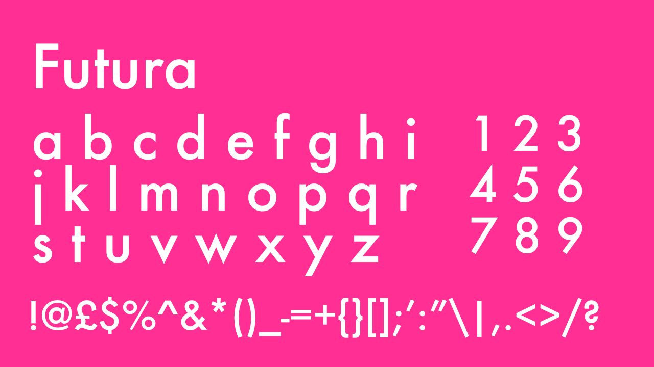
Popular in the use of editorial graphic design, Futura has also been used in many iconic brand logos. You may be surprised to realise how often you’ve stumbled across Futura without realising it, which proves just how versatile it is as a font that can be redesigned, updated and stylised into something so specific that it’s not recognisable next to a different design that might also be using Futura. It was even used on a sign planted on the moon during the first landing and is still there today. If you’re looking to get a bit more creative with your resume but want a professional font as a safe baseline to start from, Futura gives you enough space to create something completely new and as something so widely and significantly used, will always be welcome to the eyes. It’s far friendlier than the standard sans serif fonts too, with extremely rounded letters, a high contrast between the x and y-heights, and occasional stylised touches such as the art-deco-esque curve of the uppercase ‘B’. It was created with Bauhaus design of the time in mind and published by the Bauer Type Foundry, but is now owned by Monotype, who have since published their own updated version, ‘Futura Now’.
15. Garamond
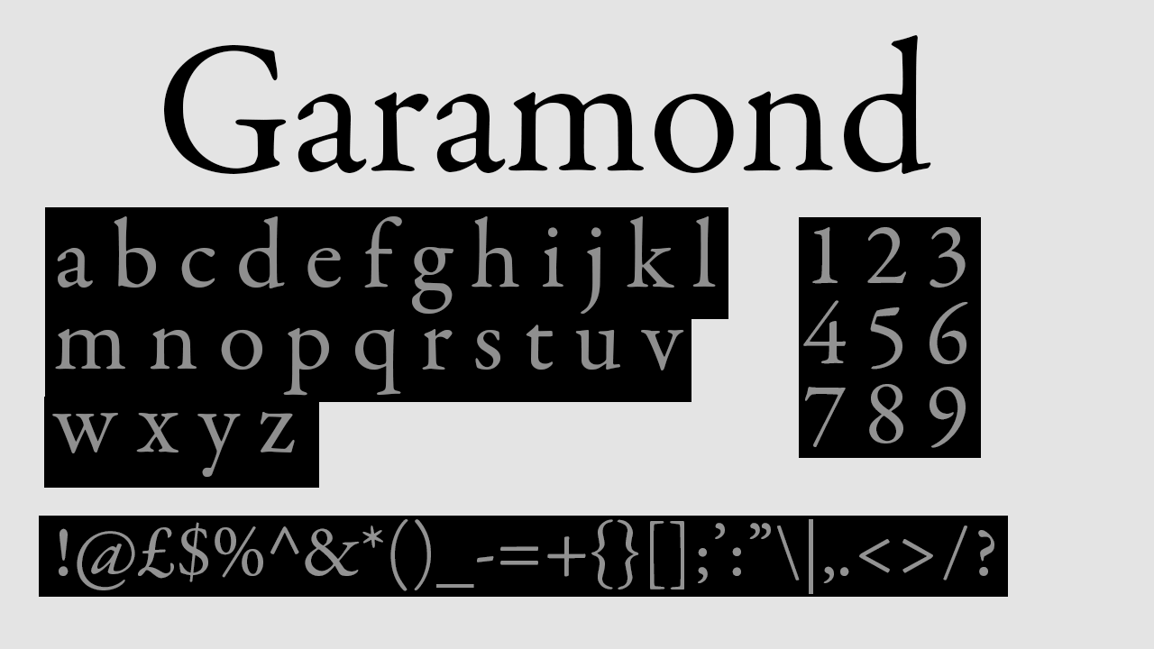
Often used in book publishing as a serif font made up of strokes of consistent thicknesses with dignified, subtle serifs, Garamond was created by a French engraver of the same name in the 1700s. It was created at a moment in time when reading was very gradually becoming distributed to more people and publishers were moving away from Gothic typefaces and towards Roman letters instead, Garamond being one of them. Garamond’s best quality is its agreeable spacing, one of its legible qualities that make it so widely used in book publishing. If you’re handing someone your resume in person, Garamond serves as one of the best options, as it is known as one of the best serif fonts to use in print, and has been respected as one of the best printed typefaces for centuries. Garamond is understated but traditional, and would add a very dignified and book-ish touch to a resume, especially for one that's directed towards the printing, publishing or teaching industries.
16. Butler
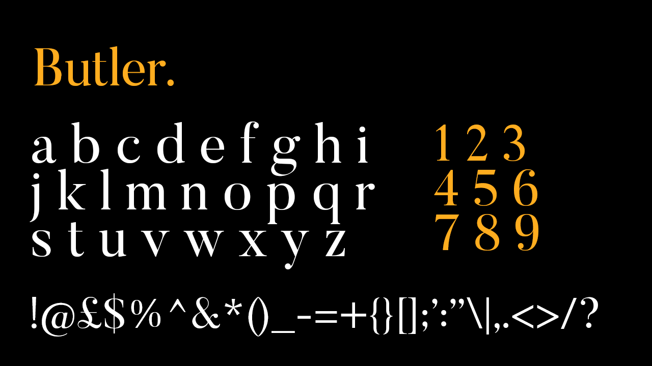
Butler was inspired by the roman font reminiscent of Gothic type features, Bodoni, with one of many differences including Butler’s inclusiveness of both lowercase and uppercase letters. Created as recently as 2015 and freely available, it is not yet a standard serif font, but is used by many and is gaining popularity as an elegant serif font with dramatic contrast in stroke thicknesses throughout each letter. With such dramatic contrast in strokes, it would work well as a distinctive header or sub-header. It does however come in 14 weights, meaning that it’s flexible enough to be used across your entire resume. It’s a neat font with subtler serifs than Belgiano Serif, so would come across as incredibly professional, and as it’s not as commonly used as some of the others on this list, would stand out from the crowd and give you a signature style.
17. Charter
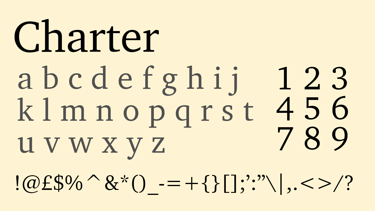
Charter is another font designed to read well on screens with lower resolutions, and its designer, Matthew Carter, holds the title of CBE for all of his significant font creations and contributions to the world. The serifs of Charter are blunted, and the x and y-heights are fairly close together, making it a squarer typeface that works especially well for use in body text both in printing and on screens. A standard font included in most softwares and computers, Charter is a sturdy-looking font that creates solid, consistent text. When used in resumes, it prides itself most on its legibility and the feeling of reliability its squareness and blunt serifs create.
18. Cochin
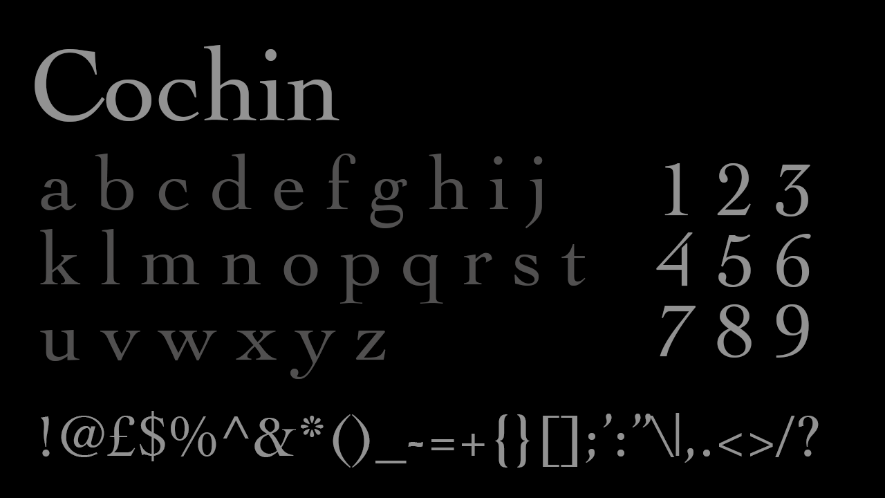
Cochin is probably one of the thinnest serif fonts made up of consistent strokes rather than strokes of contrasting thicknesses. Its French origins are apparent in its tasteful serifs and very rounded letters that create an illusion of larger spacing than usual. All these features make Cochin a dignified font that will help your resume to appear refined, thought-out and beautifully presented. It’s a strong serif but sophisticated. It also does not take up too much space, so if you’re looking for a serif typeface that fits more on one page, Cochin is the right choice.
19. Calibri
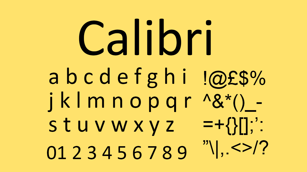
Calibri is not always a popular choice, but up until recently it was the default font used in Word, so its universal origins cannot be ignored. The Microsoft sans serif font is nothing if not understated so is used as the default for many professional situations. According to Wired, in 2023 the US Department of State even threw out the classic serif font Times New Roman to assign Calibri in its place as their default font. Arguably, there is no font choice more secure to use for your resume than the typeface professional enough for the US Department of State.
Want to use more than one font? See our guide to font pairing.

Thank you for reading 5 articles this month* Join now for unlimited access
Enjoy your first month for just £1 / $1 / €1
*Read 5 free articles per month without a subscription

Join now for unlimited access
Try first month for just £1 / $1 / €1
Get the Creative Bloq Newsletter
Daily design news, reviews, how-tos and more, as picked by the editors.

Mabel is a freelance writer, artist and filmmaker. When she's not writing about the arts industry, books or culture, she's working on writing and illustrating her stories or developing experimental filmmaking projects. Working in journalism, poetry, documentary-filmmaking, illustration and fiction, storytelling is at the heart of what she does. She started writing articles in online magazines when she was seventeen. After training at the BFI Academy and then studying at UAL, she is now continuing to write articles while she works on creating and launching her first books and films.
