Noel Gallagher's football font makes a mockery of typography, claims design lecturer
Craig Burston on why designers, not pop stars, should create typefaces.
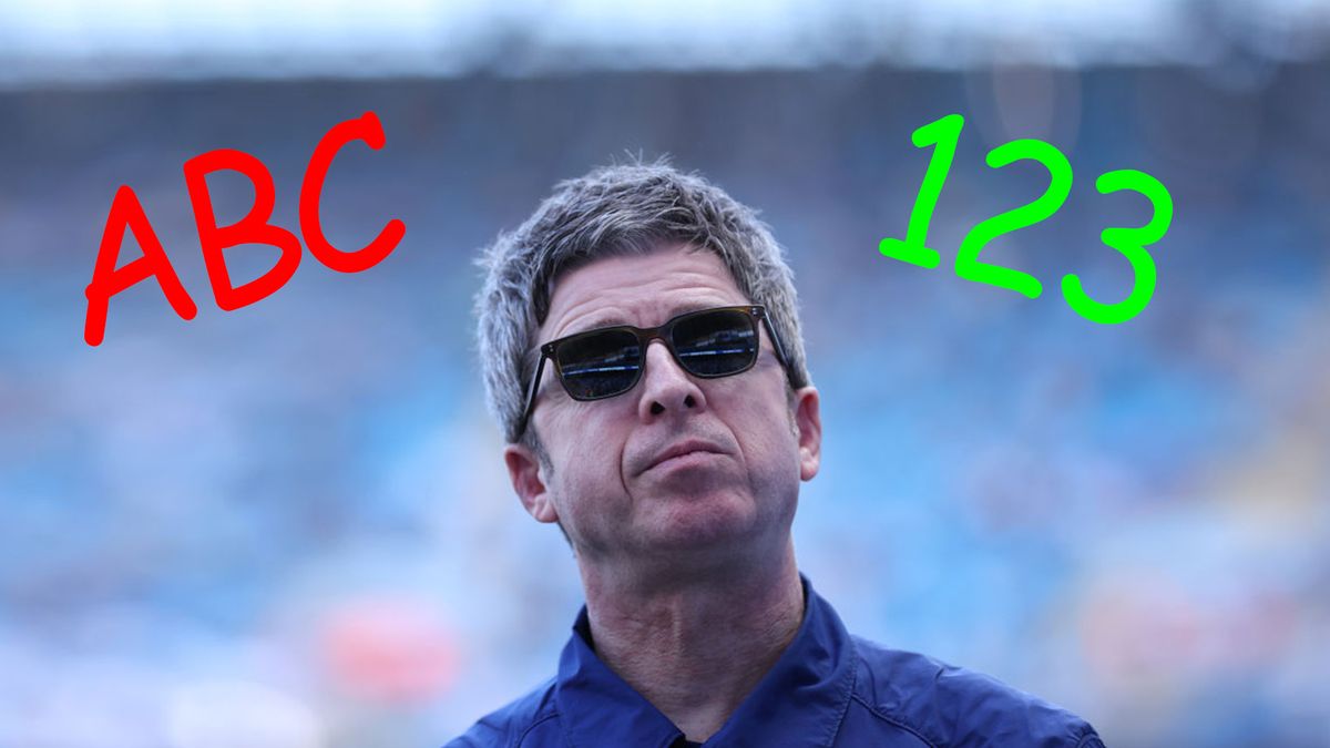
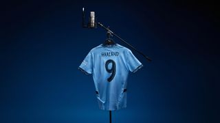
On Wednesday, Manchester City released a brand new club font to be used on its shirts. Rather than asking a renowned type foundry such as Dalton Maag (which within its portfolio includes typefaces for sports brands and teams), the current Premier League champions sought the design insight of none other than former Oasis rocker Noel Gallagher – much to the widespread mockery of football fans and design experts alike.
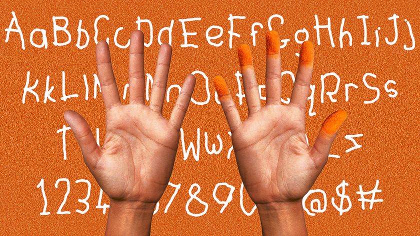
With the font supposedly inspired by his handwriting, many people – in an attempt to mock the guitarist and singer – have compared it to Comic Sans. I’d argue that’s harsh on Comic Sans. It arguably doesn't even compare with many of the best free fonts.
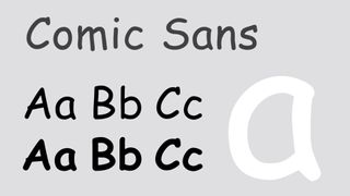
Back to Comic Sans – underneath its innocent charm lies an incredibly well-conceived and drawn face, in its original form in 1994 by Vince Connare. While the ‘Kidz Korner’ sans-serif does indeed have a poor public reputation and has become a byword for those seeking to mock graphic design, it is an excellent example of a face drawn for accessibility and legibility. Its proportions are spot on, its mechanics that sit beneath the irregular form are hidden, but they are there. It is well built, well drafted and crafted by an expert in their field.
It is, though, badly applied in many cases (I’ll never forget the sight in my rearview mirror of it being used to spell out the word AMBULANCE on the front of a van behind me), but that doesn’t make it a bad typeface, it makes it a badly applied typeface. Connare has put in the requisite ten thousand hours into the craft of typeface design.
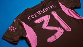
Noel, however, presumably wrote A to Z and 1 to 0 with a Sharpie and handed it over. In just the same way if I strummed an out of tune guitar, Noel would baulk at my guitar playing proficiency (he’d be right) then, well, the shooting boot is on the other foot. It stands as a great example of “I Could Have Done That” when people stand and stare at deceptively simple art and design, probably the most infamous example being Carl Andrés’ Equivalent XVII, or in dismissive parlance 'just a load of bricks'.
Noel’s dastardly design reminds me more of the famously terrible car designed by Homer Simpson. His hand drawn scrawls more resemble a child’s writing, rather than a musician renowned for his technical dexterity on the guitar.
Now, I’m not so naive as to not know this is great publicity, and more than anything it is a stunt to get fans excited and to get people talking. Who can forget the super recent hoo-ha over Nike’s temerity to weave in a cross of Saint George in colours other than red and white into the collar of the English national team shirt for Euro 2024? And I know I am playing right into their hands – or should I say feet? – even by typing these words. But it does beg the question of just how poorly the technical skill and years of experience of typeface designers are understood and valued in society.
Get the Creative Bloq Newsletter
Daily design news, reviews, how-tos and more, as picked by the editors.
If I didn’t know any better, I’d almost be tempted to suggest that somewhere in Greater Manchester there is an in-house Manchester City creative who can’t believe the top-level trolling they’ve been able to pull off. Maybe next time Glastonbury asks Noel to headline, someone like me should rock up with a guitar and have a go at Wonderwall instead. Noel, I’m up for it if you are.

Thank you for reading 5 articles this month* Join now for unlimited access
Enjoy your first month for just £1 / $1 / €1
*Read 5 free articles per month without a subscription

Join now for unlimited access
Try first month for just £1 / $1 / €1

Craig Burston is a designer, writer, music obsessive and Senior Lecturer for BA (Hons) Graphic and Media Design at London College of Communication, part of University of the Arts London.
- Daniel JohnDesign Editor
