These could be the biggest typography trends of 2025
Sign up to Creative Bloq's daily newsletter, which brings you the latest news and inspiration from the worlds of art, design and technology.
You are now subscribed
Your newsletter sign-up was successful
Want to add more newsletters?
Five times a week
CreativeBloq
Sign up to Creative Bloq's daily newsletter, which brings you the latest news and inspiration from the worlds of art, design and technology.
Once a week
By Design
Sign up to Creative Bloq's daily newsletter, which brings you the latest news and inspiration from the worlds of art, design and technology.
Once a week
State of the Art
Sign up to Creative Bloq's daily newsletter, which brings you the latest news and inspiration from the worlds of art, design and technology.
Seasonal (around events)
Brand Impact Awards
Sign up to Creative Bloq's daily newsletter, which brings you the latest news and inspiration from the worlds of art, design and technology.
We're rapidly approaching the end of the year, so surely it's about time we had some analysis of typography trends for 2025? Well, the website builder for small business platform Wix Studio is here to do just that, announcing its top 10 typography trends for the new year.
I know what you're thinking – more Y2K, right? Yep, 'Y2K' is indeed on the list of trends for what must be at least the 3rd year running (maybe it just never went away). 'Retro revival' is on there too (surely Y2K would be part of that) but more intriguing is what Wix Studio describes as "bespoke typefaces with feeling". That's a font design trend I can get behind.
"As we head into 2025, typography is proving to be more than just a design element—it’s becoming a reflection of our cultural pulse," Wix says. "The trends we’re seeing speak to a desire for both innovation and nostalgia, blending organic forms with digital precision. Designers are crafting typefaces that go beyond aesthetics, creating emotional connections and shaping brand identities in bold new ways". Here are some of the highlights of the report. To get the look for free, scour our pick of the best free fonts.
Bespoke typefaces with feeling
Wix Studio reckons that the rise of AI-generated content one the one hand and the enduring power of design nostalgia on the other suggest there's something of a battle afoot between innovation and tradition. The result is that brands and designers are seeking to create more personalised content, which means typography in 2025 will be more than ever about a quest for authenticity as much as aesthetics.
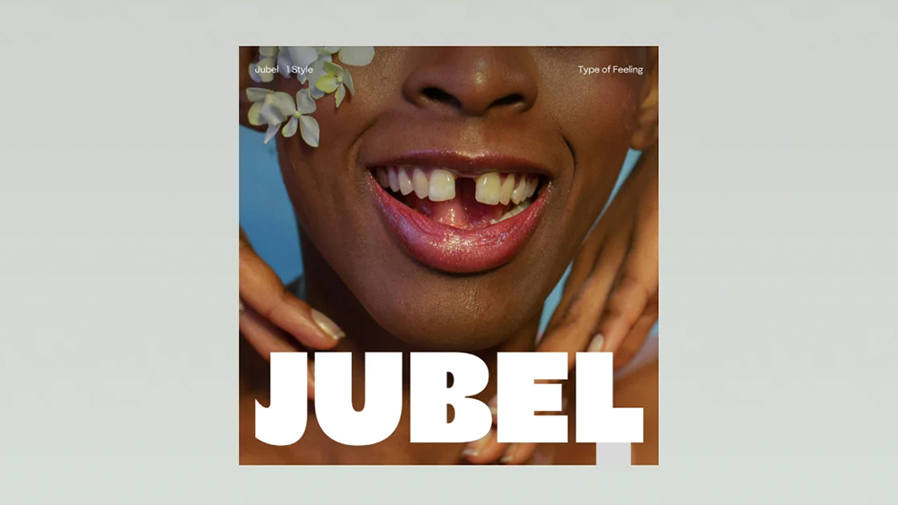
The typography trends report cites, Jessica Walsh, founder of &Walsh and the new type foundry, Type of Feeling, who predicts that more brands will want to invest in assets that help them stand out with custom type.
Walsh's goal with Type of Feeling is to create typefaces that "not only serve a functional purpose but also evoke an emotional response”. Each typeface is inspired by a unique feeling or emotion. “Jubel is the expression of joy and celebration," says Walsh. "The thick strokes and lively curves exude excitement, the 'e' almost smiles at you, reflecting the jubilant mood and celebratory feeling of the word."
Variable fonts
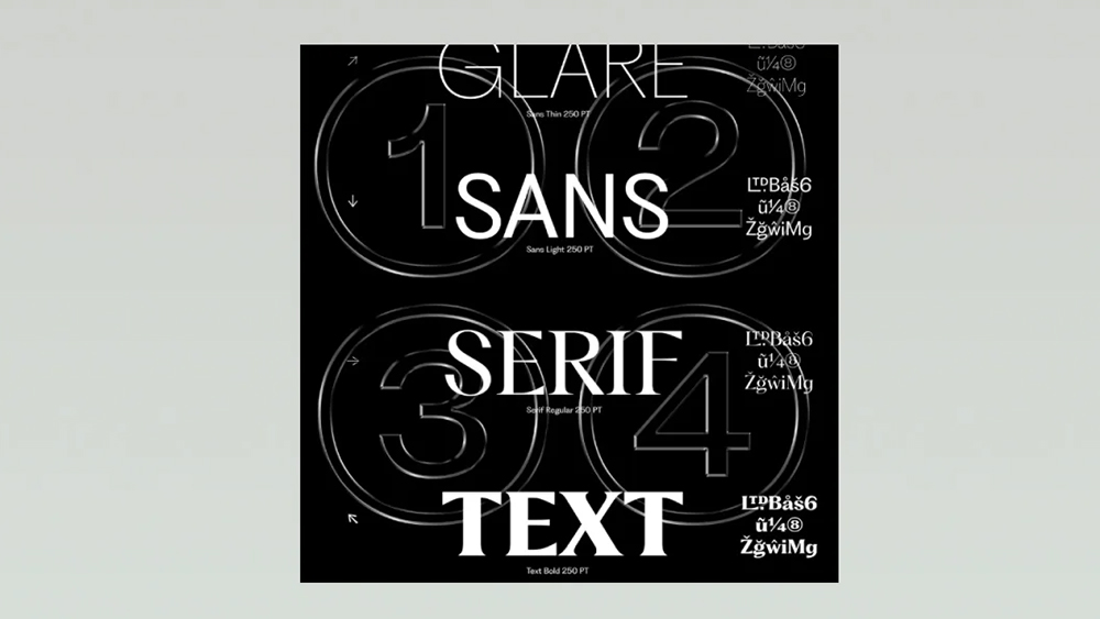
Another highlight of the Wix Studio typography trends report is Variable fonts, which provide more flexibility for designers, allowing multiple styles and weights to coexist in a single file. It mentions examples like Grilli Type’s GT Ultra or Pangram Pangram’s Fragment. "As websites and apps prioritize responsiveness and user experience, variable fonts will become essential for maintaining visual consistency while offering customizable aesthetics," Wix says.
Sign up to Creative Bloq's daily newsletter, which brings you the latest news and inspiration from the worlds of art, design and technology.
“The way we design and manipulate type today is vastly different from just a few years ago,” says Erik Herrström of Studio Herrström. “We've seen significant innovation, particularly with variable and modular typefaces, which allow designers to create work with much more variety and flexibility."
Kinetic typography
Kinetic typography, or moving type, is another key typography trend prediction for 2025. It's a logical development when you consider that so many of our interactions with brands are now digital.
Wix notes the powerful potential for storytelling and engagement through the animation of letters and words be it for video intros, social media or interactive websites. Examples provided include Tina Touli’s Shifting Symphonies and Monica Losada’s visuals for WIRED. See our own pick of the best kinetic typography for more inspiration.
Anti-design typefaces

Another prediction from Erik Herrström is a continued presence of the anti-design trend, which often means embracing a raw, intentionally lo-fi look. “Since Charli XCX made it big with her anti-design look for the Brat cover, many designers will start pitching these lo-fi and unfinished treatments for other brands in culture, music and beyond,” Herrström says. You can see this stripped down, more experimental approach to design in Pentagram’s brash rebrand for Young V&A, as well as Red Antler’s handwritten logo for Popup Bagels.
Other highlights on the report include ephemera-inspired typography, with more creatives turning to vintage items like postcards, tickets and packaging in search of timeless or aged aesthetics for inspiration. Alas, my prediction of unreadable typography doesn't make it to the list, although it could be considered an example of anti-design. You can see the full report on the Wix Studio blog.

Joe is a regular freelance journalist and editor at Creative Bloq. He writes news, features and buying guides and keeps track of the best equipment and software for creatives, from video editing programs to monitors and accessories. A veteran news writer and photographer, he now works as a project manager at the London and Buenos Aires-based design, production and branding agency Hermana Creatives. There he manages a team of designers, photographers and video editors who specialise in producing visual content and design assets for the hospitality sector. He also dances Argentine tango.
