'Comic Sans belongs in a museum': Designers defend the world's most divisive font
Industry experts reflect on the font's 30-year legacy.

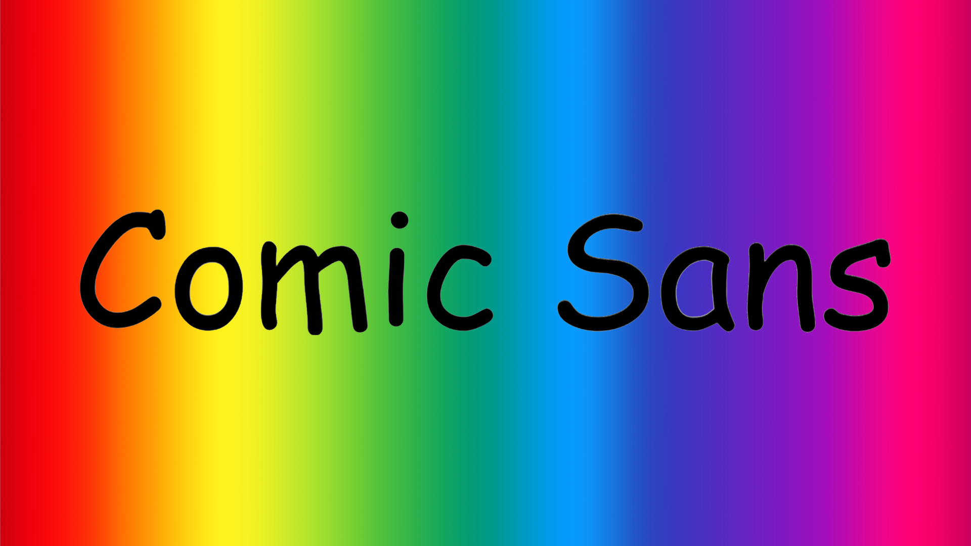
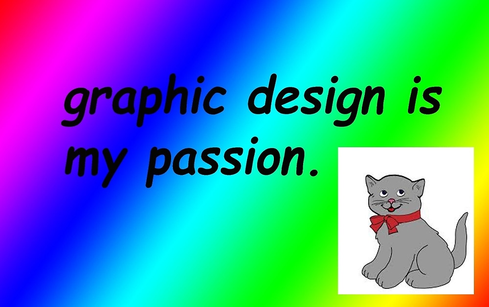
Comic Sans is perhaps one of the most divisive fonts around, either hated or ironically adored by the masses. Since its humble beginnings, Comic Sans has evolved from a casual, accessible typeface to an all-out meme, mocked for its juvenile design and oversaturated appearance on janky homemade birthday invitations and missing pet posters.
While there are many types of typography, the playful appeal of Comic Sans has always made it stand out amongst the Garamond and Helveticas of the typographical world. Now, thirty years since its conception, is it finally time to give Comic Sans the respect it deserves?

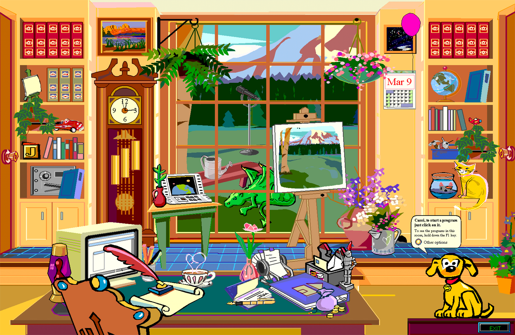
Created in 1994 by Microsoft in-house designer Vincent Connare, Comic Sans was made as a typographic voice for the dog featured in the Microsoft Bob interface. Feeling that Times New Roman didn't suit the pup's playful illustrated appeal, Vincent created the comic book-inspired font to match the cartoony skeuomorphic design.

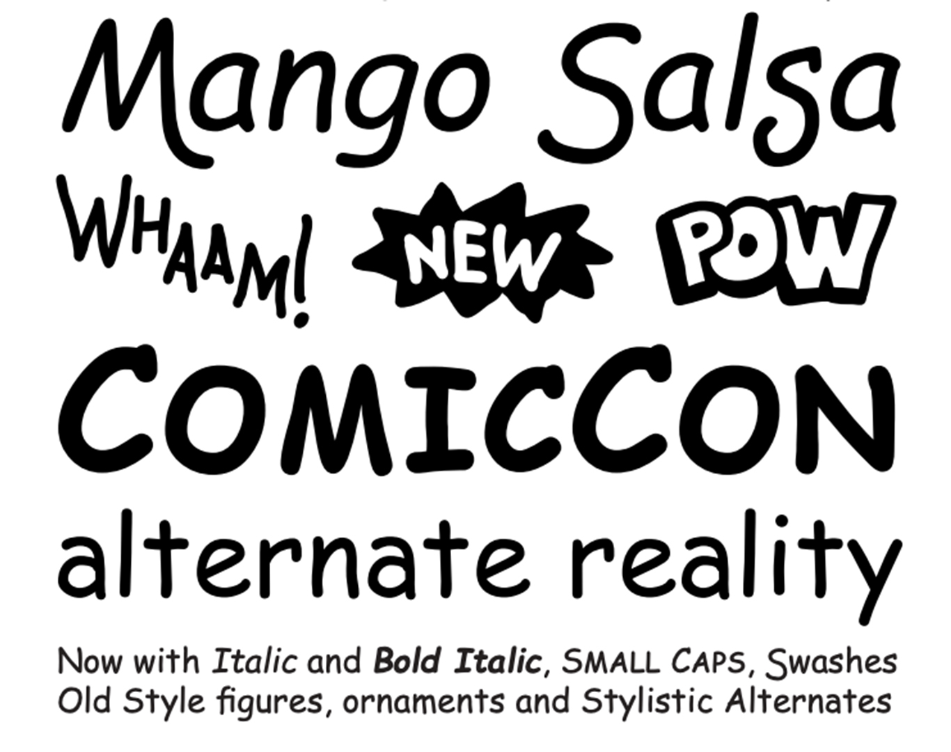
Thanks to its laidback, human-made appeal Comic Sans grew in popularity, eventually receiving a refresh from creative type director Terrance Weinzierl. "In 2010, I was tasked with adding extra glyphs to the font, showing off new features in Microsoft Office 2010. That involved adding small caps, old style figures, dingbats, and more. We also designed new italic styles that were backwards compatible with the mechanically obliqued option – while keeping the core characters the same. Comic Sans was refreshed, and ready for a new era of typography," Terrence says.
Those not yet convinced to drop the use of Comic Sans typeface. The sartorial equivalent is wearing socks — white at that — with sandals. For those who consider themselves creative in using Comic Sans, breaking rules, it's not hip/inventive/ironic/knowing, it's just tiresome. pic.twitter.com/BJ0zk1okBCNovember 21, 2019
But sadly, what comes up must come down. Due to its casual design, Comic Sans slowly developed a reputation as an amateur, unprofessional font. For Julien Fincker, type designer and founder of Fincker Font Cuisine, the font's oversaturation was its eventual downfall.
"Unfortunately, it has been misused for completely random projects and, since it is freely available, completely overused – a problem that many fonts have experienced. Due to improper use by inexperienced font users, it has unfortunately fallen into disrepute," Julien says.

“It's hard to imagine a typeface more misunderstood than Comic Sans," adds Don Citarella, founder and creative director of ERA404 Creative Group. "For 30 years, enthusiastic parents have been printing out birthday cards and lost cat posters using a font originally meant for only digital cartoon speech bubbles. Anyone with a dot-matrix banner printer and Windows 95 could happily ruin family reunions and neighbourhood block parties with a few keystrokes," he adds.
Get the Creative Bloq Newsletter
Daily design news, reviews, how-tos and more, as picked by the editors.
Despite its controversial nature, Comic Sans has developed into a cultural icon that continues to divide people. "As a teacher, it sometimes finds its way into discussions with my new design students, as it exists as a phenomenon,” says Donald Tarallo, typeface and graphic designer at Tarallo Design. For Svet Simov, CEO and Founder of Fontfabric, Comic Sans has earned its place as a typographical icon "I consider Comic Sans a specific time classic which belongs in a museum," he says.
comic sans is the coolest font and im tired of pretending like it’s notDecember 18, 2020
It's not just its loveable meme status that makes Comic Sans such an iconic font – studies suggest that it boosts legibility and accessibility, particularly for individuals with dyslexia. "Whether it’s for the fun it brought to fonts or the gravitas of its impact on legibility and accessibility, Comic Sans has fulfilled its mission and more," Terrence says. "In our digital world, typefaces are the way we communicate our stories. And we’ll always need to tell new stories, make new art, make new music and dance, and make new typefaces. What’s more, art doesn’t have to be beautiful or sombre to be effective," he adds.
For more typographical insight check out our definitive guide to font vs typeface. If you're after more creative inspiration, take a look at the best free fonts to inspire your next creative project.

Thank you for reading 5 articles this month* Join now for unlimited access
Enjoy your first month for just £1 / $1 / €1
*Read 5 free articles per month without a subscription

Join now for unlimited access
Try first month for just £1 / $1 / €1

Natalie Fear is Creative Bloq's staff writer. With an eye for trending topics and a passion for internet culture, she brings you the latest in art and design news. Natalie also runs Creative Bloq’s Day in the Life series, spotlighting diverse talent across the creative industries. Outside of work, she loves all things literature and music (although she’s partial to a spot of TikTok brain rot).
