Design disaster or stroke of genius? The new Cheetos font is turning heads
It might just be a brilliant branding move.
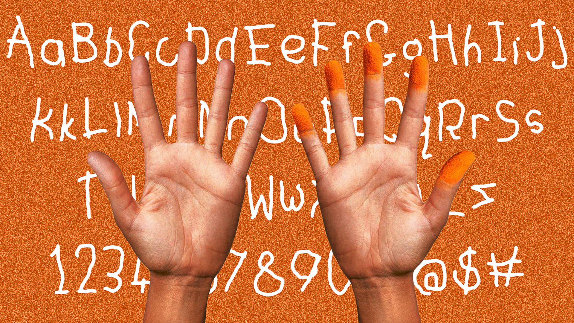
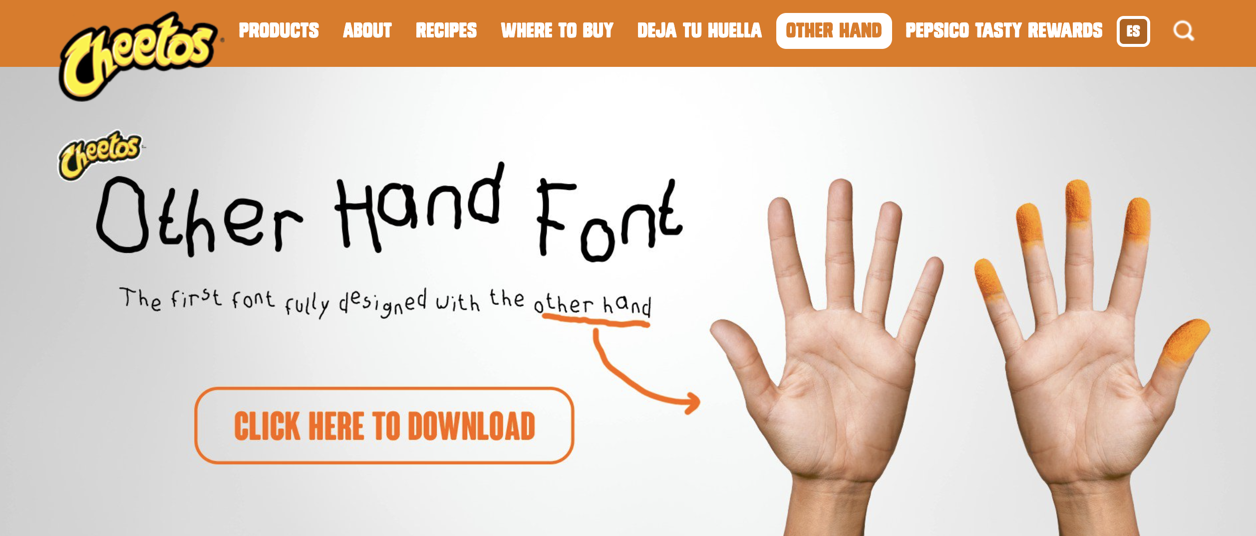
In a world obsessed with sleek aesthetics and pixel-perfect precision, Cheetos has thrown a deliciously cheesy wrench into the works. Its ‘new font’, a deliberately messy, hand-drawn creation, has got people looking up from their snacks. Surely a marketing gimmick? A design disaster? Or maybe, this delightfully human mess is actually a cheesy stroke of playful genius.
Ask any type designer, and they'll tell you: custom fonts are powerful tools for shaping brand identity. They imbue every word, every message, with the brand's unique personality. Cheetos has taken this concept and run with it, or rather, smudged it with cheesy fingers. The font, created by designers drawing with their non-dominant (and presumably non-cheesy) hand, captures the very essence of the Cheetos experience: messy, playful, and very human. (For more typographical inspiration, take a look at the best free fonts.)

While many brands strive for polished consistency, Cheetos understands that true authenticity lies in the raw and relatable. And it's a recognition that in our increasingly automated, AI-driven world, the human touch is more valuable than ever.
The Human Touch: Reclaiming Humanity in a Digital World
We see this yearning for human connection in a digital world in the resurgence of vinyl records, the renewed interest in film photography, and the growing appreciation for handcrafted goods.
Maybe we humans are craving a bit of nostalgia. Or maybe something deeper is happening here- a need for something real, something tangible, something that reminds us that we're not just interacting with a brand, but with people.
Cheetos' font, with its inherent imperfections and playfulness, embodies this human element perfectly. You can almost picture the designers in the office, laughing, snacking, and creating this wonderfully messy masterpiece. Maybe it even came about as one designer dipped into a bag of Cheetos while doodling.
This push for human connection is crucial in today's branding landscape. A brand, at its core, is a set of associations and expectations held by an individual. It's a deeply personal, human connection.
Get the Creative Bloq Newsletter
Daily design news, reviews, how-tos and more, as picked by the editors.
Yet in the pursuit of efficiency and automation, many brands have lost sight of this fundamental truth. Sleek, minimalist designs dominate, often sacrificing personality for the sake of polish.

Cheetos, on the other hand, understands that human nature hasn't evolved as quickly as technology. We still crave the human touch, the quirky imperfection that makes us feel connected.
The Cheetos font also reflects a shift from static brand identities to more flexible and dynamic brand experiences. Traditional brand guidelines, while essential for consistency, can sometimes stifle creativity. They prioritise uniformity over surprise and predictability over playfulness.
Cheetos demonstrates the power of moving beyond rigid guidelines and embracing a more fluid approach to branding. Its new font isn't just a visual element: it's an experience, a representation of the brand's playful spirit. It puts the brand experience first, rather than simply adhering to static rules.
I’m not saying this should mark the end of brand guidelines. As a designer, I know they have a pivotal role to play. But they should be treated as what they are - ‘guidelines’. We can definitely be less static.
Brands always need to find a balance between consistency and flexibility, between control and creativity. They need to create systems that allow for dynamism and surprise, while still maintaining a cohesive brand identity. We are already seeing this with the rise of ‘flexible identities’ that can adapt and evolve while remaining true to their core values.
But in a world that often feels too polished and too perfect, Cheetos' messy, cheesy font is a breath of fresh air – or perhaps, a puff of cheesy dust. It's a testament to the power of human connection, the beauty of imperfection, and the enduring appeal of a good, cheesy snack.

Thank you for reading 5 articles this month* Join now for unlimited access
Enjoy your first month for just £1 / $1 / €1
*Read 5 free articles per month without a subscription

Join now for unlimited access
Try first month for just £1 / $1 / €1
Jonas Schmidt is Senior Business Designer at Designit, an experience innovation company working at the intersection of technology, design, strategy, and marketing.
You must confirm your public display name before commenting
Please logout and then login again, you will then be prompted to enter your display name.


