9 iconic typefaces in movies and TV – from Stranger Things to Napoleon Dynamite
When type sets the tone.

Ever seen a piece of text or type and thought, I’ve seen this before? There’s probably a reason for that. Sometimes, the type choices made on screen and television end up being as iconic and memorable as the features themselves and can set the tone in terms of visual storytelling even before a single word is spoken.
The right typeface can convey a stunning sense of time, place, emotion and genre, and from the classic to the contemporary, we run through here some of the most notable examples as well as exploring why they work so well, with experts weighing in with why these choices work so well.
For more on typography, see our typography of the decade series the best free fonts.
01. Futura in The Royal Tenenbaums
Futura is a geometric sans-serif typeface, designed by Paul Renner in the 1920s, and it's been used cleverly in film. "Wes Anderson embraced Futura like no else in his movies (The Royal Tenenbaums, The Life Aquatic with Steve Zissou, Moonrise Kingdom) using its structured yet playful nature to complement his meticulously designed worlds," explains Julio Zukerman, type designer at Type of Feeling. "Futura’s versatility, sleekness, and striking presence have made it particularly memorable and iconic."
Stanley Kubrick's 2001: A Space Odyssey's also used Futura to embody the modernist ethos of efficiency, simplicity and clarity and is used extensively throughout the film as well as in the title cards and the opening credits.
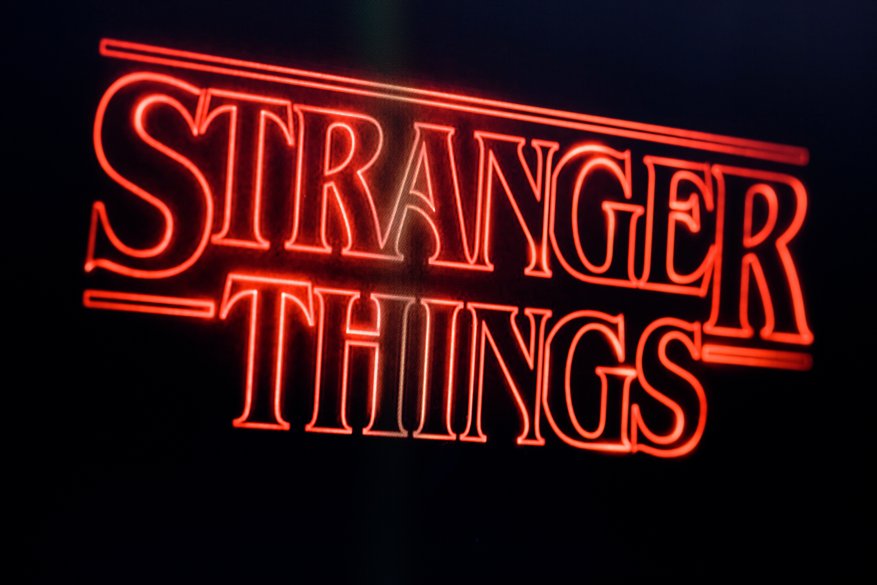
02. ITC Benguiat in Stranger Things (2016–)
It’s hard to think about typography and screen in unity and not conjure up the defining image of Netflix other the last few years – the Stranger Things splash screen. Not only has the TV show itself become a cultural phenomenon, its use of ITC Benguiat for the title sequence is a significant part of its appeal and the emphasis on nostalgia and days gone by.
"The typeface helps evoke that sense of nostalgia, while its curved details reinforce the mysterious and supernatural atmosphere of the series," explains Jessica Gracia, graphic designer at &Walsh. Designed by Ed Benguiat in the 1970s, it combines elements of Art Nouveau and Gothic lettering, and it has a quirky, distinctive style that evokes a sense of mystery and adventure that aligns it perfectly the show’s homage to 1980s pop culture and its blend of supernatural horror with coming-of-age drama. It works as it sets the tone for the series. With both its design and its bold colouring, you know what to expect from Stranger Things.
03. Papyrus in Avatar (2009)
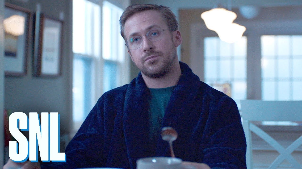
If you’ve seen Ryan Gosling’s SNL sketch about the use of Papyrus in Avatar (above), you’ll not be surprised that to this day, this remains one of the most controversial typeface choices in film history. Designed by Chris Costello in 1982, Papyrus is known for its textured, calligraphic style that evokes a sense of the ancient and the exotic. Despite its widespread availability (and a commonly mocked option on Microsoft Word), it was claimed to represent the alien world of Pandora. Some people say that the Avatar logo was in fact a custom design, but try as you might, you can’t help but see the similarities to Papyrus.
The supposition was that Papyrus was intended to convey the otherworldly and mystical qualities of the Na’vi culture. However, some critics argued that it undermined the film’s sophisticated visual effects and immersive world-building, such is the perceived ‘basic’ nature of the font.
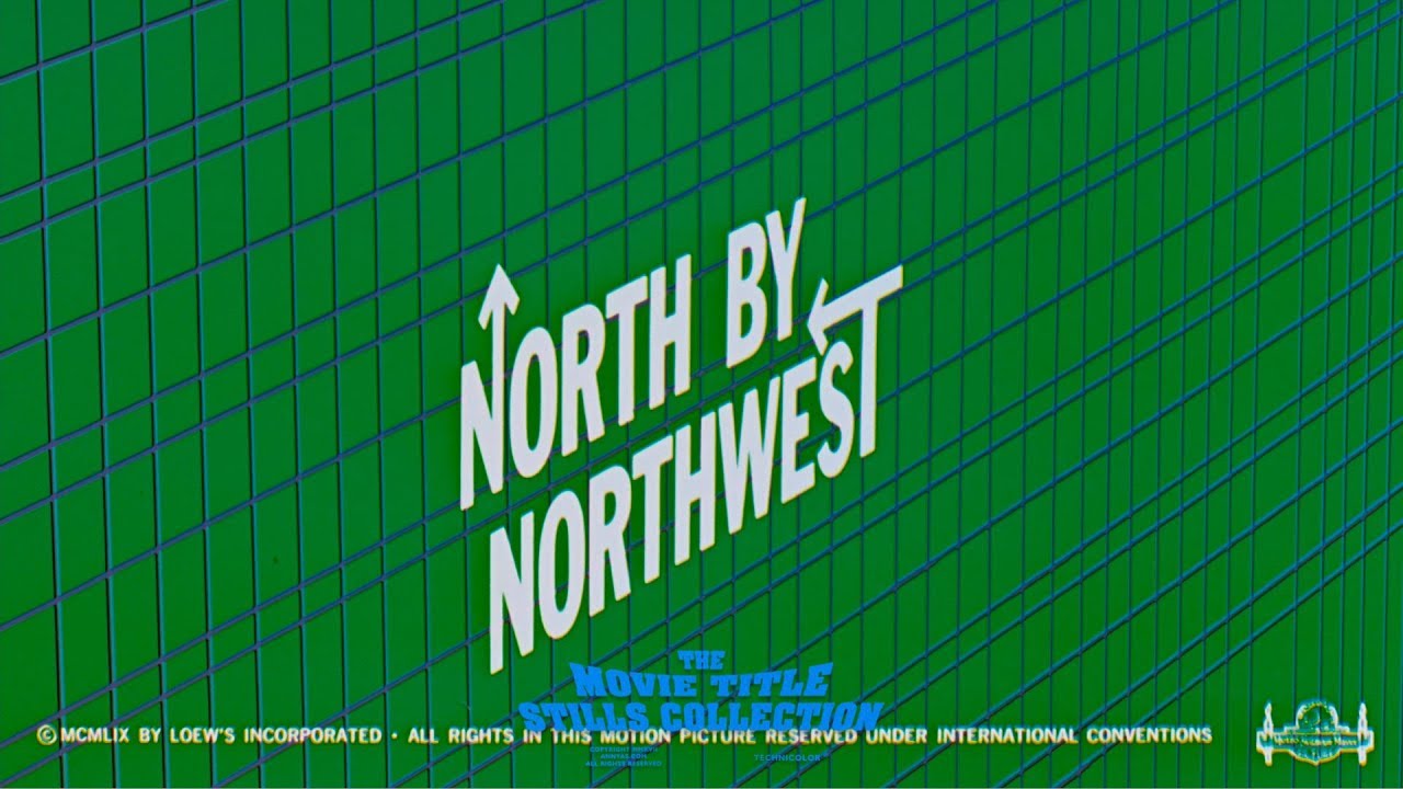
04. Saul Bass Typography in North by Northwest (1959)
David Airey, who works with clients worldwide from an independent design studio in Northern Ireland, points out that the custom type designed by Saul Bass for Hitchcock’s 1959 film has become a classic example of iconic type in movies. "The cool sophistication of the title sequence reflects that of the main character – a New York ad exec whose world is turned upside down when he’s mistaken for a spy," David points out. "The opening credits move up and down the side of a large office building like elevators," which further reinforces how type design can live within a film world, reinforcing its narrative.
05. Courier in The Matrix (1999)
Over the years, there have been quite a few discussions around what exactly the font on Neo’s computer is, and the consensus that seems to make the most sense is that it’s Courier, a monospaced serif typeface that’s widely associated with typewriters and coding. It makes it a fitting choice for the digital themes explored in The Matrix and the film’s iconic green code, which cascades down the screen, is set in a variant of Courier which symbolises the artificial nature of the Matrix and its connection to computing.
More generally, Courier’s association with coding and machinery is an obvious choice – designed in the 1950s for IBM’s typewriters, its letters and characters each occupy the same amount of horizontal space (hence ‘monospace’), which gives it a uniform, perceivably strict mechanical appearance. When typed in 12pt, one page of Courier is exactly one minute of screen time, which is why it’s a reliable type for scripts and screen direction.
06. Kabel in Lost in Translation (2003)
Sofia Coppola is known for creating atmospheric worlds upon which choosing the right typeface can significantly affect the mood and style of viewing. Lost in Translation was her breakthrough hit, and the use of Kabel, a geometric sans-serif typeface designed by Rudolf Koch in 1927, plays a subtle but significant role in the title sequence of the film.
While Kabel was designed in the 1920s, it saw a resurgence in the 1970s and 1980s in travel and tourism materials and this retro association subtly evokes the idea of being in transit, which mirrors the film’s themes. The text echoes the film’s mood well, and its understated elegance reflects the sense of isolation and vulnerability. Incidentally, it’s also the font used in the original version of the Monopoly game.
07. Aachen in Pulp Fiction (1994)
Aachen is a sturdy, blocky slab-serif typeface, known for its thick strokes and compact structure. Like the film Pulp Fiction, it demands attention, with a bold, loud and aggressive form that echoes the film’s unapologetic energy. The type has a physical weight to it – it’s chunky, dense, and carries impact, much like the film’s unforgettable characters and moments.
The film’s logo and promotional material could often be seen using Aachen in bright yellow on a red background, a combination that feels both urgent and reminiscent of old-school movie posters, fast-food branding and pulp magazine covers. It's memorable for all the right seasons.
08. Cooper Black in Napoleon Dynamite (2004)
The typeface Cooper Black has a storied history. As well as being the font for the ‘Vote for Pedro’ shirts in Napoleon Dynamite, it also graced the cover of the Beach Boys’ Pet Sounds album and throughout the 20th century, could be seen on everything from sweet wrappers to advertising hoardings and shop front signs. Why? It’s largely because its inventor, Oswald Cooper, utilised new Linotype technology to create a full display typeface that could be somewhat universal, negating the need to cut individual letters out of wooden or metal blocks for printing.
Its curved shape and irregular forms also worked well for the limited space newspaper advertising afforded, and if you pick up a piece of print from the mid 20th century, it’s likely that Cooper Black will be ubiquitous. It works in Napoleon Dynamite because of this very ubiquity – because the film is set in a small Idaho town that feels frozen in time, this typeface reinforces the fact that this font is what you’d see each day. It doesn’t feel polished; it resonates a handmade charm that the film echoes and its bold but not intimidating – much like the film.
09. Albertus in the Prisoner (1967)
The Prisoner was a 1960s TV series that follows the story of ‘Number Six’, an unnamed British intelligence agent who before a planned trip abroad is kidnapped and trapped in a re-creation of his own home in a location known as ‘The Village.’ This mysterious location turns out to be a utopian nightmare – bright and cheery on the surface but controlled by an unseen authority.
The font Albertus is prominent in the series, both in terms of the title sequences but also on props and signage in The Village. Designed in the 1930s by Berthold Wolpe, its sharp angles and uneven letterforms can be seen to subtly reinforce a sense of unease and hidden control. In the show, it feels like it’s used as the branding of a secret society or an ancient order, and in fact, in real life Albertus has indeed often been used in official government signage, war memorials and even military branding, so it carries a weight of institutional power that the show capitalises on.
For more on typography, see our pieces on font pairing and best menu fonts.

Thank you for reading 5 articles this month* Join now for unlimited access
Enjoy your first month for just £1 / $1 / €1
*Read 5 free articles per month without a subscription

Join now for unlimited access
Try first month for just £1 / $1 / €1
Get the Creative Bloq Newsletter
Daily design news, reviews, how-tos and more, as picked by the editors.

Jacob Little is a freelance writer and photographer and over the past ten years, has written for several national publications and brands. Based near Bristol, technology and the creative industries form the basis of his work, and he also provides content planning and project scoping services for agencies and businesses.
You must confirm your public display name before commenting
Please logout and then login again, you will then be prompted to enter your display name.
![The Royal Tenenbaums | Original Trailer [HD] | Coolidge Corner Theatre - YouTube](https://img.youtube.com/vi/-DNAI9bhBFU/maxresdefault.jpg)
![Stranger Things | Title Sequence [HD] | Netflix - YouTube](https://img.youtube.com/vi/-RcPZdihrp4/maxresdefault.jpg)


