(Image credit: Ragged Edge/Brunswick Music Festival)
Flyers are one of the oldest and most popular forms of print in the world. People everywhere with an urge to make or shout about their message have used a flyer to do so. They're cheap to produce large quantities of and easy to distribute to a large number of people, so companies and artists alike all have the challenge of bringing something new to the tradition of the flyer.
In a world where you're more likely to discover an event on an Instagram story than in a magazine or on a poster, it's refreshing when companies and artists choose to use flyers to communicate. It's a refined format that requires only three components; text, image, and physical format, so it takes a lot of skill to make these into something fresh. We've curated a list of 15 flyer design ideas you need to see to inspire your next project. While you're at it, make sure to check out the best flyer templates to help you get started.
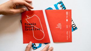
Prémio Douro Criativo is an award celebrating creativity in the Portuguese region of Duoro. With an entire branding scheme centred around the idea of folded paper, it made sense that the flyer for the event wasn't just a flat sheet. Double-sided printing and clever folding to juxtapose different colours and patterns help this design stand out. The identity for the awards was created by Portuguese studio Lateral in collaboration with designer Nick Öhlo.
Latest Videos From Creative Bloq
02. The New York Times Food Festival 2022
(Image credit: Base Design, New York Times Food Festival 2022)
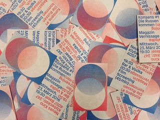
Base Design, one of the most noteable design agencies in the world, brought its own pizazz to the New York Times Food Festival in 2022. People at the event couldn't move for flyers full of snippets of information, each one presented in a different layout. The use of the serif font cleverly encompasses the classical newspaper-print style of The New York Times while combining it with the eye-catching, bright colours and modern shapes used to define the unique look of the event. You can see their whole design of the event here.
03. Brunswick Music Festival 2019
(Image credit: Brunswick Music Festival)
The Brunswick Music Festival reimagined itself with a full rebrand in 2019, with the design agency TRiC creating a full set of posters, tickets, pamphlets and flyers using innovative graphic design inspired by old-fashioned tickets. According to the book Graphic Fest 2, this 'invited' concertgoers to attend in the spirit of embracing both multiculturalism and the arts industry. The bold colour combinations are reminiscent of Lady Gaga's website and product design during her Chromatica era, and the dynamic lines spinning through the text and the shapes make it impossible to look away.
This Liverpool-based designer has taken things back to basics with his self-promo flyer. We love all the amazing things you can do with Photoshop CC and the like, but sometimes you can't beat the old-school combination of a photocopier, scissors, glue and sheer bloody-mindedness. Good work, Zach Darlington, on this retro collage-style flyer.
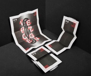
These flyers, created by Studio Bureau for the ceramics department at the Bern School of Design, Switzerland, are the gift that keeps on giving. Publicising a graduation exhibition themed around the German word 'Verzogen', meaning twisted, the eye-catching flyer was designed to be turned and twisted into the exhibition poster.
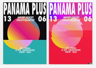
Panama Plus is a subculture festival of art, music, creative performance and writing, and these flyer designs perfectly embody that spirit. Munich-based design bureau Moby Digg, working in collaboration with ZOO, took the vibrancy of the festival as inspiration to create this vivid, colourful artwork. Each piece of material for the show features a circle filled with a different brightly coloured gradient, which is then fed through a glitch generator. The result is a beautiful, eye-catching series of visuals.
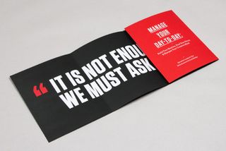
To promote Manage Your Day-to-Day – a 99U book suggesting that the way we work needs to change – Matias Corea, Raewyn Brandon and Jocelyn K. Glei created this fold-out flyer/poster. "The idea was to create a print piece that would give people a succinct overview of the book, while also giving them something with lasting value," says Matias.
"Thus, the piece folds out to create an active experience of learning about the book; then, when it's fully unfolded, the piece works as a motivational quote poster that you can tack up over your desk."
09. Drop Inn Hostel
(Image credit: Bravo, Drop Inn)
This is a simple but brilliant concept for the Drop Inn hostel, based in Singapore. Created by local creative agency Bravo, this luxury and stylishly designed O-shaped flyer informs each recipient that the hostel has dropped its vital vowel and will therefore reward guests who return them with a discount on room rates.
10. CSUS Spring Show
(Image credit: Christine Jackson, California State University)
To promote its student show back in Spring 2011, California State University, Sacramento commissioned designer Christine Jackson to create these promotional flyers.
The back of the flyer provides all the necessary event details
The threading of various icons into the design cleverly demonstrates both the artistic side and connectivity of the graphic and interior design and photography departments.
11. Marshmallow
(Image credit: Ragged Edge, Marshamallow)
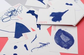
A lot of hype around Marshmallow's iconic rebrand of 2024 was focused on the animated digital graphics, but Ragged Edge – the design agency behind the rebrand – also produced some striking print media to match. This flyer casually placed on a car's windshield shows that the power of using print to get the word out has not been underestimated by the designer. Ragged Edge successfully translated the dynamic digital graphics into print with the modern sans-serif text and the large pink marshmallow-like blob taking up the majority of the flyer, creating a piece of marketing material so beautiful it's almost a keepsake.
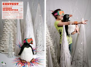
Creative agency Zim & Zou is well known for its spectacular paper art, and this skiing penguin flyer design is a great example. This is no computer wizardry either – the team actually created a snow scene from paper and wire, and photographed it to appear on the flyer (on-set photo included for scale). A specially designed custom font completes the cool design, and all of this was used to promote a snowboard and skiing contest in France.
13. Soi
(Image credit: Eszter Laki, Réka Imre)
Soi is a Thai street food canteen in Geneva, Switzerland. Budapest-based graphic designers Eszter Laki and Réka Imre aimed to capture this cultural mashup in their identity design, which includes these postcard-style flyers. The logo is based around the colours of the Thai flag, with comic-strip style lettering, while the flyers feature typical characters you might find on the streets of Bangkok.
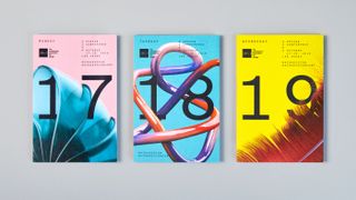
Creating the branding for a gathering of America's leading design association is a daunting task, so when AIGA needed a look for its annual conference, it put the task in the safe hands of leading creative agency Mother Design. The team put together a range of material, including motion graphics, site banners, posters, and these quirky flyer designs.
"Our design solution became a metaphor for the organisation and annual conference itself: evolving over time and embracing the beautiful, messy and sometimes unexpected ways that people and ideas come together in one place," says Mother Design on its website.
French graphic design bureau Nouvelle étiquette created these intriguing flyers for an open studio event in the Alsace region. For the 2017 identity, the team drew inspiration from artist François Génot, with each element providing a clue to how Génot creates his artworks.
Following the artist's lead, the design team collected different objects, placed them on a pre-printed background, and spray painted around them to create a silhouette. It's worth checking out the project on Behance for a glimpse into the weird and wacky creative process.
Mabel is a freelance writer, artist and filmmaker. When she's not writing about the arts industry, books or culture, she's working on writing and illustrating her stories or developing experimental filmmaking projects. Working in journalism, poetry, documentary-filmmaking, illustration and fiction, storytelling is at the heart of what she does. She started writing articles in online magazines when she was seventeen. After training at the BFI Academy and then studying at UAL, she is now continuing to write articles while she works on creating and launching her first books and films.