Five killer ways to use mobile navigation
When diving into RWD, it’s important to make sure users don’t get lost – so you need to give them the navigation they deserve, advises Gene Crawford
This article first appeared in issue 236 of .net magazine – the world's best-selling magazine for web designers and developers.
Responsive web design is the new great industry progression in how you approach making your website usable across different mobile devices. The big three elements that make up a proper responsive website are: fluid grids, media queries and flexible media. These are great, but are primarily tech-focused. There is a pretty big hurdle in figuring out what to do with all the interactions and design elements on your website as you fit your work into much smaller screen widths.
The most important interaction is the main navigation. There are quite a few design patterns for how this can be handled successfully, but there are also some basic considerations you need to take into account to make something truly easy to use.
One is that there is a design factor in what a person can reach on the screen with the use of one hand. So the links or buttons on your design need to be large enough that a user can target them with their finger, preferably their thumb.
Scrolling isn’t a huge issue. The trick is to make sure the major interactions don’t scroll. If you design a slide-out navigation or have so many links in your navigation that it scrolls into another screen view, then you risk pushing the user to make errors.
Another concept to grapple with is that people are typically splitting their concentration when using a website on their mobile phones. I’ve seen this described in a way that suggests you need to make the design for the mobile space easy to use for dummies. But not putting all your attention into something and being dumb are two very different things, so spend some time empathising with how someone would be using the website in a hurry before assuming they just aren’t interested.
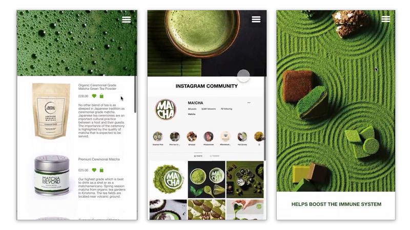
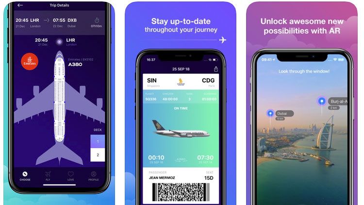
Five examples to check out
Mobile website design: 25 pro tips, over at Creative Bloq.
Get the Creative Bloq Newsletter
Daily design news, reviews, how-tos and more, as picked by the editors.

Thank you for reading 5 articles this month* Join now for unlimited access
Enjoy your first month for just £1 / $1 / €1
*Read 5 free articles per month without a subscription

Join now for unlimited access
Try first month for just £1 / $1 / €1
The Creative Bloq team is made up of a group of design fans, and has changed and evolved since Creative Bloq began back in 2012. The current website team consists of eight full-time members of staff: Editor Georgia Coggan, Deputy Editor Rosie Hilder, Ecommerce Editor Beren Neale, Senior News Editor Daniel Piper, Editor, Digital Art and 3D Ian Dean, Tech Reviews Editor Erlingur Einarsson and Ecommerce Writer Beth Nicholls and Staff Writer Natalie Fear, as well as a roster of freelancers from around the world. The 3D World and ImagineFX magazine teams also pitch in, ensuring that content from 3D World and ImagineFX is represented on Creative Bloq.


