Five killer ways to integrate social sharing
Creating your own buttons to get people to Like or tweet your own or your client’s pages isn’t always an option. Matthew Smith takes a look at the right way to integrate social networking into your sites
We’re right in the middle of an era of socialism. Not the political preference, but the phenomenon of sharing everything using your preferred social tool. However, integrating social sharing into your designs can be tricky.
You may gripe about the Facebook Like button or hate Twitter’s tweeting bird, but creating your own buttons to get people to Like or tweet your own or your client’s pages isn’t always an option, or recommended. So assuming we’re going to use the buttons provided by social sites, how can we bring them to our users in a context that makes using them fluid and easy?
These social buttons are essentially mini forms and actions that can be taken on a page. Although each social sharing process is unique, they should all be handled with design care so the user feels well-informed about their sharing choices and how to do it quickly so they can keep enjoying your site.
You can do this by creating the context for action. Social sharing actions are a kind of metadata on a site, and can be pulled aside using whitespace, a utility box or using a persistent vertical travel to get the user’s attention.
Sometimes, conventions can be worth breaking, but often on the web there are conventions that help users who may not even know what a web browser is. Whether or not you change the overall characteristics, placing the buttons near other metadata or titles can help draw appropriate attention to them. If you leave the buttons in their native state, you can emphasise or separate them with context. This can be a way to customise the look and feel without breaking the best parts of the convention.
Five examples to check out
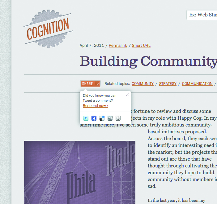
1. Cognition The blog of website design and development firm Happy Cog uses a strong orange highlight within an otherwise muted colour scheme and pulls all the social sharing buttons into one common button with a drop-down menu of options.
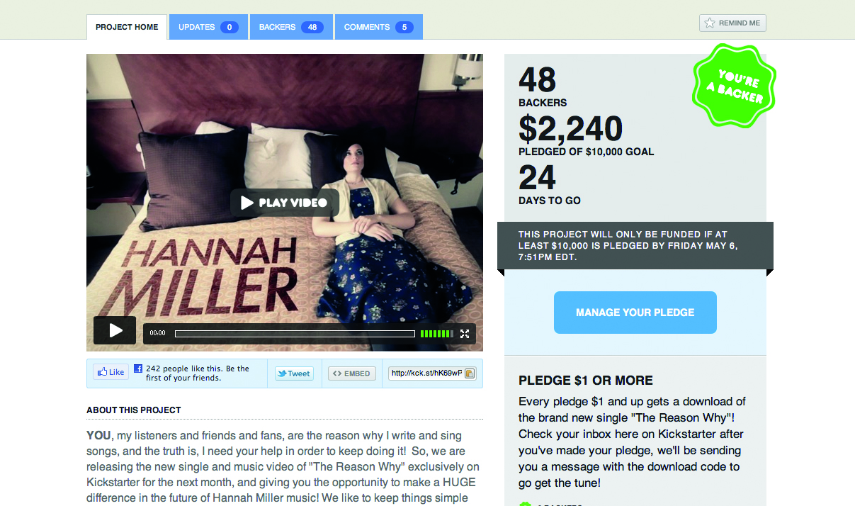
2. Kickstarter I think my favourite approach to social sharing distinction at the moment is the tool bar created for funding platform Kickstarter. It’s pulled a group of the social buttons into a clean blue block on a white background, subtly setting it apart from the rest of the content.
Get the Creative Bloq Newsletter
Daily design news, reviews, how-tos and more, as picked by the editors.
3. Reuters The news website Reuters pulls a host of social links into a column on the right-hand side next to the article, keeping all the tools, including emailing and printing, together in one easy space.

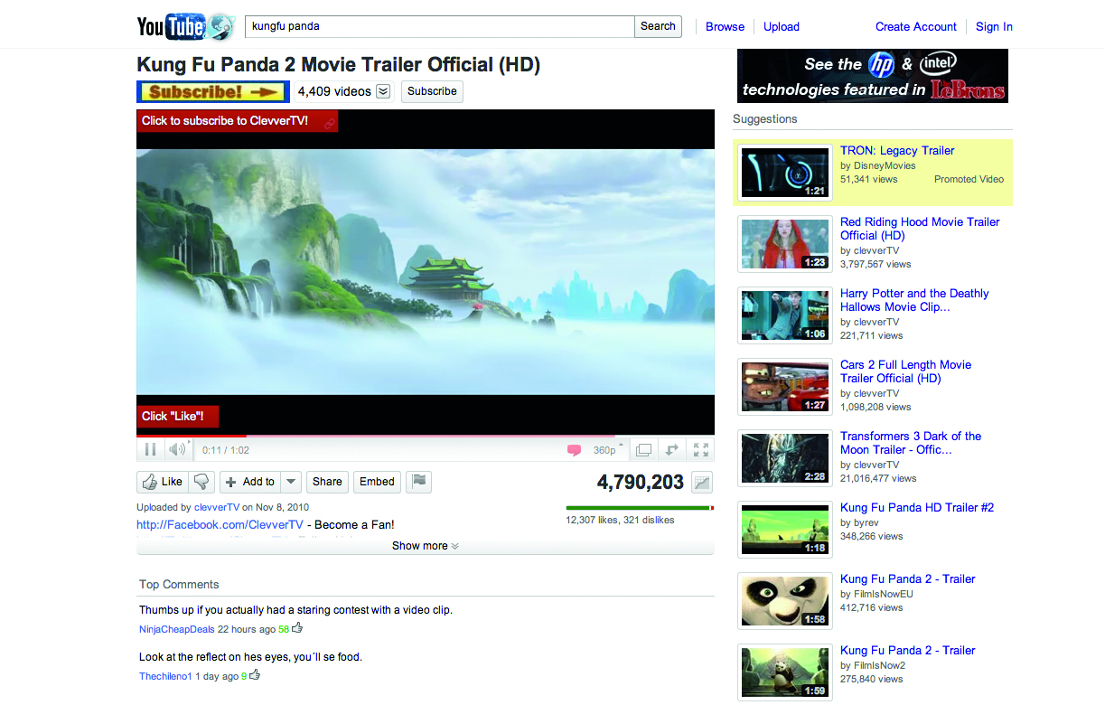
4. YouTube YouTube is a big player in the social sharing space. It gets its sharing links out of the way by muting them in grey, removing the trademark colours. This is especially appropriate considering the focus it needs to keep on the video.
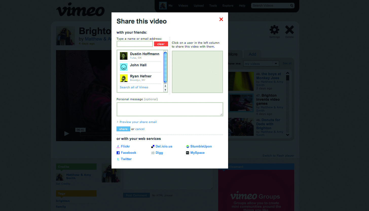
5. Vimeo Vimeo uses a simple sharing icon in its player that opens a modal window with a host of sharing options to enable the user to make simple decisions to share videos in a personal way.
What are you favourite ways of integrating social networking? Let us know in the comments!

Thank you for reading 5 articles this month* Join now for unlimited access
Enjoy your first month for just £1 / $1 / €1
*Read 5 free articles per month without a subscription

Join now for unlimited access
Try first month for just £1 / $1 / €1
The Creative Bloq team is made up of a group of design fans, and has changed and evolved since Creative Bloq began back in 2012. The current website team consists of eight full-time members of staff: Editor Georgia Coggan, Deputy Editor Rosie Hilder, Ecommerce Editor Beren Neale, Senior News Editor Daniel Piper, Editor, Digital Art and 3D Ian Dean, Tech Reviews Editor Erlingur Einarsson, Ecommerce Writer Beth Nicholls and Staff Writer Natalie Fear, as well as a roster of freelancers from around the world. The ImagineFX magazine team also pitch in, ensuring that content from leading digital art publication ImagineFX is represented on Creative Bloq.
