Easy ways to add texture to vector graphics in Photoshop
How to give your vector graphics a distressed and textured look in Photoshop.
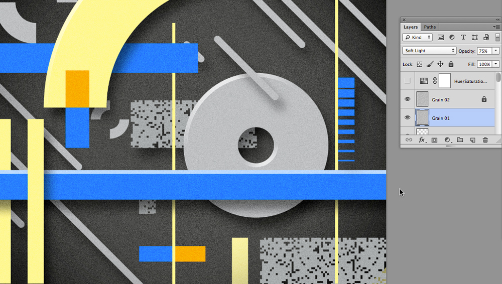
Everyone loves a nice clean vector graphic, whether it be a logo design or an intricate illustration, the appeal of vector art is the perfect lines and solid flat colours that they provide. Sometimes however this cleanliness and perfection is not always appropriate for a job and a more human edge is required to bring the piece to life.
Through the next few stages I'll demonstrate how to quickly and easily apply textured elements to your flat vector graphic in Photoshop, from the fairly basic to the more advanced layer mask options.
01. Applying an overall grain
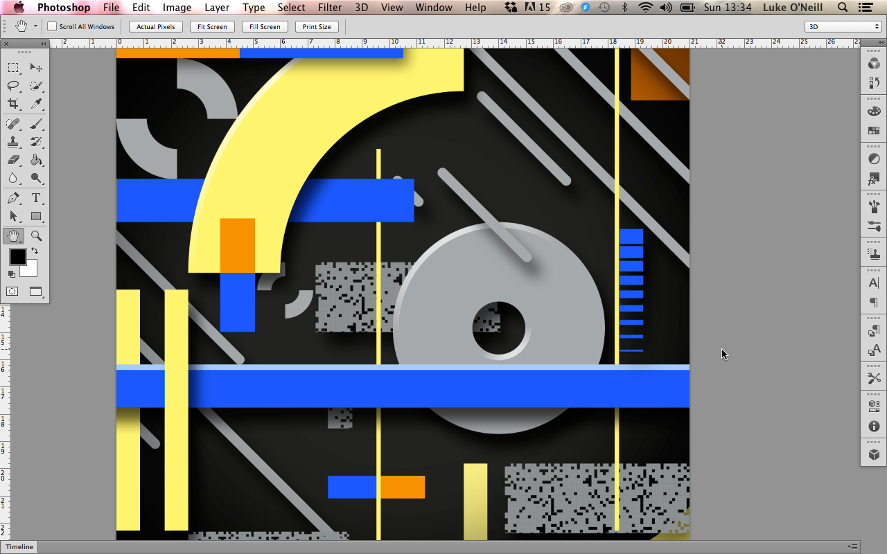
One of the simplest ways to add an overall subtle texture to your work is to apply a film grain filter to it that will take the harsh cleanliness of the vectors away. Begin by opening you vector file in Photoshop, either by simply dragging the Ai file onto the PS icon or by copying and pasting the elements across.
Create a new layer at the top of your layer stack and fill it with white. Ensuring that you're working in RGB mode, navigate to the filters gallery and from the artistic menu select film grain. Adjust the sliders until you're satisfied with the results and apply the filter.
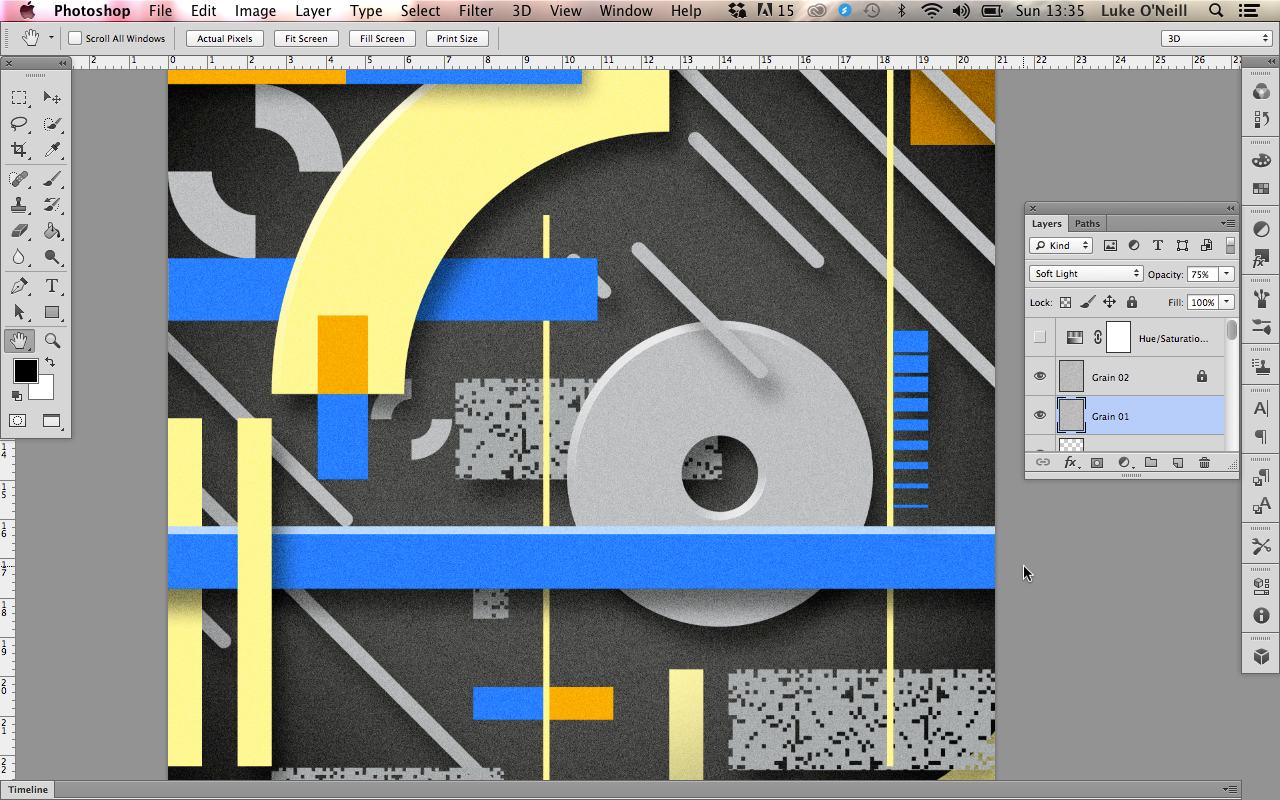
Now set the layer blending mode to soft light and adjust the opacity until you;re happy with the results. Lock the layer and leave it at the top of the stack and everything you create underneath will be affected by the grain layer.
02. Applying a custom overall rough texture (i)
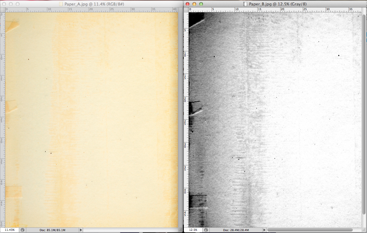
Although there are some default PS textures that can be found under the pattern fill function, they're not the best for achieving an authentic look as they're far too uniform. It's always best to use real world textures and either scan them in or photograph them. In this case I have an old piece of yellowing and crewed paper that I've found.
Begin by converting the document to grayscale and then navigate to the levels panel found under Image>Adjustments. Now simply pup the contrast of the black and white image using the sliders bearing in mind that the more contrasty and grungy looking you make the paper then the more intense the textured effect ail be.
Get the Creative Bloq Newsletter
Daily design news, reviews, how-tos and more, as picked by the editors.
03. Applying a custom overall rough texture (ii)
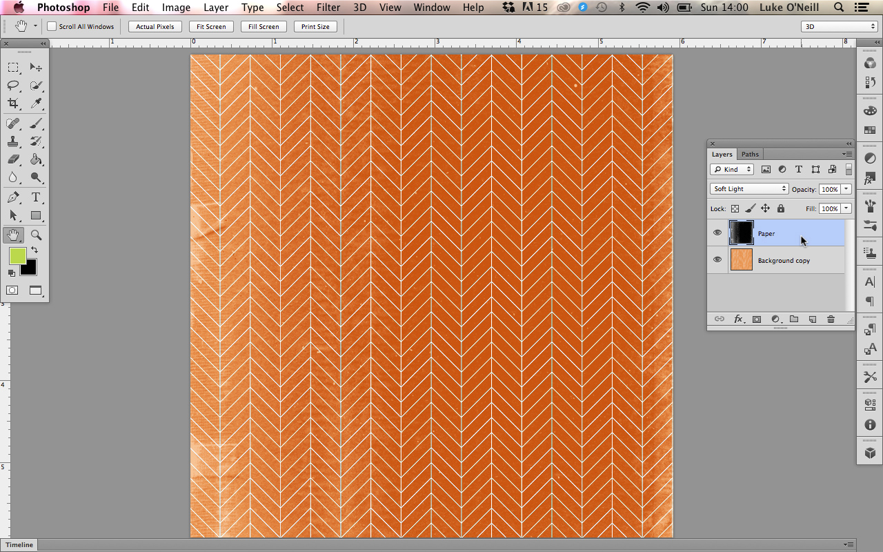
Now simply paste the texture over any existing document you may have to apply the texture. In this case I've gone for soft light as the blending mode again as it blends the texture with the background colour rather than Multiply which will simply overlay the black and white image. In this case I also hit Cmd+I to invert the texture red image so that the darker areas are in the middle and the lighter areas on the outside of the image.
04. Applying textures to individual elements using layer masks (i)
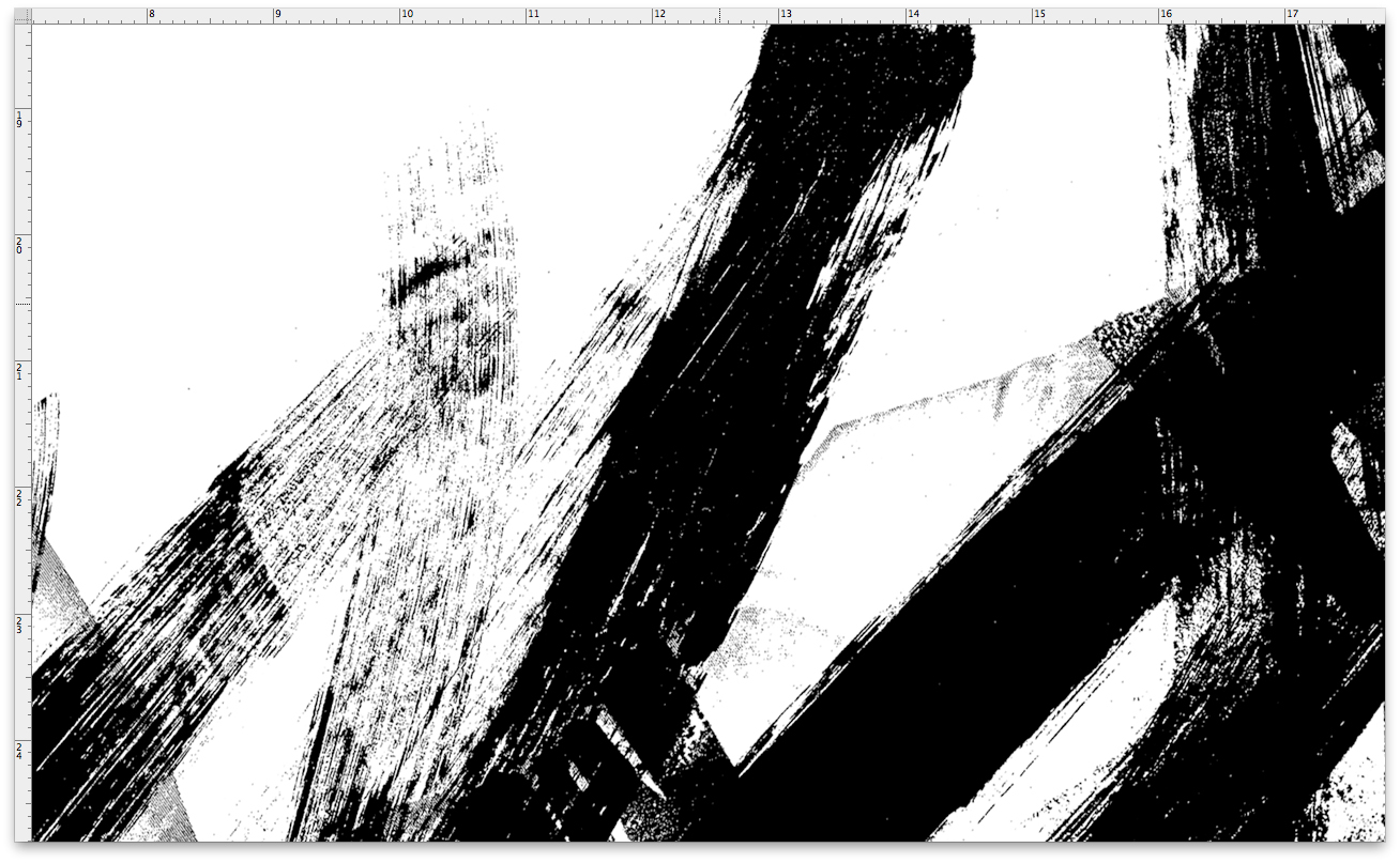
Now for a little more advanced technique using layer masks. Begin in the same way that we did in step 03 by picking your texture and ramping the contrast right up, in this case some rough paint marks.
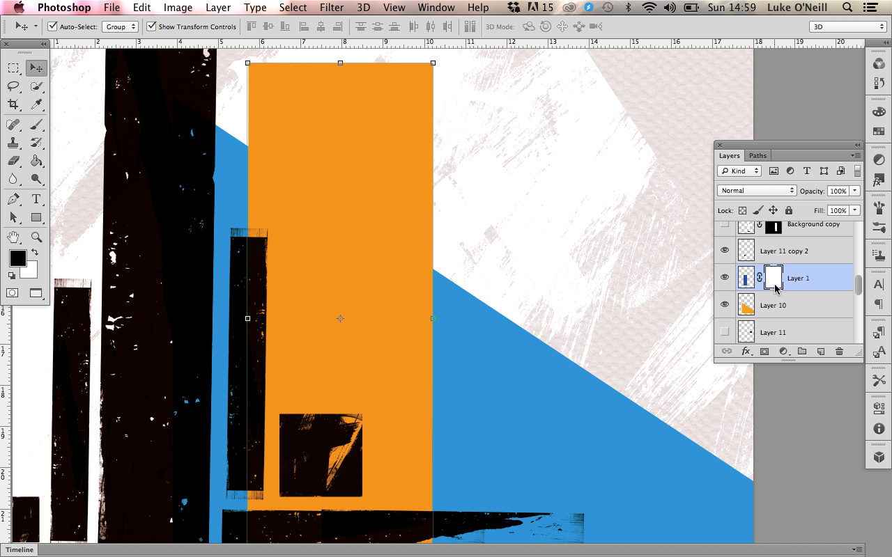
Now navigate to the PSD and the specific layer that you want to affect with the texture. Select the layer and hit the 'add vector mask' found at the bottom of the layers panel.
05. Applying textures to individual elements using layer masks (ii)
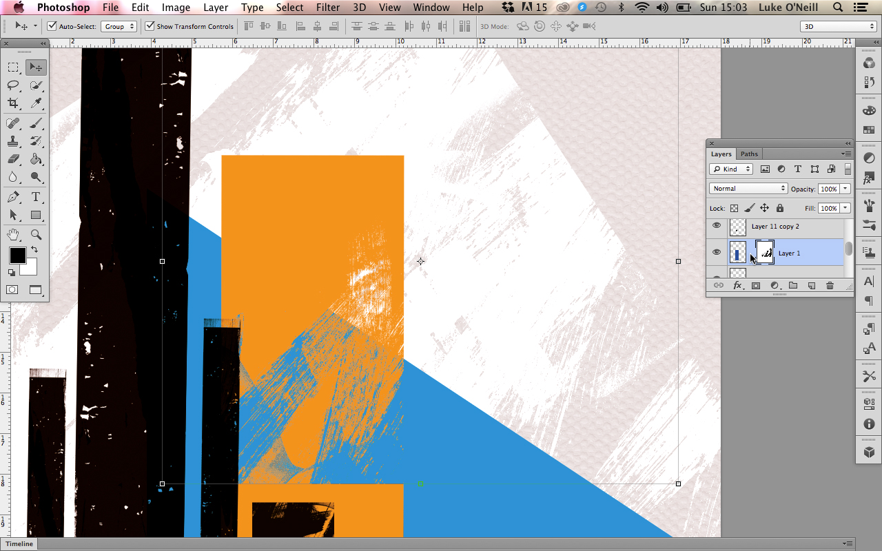
Now that we've applied the layers mask, click on the layer mask thumbnail whilst holding Alt to show just the layer mask. Now we can paste the texture layer into the layer mask and the black textured areas will be knocked out of the layer. Simply Alt+click again to view the effect. To move the texture within the layer then simply deselect the link icon between the layer thumbnail and there layer mask thumbnail.

Thank you for reading 5 articles this month* Join now for unlimited access
Enjoy your first month for just £1 / $1 / €1
*Read 5 free articles per month without a subscription

Join now for unlimited access
Try first month for just £1 / $1 / €1
Luke is a creative director, visual designer and digital artist, who works at THG Studios in Manchester as creative director of beauty. He previously worked for Future Publishing, where he was art editor of leading magazines such as Guitarist, T3 and Computer Arts.
