Design a compact calendar in Fireworks
Alex Brooke discusses the benefits of designing in Fireworks and explains how to use the tool to create a nicely detailed, multi-purpose compact calendar
This article first appeared in the April issue (226) of .net magazine – the world's best-selling magazine for web designers and developers.
These days there are a large number of tools to choose from when it comes to designing. Adobe Fireworks is an easy-to-work-with and extremely efficient piece of software that can be used to make all sorts of goodies – from the simplest of things, such as wireframes, all the way through to more detailed imagery for a website.
I first started out designing in Photoshop before converting to Fireworks, because I’d heard some good things about it and wanted to try something new. Since then I’ve grown to prefer using Fireworks to Photoshop.
Friendly interface
What’s the difference? I find that the Fireworks interface is much better to work with, and the program experience is much more user friendly. I’m keen on the way that the properties panel is laid out, making it very easy to see all of the styles on a shape with just one click of the mouse. All these factors have contributed to me enjoying designing in Fireworks – far more so than I did when using Photoshop.
In this tutorial I’ll be walking you through the process of making a small but detailed compact calendar that can be used for pretty much anything you like. The more detail you add and the more attention you give to the little details in your calendar design, the better your end result will be. You can also carry on some of these useful techniques toward your future designs.
1. New canvas
Open Adobe Fireworks and create a new canvas by selecting File>New. Once the box pops up, set your canvas up with a width of 530px, a height of 325px and a resolution of 72 px/inch with background colour set to white. This will be our base for the calendar.

2. Panels
Before you get started, make sure that your Properties and Layers panels are open (Window>Properties; Window>Layers). Path is another useful panel (Window>Others>Path). These will be used throughout the tutorial so it’s useful to have them handy.
3. Background
First let’s make a document background. Draw a rectangle of width 530px and height 324px covering the entire canvas. Then in your Properties panel pick the drop-down Solid and select Gradient>Radial. Make your inner colour #333333 and outer one #000000.
4. Top bar
Draw a rectangle, size 218 x 46px, and create a gradient, this time selecting Linear instead of Radial. Set your left-hand colour on the slider to #C65806 and the right-hand to #8B2300. This will be the base for the top bar of your calendar (this will later contain the month).
Get the Creative Bloq Newsletter
Daily design news, reviews, how-tos and more, as picked by the editors.
5. Style up
To style it up, click the box by the pencil icon in your Properties panel and set colour to #C55706, with 1px wide and Hard line set in the next boxes. Click Filters>Photoshop Live Effects and tick Stroke. Set size to 1, position to Outside and colour to #8D2500.
6. Draw circle
Now, draw a white circle, size 11 x 11px, by pressing the U key until the Ellipse tool displays in your Properties panel. Position the circle with roughly 6px of padding around it at the top of the rectangle you’ve just made.
7. Duplicate
Next, duplicate (by copying and pasting) the circle 14 times and position the circles along the top of the rectangle as you go by pressing Shift + >, setting them around 3px apart. This will create a row of evenly spaced white circles along the top of your rectangle.
8. Punch in
We now need to make the circles look ‘punched into’ the rectangle. First, ensure your Paths panel is to hand (Window>Other>Path) and inside the panel look for the Punch Path button (this is the button with a filled semi circle and a transparent circle, joined together).
9. Make holes
Click on all the circles and the rectangle while holding down Shift. Inside your Path panel click the Punch Path button and continue clicking it until all of the holes have been punched through, so that we can see the dark background through the holes.
10. Ring binder
The next step is to make the ring binder style for the top of the calendar. Create a 6px wide by 17px high rectangle, with roundness set to 100% in your Properties panel. Duplicate the rectangle and position each one over one of the holes you’ve just created.
11. Linear gradient
Now let’s add styles to the rectangles to make them look more realistic. To do this we will add a linear gradient (go to Solid>Gradient>Linear) and from left to right in the Gradients panel add #999999, #FFFFFF, #999999 and #FFFFFF and drag them apart in order to create a realistic style.
12. Add month
We will now add a month to the calendar header. Press the T button on your keyboard to select the Type tool. Position the cursor over the header and, for this example, type December 2011. Now make sure that your text is set to Arial, weight Regular and size 15px with the B button selected.
13. More detail
To make the calendar more detailed let’s style up the month text. Set the text colour to white, if it hasn’t automatically been done, and select Filters>Photoshop Live Effects. Tick Drop shadow and set colour to #421200, distance to 1, size to 0 and opacity to 100%.
14. Create triangle
Hit your P button and use the pen tool to draw out a rough triangle (using the Shift key to roughly align points). Now press A for the Direct selection tool, zoom in and line up the points correctly by clicking them and using your arrow keys to align them. Now make the colour #ffffff.
15. Copy and paste
Select your triangle (pointing left or right and making sure it is 7 x 11px in size). Copy and paste it, positioning it over the other side of the orange bar. Now go to Modify>Transform>Flip Horizontal: you now have another triangle facing in the opposite direction.
16. Draw rectangle
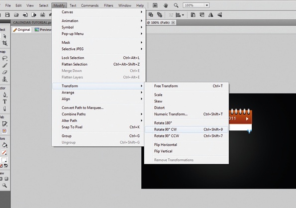
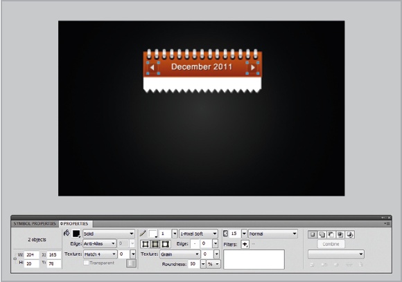
Draw a white rectangle that drops down under the orange bar just completed, size 218 x 22px. Duplicate one of the downward pointing triangles and go to Modify>Transform>Rotate 90° CW. Move this triangle to the bottom of the white rectangle so they touch.
17. Duplicate triangles
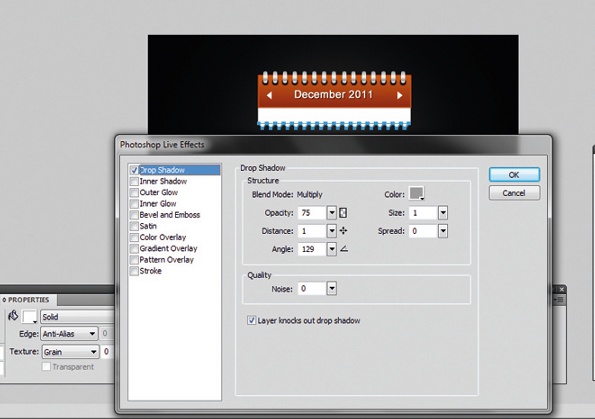
Duplicate this triangle along the width of the white rectangle so the shapes touch. Select all these triangles and go to Filter>Photoshop Live Effects. Tick Drop shadow and set colour to #999999, size and distance to 1 and angle to 129.
18. Button style
To make the top bar triangles look clickable, we’ll create a button style. On your Layers panel, ensure you’re creating a layer behind the triangles. Draw a box of 20 x 20px and set colour to #000000, opacity to 15, border to 1-pixel soft #ffffff and roundness to 50.
19. Create days
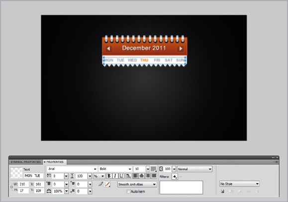
Now using the T button write MON, TUE, WED, THU, FRI, SAT, SUN (with two spaces in between each day of the week) and format it as Arial, Bold, 10px, colour #999999 and selected day in #F27900. Position this in the centre of the white bar.
20. Main calendar
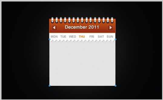
Now we’ll move on to the main part of the calendar. Ensure this layer is positioned beneath the triangle layers (by dragging the selected layer below your current layers on your Layers panel) and draw a 218 x 153px rectangle, colour #E1E1E1, set as the background.
21. Divide days
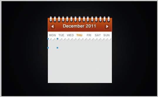
To divide up the days, we’re going to have to split this rectangle up into a 5 x 7 grid. To do this we will draw a square sized 32 x 31px and place this in the top right corner of our rectangle (so it is positioned slightly underneath the triangles).
22. Apply border
Now, apply a 1-pixel soft #CCCCCC border to the square, duplicating it six more times while spacing it horizontally. Select the squares along the top of your rectangle and copy and paste them four more times, moving them downwards to fill up the rest of the space.
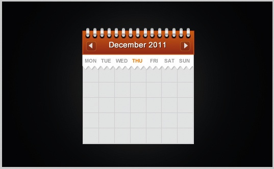
23. Add dates
Now the basic grid for the calendar has been created, we can begin adding the dates of the month. For this example we’re using December so in each grid box, work horizontally and write the numbers from 1 to 31. You should have some empty squares once done.
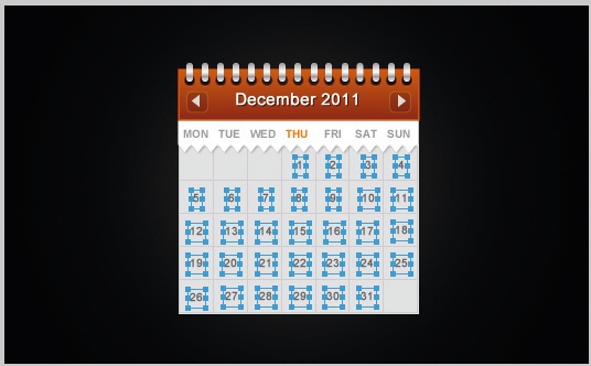
24. In the centre
Make sure that your dates are set to Arial, size 10, colour #666666 with the B box selected. Also, before carrying on, check that each date is positioned in the absolute centre of its square: this is for neatness and will make the overall calendar look far more professional.
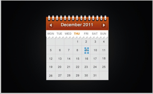
25. Empty squares
Find the empty squares (there should be three at the beginning and one at the end of the month. Copy and paste the existing square over each one and set the colour to #000000, border to #000000 and opacity to 10. This should create a ‘dulled out’ effect on these boxes.
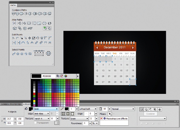
26. Orange overlay
Now, on the selected day of the month (the day that it is today; for this example we’ll use 1 December) we’ll copy and paste the original square over the top of itself and set colour to #FF6600, border to #FF3300 and opacity to 40, creating an orange overlay.
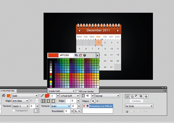
27. Text colour
Now, in order to emphasise that this is the day that has been selected, let’s change the text colour of the ‘today’s’ date. Select the date and set the colour to #B7370C. This creates a darkened effect on the text, which reiterates that it is today’s date.
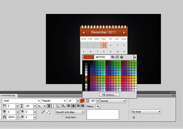
28. Feel complete
Finally, in order to make the calendar feel more complete select each box that you have created in the grid and go to Filter>Photoshop Live Effects. Tick Stroke and set the colour to #ffffff, size to 1, position to Outside and opacity to 50.
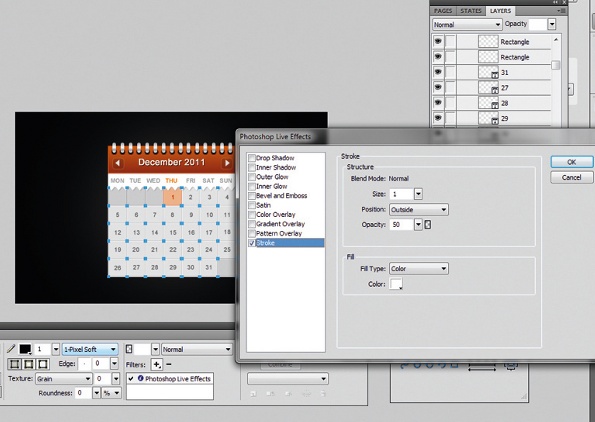
For more on the subject, check out
Jonathan Snook's 8 essential Fireworks tips for web design
.

Thank you for reading 5 articles this month* Join now for unlimited access
Enjoy your first month for just £1 / $1 / €1
*Read 5 free articles per month without a subscription

Join now for unlimited access
Try first month for just £1 / $1 / €1

The Creative Bloq team is made up of a group of art and design enthusiasts, and has changed and evolved since Creative Bloq began back in 2012. The current website team consists of eight full-time members of staff: Editor Georgia Coggan, Deputy Editor Rosie Hilder, Ecommerce Editor Beren Neale, Senior News Editor Daniel Piper, Editor, Digital Art and 3D Ian Dean, Tech Reviews Editor Erlingur Einarsson, Ecommerce Writer Beth Nicholls and Staff Writer Natalie Fear, as well as a roster of freelancers from around the world. The ImagineFX magazine team also pitch in, ensuring that content from leading digital art publication ImagineFX is represented on Creative Bloq.
