Data visualisation compo winners
Winner of Information is Beautiful competition gets an iPad 2

Back in May we told you about a competition to create a data visualisation run by Postgrad.com and David McCandless of Information is Beautiful.
Entrants were given a data set relating to the demographics of university students in the UK, and were free to mash it up with additional data of their choice. It was judged by a panel including McCandless and our very own art editor, Rob Bowen. The winners have now been announced!
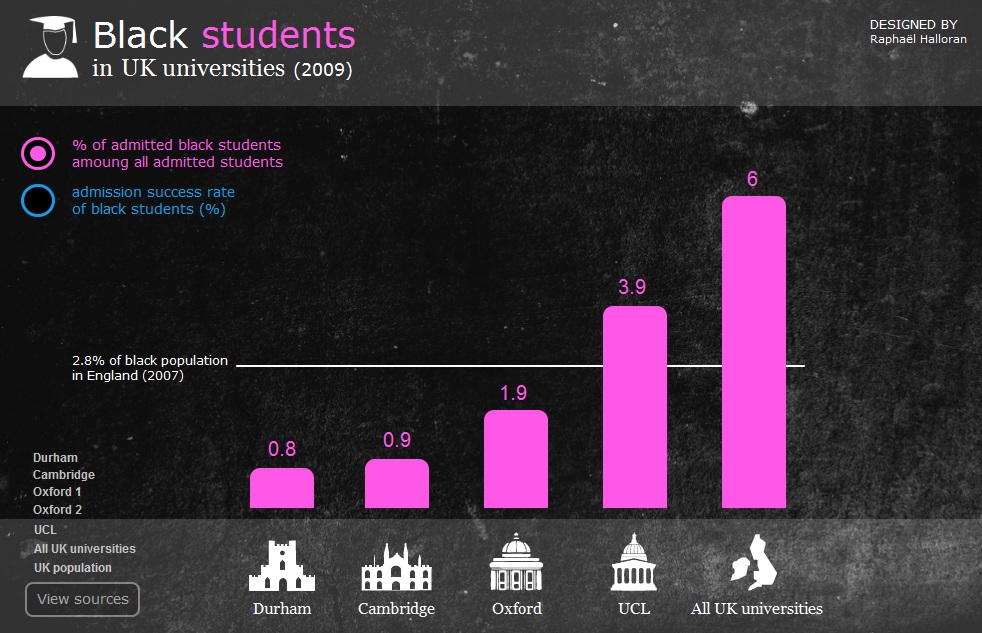
In first place is Raphal Halloran, who used an uncluttered design to make the data easy to absorb. It's an interactive chart built in HTML5 - click through to try it out.
Judge Bowen said “The competition was strong. It was hard for me to choose between the top three or four but Raphal's solution encompasses what Data Vis is all about. It delivers information in a clean, concise and well thought-out way.
"The eye-catching simplicity is what makes this work along with boldness of the colour palette and the addition of neat visual aids to identify specific universities.”
Second place went to Dave Bowker and third to Jon Schwabish. You can see these and the runners up on the Postgrad Blog entry.
For more on data visualisation, take a look at our interview with David McCandless.
Get the Creative Bloq Newsletter
Daily design news, reviews, how-tos and more, as picked by the editors.

Thank you for reading 5 articles this month* Join now for unlimited access
Enjoy your first month for just £1 / $1 / €1
*Read 5 free articles per month without a subscription

Join now for unlimited access
Try first month for just £1 / $1 / €1

The Creative Bloq team is made up of a group of art and design enthusiasts, and has changed and evolved since Creative Bloq began back in 2012. The current website team consists of eight full-time members of staff: Editor Georgia Coggan, Deputy Editor Rosie Hilder, Ecommerce Editor Beren Neale, Senior News Editor Daniel Piper, Editor, Digital Art and 3D Ian Dean, Tech Reviews Editor Erlingur Einarsson, Ecommerce Writer Beth Nicholls and Staff Writer Natalie Fear, as well as a roster of freelancers from around the world. The ImagineFX magazine team also pitch in, ensuring that content from leading digital art publication ImagineFX is represented on Creative Bloq.
