Cultural factors in web design
By factoring in cultural variables, we can create sites that are relevant for a wide variety of users around the world
Over the past three years, we’ve been captivated by media queries. Our focus on responsive design has been incredibly successful, especially when you look at statistics saying the majority of web users demand mobile ready sites. I believe that something is still missing. By looking so exclusively at technology and code, we have largely ignored cultural differences and the global mindset necessary in our connected world. We need to start using cultural queries in our designs as a way to adapt content for different groups of people.
Culture eats strategy for breakfast
In the rush to check sites across devices and widths, we often completely forget to build things that are responsive to the culture of the user. Culture deeply affects how users interact with our apps and sites. Even seemingly generic things like icons or images make a difference. I try to remember that there’s a difference between someone understanding an interface and someone accepting an interface.
There is a group of people in Australia called the Guugu Yimithirr. They use cardinal directions, meaning everything to them is north, south, east, or west. Instead of saying ‘turn left’, they say ‘turn north’. For languages and cultures like this, what real meaning do our digital wayfinding systems have? Which way is scroll down, or go back? Instead, we need design that is culturally responsive, that can adapt to these kinds of differences.
Defining cultural variables
It helps to be able to quantify cultures. Importantly, this is not a way to make blanket statements about people from certain countries, but a way to clarify how groups interact with each other and the internet. Cultural variables have been written about since the 1970s, and are an accepted way of speaking about cultural variance across the world. With that caveat said, here the variables that matter.
High context versus low context cultures

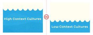
Some cultures are High Context. This means most communication is simply understood rather than explicitly stated. These cultures have a much higher tolerance for ambiguity and understatement. You could say that, in a High Context culture, the responsibility for understanding rests with the listener and it’s left to them to divine deeper meaning from the conversation or statements coming at them.
Low Context cultures, on the other hand, are much more explicit and often rely on directness and true feelings to communicate. These cultures are great at creating an external set of rules and responsibilities for the members of society as this is the only way that people can figure out what is to be done. In these types of cultures, the responsibility for understanding is on the speaker to convey their ideas clearly and without ambiguity.
Within these two types of cultures, there are four variables that I believe have a huge impact on the design, and more importantly, the acceptance of that design by users around the world. They are each related to a High or Low context culture.
Get the Creative Bloq Newsletter
Daily design news, reviews, how-tos and more, as picked by the editors.
1. Ambiguity and directness

Some groups of people tolerate a much higher level or ambiguity than others. We often speak of being direct and to the point with our messages on the web, but there are cultures that value ambiguity and a circumspect approach to communication.

2. Collectivism and individuality

While many images and stories in the West have the individual at the core, this is not universal by any means. Some cultures are very group oriented and members gain identity from the group they are in.

3. High power distance and low power distance

This variable refers, basically, to how powerful bosses are. High Power Distance societies tolerate a high level of authority in their leaders, and their orders are often unquestioned. Symbols of this power are important. On the other hand, Low Power Distance societies have bosses that are much closer to their employees in power levels, and instructions can be debated or challenged. Symbols of power aren't seen as relevant.

4. Slow Messaging and Fast Messaging

Slow Messaging refers to the speed that people expect things to happen and this does vary across cultures. Slow Messaging cultures are more easygoing about the speed at which messages and information travel. Fast Messaging cultures demand that information travels quickly and efficiently. It can have a profound effect on how we construct interfaces and feedback mechanisms on the web.

Being culturally responsive
So what do we do for our own sites? People need to feel at home with the cultural references in our designs. By using the variables above, we can create culturally responsive sites that are accepted and used by people across the globe. I propose we use cultural variables to show the appropriate content for specific groups of users in the same way that we use media queries to show content according to viewports or breakpoints.
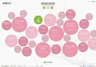
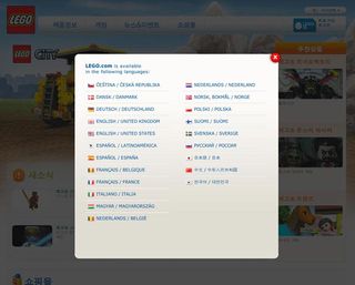
Perhaps the easiest step is to localise the language in your site. Translate the important content, particularly the calls to action, descriptions and contact forms. While you may not be able to make it perfect, it can help to make the site usable for speakers of different languages.

Another step is making the design visually relevant to the user. Add colour, images and queues that are responsive to the users perspective. By referencing culturally significant
themes, it makes your design more welcoming and responsive to the user.

Finally, put it all together. Use media queries to adapt to the content blocks and the viewport, and the variables above to display a site that adapts to the user’s culture.
Adapting
Every culture contains a deepness and richness that comes when groups of people get together. As we design for ever larger audiences and as the web reaches deeper into homes and private lives, we need to think more about how our sites contribute to those cultures. We need to adapt them to a wider variety of situations beyond simply viewport or pixel width. How do we make our fellow humans comfortable with our interfaces and site? Start using cultural queries in our designs.

Thank you for reading 5 articles this month* Join now for unlimited access
Enjoy your first month for just £1 / $1 / €1
*Read 5 free articles per month without a subscription

Join now for unlimited access
Try first month for just £1 / $1 / €1
The Creative Bloq team is made up of a group of design fans, and has changed and evolved since Creative Bloq began back in 2012. The current website team consists of eight full-time members of staff: Editor Georgia Coggan, Deputy Editor Rosie Hilder, Ecommerce Editor Beren Neale, Senior News Editor Daniel Piper, Editor, Digital Art and 3D Ian Dean, Tech Reviews Editor Erlingur Einarsson and Ecommerce Writer Beth Nicholls and Staff Writer Natalie Fear, as well as a roster of freelancers from around the world. The 3D World and ImagineFX magazine teams also pitch in, ensuring that content from 3D World and ImagineFX is represented on Creative Bloq.
