The WTA recently debuted its new visual identity – an authoritative new look that brings us into a refreshingly bold era for women's tennis. Like many of the best rebrands, the WTA's new look doesn't rely on aesthetics alone, establishing an empowering message to inspire future generations and "rally the world" behind the dynamic sport.
While some critics (and players) have slammed the new logo design, I believe some are missing the point – design is just one side of the multifaceted rebrand. While definitively more minimalist than its predecessor, the WTA's new logo shines in its simple yet bold design, demonstrating how stripped-back visuals can bolster a powerful brand message.
(Image credit: WTA)
The new WTA logo features an upgraded font with a more athletic feel, akin to the bold, italicised design of the EA logo. In line with the brand's heritage, the aptly named "Heritage Purple" brings a rich sense of identity to the brand, while subtle flourishes like the curved bar of the 'A' gesture to the sport itself, imitating the arch of a bouncing ball.
Latest Videos From Creative Bloq
Since its debut, the logo has received harsh criticism, with fans calling it "boring", "generic" and "unnecessary". Among the naysayers was Grand Slam champion Kristina Mladenovic who questioned "What does it represent?” adding that the “Previous logo was so much better.” Traditionally featuring an emblem of a female tennis player, the new logo's sporty, minimalist appeal may at first appear like an erasure of the association's message, but the wider rebrand proves this is far from the truth.
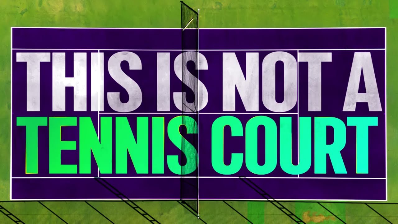
This is not a tennis court. This is our stage. - YouTube
Created by ChapterX and Nomad Studio, the new identity is a future-proof brand that spotlights the WTA's most important asset – its players. Putting tennis' most influential faces at the centre of the brand, the accompanying 'Rally the World' campaign spotlights individual success stories, repositioning the court as a global stage to inspire a new generation of fans. "This bold new brand provides a distinct and powerful voice to tell our stories and showcase the WTA as the global sports and entertainment brand where women’s tennis shines," the WTA's CEO Portia Archer says.
While it's easy to get lost in aesthetics, sometimes stripped-back branding is merely a complementary tool to carry a wider message, allowing us to focus on what really matters. The WTA's new identity is an authoritative, fuss-free identity that symbolises strength in women's sport – contemporary and bold, it's not weighed down by over-engineered design and tired 'female empowerment' branding. The players are the brand, and their talent speaks for itself.
In essence, the WTA's rebrand is the very antithesis of PrettyLittleThing's recent "luxury" rebrand, which uses its sleek design aesthetic to veil its true identity. Design trends come and go, but timeless visuals backed by a strong brand ethos will stand the test of time.
Get the Creative Bloq Newsletter
Daily design news, reviews, how-tos and more, as picked by the editors.
Thank you for reading 5 articles this month* Join now for unlimited access
Natalie Fear is Creative Bloq's staff writer. With an eye for trending topics and a passion for internet culture, she brings you the latest in art and design news. Natalie also runs Creative Bloq’s Day in the Life series, spotlighting diverse talent across the creative industries. Outside of work, she loves all things literature and music (although she’s partial to a spot of TikTok brain rot).
You must confirm your public display name before commenting
Please logout and then login again, you will then be prompted to enter your display name.