Create wireframes that work for you
In this excerpt from The Web Designer's Roadmap, Giovanni DiFeterici discusses the role wireframing plays in design, and how to create a wireframe that suits your own needs
Once all the planning for a site is done and the initial thoughts have been hashed out, we must start putting together concrete ideas for design and structure. Eventually, we’ll reach the point at which we’re working in Photoshop (or the browser, if that suits you) and delicately crafting pixel-perfect designs, but first we need to establish what we’re designing.
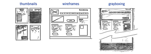
In this article, we’ll discuss thumbnails, wireframes, and grayboxes. We’ll see how they fit into our workflow and what purpose they serve. The article should serve as an introduction to the wireframing process, and an overview of the key decisions it involves.
Why not go straight to Photoshop?
Honestly, it depends on how you prefer to work. No single process works for everyone, and you may trust your instincts enough to just go for it and hammer out your designs in one sitting. More power to you, if that’s the case, but I’d doubt it. Most of us require a little structure to sort out our ideas before we can work with them.
I know a number of designers who essentially skip over the predesign phase of the process and go straight to the likes of Photoshop CS6 for their mockups. They push around pixels until they find a design they’re happy with and serve it up to the client. Sometimes it works and the design is accepted, marked up and shipped out. Sometimes it doesn’t.
More often than not, the designers that can make a great design without sketching or wireframing have a fast internal decision-making process. The designer either goes with the first idea, or they have the ability to quickly and decisively accept or reject ideas on the fly. Really, they are going through the same process that I’m outlining, they just do it internally. Either way, a process still takes place when they attack that blank Photoshop canvas.
Be warned: usually, the ability to solve these problems internally takes a great deal of experience. I believe that the structure provided by a definite process can help ensure that you give every aspect of the design the attention that it needs.
Structure and form
When I refer to the structure of a design, I’m talking about two things. A design must be structured visually, on a per-page basis. The layout must be easy to parse and the content should be organised in a way that lets the user know what’s important and what’s ancillary.
Get the Creative Bloq Newsletter
Daily design news, reviews, how-tos and more, as picked by the editors.
But in addition to organising a page’s content, our designs must make the rest of the site accessible and easy to parse. They should give the user feedback about where they are, what they’ve just done, and how they can reach the next piece of information they want.
I think of it as giving structure to the information that is seen (the visible information on the page) and hidden (all the content not on the current page). Both are equally important, and the best designs find a way to blend the two.
Wireframes
“With client services, sometimes you need to develop a wireframe that’s a deliverable for the client, sometimes you don’t. When you don’t, sometimes you’ll still develop it, but for yourself ... I think there shouldn’t be one way of doing everything every time.” — Dan Rubin
Alrighty. Now is the time for us to tackle the good stuff.
Wireframes are super-low fidelity (which means simple: lines, boxes, text) designs that focus on content hierarchy, general layout and functionality. A wireframe should exclude color, texture or imagery. Instead, it’s a purely structural document that tries to organise content and interaction without all the visual clutter that design elements can create.
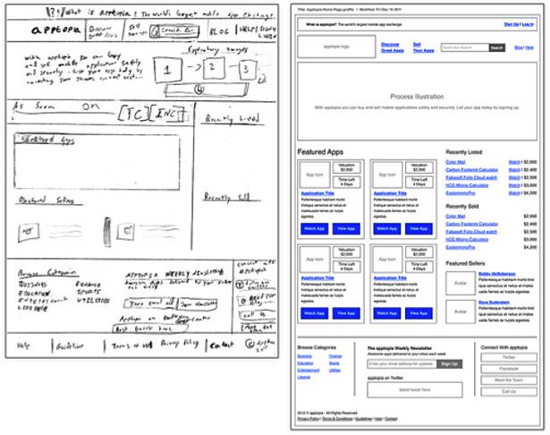
In some firms, the UX designer and the interface designer are the same person, but that’s not always the case. If you’re working in an agency or within a team, the wireframing task will probably fall to another person. Whoever is doing UX will likely hand you a stack of wireframes to work from, so I’d recommend talking candidly with that person to ensure that you receive wireframes of a level of detail that works for you.
How detailed should I make my wireframe?
The level of detail that goes into a wireframe is a subjective decision. The depth of a wireframe often depends on how much of the decision-making process is left to the interface designer and how much is controlled by the UX designer. A detailed wireframe means that the UX designer is already making strong choices about the layout and content hierarchy. But often, wireframes aren’t 'set in stone' documents, so the interface designer has quite a bit of latitude to move content around when crafting a final mockup.
Wireframe detail can also be affected by the amount of content on a page, or the type of content, as the image below proves. A home page with a few lines of text and a couple of big images won’t require a detailed wireframe. Because there are very few elements on the page, carefully organising them hierarchically is unnecessary.
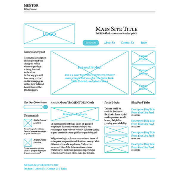
By contrast, a home page for a news site with multiple columns of content, featured stories, social media feeds and video clips will require preplanning. On a busy website, the wireframe should be given more attention because of the need for structure.
More often than not, the quality of a wireframe is dependent upon how the wireframe is used. In some cases, a wireframe can be used to hammer out very concrete layout and hierarchy decisions. In other cases, the wireframe serves as a general guide for the designer to reference when crafting designs.
Very low-fidelity wireframes can give you plenty of flexibility when designing your layout, but often provide few clues about the details of functionality and the structural necessities of a design. High-fidelity wireframes can provide lots of info about the details of a page, but can make you feel boxed in with your design choices. Your designs don’t have to follow the wireframes exactly either, as the example below proves.
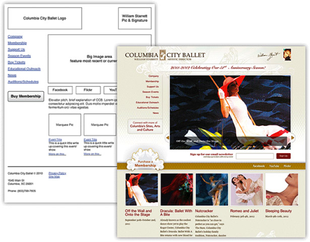
Wireframes are a kind of shorthand for final designs. As such, common elements have a simplified representation. Images are represented as a square with lines crossed through it. Forms are boxes with titles over the top line. Horizontal nav elements are long boxes with evenly spaced titles. Text is ... well, text. But let me emphasise: nothing fancy! A wireframe can have almost nothing to do with how the final design will look, as the image below shows.

When drafting a wireframe, you should be asking yourself four questions:
- What content needs to be on the page?
- How do the different pieces of content relate to one another?
- How might they possibly be arranged?
- How should the user interact with the content?
That’s it. If you’re thinking about fonts and imagery, it’s likely you’re getting ahead of yourself. Just focus on content and structure.
This article is an exclusive excerpt from The Web Designer's Roadmap by Giovanni DiFeterici, published by SitePoint. This 192-page full-colour book covers all the steps from initial inspiration to finished design, helping to make you a more professional web designer.
You can sign up to receive a free sample chapter before you order the book.

Thank you for reading 5 articles this month* Join now for unlimited access
Enjoy your first month for just £1 / $1 / €1
*Read 5 free articles per month without a subscription

Join now for unlimited access
Try first month for just £1 / $1 / €1

The Creative Bloq team is made up of a group of art and design enthusiasts, and has changed and evolved since Creative Bloq began back in 2012. The current website team consists of eight full-time members of staff: Editor Georgia Coggan, Deputy Editor Rosie Hilder, Ecommerce Editor Beren Neale, Senior News Editor Daniel Piper, Editor, Digital Art and 3D Ian Dean, Tech Reviews Editor Erlingur Einarsson, Ecommerce Writer Beth Nicholls and Staff Writer Natalie Fear, as well as a roster of freelancers from around the world. The ImagineFX magazine team also pitch in, ensuring that content from leading digital art publication ImagineFX is represented on Creative Bloq.
