Create a web icon
A cool icon can make the difference between success and failure for your site. Bolivian web developer and graphic designer Alvaro Guzman explains how to create one
Icons are a great way of speeding up navigation by representing often complex ideas or information in a single, simple image.
Icons were first used on computers to signify technical items such as directories, files and hard drives. Since then, technological innovations such as graphical tools, improved screen resolutions and increasingly sophisticated graphics cards have helped make icons central to modern computing.
In early web browsers, icons first began being used for navigation: clicking on these small, attractive images was much more user-friendly than scrolling through boring text. The latest development is the way icons have expanded their horizons to modern smartphones: it’s difficult to imagine a modern mobile app becoming successful without a nice icon.
Designing an icon should be fun. No matter whether you’re creating an icon for yourself or for a client’s project, you should enjoy the process. Today, designers have far more creative freedom in terms of the number of colours and shapes used than was possible even a few years ago.
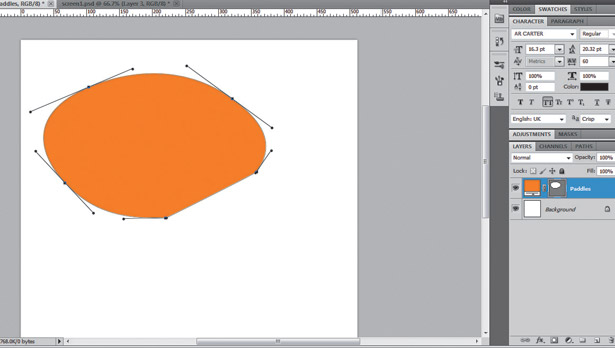
1. Draw paddle
Create a 512px x 512px document (at 72dpi resolution), which is a standard for large icons, and fill it with a white layer. Then, using the Pen tool, create a ping-pong paddle’s head shape as shown above and fill the shape with orange (#FF9000).
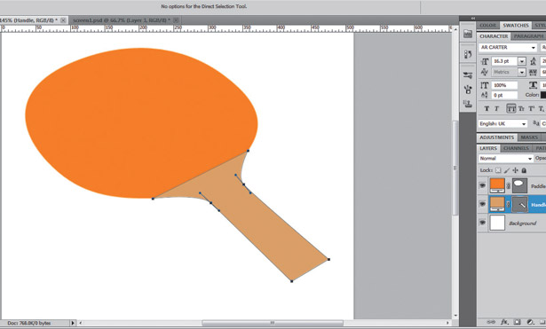
2. Draw handle
Use the Pen tool to draw the handle of our ping-pong paddle. This should be a flat shape: don’t worry about volume yet. Use the colour #DFB271 to fill the shape. Try to match the top border of the handle with the bottom border of the paddle’s head.
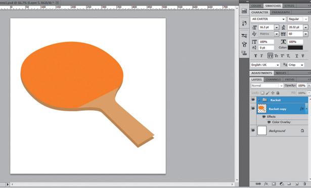
3. Add volume to paddle
Put both Paddle and Handle layers into a folder named Racket, then duplicate the folder and merge it (Cmd/Ctrl + E). Move the resultant layer some pixels down, creating a volume effect, and apply a Layer Style > Color using the colour #C1995E.
Get the Creative Bloq Newsletter
Daily design news, reviews, how-tos and more, as picked by the editors.
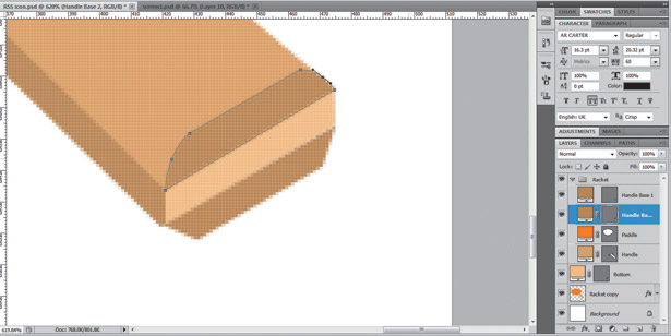
4. Handle base
Using the Pen tool, draw three shapes above the Handle layer on the Layers Panel: a rectangular distorted shape should be the base (#F3CE98), and two half-rounded corner rectangles (#C8A36E) will become the base of two more pieces, adding volume to the handle.
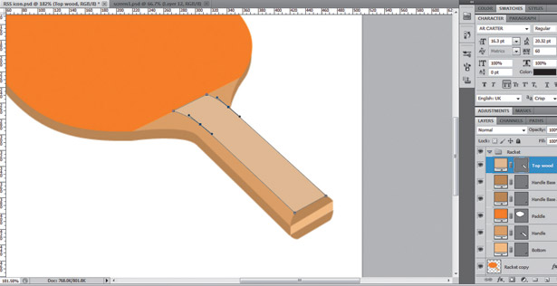
5. Top handle piece
The handle consists of three pieces of wood. We’ve already added the main piece, which is the paddle’s head itself. Now we need to draw the top piece of the handle using the Pen tool (#E5C8A0). The shape should have a curved effect, as shown above.
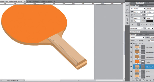
6. Add side of handle piece
With the Pen tool, draw a shape for the border of the top piece of the handle. Use #D6B78B for the foreground and ensure the layer is placed behind the shape we created in the previous step, as well as behind the base layers of Step 4.
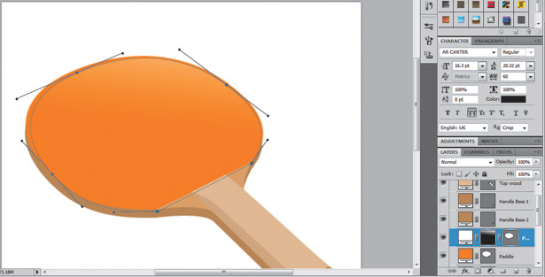
7. Paddle head light
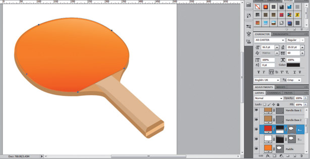
Duplicate the orange paddle layer. Put the copy above the original on the Layers Panel. Change its foreground colour to white and then apply a Layer Mask > Hide All. Fill the mask with a linear Black/White Gradient from top right to bottom left.
8. Paddle head shadow
Duplicate the orange paddle layer as before. Put the copy above the original on the Layers Panel. Change its foreground colour to #CB3000 and apply a Layer Mask > Hide All. Fill the mask with a linear Black/White Gradient from bottom left to top right.
9. Paddle head texture
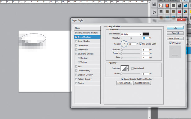
Starting with the paddle’s head texture, create a new document (20 x 20px) and with the Ellipse tool draw an ellipse on the top-left corner of the canvas. Apply a black Drop Shadow Layer Style: Opacity 50%, Angle 60 degrees, Spread 0px, Size and Distance 1px.
10. Save the texture
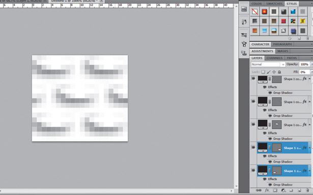
Duplicate the ellipse several times as shown above. To save this graphic as a reusable pattern, go to Edit > Define Pattern… and type a name for the pattern. Then save the document if you want to, close it and return to our main document.
11. Applying paddle head texture
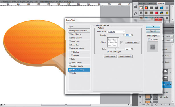
Select the paddle’s head layer, and apply a Layer Style > Patter Overlay to it. If you save the texture correctly, it should appear at the end of the Pattern list. Select our brand new pattern and change the effect’s Blend mode to Soft Light.
12. Paddle head shadow
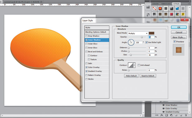
Let’s add a subtle inner shadow to increase the volume of the paddle. Still with the paddle’s head layer selected, apply an Inner Shadow Layer Style, using the colour #6D4000, Opacity: 75, Size: 16px, Blend Mode: Multiply and both Distance and Choke 0px.
13. Handle’s inner shadow
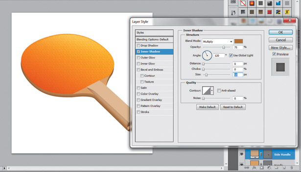
It’s time to add some effects to the top piece’s side of the paddle handle (see step 6). Apply an Inner Shadow to it using this color: #BC863C, Opacity: 75, Size: 13px, Blend Mode: Multiply and both Distance and Choke 0px.
14. 1px border effect
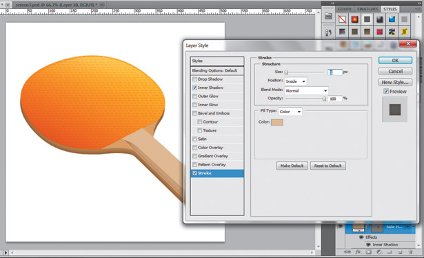
Often it’s the little details that make the difference. With the previous step layer still selected, apply a Layer Style > Stroke. Set the colour to #E5C8A0, size 1px, Opacity 100% and Blend Mode: Normal. Now the piece is clearly delimited from the other layers.
15. Add Gradient
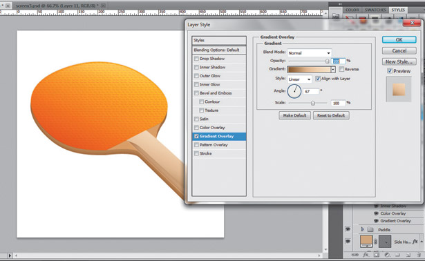
Overlay Select the handle’s top piece face layer (see step 5) and apply a Layer Style > Gradient Overlay to it. Use the following colours: #906B36 and #FAEBD5, set Opacity to 100%, Scale: 100%, Style: Linear and Angle: 67 degrees.
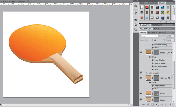
16. More borders
It’s a good time to organise all the layers into folders or Layer Groups. Put the handle and the head into separate folders (this isn’t mandatory, just a good practice). Add 1px borders to all the layers, especially the handle layers.
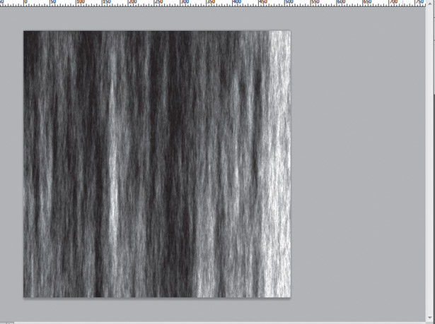
17. Wood texture
Create a new document, 512 x 512px and name it Wood. Press D to load the default colours. Go to Filter > Render > Clouds and create some. Then go to Filter > Render > Fibers and play with the values to get a nice fibre texture.
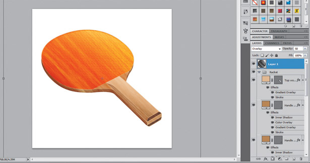
18. Apply texture
Copy the wood fibre pattern from the previous step, save it and close it. Back on our main document, paste the pattern above all the other layers and rotate it left 45 degrees using the Free Transform Controls. Change its Blending mode to Overlay and Opacity to 50%.
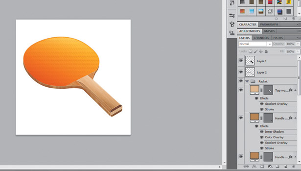
19. Delete extra wood
Cmd/Ctrl-Click over the paddle’s head layer in the Layers Panel to create a selection. Go to the wood texture layer; delete the selection. Repeat the process but include all the handle’s layers. Invert the selection (Cmd/Ctrl + Shift + I) and delete all the additional texture.
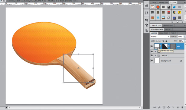
20. Light reflection
As an additional detail, add some light over the paddle’s handle. Using the Pen tool, draw a white shape similar to the top piece of the handle, then apply a Layer Mask > Hide All to it and fill it with a linear Black/White gradient from top right to bottom left.
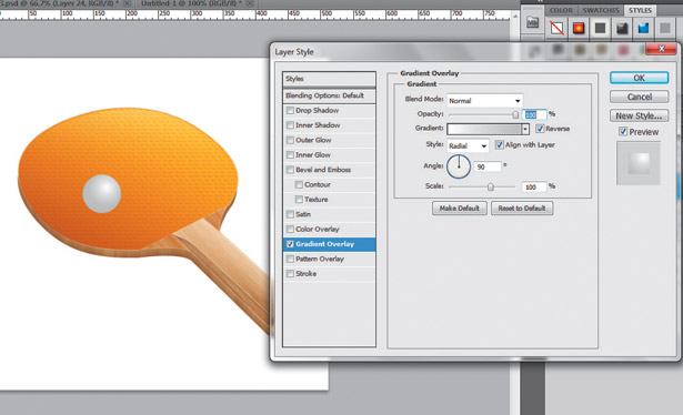
21. Add ball
Draw a circle using the Ellipse tool. Place it somewhere over the paddle. Add a Layer Style > Gradient Overlay using colours #FFFFFF-#C8C8C8. Set Style: Radial and, using the Move tool, drag the gradient a little, placing the white area of the gradient at top right of the sphere.
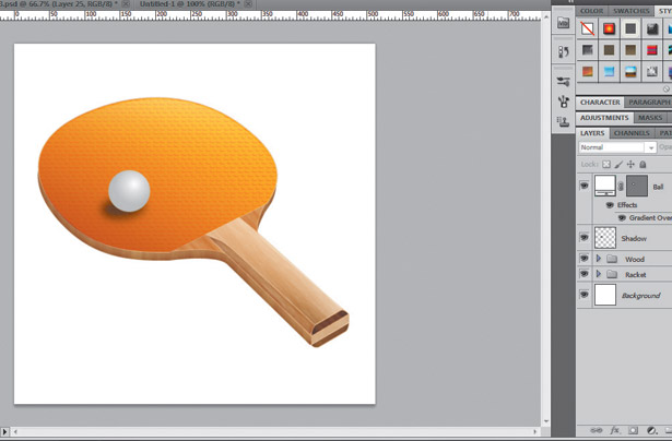
22. Ball’s shadow
Draw a black filled ellipse with the Ellipse tool; place it behind the ball layer of the previous step. Then, go to Filter > Blur Gaussian Blur. Set the Radius to 5px. Distort the shadow, making it narrower – wider than higher. Finally, reduce its Opacity to around 50%.
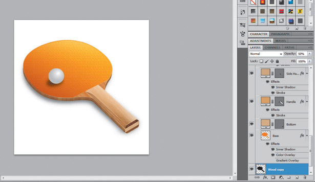
23. Paddle shadow
If you haven’t yet, put all the paddle’s layers into a folder. Duplicate and rasterise it (Cmd/Ctrl + E), and put the resultant layer behind everything else. Place the shape a few pixels down to the left and re-apply the Blur Filter (Cmd/Ctrl + F). Set the Opacity to 50% as well.
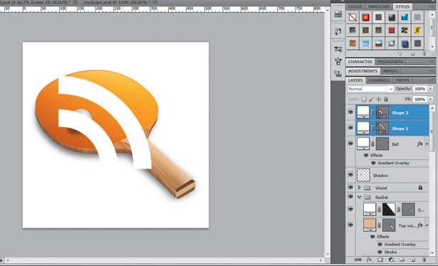
24. RSS icon shape
If you’re familiar with the vector features of Photoshop, drawing this shape shouldn’t be a challenge. Otherwise, you just can look for a free vector shape over the web or open it from the tutorial files on the CD. Either way, the shape must have a white foreground.
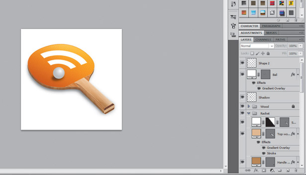
25. Distort RSS shape
Using the Move tool, select the RSS shape then, showing the Free Transform Controls distort the shape, putting it into the same perspective as the paddle. Use Cmd/Ctrl-Click over the corners of the Transform Controls to distort its perspective.
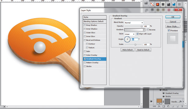
26. Add gradient overlay
Apply a Layer Style > Gradient Overlay to the RSS shape using these colours: #D5D5D5 and #FFFFFF. Set the angle of the gradient to 69 degrees. This process will visually merge the new RSS shape with the actual scenario in terms of lights and volume.
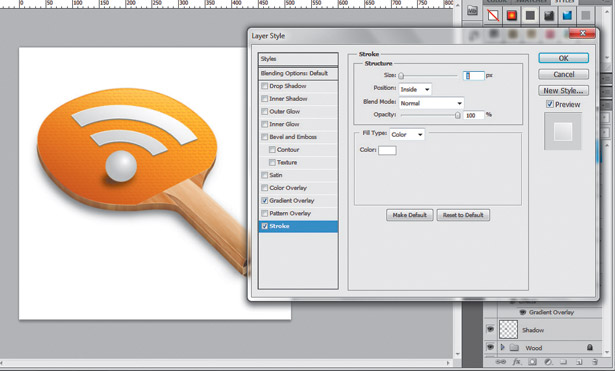
27. Add shadow & stroke
Duplicate the RSS shape layer and apply a Color Overlay Layer Style to it, using a dark variant of grey. Finally, to make the shape pop a little bit, add a 1px White Stroke to the RSS shape. Finally, organise the icon and the ball in separate folders.
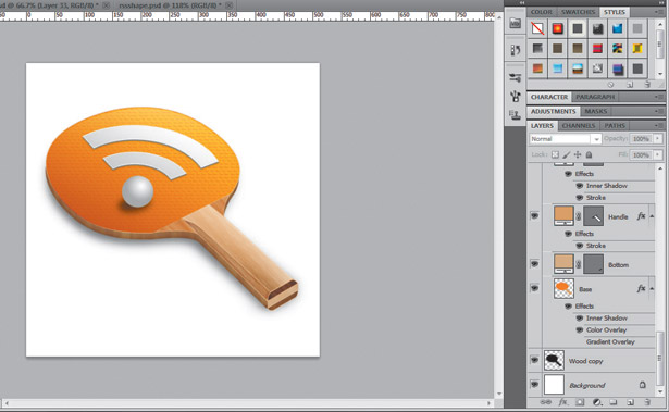
28. That’s it!
Now you have an RSS icon, try changing the paddle’s head and the social media shape to create different variations of the icon. Export each as a transparent .PNG file, hiding the white background, and resize it to the standard icon sizes: 256, 128 and 64 pixels.

Thank you for reading 5 articles this month* Join now for unlimited access
Enjoy your first month for just £1 / $1 / €1
*Read 5 free articles per month without a subscription

Join now for unlimited access
Try first month for just £1 / $1 / €1

The Creative Bloq team is made up of a group of art and design enthusiasts, and has changed and evolved since Creative Bloq began back in 2012. The current website team consists of eight full-time members of staff: Editor Georgia Coggan, Deputy Editor Rosie Hilder, Ecommerce Editor Beren Neale, Senior News Editor Daniel Piper, Editor, Digital Art and 3D Ian Dean, Tech Reviews Editor Erlingur Einarsson, Ecommerce Writer Beth Nicholls and Staff Writer Natalie Fear, as well as a roster of freelancers from around the world. The ImagineFX magazine team also pitch in, ensuring that content from leading digital art publication ImagineFX is represented on Creative Bloq.
