How to create a style guide: 25 expert tips for designers
Help others to use your work with these tips on how to create a style guide.
Understanding how to create a style guide may not be simple, but the style guide is a crucial part of a design project so it's something you need to know. When handing over a creative project, most agencies or freelancers will include a style guide because it helps guide the client through your designs, allows you to explain your creative choices and makes you look more professional.
You want your style guide to be informative, clear and as comprehensive as possible, while also ensuring it doesn't sound too preachy. All this means striking the right tone is difficult – it is a fine line.
Having an up-to-date resumé is also a great idea, especially if you are pitching new work, as some clients will want to see your experience and credentials. Need some inspiration for your resumé? Check out our picks of the best creative resumés around.
Read on to learn how to create a style guide, what to include in it and gain a better understanding of why they are important to your projects.
If you want to nail your UX design, we've got just the thing for you. Our expertly curated course will teach you all you need to know. Find out more on our dedicated UX design course post.
How to create a style guide
01. Avoid pomposity
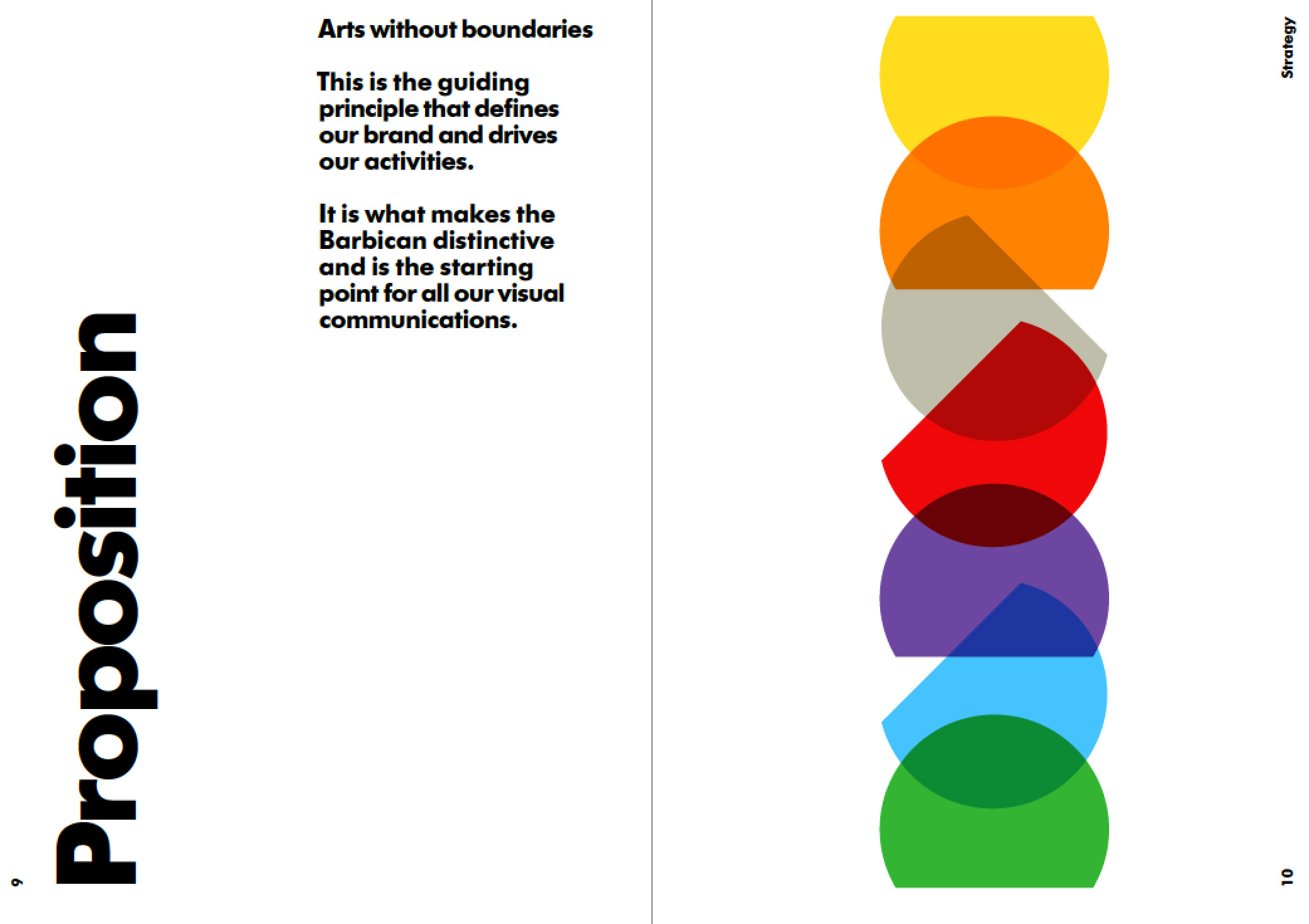
Creatives are a sensitive bunch, haunted by nightmares about clients screwing up our (much laboured over) designs. There's a tendency to become over protective, preachy and, dare we say, a little mouthy when it comes to rolling these out to the folk who pay for them. A style guide that's overly bombastic or pompous in tone will only end up stifling its creative application. Clarity, simplicity and lots of white space make The Barbican's style guide (see above) a joy to read.
02. Allow for some slack
Many style guides read like the work of control freaks. They shouldn't. They should serve as a guide to any other agency, freelancer or licensing company who is working with the brand you initially helped develop. They should allow for the brand to develop, whilst establishing an overall framework.
03. Don't wait for perfection
We'd all love to spend time and energy crafting the perfect design style guide for each project. But in the real world, that's not always possible. If you're up against a tight deadline and not able to create a style guide with lots of bells and whistles (and examples), be sure to include the most pertinent and helpful information about the brand or piece of work you've created in the time you do have.
04. Include essential elements
Start off with:
- A written overview of the company it's for
- A rationale for the work carried out
- Information about logos, font usage, colour palette and tone of voice
- Photographic guides
- Collateral information
If you have enough time, it's worth adding some examples of logo and typographic usage, as well as links to master artwork or brand collateral templates, and helpful contacts within your agency or company.
05. Give the client options
Name your design style guide something like 'Styleguide_lite_v0.1' and explain to your client that this is the "lite" guide to working with the brand, which is suitable for everyday creative use. Should they wish for an additional, more thorough version, this can be classed as a separate project – with a separate budget.
06. Hit the right tone
If you're creating a style guide for, say, a cartoon show, then make it as fun, colourful and wacky as the series. If it's for an asset management company, make it as clean and straight-down-the-line as the company's thinking and brand equity is.
This shows the client you understand the brand or television property you've been working on. Plus, it'll instantly put that tone in the mind of the designer who's been given the style guide to use.
07. Guide, don't preach
Remember you are producing a guide – which, when applied successfully, will produce a common system of elements that work together, reinforce brand values and embrace successful interpretation of that guide.
A wagging finger approach will instantly put the person who uses the guide in school mode. "Don't do this; don't do that" is a surefire way to stress someone out and make them not want to use the guide successfully.
In terms of tone, you'll catch more flies with honey than with vinegar: encourage innovation by allowing the possibility for interpretation and innovation.
08. Think of it like a cook book
Look on a style guide as being similar to a cook book. It's full of brand recipes and ingredients that work well together, and create a successful blend of flavours and tastes. It should allow for experimentation, but clearly explain where too much of the wrong type of ingredient will spoil the brand broth.
09. Concentrate on the visible
Look around your workplace and you'll (probably) see colleagues who look presentable and are nicely dressed. Quite possibly a large percentage of these people do not have matching undergarments. But who cares? You (hopefully) don't get to see them.
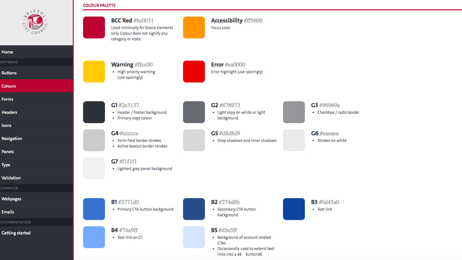
Similarly, in your style guide, concentrate on the visible and the relevant. Try not to deep dive into creating colour palettes that then have sub colour palettes and then further sub, sub colour palettes, which might never be used or seen. Bristol City Council's style guide section on colour (above) tells you exactly when to use each colour.
10. Remember, less is more
Ask yourself if every 'rule' you add to your design style guide is absolutely necessary. By giving too much information you might just end up confusing designers, or overwhelming them with so much information they can't possibly remember all of it.
11. Be helpful and specific
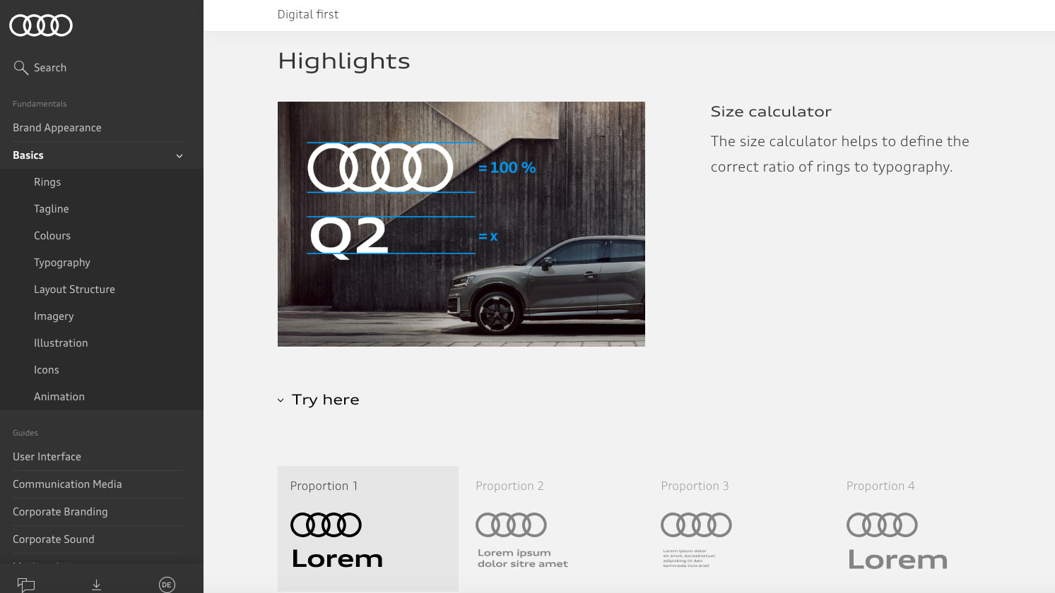
Try to give out helpful and practical advice to the creative reading your guide. If you're using a particular type of overlapping text (see the image above) or a certain type of Photoshop treatment, then think about adding a page to your style guide that explains exactly how to do this. Audi's style guide shows you exactly how to use the brand's iconic rings.
12. Think creatively
Your style guide is an extension and expression of your creativity. It should have its own guidelines applied to it, and communicate the brand simply and effectively. There's no rule that says it has to be in PDF format (although admittedly a lot are) – you could have the whole thing online. Think creatively, but don't over complicate. Five clicks to a logo download are just annoying. Keep it simple.
13. Work with a copywriter

Work with a copywriter to energise and communicate the brand. This style guide will potentially be used client-side by the in-house creative team or sent out to other agencies to be applied in future work.
For your guide to be applied successfully, it's essential to communicate effectively in written form: the brand spirit; the reason behind the work; what the guide is there for; and what the brand goals are – all things that the creative using the guide should be mindful of.
14. Add a section on tone
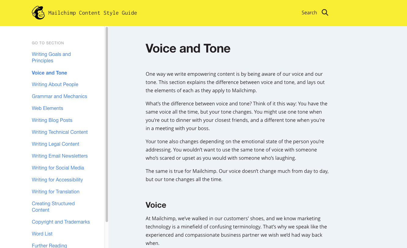
Peculiarly, 'tone of voice' is sometimes forgotten in style guides. A tone of voice section includes a guide to copy tone, appropriate style and how messaging is communicated to an audience.
It works hand-in-hand with the creative vision. If you think about a brand such as Virgin, its tone of voice is quite irreverent and perfectly matches the visuals. A style guide should include these details, as it helps to communicate who the brand's audience are, as well as the spoken vision, which is aligned to the visual one. Hand in hand, these both effectively communicate the brand. Mailchimp's style guide has an informative section on voice and tone.
15. Proofread your work
Proofread your guide before sending it out. Typos and bad grammar make you look awfully silly when you're sending out a 'best practice' guide to your work.
If at all possible, have someone else read the guide for you and ask them to flag up anything that isn't clear, and whether any parts need further explanation.
16. Show elements on a page
Don't just say. Do. The best way to have someone get to grips with the creative vision shown in the guide is to pack it full of examples of what you're going on about. So for example, if an element is to be positioned on a grid, just so, then show it in situ.
17. Master artwork and templates

Your guide will be severely lacking if it doesn't include the artwork mentioned in it. Create a repository online for all brand materials, and index these by category so they make sense.
One great big list of brand asset download links is of no real help to anyone. Create categories relevant to your style guide and add the links there. Cross link between PDF or webpages to each download as well as having this separate download area.
Add version numbers and dates to template file names, which are likely to update over time, and do the same with your style guide.
Art-working up examples of creative templates can be a great way to showcase how the guide can be interpreted. Also consider supplying these files for download with the style guide. The BBC's style guide (no longer live) allowed you to see how each page looks with different 'skins'
19. Explain your typographical choices
"Type that has long and very fine serifs has a habit of breaking up on screen and becoming illegible when used on television, so big blocky sans-serif fonts are best."
That, ladies and gentleman, is an informative tidbit of information. If you didn't know much about type, it would prove useful if you had a choice between two brand fonts for an animated type treatment for television.
Pepper your guide with brief titbits of information like this and remember that not everyone is a type guru. Don't write volumes, but instead educate by rationalising and giving examples of usage.
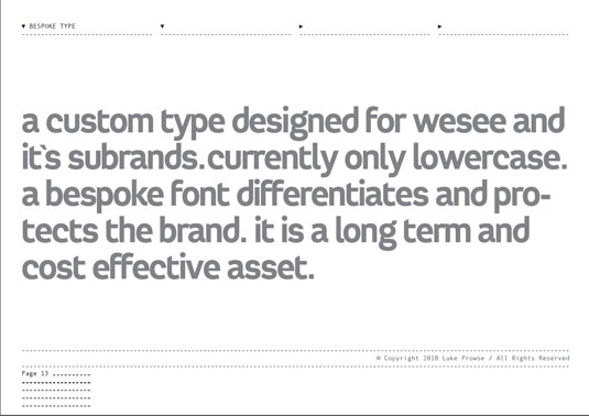
Oh, and if your brand font is bespoke, supply it. If it's available from a font library, give out the download link. Don't distribute fonts you have no right to (see our guide to font licensing for more on this).
20. Rationalise your thinking
If you took a friend to your favourite Angus Steakhouse for dinner and they sat there nursing a single malt while refusing to eat, you'd think their behaviour quite bizarre.
If, on the other hand, they explained they were a vegetarian, you'd immediately understand their predicament and pop out for a stuffed pepper and some cous cous.
Similarly, you need to rationalise your thinking behind why a logo would look bad with a drop shadow (our guide to logo design will help with this), or why all the type shouldn't be used in title case.
No one's a mind reader, and creatives mostly approach style guides with suspicion that the document will limit their creativity. Rationalise your thinking simply and clearly to prevent this.
21. Anticipate questions
At the end of the guide, include relevant contacts and create a group email address in case the reader has any queries about the guide and wants to get in touch. (Although if you've included all the relevant details in your guide, this should very rarely happen.)
Also consider creating an FAQ as part of the guide, and think about the top 20 questions a creative might ask about a brand when they first approach it. “I hate your logo. Do I have to use it?” is a question that isn't allowed.
22. Take people on a journey
However mawkish that tip might sound, it's exactly what you're aiming for. Approach the job as if you were creating an immersive creative experience, but in book (or online) form. Take the stand that your reader knows nothing about the brand they're about to work with, and from the brand mission statement to showcased collateral examples, educate the reader with bite-sized information about what the brand represents and how the creative elements work together.
23. Show collateral flexibility
Briefly touch on the brand collateral's flexibility. It will show the client your thoughts about future-proofing your work, as well as covering off the potential that your guidelines for a purely online brand might one day move into print, outdoor or broadcast collateral.
24. Leave room for improvement
To survive in any commercial enterprise, we have to adapt and change. Brands change constantly, either organically, or to reflect markets and fashions. Creating a style guide that bolts down a brand and stifles it to such a degree that it can't develop over time is disastrous and rather silly. There's always room to grow and develop, and your guidelines should reflect this.
25. See some examples

Need some inspiration? The best thing to do is have a look through some real-life examples of style guides. Check out Skype's style guide and the Barbican for starters...

Want to learn more about UX and UI? Don't miss our UX design foundations course.
Get the Creative Bloq Newsletter
Daily design news, reviews, how-tos and more, as picked by the editors.
Related articles:
- The best free fonts for designers
- Typography design: Rules and terms every designer must know
- Perfect font pairings: These fonts go together

Thank you for reading 5 articles this month* Join now for unlimited access
Enjoy your first month for just £1 / $1 / €1
*Read 5 free articles per month without a subscription

Join now for unlimited access
Try first month for just £1 / $1 / €1
The Creative Bloq team is made up of a group of design fans, and has changed and evolved since Creative Bloq began back in 2012. The current website team consists of eight full-time members of staff: Editor Georgia Coggan, Deputy Editor Rosie Hilder, Ecommerce Editor Beren Neale, Senior News Editor Daniel Piper, Editor, Digital Art and 3D Ian Dean, Tech Reviews Editor Erlingur Einarsson, Ecommerce Writer Beth Nicholls and Staff Writer Natalie Fear, as well as a roster of freelancers from around the world. The ImagineFX magazine team also pitch in, ensuring that content from leading digital art publication ImagineFX is represented on Creative Bloq.
