Create Photoshop graphics with Layer Styles and Smart Objects
Discover how to use layer options and Smart Objects to create separators, media players and buttons you can use on your own site mockups. Andreea Nanu shows you how
In this tutorial, we will be designing graphics for the website for 8izz, a fictitious iPhone app. I will explore how to use Photoshop's Layer Styles and Smart Objects to create clean, corporate graphic elements that you could repurpose for your own design projects, including the site's presentation area and its order button; separators to divide up site content; and a media player with custom rounded corners.
Below, you can see the complete mockup for the site. You can see close-ups of the individual elements you will be building throughout the course of the tutorial.
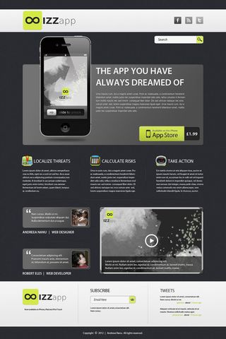
1. The presentation area
We'll begin by creating the grey presentation area at the top of the mockup. We'll also create a fake custom drop shadow for the iPhone graphic.
Let's start our layout by opening a new Photoshop document. Select File > New or use either Cmd + N or Ctrl + N, depending on whether you're working in Mac OS X or Windows.
Set the Width to 1200 pixels and the Height to 1800 pixels (we will be using pixels for all the layers, except for the text, for which we will be using points). Set up a 12-column grid: I recommend using Nathan Smith's 960 grid template, which you can download for free from his website. (Installation instructions are included in the download.) You may activate or deactivate the grid via the Cmd/Ctrl + ; shortcut.
The next step is to add a background pattern to the presentation area. I'm using the free vertical_cloth pattern from the Subtle Patterns website, but you could use one of your own. Open the image, Select > All, choose Edit > Define Pattern and click OK.
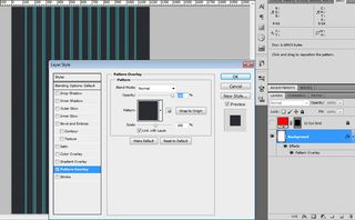
Now add the pattern to the Background layer by going to Layer > Layer Style > Pattern Overlay or by simply double-clicking on the layer in the Layers palette and choosing the Pattern Overlay option from the Layer Style dialog. (Note: if you don't see the Layer Style option, you may need to convert the Background to a normal layer by right-clicking on it in the Layers palette and choosing Layer from Background). You will need to select the vertical_cloth pattern in the dialog, which you can do by clicking once on the Pattern graphic (shown below) to open a set of swatches.
Get the Creative Bloq Newsletter
Daily design news, reviews, how-tos and more, as picked by the editors.
Create a new Layer Group by going to Layer > Group Layers or by pressing Cmd/Ctrl + G. Place it above the Header and name it Main Content (right-click it in the Layers palette and choose Group Properties to rename it). Inside it, create another group named Presentation.
Now select the Rounded Rectangle Tool (U). From the settings bar at the top of the screen, set it to 10px Radius and #606060 Color. Draw a 960 x 430px shape, name it Presentation Base and add the following Layer Style:
- Drop Shadow: Normal Blend Mode, 40% Opacity, 120° Angle, Use Global Light, 1px Distance, 3px Size (leave all the other settings on the default values)
- Inner Shadow: Normal Blend Mode, 50% Opacity, 93° Angle, 2px Distance, 3px Size
- Gradient Overlay: Overlay Blend Mode, 20% Opacity, Gradient 100% Opacity from #000000 to #ffffff (you can edit these settings by clicking on the Gradient graphic to open the Gradient Editor), Linear Style and Align with Layer, 145° Angle
- Stroke: 1px Size, Outside Position, Normal Blend Mode, 100% Opacity, #1f1f1f Color
The result should look like this:

In order to save these settings as a Style, go to the Styles palette, click on the Create new style icon at the foot of the palette, and name it Base Style. This enables you to use the same settings later on by selecting the layer to which you wish to apply it and clicking on the desired style from the menu.
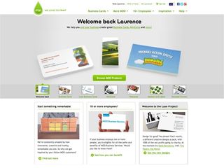
Don’t forget to align the presentation area to the grid!
Now add the iPhone 4s mockup (you can download it for free from Pixeden). Open iPhone-4S-black-3views-mockup.psd from the download, choose the iPhone 4S (black) Group, and drag and drop it and arrange it inside the Presentation Base, leaving a 90px left margin and 45px lower margin.
We will create a new shadow for the iPhone, so delete the Shadow and Reflex layers from the iPhone 4S (black) group (you can do this by right-clicking them in the Layers Palette and selecting Delete Layer). Now select the Ellipse Tool (U) and create a shape with the dimensions 220px by H:7px, with Color set to #00000. Convert this layer into a Smart Object by right clicking on the layer and choosing the Convert to Smart Object option. Go to Filter > Blur > Gaussian Blur and set the Radius to 6px in order to make it look like a shadow.

If you want to add the text to the presentation area, you can create the title with the Horizontal Type Tool (T) set to Myriad Pro Semibold, 48pt, Sharp. From the Layer Style dialog apply a Drop Shadow, set to Normal Blend Mode, 40% Opacity, 120° Angle, Use Global Light, 1px Distance, 3px Size, #f5f5f5 Color. Align the text with the grid leaving a 30px left margin and a 20px upper margin.
Now write the body text, placing it 40px below the title using DejaVu Sans Book, Sharp, 12pt. (You can download the font for free here.) Set the leading to 18pt (click the icon in the top bar to toggle the Character and Paragraph panels, or select Window > Character) and use Color #f5f5f5.
To add the Layer Style, select the title text layer, right click on it and select Copy Layer Style, then go to the current text layer, right click on it and select Paste Layer Style. Alternatively, create a new Layer Style manually, in the same way as you did earlier.
The completed presentation area should look something like this:
2. Creating an order button
Creating a button from scratch is not that hard. We'll be recreating the design below:

Start by creating a new Group inside the Presentation group and naming it Button. With the Rounded Rectangle Tool set to 10px Radius and #262626 Color, draw a shape with the dimensions 90 x 70px and name it Price Tag. From the Layer Style dialog, add an Inner Shadow with Normal Blend Mode, 45% Opacity, a 50° Angle, 2px Distance and 5px Size.
Add the text showing the price using Myriad Pro Bold, Sharp, 24pt, and Color set to #f5f5f5. From the Layer Style dialog, apply the following settings:
- Drop Shadow: Normal Blend Mode, 40% Opacity, 120° Angle, Use Global Light, 1px Distance, 3px Size
- Inner Shadow: Normal Blend Mode, 25% Opacity, 120° Angle, Use Global Light, 1px Distance, 2px Size
- Inner Glow: Normal Blend Mode, 15% Opacity, Gradient from 100% to 0% Opacity and #ffffff Color, 1px Size

To create the 'Available on the iPhone App Store' part of the button, use the Rounded Rectangle Tool set to 10px Radius and #d4e945 Color. Draw a shape with the dimensions 240 x 80px and name it Button.
I will now show you a precise way of changing the rounded corners of this rectangle. Have the Button Vector mask thumbnail selected (click on it in the Layers palette to select or deselect it). Using the Rectangle Tool with Shape Layers and Add to Path Area (+) selected as shown below, create a square that will fill the corner, making it perfectly sharp. Apply this change to both right corners.

For this button we will create a new pattern, so press Cmd/Ctrl + N to create a New File with Width 5px and Height 5px. Select the Pencil Tool (B) with the Size set to 1px and the Hardness to 100% and draw a diagonal slash, as shown below.

Now go to Edit > Define Pattern and name your pattern, then go back to the previous file to add the following Layer Style effects to the 'Available on the iPhone App Store' button:
- Drop Shadow: Multiply Blend Mode, 15% Opacity, 90° Angle, 1px Distance, 1px Size
- Inner Shadow: Normal Blend Mode, #ffffff Color, 90° Angle, 1px Distance, 1px Size
- Bevel and Emboss: Inner Bevel Style, Smooth Technique, 100% Depth, 2px Size, 90° Angle, Highlight Mode 0%, Shadow Mode 10%
- Gradient Overlay: Multiply Blend Mode, 30% Opacity, Gradient 100% Opacity from #000000 to #ffffff Color, 150% Scale
- Pattern Overlay: Multiply Blend Mode, 10% Opacity, and choose the pattern you just made from the Pattern swatch
- Stroke: 1px Size, Inside Position, Normal Blend Mode, and Fill Type set to Gradient with 100% Opacity from #8a8a8a to #767676 Colour and Reverse selected, Linear Style, 90° Angle
Drag and drop Available_on_the_App_Store_(gray).png (available from Wikipedia) on top of the Button shape and edit the Smart Object as follows: go to Select > Color Range, set the Fuzziness to 200 and pick the background grey colour and change it to #d4e945. Using the same technique, select the white colour and change it to #272827.
Resize the App Store badge by pressing Cmd/Ctrl + T or by going to Edit > Free Transform and downsizing the badge to 80% by typing this value into both the W and H fields. Centre it. Apply the transformation when prompted. In order to make the badge blend nicely with the base of the button, we will make it a clipping mask. Right-click on the App Store badge layer and select Create Clipping Mask.
Now let’s give the button a nice gradient effect by selecting the Gradient Tool (G). From the Gradient Editor, set its Color to #ffffff, and make the left side 100% Opacity and the right side 0% Opacity. Select the Angle Gradient icon from the Gradient toolbar at the top of the screen, and set the Opacity to 10%. Create a new layer by pressing Shift + Cmd/Ctrl + N. With the layer selected, hold Cmd/Ctrl and click on the Button layer’s Vector Mask thumbnail to limit the actions of the gradient layer to that particular shape. Now drag the gradient from the lower right corner to the upper left corner. The result should looks something like this:

Finally, position the button appropriately, leaving a right and lower margin of 20px.
3. Making some awesome separators
Next, we will create some linear separators to divide up different parts of the design, as shown in the image below:
Create a new Layer Group and name it Separators.
We will start designing a separator by creating a horizontal linear shape with the Line Tool (U). For a short vertical separator, use the dimensions 1 x 960px (you can use a Weight setting of 1px) and Color set to #585858. Arrange it 40px underneath the text boxes and, from the Layer Style dialog, apply the Gradient Overlay settings shown below:
Duplicate the layer, change the Color of the shape and the Gradient Overlay settings to #101010 and place this new line underneath the first one.
Select the two layers and convert them into a Smart Object, naming this Separator 1.
For a longer horizontal separator, duplicate the Separator 1 layer (right click in the Layers palette and Duplicate Layer), resize the copy to 1 x 200px, rotate it 90° (again, you can use Edit > Free Transform Path) and duplicate this as well. Below, you can see these separators in the finished mockup. (We won't go into how to create the text and icons here.)
4. Designing a custom media player
Next, we'll create a custom media player graphic with rounded corners, as shown below:
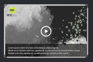
Create a new Layer Group, name it Player and place it under the Main Content.
For the frame, use the Rounded Rectangle Tool. Create a shape with the dimensions 550 x 355px and #c2c2c2 Color. Name the layer Frame, and apply the following Layer Style settings:
- Drop Shadow: Normal Blend Mode, 40% Opacity, 120° Angle, Use Global Light, 1px Distance, 3px Size
- Inner Shadow: Normal Blend Mode, #ffffff Color, 20% Opacity, 120° Angle, Use Global Light, 2px Distance, 0px Size
- Bevel and Emboss: Inner Bevel Style, Smooth Technique, 50% Depth, 3px Size, 120° Angle, Use Global Light, Highlight Mode 50%
- Gradient Overlay: Overlay Blend Mode, 20% Opacity, Gradient 100% Opacity from #000000 to #ffffff Color, Linear Style, 145° Angle, 100% Scale
- Stroke: 1px Size, Inside Position, Normal Blend Mode, Color Fill Type, #474947 Color
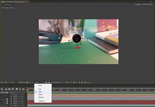
To create the rounded corners, draw a rectangle with the dimensions 26 x 28px, and Color #585858. With the Direct Selection Tool (A), select the lower right corner and move it towards the centre of the rectangle in order to get a triangular shape. Use the Polygonal Lasso Tool (L) to cut a scalene triangle inside the existing one on its longest side. Make the width 8px and the height 9px. (Use the image below as reference.) Apply the same Inner Shadow, Gradient Overlay and Stroke settings as for the frame.
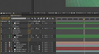
Name the layer c1 (as in 'corner 1'), duplicate it three times, Free Transform each of the duplicates to fit in a different corner of the frame, and make them all clipping masks of the Frame layer.
Create a new Image Holder layer, using the same methods as before. This is a 532 x 336px rectangle, with #262726 Color and no Layer Styles. Add the image you want to appear inside the player (this can be anything you like: we haven't provided one) and make it a clipping mask.
At the bottom of the image holder, above the image, add a rectangle with the dimensions 532 x 85px, set the Opacity to 60% and name the layer Text Holder.
Write some overlay text for the bottom of the player using Myriad Pro Bold, Sharp, 14pt. Set the leading to 18pt, set Color to #f5f5f5 and place it above the previous layer, centring it vertically and leaving a left margin of 20px. Apply the same Drop Shadow settings as the ones we used for the Price Tag.
For the player button, select the Custom Shape Tool (U), choose the Circle Thin Frame from the fly-out menu with #ffffff Color and create a shape with the dimensions 120 x 120px. From the Stroke setting of the Layer Style dialog, set Size to 1px, Position to Outside, and Color to #ffffff. With the same tool pick the Triangle shape (you may need to click the little arrow icon on the right of the fly-out menu and select All before you can see it). Using the same settings and Layer Style as for the Circle, create a 31 x 36px triangle. Convert these two layers to a Smart Object, centre them and name the layer Player Arrow.
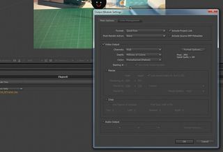
And that's our custom graphics finished. Have fun trying out these techniques! Test and adapt them to your new designs and create something amazing.
Resources
The following free resources are used to create the graphics shown in the tutorial:
- 960 Grid System by Nathan Smith
- Vertical cloth background pattern by Subtle Patterns
- DejaVu Sans Bold and Extra Light from DejaVu Fonts
- iPhone 4s Psd Vector Mockup Template from Pixeden
- Available on the App Store (gray).png from Wikipedia
And the following resources were used in creating the rest of the mockup, but aren't necessary for the tutorial itself:
- Mobile Icon Set from Web Icon Set
- Clean Noisy Social Icons from SoftIcons.com
Don't forget to check out the latest features in Photoshop CS6!

Thank you for reading 5 articles this month* Join now for unlimited access
Enjoy your first month for just £1 / $1 / €1
*Read 5 free articles per month without a subscription

Join now for unlimited access
Try first month for just £1 / $1 / €1
The Creative Bloq team is made up of a group of design fans, and has changed and evolved since Creative Bloq began back in 2012. The current website team consists of eight full-time members of staff: Editor Georgia Coggan, Deputy Editor Rosie Hilder, Ecommerce Editor Beren Neale, Senior News Editor Daniel Piper, Editor, Digital Art and 3D Ian Dean, Tech Reviews Editor Erlingur Einarsson, Ecommerce Writer Beth Nicholls and Staff Writer Natalie Fear, as well as a roster of freelancers from around the world. The ImagineFX magazine team also pitch in, ensuring that content from leading digital art publication ImagineFX is represented on Creative Bloq.
