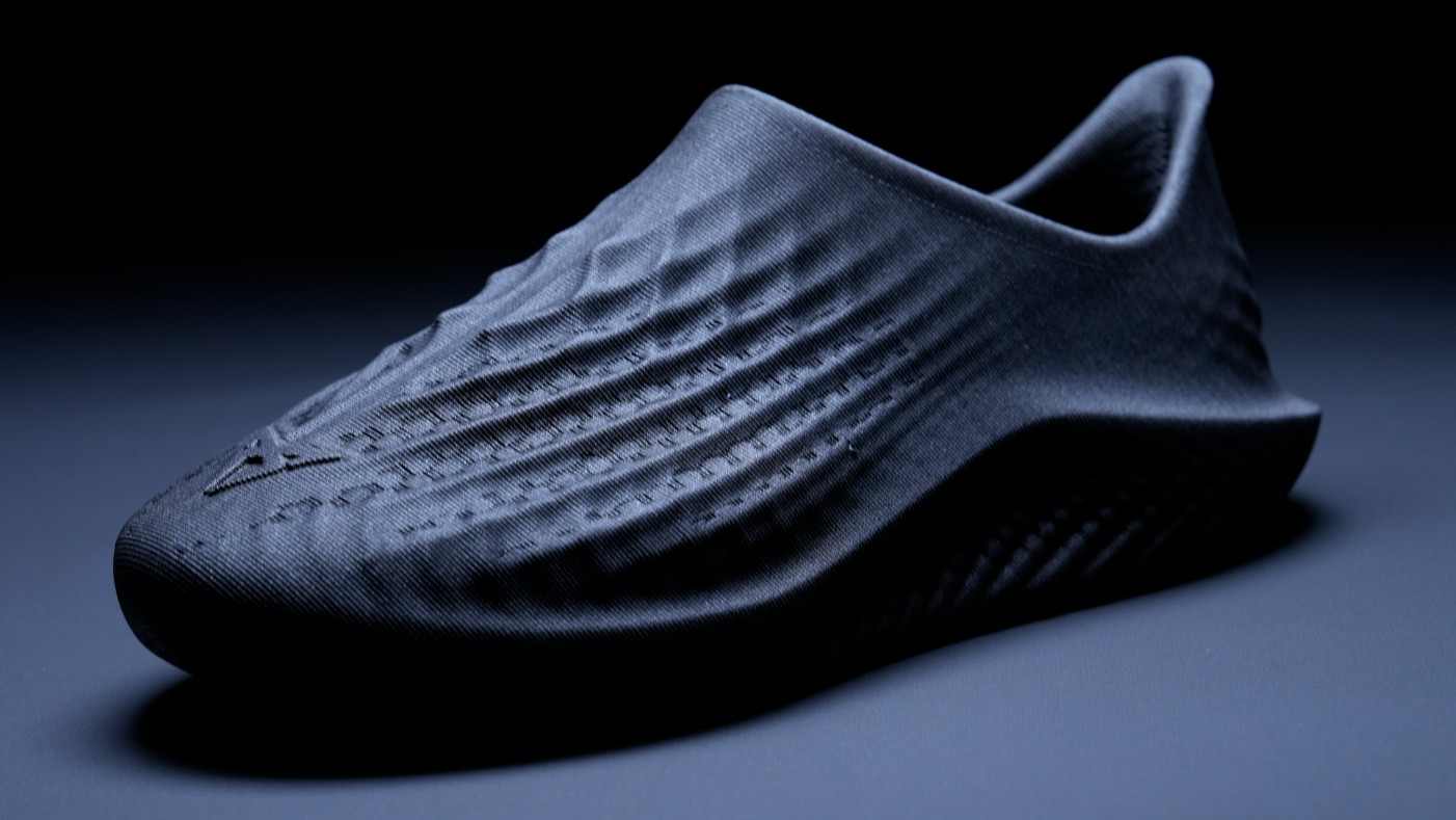
Create a custom lettered logo in Illustrator
Learn how to use Adobe Illustrator CS5 to creatively manipulate letterforms that, in combination with unique shapes and negative space, create a solid, recognisable mark. Designer Chandler Van De Water talks us through it.
- Knowledge needed: Basic Illustrator knowledge
- Requires: Adobe Illustrator CS5
- Project Time: 1-3 hours
- Support file
There are hundreds, if not thousands, of ways to draw each letter of the hundreds of different written languages and the shape of that letterform can dictate the entire tenor of its parent word or phrase. In this article, you will cover how to manipulate the glyphs from a font to create a unique, appropriate letterform style. Learn how to slice and dice shapes to create a logo design that is simple yet recognisable and, most importantly, ready for print. This tutorial will only skim the surface of possibilities but these foundational methods can unlock infinite potential in the world of logo creation.
01. Start with the word
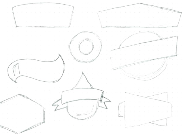
Start with the word you'd like to design around. I'll be using the make-believe word "AQUIO," which, in our case, is a hydro-electric energy company. Grab a sketchpad and draw some shapes that remind you of the word. These shapes will be starting points for what will "house" our type. Try and push the boundaries, you never know what pieces might make it into your final design.
02. Brainstorm
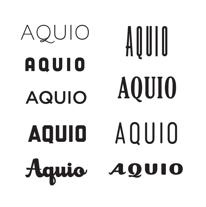
Open up Illustrator and explore several different typeface options. If you don't have many fonts, I suggest heading over to losttype.com and picking up a few. Here you can see some options that I've made for myself. After looking over what I've got, I think I like the third one on the right, although I think it's a little tall. Let's make some adjustments!
03. Create outlines
I'm using Mensch by Morgan Knutson but for what I've got in mind, I think that the letters are a bit tall and I don't like the "A" in this scenario. Increase your text size, then create outlines by selecting it and hitting ⌘+shift+O or by Type > Create Outlines.
04. Customise the lettering
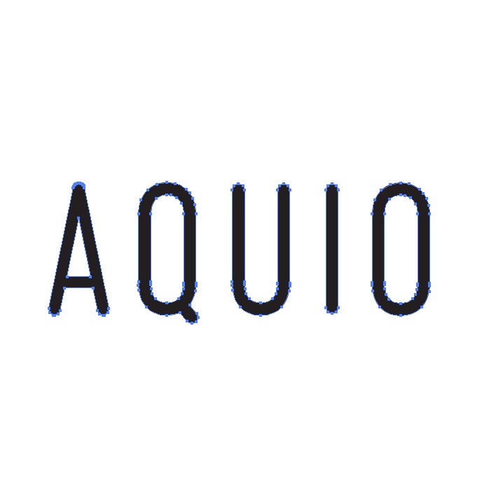
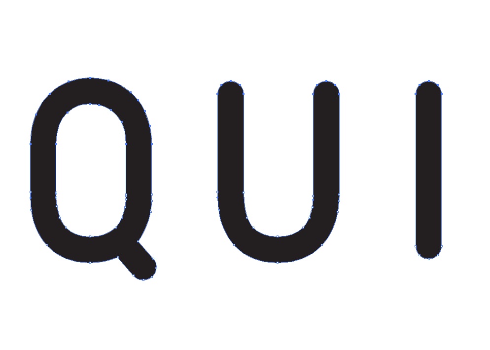
Delete the "A" and highlight the anchor points on the top half of the text with your direct selection tool. This font works well because it's got vertically straight sides. I'm a nudger, so I use shift+down arrow to make the text a little less condensed but you could drag the points down with your mouse – just make sure you hold the shift key to keep them vertically in line.
05. Create new letterforms
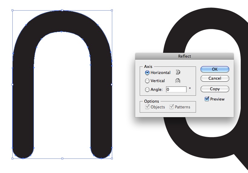
Duplicate the "U" and move it to the left of the "Q"; this will be our new "A". Object > Transform > Reflect it horizontally – if you have it selected, you can also right-click on it and quickly access the Transform > Rotate palette. Because we want to be consistent with the typeface, duplicate the "I", rotate it 90° and bring it over to the new "A" to create a crossbar.
06. Learn to kern
Squish your new crossbar in so that it fits inside the stems of the "A". Find a suitable height for the crossbar and group (⌘+G) or Pathfinder > Unite the two shapes that create your new "A." Position it amongst the other letters until your kerning feels appropriate.
Get the Creative Bloq Newsletter
Daily design news, reviews, how-tos and more, as picked by the editors.

07. Begin making the shape
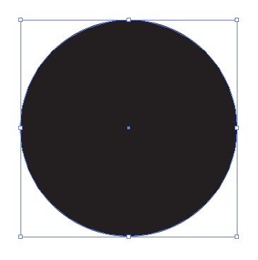
Now, let's look back at our sketches and choose a shape to build. Normally, I'd do two or three for a client but for our purposes, just creating the droplet shape will do. When making a logo, it's best to start with black and white, using negative space to build a shape that can work with just one colour. Let's start with a circle – press L to quickly access your ellipse tool and hold shift while drawing it to make it perfectly round.
08. Make a droplet
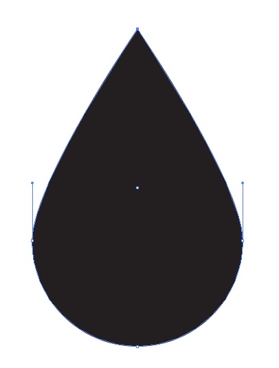
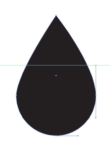
Select the top anchor point with your direct select tool and move it up. Switch to your pen tool (P) and hold option – this quickly accesses the convert to anchor point tool. Click the point you just moved to remove the bezier points.
09. Clean up the shape
The shape is a little imperfect, so grab the top handle of the rightmost point and move it up. Place a guide by dragging down from your ruler (turn it on with ⌘+R) and line it up with that top handle – reason being, we want the other side to be perfectly symmetrical. Move the left anchor point's handle up to the guide. Apply a thick white, outside stroke to your new droplet shape.
10. Frame your lettering
Now draw a black rectangle around your letters (I've also spaced mine out a bit more). Select your letters and change their fill colour to white, then move them in front of your black rectangle with ⌘+X then ⌘+F. Apply the same white, outside stroke (from the droplet) to the rectangle, and move it, along with your letterforms, on top of the droplet. If it looks like it's behind the droplet, move it above the droplet in the layers palette or use ⌘+X then ⌘+F. Once everything feels good, duplicate your black rectangle and move it straight up and out of the way (it's going to be our "ribbon" shape later on).

11. Begin creating the ribbon
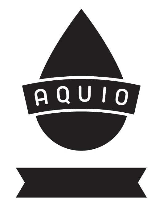
Select your rectangle behind your letters and Object > Path > Outline Stroke. Then group it with your letters by selecting both and pressing ⌘+G. With your new group selected, Effect > Warp > Arc about 15°. With both still selected, Object > Expand Appearance and then ungroup them with ⌘+shift+G. Return to the black rectangle you moved out of the way earlier and make it a little wider via the bounding box. Add anchor points to the middle of each side (smart guides will help you align them perfectly) and nudge each one towards the middle of the shape to create a "ribbon".
12. Begin setting up your completely flat shape
Turn off the stroke on your "ribbon" shape and apply the same arc effect by pressing ⌘+shift+E (or Effect > Apply Effect). Move it behind your droplet shape and Object > Expand Appearance. Select your droplet, Object > Path > Outline Stroke, and then duplicate it (⌘+C then ⌘+F). With the new droplet still selected, Pathfinder > Unite (this should give you an all white droplet on top of your other one). Select both the white droplet and your "ribbon" and Pathfinder > Minus Front.
13. Slice and dice your shapes
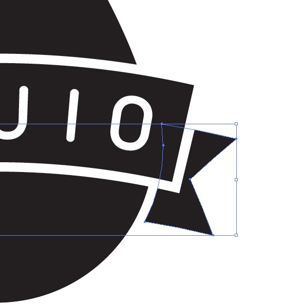
Select the original black banner (not the text) and its white stroke and ⌘+C, then ⌘+F, then Pathfinder > Unite. Select this white banner and the droplet behind it and Pathfinder > Minus Front. Direct select the white stroke around the banner and delete it with the delete key.
14. Clean up the details
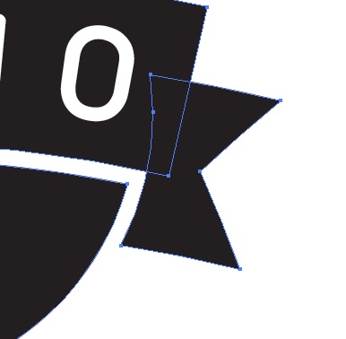
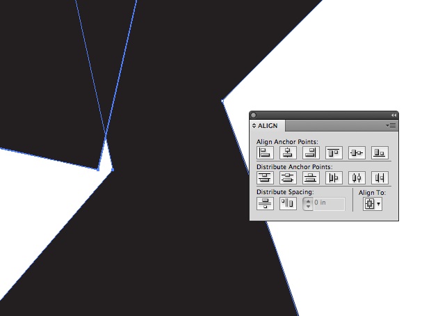
Zoom into your rightmost "ribbon" piece and create a new anchor point along its left side with the pen tool. Move this anchor point next to the bottom right corner of the main banner shape. Remove the handles from the new anchor point as well as the one to its bottom left (in the same shape) by clicking each point with the pen tool while holding option. Direct select both the newly created anchor point and then the bottom right anchor point of the main banner shape (in this order!) and horizontally and vertically align the anchor points using the Align palette. Repeat this process on the left side.
15. Merge your shapes
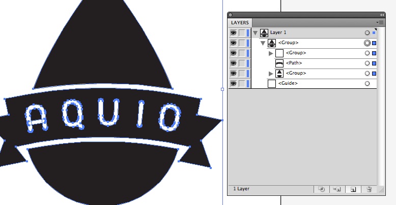
Select the three banner pieces and Pathfinder > Unite. If for some reason, you can't see your text, just move this new shape below the text in your layers palette. You should now have only three shapes – the text, the banner, the droplet.
16. Finish up with colours
We now have a fully flat logo that is ready for any printer and can be easily manipulated for a one-colour or multi-colour version. Try out some different color combinations and find something you like.

This is only the beginning of what the logo could look like but, in general, simple is best!
Chandler Van De Water is a designer out of Greenville, SC. He loves Jesus, great typography, and well-crafted beer. When he's not designing type-heavy art, he's designing hop-heavy home brews. He is nothing without his beard or his wife.
Liked this? Read these!
- Illustrator CS6 review
- Illustrator CC review
- Download free textures: high resolution and ready to use now

Thank you for reading 5 articles this month* Join now for unlimited access
Enjoy your first month for just £1 / $1 / €1
*Read 5 free articles per month without a subscription

Join now for unlimited access
Try first month for just £1 / $1 / €1

The Creative Bloq team is made up of a group of art and design enthusiasts, and has changed and evolved since Creative Bloq began back in 2012. The current website team consists of eight full-time members of staff: Editor Georgia Coggan, Deputy Editor Rosie Hilder, Ecommerce Editor Beren Neale, Senior News Editor Daniel Piper, Editor, Digital Art and 3D Ian Dean, Tech Reviews Editor Erlingur Einarsson, Ecommerce Writer Beth Nicholls and Staff Writer Natalie Fear, as well as a roster of freelancers from around the world. The ImagineFX magazine team also pitch in, ensuring that content from leading digital art publication ImagineFX is represented on Creative Bloq.
