Canva’s brand glow up puts a playful spin on corporate design
The Adobe competitor flexes its vivid personality.

Visual communication platform Canva has unveiled a stylish brand "Glow Up" set on bringing its suite of tools to the wider workplace. With its new brand system, Canva's revamped design injects a fresh burst of personality, applying its creative spirit to bridge the gap between its solo user base and corporate clientele.
Canva has long been the underdog of graphic design software compared to frontrunners such as Adobe and Figma. Originally positioning itself as an empowering tool to bring creativity to everyone, it has often been snubbed by creative professionals as a juvenile design platform. The refreshed system establishes Canva as a unique competitor that embraces functionality, accessibility, and a delightful dose of playful design.
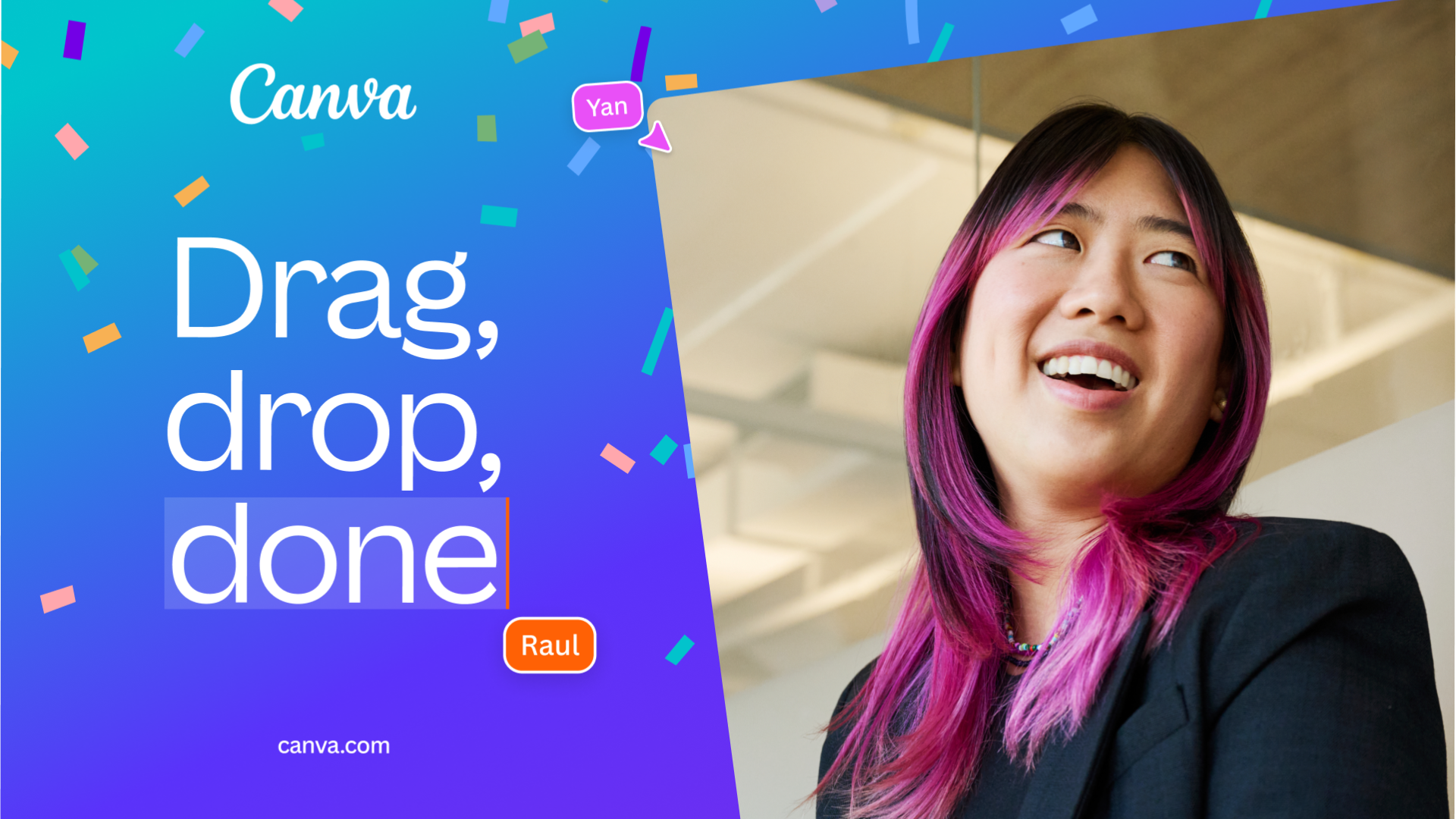
Maintaining its bright gradient, custom typeface and hand-crafted logo, the brand refresh was created as a way to scale Canva's reach while reaffirming its already established global identity. "Canva spent its first decade democratizing design for individuals, and we’re now leveraging what we’ve learned to empower all organizations worldwide," Cat van der Werff, executive creative director at Canva told Creative Bloq. "Doubling down on the idea of empowerment was the guiding light for the entire brand refresh. Design isn’t just about what people create, it’s also about what that design empowers them to achieve," she adds.
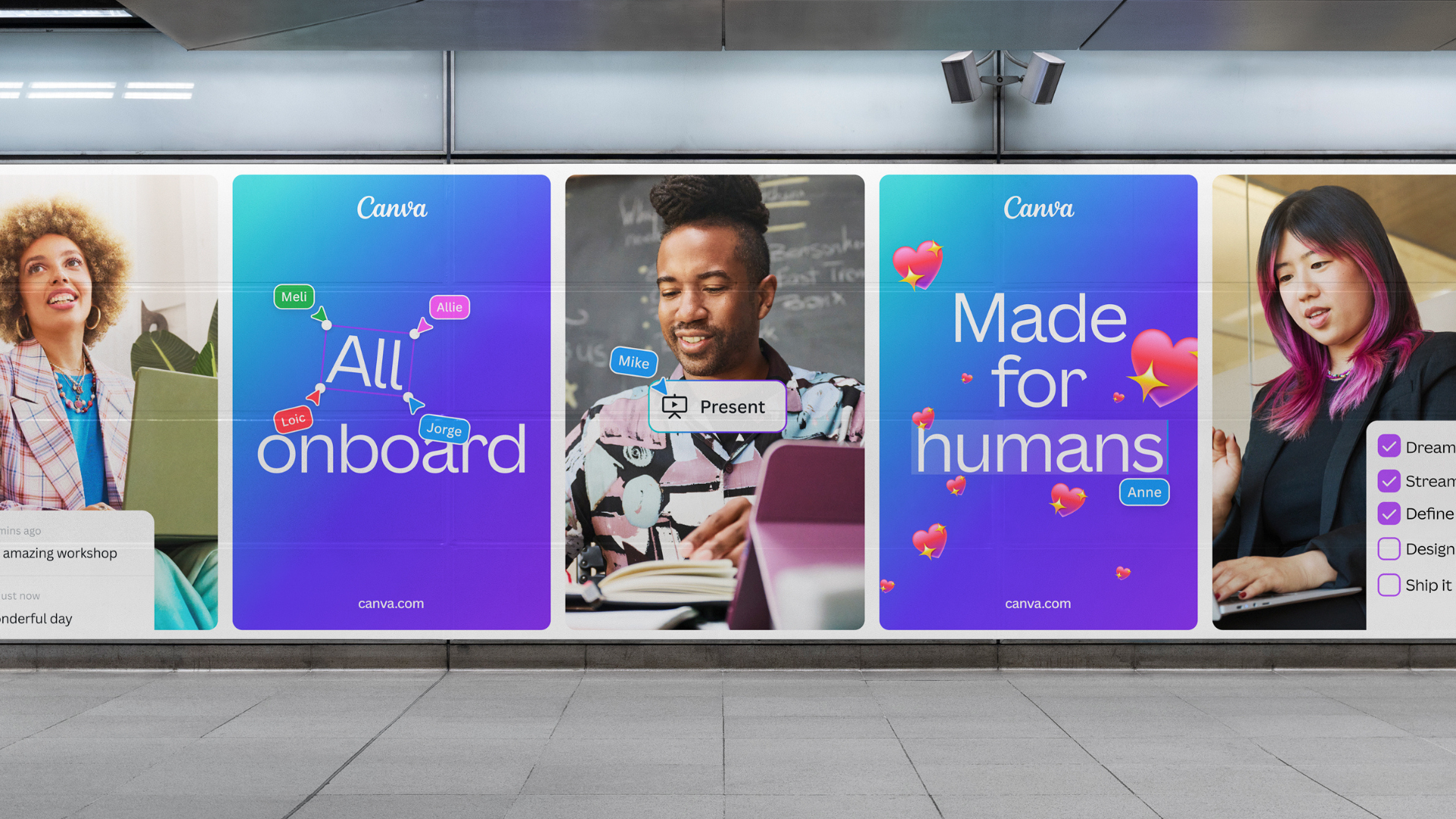
It comes as no surprise that the new brand system was created using Canva's suite of tools. "We’re big believers in leveraging Canva’s tools to show it’s entirely possible to build and scale a global brand all within Canva," Cat says. With revitalised UI and dynamic cursor motifs, the new design system comes alive to spotlight "design at work", showcasing Canva's active functionality as "a brand in motion, even when static."
"We also needed our brand to scale globally, while also connecting locally, reaching more people in more places than ever before. Our refreshed design system functions as a fixed house for flexible content that can be hyper-localized so that international teams are empowered to apply local insight to truly connect with people in meaningful ways," Cat adds.
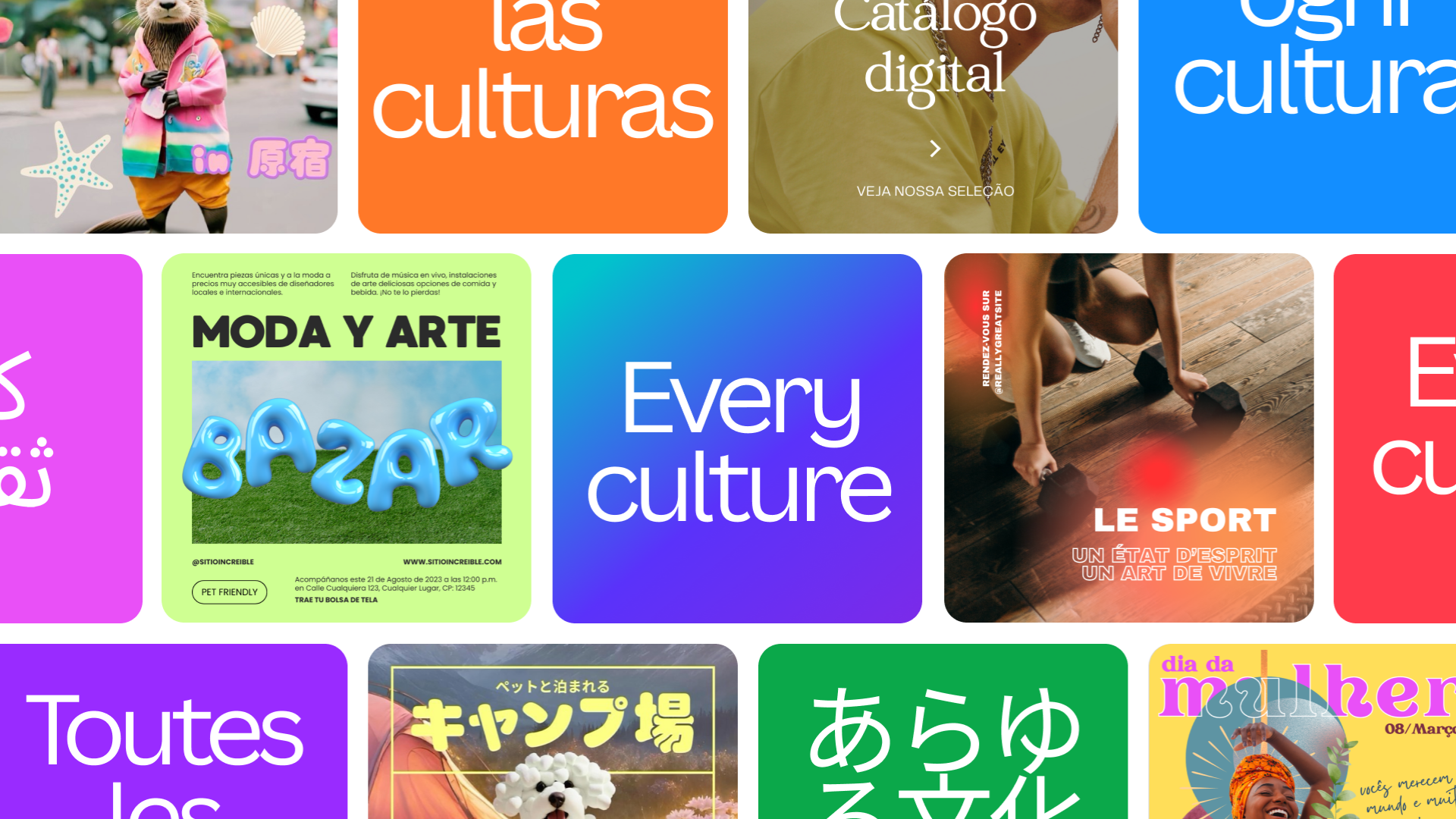
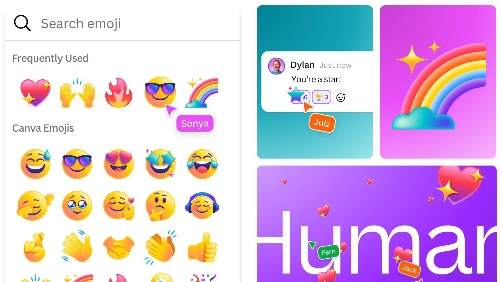
Empowerment and accessibility were key to Canva's glow-up, trading its eclectic colour scheme for a more condensed palette in line with the AA's accessibility standards. The refreshed identity boosts Canva's playful brand voice, ditching mundane corporate copy to amplify the brand's vivid personality. A suite of custom emojis created in collaboration with Buck brings amplified interactivity to the new design system to "put a unique Canva spin on the universal language of emotion," according to Cat. "While emojis speak a universal language, we wanted to ensure our style felt distinct and deeply rooted in who we are," she adds.
When asked what she was most proud of throughout the creative process, Cat Told Creative Bloq: "Our brand has always evolved with our business, but I truly feel this is the best, most playful and professional expression of our brand yet. I’m really proud of how this new brand system highlights the needs of the workplace and how we, as a brand, are supporting organizations overall. As the workplace becomes more visual, our easy-to-use tools make complex things simple, and our refreshed brand makes them even more accessible."
Get the Creative Bloq Newsletter
Daily design news, reviews, how-tos and more, as picked by the editors.
For more Canva news, check out why the brand's recent Affinity acquisition could mean serious competition for Adobe. For some unexpected but ingenious marketing inspiration, take a look at Canva's rap that got the internet laughing and cringing in equal measure.

Thank you for reading 5 articles this month* Join now for unlimited access
Enjoy your first month for just £1 / $1 / €1
*Read 5 free articles per month without a subscription

Join now for unlimited access
Try first month for just £1 / $1 / €1

Natalie Fear is Creative Bloq's staff writer. With an eye for trending topics and a passion for internet culture, she brings you the latest in art and design news. Natalie also runs Creative Bloq’s Day in the Life series, spotlighting diverse talent across the creative industries. Outside of work, she loves all things literature and music (although she’s partial to a spot of TikTok brain rot).
