The Wombles rebrand is a cosy blast of nostalgia
Cat How discusses refining the "essence of Womble".

The Wombles are back! Yes, our humble nature-loving furry friends have returned in a wholesome rebrand, bringing their enduring spirit of sustainability to a new generation. With a fresh visual and verbal toolkit, the loveable critters are bestowing their official Wombly seal of approval on brands that share their enduring environmentalist ethos.
Looking back on the best rebrands across the decades, one pervading issue crops up time and time again – negotiating nostalgia. The Wombles rebrand is not only a delightful homage to the grassroots origins of the brand but a thoughtful reimagining that captures the character's unique charm while championing green initiatives, proving it's far more than an empty nostalgia reboot.
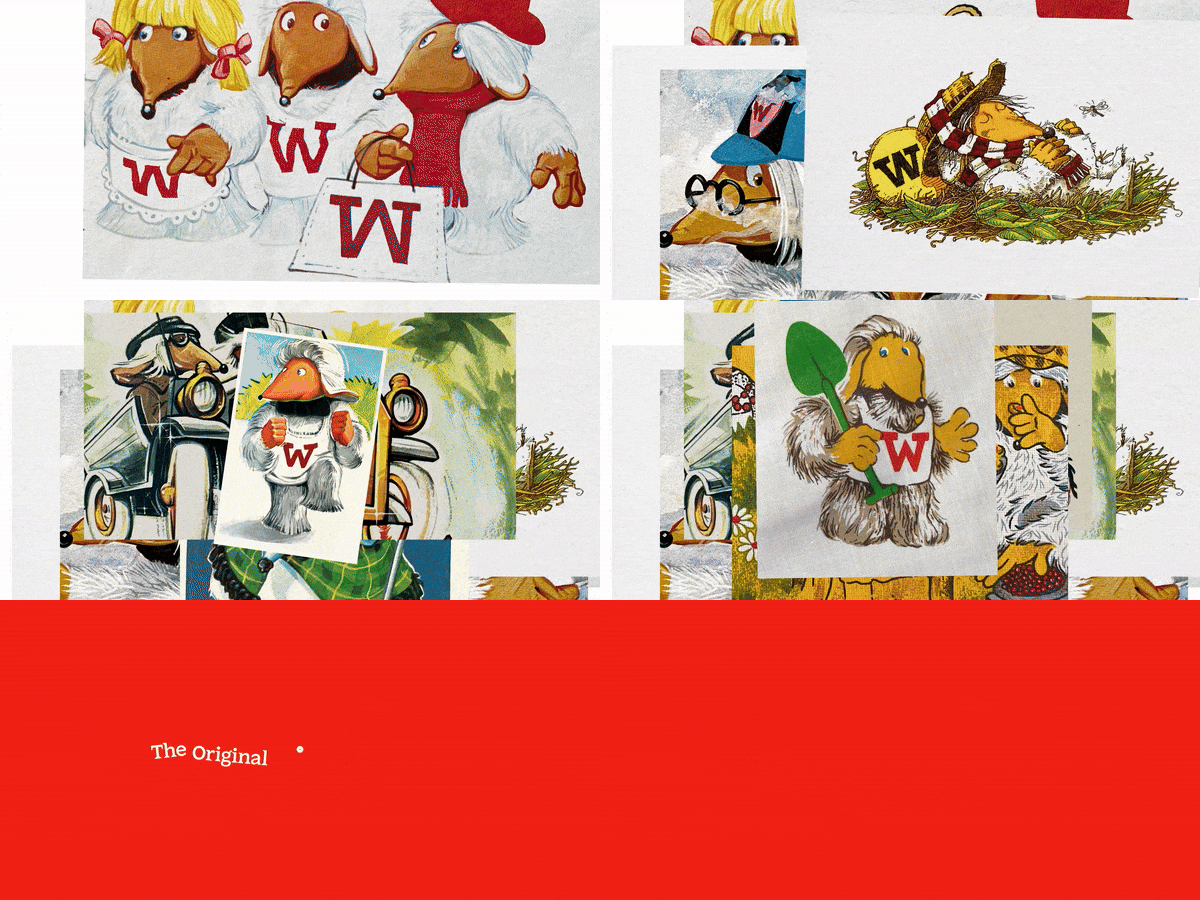
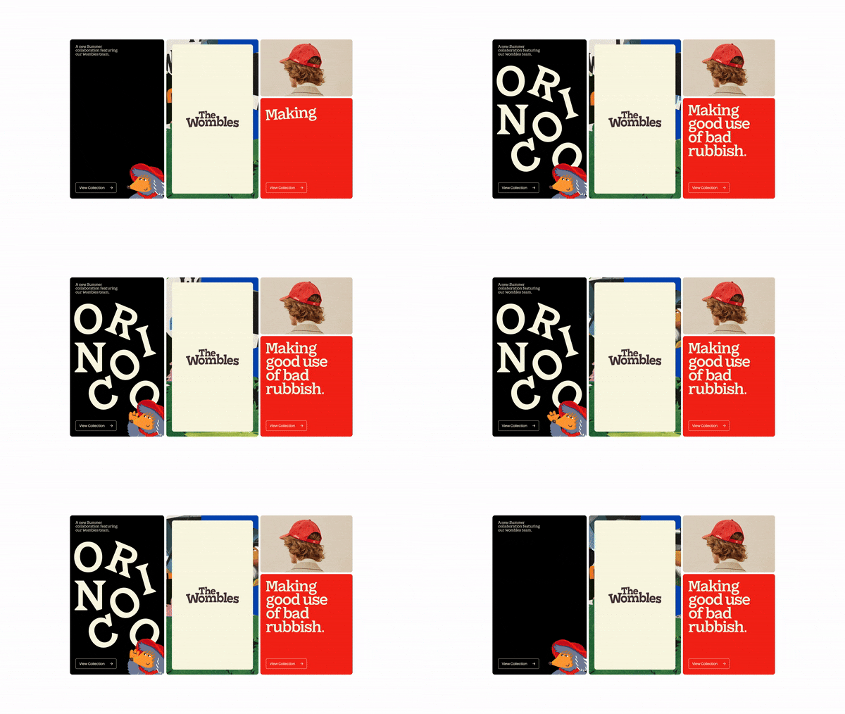
Created by branding agency How&How, the Wombles rebrand was shaped by the characters' iconic legacy dating back to the 70s. Inspired by the Wombles ‘Found & Found’ workshop, How&How transformed old 'found' brand assets to create a "true British picnic of warm, Wombly features." With a diverse array of nostalgic icons, patterned pictograms and charming illustrations, the rebrand is a visual and verbal toolkit for brand partners to embrace the Wombles' sustainable spirit.
Tackling a brand with such strong nostalgic ties is no easy task, something that How&How's founder, Cat How was conscious of throughout the design process. "It's a delicate balance of making sure that you can successfully and sympathetically update the brand, while still keeping all the key components of what made that brand so charming and engaging in the first place," Cat tells Creative Bloq.
For us, it was all about a deep dive into the archives that The Wombles team gave us access to. Going through all the source material helped us to figure out key characteristics or traits that kept on emerging over the different decades, and the most important ones always rose to the top. It was then up to us to make sure we recognised these, and brought them to life," she adds.
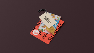
Maintaining the Wombles' spirit of sustainability was a crucial element that the creative team worked hard to preserve throughout the project, both in practice and execution. "Much like The Wombles upcycled and made 'good use of bad rubbish', we had quite a cut-and-paste approach to building the brand: rifling through stacks of source material, and gradually building up the resolution of the final brand after much rummaging around the archives, iterating and testing," Cat says.

When asked what element of the rebrand was most fun to create, Cat highlights the illustration elements that bring the project to life. "The character illustration was a real highlight—probably because each one came with certain key personality traits and characteristics that had to be distilled and visualised," she says.
Get the Creative Bloq Newsletter
Daily design news, reviews, how-tos and more, as picked by the editors.
"We also created an illustrative toolkit for each one, complete with bespoke fabric texture designs and random ephemera (a croissant, kite, piece of chocolate, paintbrush or guitar for example) associated with each Womble. I think trying to work out if the droop of a nose, or the position of an eye was the true 'essence of Womble' was a lot of fun. Applying systems logic to something so playful and surreal was a real joy to be a part of," she adds.
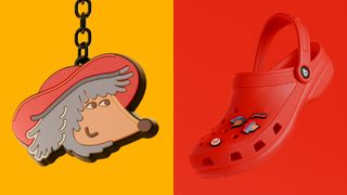
Expertly showcasing the enduring appeal of the Wombles, the rebrand is a harmonious blend of nostalgia and thoughtful design that never loses the beloved characters' playful spirit. From its charming illustrations to its upbeat straplines, it's a dynamic toolkit built to empower brands, spreading sustainability and joy in equal measure. Oh, and in case you were wondering, Cat assures us "No Wombles were harmed in the making of this project."
For more brilliant branding from How&How, check out its stunning national park rebrand that's packed with natural symbolism. If you're after more recent rebrand news, take a look at Burt’s Bees' retro summer camp campaign that's straight out of the 70s.

Thank you for reading 5 articles this month* Join now for unlimited access
Enjoy your first month for just £1 / $1 / €1
*Read 5 free articles per month without a subscription

Join now for unlimited access
Try first month for just £1 / $1 / €1

Natalie Fear is Creative Bloq's staff writer. With an eye for trending topics and a passion for internet culture, she brings you the latest in art and design news. Natalie also runs Creative Bloq’s Day in the Life series, spotlighting diverse talent across the creative industries. Outside of work, she loves all things literature and music (although she’s partial to a spot of TikTok brain rot).
