venturethree is the branding agency that hates rebrands.
(Image credit: Venturethree)
A creative agency that hates rebrands. Provocative? Well, maybe not as much as you think. The clue is in the word itself: the “rebrand.” It implies an air of self-indulgence. Self care for your business. Like a new lick of paint or a new CMO making moves. A spring clean for your brand. With the best rebrands, the intention behind it is immediately clear – but too often, the rebrand becomes a distraction, and too many people end up missing why behind the what.
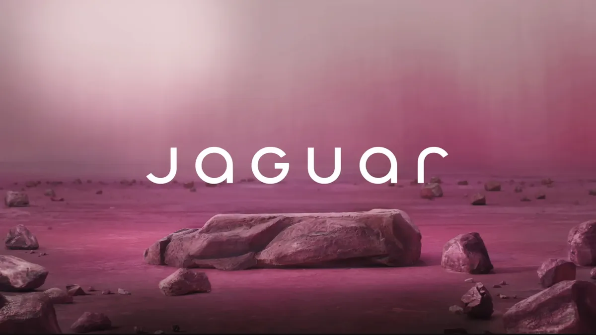
We live in a fast-moving world where the focus is often on the wrong things. The logo. The colours. The new typography. Is it woke? Does it honour a legacy? Is it ugly? Too modern – or not modern enough? Have we seen it all before? Should it never have been changed in the first place? Just look at the recent response to the Jaguar rebrand. All too often, a rebrand is boiled down to the lowest common denominator in both the design and mainstream press and across social media platforms. Clickbait. Knee-jerk reactions. Focusing on the colour, or a new font.
The recent Jaguar rebrand raised eyebrows (Image credit: Jaguar)
Now, I’m not saying these aren’t important. They are. A unique creative expression is business critical these days. But these elements of a rebrand are just the visible outcome and are almost always – when done well – in service of a much bigger picture. A new business vision. A full repositioning in the market against new competition, or in your existing and potential customers’ eyes. Opening to new markets, often positioned alongside a new product, service or offer to back up the business reset.
Latest Videos From Creative Bloq
At venturethree, we challenge rebrand briefs by addressing core values, vision and the ‘why’ behind a brand’s existence to ensure branding work aligns with a brand’s reset, recalibration or repositioning, and has the potential to act as a catalyst for needed organisational change.
Sometimes that bigger picture reveals itself immediately, sometimes more slowly. But if and when it is there, the word “rebrand” simply does not do it justice. The best work happens when the full suite of brand tools is applied both internally and externally, influencing absolutely every aspect of a business: its customer experience, capabilities, culture and communications. Its vision and North Star. Metrics that the external commentator will never be privy to, but hopefully one day will simply feel.
To get there, brand leaders need to ask not “does my company need a rebrand?” and instead “what is our brand trying to achieve?” Is it fit for purpose in terms of the direction we want to travel? And how can capital-B “Brand” achieve this, rather than just brand expression?
(Image credit: Venturethree)
Take Sports Direct for example. For 30 years, they had been known as the go-to for low-cost sports gear but with a new brand strategy and identity, we helped them transform from a high street value player to an empowerment champion. Built on the promise of “equal through sport,” the new identity — an equal sign — puts equality and inclusivity at the heart of the brand. By utilising the power of sport to champion everyone, a deeper purpose for the brand was unlocked, focusing on accessibility and an ongoing promise to make people feel confident and empowered, whatever their goal, budget or ability.
Get the Creative Bloq Newsletter
Daily design news, reviews, how-tos and more, as picked by the editors.
(Image credit: Meta)
There’s also Meta, which boldly moved away from the Facebook brand, not only consolidating its apps and technologies under one unified company brand but also signalling its intent to lead the growing metaverse. This is when a rebrand is much more than a rebrand. When the actions are louder than the word. That catch-all word that often falls short. For now, maybe the rebrand needs a rebrand.
Thank you for reading 5 articles this month* Join now for unlimited access
Tim Jackson is a creative force in brand reinvention and innovation, shaping brands that cut through the noise with clarity, impact, and originality. As Creative Director at venturethree, he leads the creative development of brand identities, systems, and experiences—guiding every aspect from concept to execution.