Upwork's new identity shows the importance of motion in modern branding
Sign up to Creative Bloq's daily newsletter, which brings you the latest news and inspiration from the worlds of art, design and technology.
You are now subscribed
Your newsletter sign-up was successful
Want to add more newsletters?
Five times a week
CreativeBloq
Sign up to Creative Bloq's daily newsletter, which brings you the latest news and inspiration from the worlds of art, design and technology.

Once a week
By Design
Sign up to Creative Bloq's daily newsletter, which brings you the latest news and inspiration from the worlds of art, design and technology.
Once a week
State of the Art
Sign up to Creative Bloq's daily newsletter, which brings you the latest news and inspiration from the worlds of art, design and technology.
Seasonal (around events)
Brand Impact Awards
Sign up to Creative Bloq's daily newsletter, which brings you the latest news and inspiration from the worlds of art, design and technology.
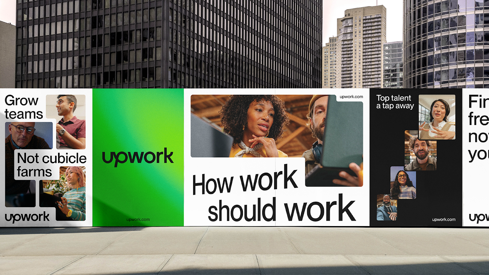
Rebranding a freelance talent platform sounds like a tall task. How do you give an exciting and appealing personality to... work? But Upwork's managed that with a dynamic new brand identity that leans into its mission to create a flexible workspace for the future. And it shows just how important motion is in modern branding.
In Upwork's brand refresh, movement isn't just an afterthought (like when a brand suddenly decides it needs to solder on an animated logo or audio logo to an existing identity). It's baked in throughout in the form of motion behaviours that are intended to reflect a world of work that never stands still. The result is a design language that feels consistent across everything from social posts to the platform's UI design.

The Upwork brand refresh is the work of Widen+Kennedy's design and branding arm, NOT Wieden+Kennedy. The new visual identity and global design system revolves around the concept of 'a new dimension of work’, aiming to reflects a vision of a flexible and accessible future of work that fits into people's lives, rather than the other way around.
Motion is highly present thanks to the use of a grid system that animates to react to content and messaging. And the feeling of continual movement is amplified by angled typography and the introduction of colour gradients rather than block colours.

NOT Wieden+Kennedy spent 18 months working on the project, from conducting interviews with Upwork employees and customers to reviewing hundreds of brand touchpoints. It settled on a sleek, minimalist approach that gives a "constant sense of forward momentum and growth".
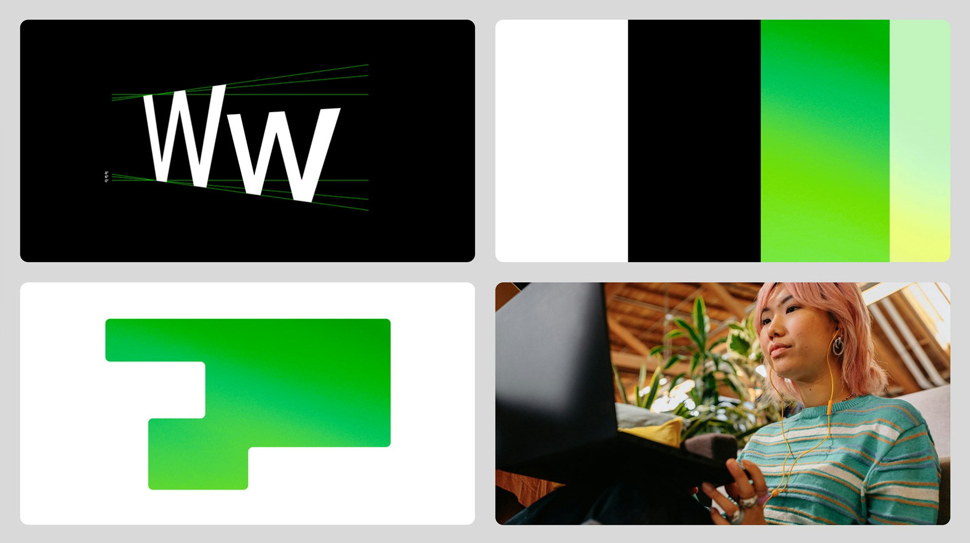
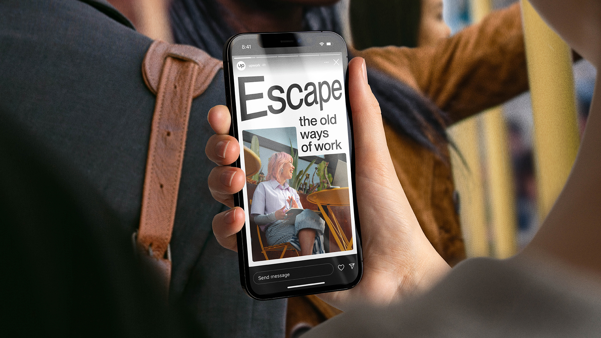
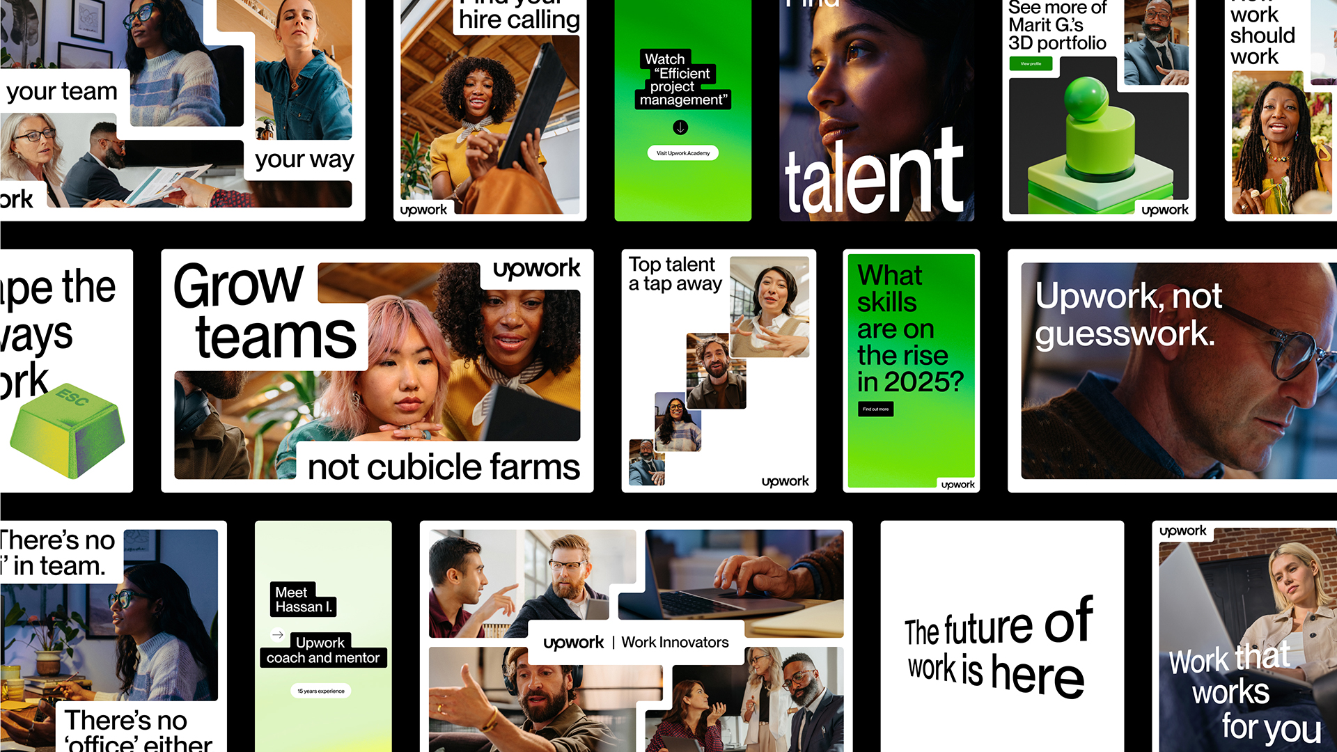
There's a new typography system with dimensional treatments created on that purpose-built fluid grid system to allow endless permutations of shape and image – again part of that aim to convey a flexible future for work.
The brand colours were also refined, with the palette now streamlined to increase brand awareness while adding a depth and dynamism (and touches of glimmer) for an energetic identity that differentiates Upwork from competitors.
Sign up to Creative Bloq's daily newsletter, which brings you the latest news and inspiration from the worlds of art, design and technology.
For more branding news, see why everyone hates the Nottingham Building Society rebrand and why it's increasingly important to adopt a 'fix and flex' approach to branding.

Joe is a regular freelance journalist and editor at Creative Bloq. He writes news, features and buying guides and keeps track of the best equipment and software for creatives, from video editing programs to monitors and accessories. A veteran news writer and photographer, he now works as a project manager at the London and Buenos Aires-based design, production and branding agency Hermana Creatives. There he manages a team of designers, photographers and video editors who specialise in producing visual content and design assets for the hospitality sector. He also dances Argentine tango.
