I speak to JKR and the RSPCA about the rebrand that won big at this year's Brand Impact Awards.
(Image credit: RSPCA)
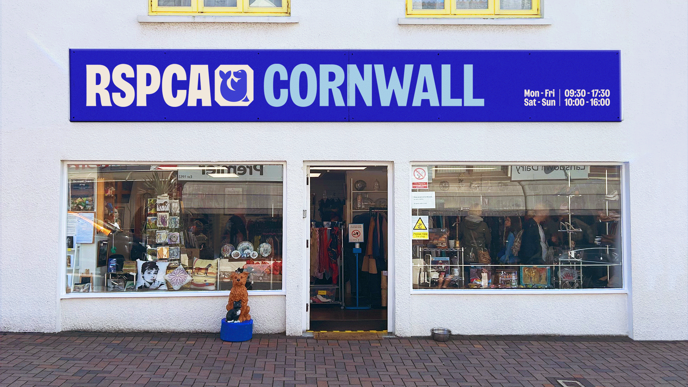
The RSPCA is the largest animal welfare charity in the UK and is celebrating its 200th birthday this year. It hadn't rebranded since the 1970s, and research showed that its brand was holding its back – limiting its ability to achieve its ambitious strategy. "Many people felt that the RSPCA wasn't for them," says Olivia Reid, assistant director of marketing and communications at the RSPCA.
Enter branding agency Jones Knowles Ritchie (JKR), who worked closely with the RSPCA to develop a new identity for the charity. The resulting identity launched to overwhelmingly positive acclaim and won Gold at the 2024 Brand Impact Awards, as well as the highly coveted Best of Show: Identity award.
As part of our How we Made series, I spoke to Olivia and Christopher Sharpe, creative director at JKR to find out more about the project.
How did you draw upon the charity’s heritage in the new identity?
Christopher Sharpe: Working with a 200-year-old institution like the RSPCA, the archives were always going to be rich pickings. Two moments in particular stand out.
The first is a vibrant shade of blue, discovered adorning a hardback book from the brand’s 100th anniversary. Our chief growth director found the rare tome online, bought a copy, and brought it to the pitch as both a meaningful artefact to rally around and a powerful driver of our work moving forward. Though we explored many other options for evolving the RSPCA’s signature colour along the way, we kept coming back to the pop and pride of that shade, which we then optimised for an RGB-ready world.
The second major source of inspiration was signage uncovered from decades of campaigning for animal welfare. Often hand-drawn or carved, these bold, imperfect letterforms grounded us in the humanity of the brand – this has always been a movement driven by people who care deeply for animals, giving up their time and talent to make a difference. And, of course, they were also the spark for our bespoke typeface: Wilberforce Sans.
But ultimately, it wasn’t the heritage of the RSPCA that was the biggest inspiration for our work; it was its here-and-now. We traveled around the country, immersing ourselves in the lived reality of the RSPCA. We visited branches, animal hospitals, farms, rescue centres, and call centres, and even spent a day with inspectors on the frontline, witnessing animal cruelty first-hand.
These experiences not only brought sources of visual and verbal inspiration but also drove home to each team member that this was no ordinary rebrand – and how vital the RSPCA’s work is.
(Image credit: RSPCA)
What was the thinking behind the new logo and colour palette?
CS: This rebrand was a real high-wire act – striking the balance between the gravitas of a 200-year-old institution and the bold, disruptive relevance the RSPCA needed to stand out from the herd. Retaining the support of their existing base while appealing to a new generation of animal activists. Being ‘Everyone for Every Animal’ without trying to be all things to all people.
Early on, it became clear that the previous logo’s compressed letterforms and the octagonal holding shape (unaffectionately known within the RSPCA as ‘the coffin’) had to go. It was too authoritarian and rigid – both in the image it projected to the public and in its inflexibility as part of a design system. The logo also needed to be telegraphic, expressing a sense of the RSPCA being clearly animal-first, even for those unfamiliar with what the acronym stood for.
We loosened up the typography, ensuring each letter stood proud, reflecting the open, progressive nature of the modern RSPCA. The distinctive shape of the octagon was retained but evolved into the “octopunct” – a blend of the brand’s most recent logo and the interpuncts from its historic ones. The octopunct functions either as a punctuation point after the name, symbolising the brand’s commitment to ending animal cruelty, or as a new holding device for animal icons. Rather than being one-size-fits-all, these icons flex to reflect the animal featured in the brand’s communications or the one most closely associated with a local branch or area – a canary for Norwich, a fox for Leicester, for instance.
Meanwhile, the colour palette took the distinctive blue and white of the brand and injected a much-needed dose of vibrancy and warmth. These were supported by a simple yet hard-working suite of secondary colours, allowing the brand to encompass both the joyful, optimistic side of its work and the gritty, serious subject matter of animal cruelty.
(Image credit: RSPCA)
How did you develop the typography, together with Studio Drama?
CS: We knew from the beginning that a brand as well-known, storied, and campaigning-focused as the RSPCA deserved a bespoke typeface of its own. Studio Drama rose to the challenge, going above and beyond in both the research and craftsmanship of the typeface.
We worked closely to ensure the typeface captured the strategic essence of the brand – ligatures that expressed the unity of everyone working together for every kind; soft ink traps and blunt details that reflected the firm yet friendly tone of their animal rescue officers – while also working seamlessly with other elements of the brand, such as the animal illustrations.
The final vital cog in the process was the RSPCA’s in-house design team, whose passion for type ensured we were not only visually on point but also fit for purpose.
(Image credit: RSPCA)
What inspired the style of illustrations?
CS: Beyond our own creative vision, our illustrations had several hoops to jump through. They had to be simple and immediate, yet flexible enough to encompass everything from cows to cats. They needed to work harmoniously with our typography while fitting comfortably both inside and outside the octopunct shape. Crucially, they had to be inviting, expressing animals at their happy, healthy best, but they also had to be approved by the RSPCA’s veterinarians to ensure they were scientifically accurate and representative.
Fully crafted in-house, the result was a characterful, geometric style, with an emphasis on positive body language and expressive eyes. We’re very proud of them.
What challenges did you come across in this project?
CS: We anticipated that bringing a 200-year-old organisation on this journey would be tricky. A topic as meaningful as animal welfare would naturally inspire passionate debate, far surpassing the usual discussions about design systems and Pantone swatches. But very early on, it became clear how much legwork the RSPCA team had done to even get this rebrand to the briefing stage. They’d set us up for success. They were willing to trust us and the process.
So the biggest challenge? Not letting them down.
Olivia Reid: With 200 years of iconic heritage, changing a brand of this magnitude came with huge responsibility. The RSPCA is also a federated organisation with over 135 independent branches operating in the heart of the community. Brand is quite a nebulous topic, and it’s difficult for some people to understand the value of brand to an organisation's success. Engaging with the complex stakeholder network was key to getting this right. Some were sceptical of the change. So we aimed to inspire and excite our audiences to adopt the new brand and demonstrate the new identity would deliver much more than the outdated old one.
Data played a really important role here. We used an iterative creative testing platform useloops.com to invite feedback from our key audiences (internal and external) to understand how the creative iterations were landing. We built from the learnings. This made decision making much more objective and gave the RSPCA Board the confidence we were moving in the right direction and the rebrand would deliver the strategic intent. We could not have got the project over the line without it.
(Image credit: RSPCA)
Do you think the new identity is future-proof? How did you ensure this?
CS: When it comes to animal welfare, the RSPCA are the OGs. In 1824, they deliberately went against the conventional wisdom of the day to rally humanity for animals. In doing so, they sparked a movement that ruffled a few feathers but saved many more. Whenever we questioned ourselves throughout the creative process, we came back to that thought: it had to feel true to that spirit and the RSPCA’s mission. Bold, yet empathetic. Human, yet animal-first.
If we were ticking these boxes, we knew this was a design that would wear in rather than wear out.
But we didn’t just have 200 years of history to guide us; we also had an innovative AI-powered research partner: Loops.
Throughout the process, we used this platform to test our strategy and design with key stakeholders, dozens of RSPCA team members, and the population at large. This allowed us to stress-test our routes and ideas sooner rather than later, using research not as a final hurdle for our work but as a tool to constantly drive its development forward – solving pain points and convincing the wider organisation of its objective value in real-time.
What’s your favourite part of the finished work?
OR: I love the distinctive animal icons, representing that we are here for all animals! They were developed in partnership with our brilliant brand partner, JKR and our science teams depicting a range of animals in their happy, relaxed state. In motion they mimic the natural behaviours of their real life counterparts. The craft and love that went into designing these illustrations shines through.
The overall identity is bold and flexible but it originates from our heritage. The distinctive ‘octopunct’ shape is a useful organising device to house the animal icons and key stats about animal welfare but originated from the lozenge that previously housed the RSPCA logo. The letters have now been freed from the restrictive enclosure and are much more welcoming and confident. JKR helped us unlock a brand identity that is authentic to our roots yet modern and relevant for today’s world.
(Image credit: RSPCA)
What did you learn from this project?
CS: How interconnected human and animal lives are – and how out of balance that connection has become due to the impact of factory farming, climate change, and much more. And that, to even begin to fix it, it takes a society – a society brought together by radical honesty and a commitment to change, whether it’s between us and the RSPCA, a local branch and its community, or a government and the people campaigning tirelessly to end animal cruelty.
OR: I learned the true value of a great partnership and a well-defined process. When things felt challenging we reminded ourselves to trust in the process. We did and it worked.
Part of the process invited us to look back deep into our roots to rediscover what drove and motivated our founders who inspired animal welfare movements worldwide. Looking back into our history provided the pivotal insights needed to develop an authentic, ambitious RSPCA, fit for the future.
Working with JKR was a pleasure. We were a real team, we all shared in our objectives. We challenged each other to create a brand with impact.
(Image credit: RSPCA)
What’s the feedback been like so far?
OR: I'm pleased to say that the response so far has been incredible. Charity rebrands can be sensitive and controversial, but the strength in the strategic foundations of the brand, audience testing and careful positioning at launch meant we started the brand journey with confidence.
We had:
90.3% positive press coverage.
70% positive across social media.
83% of existing supporters agreed the new brand made them feel positive about the RSPCA.
Maintaining our supporter base whilst we grow and reposition ourselves has always been a key consideration.
Critically, consideration to donate is up. It's a particularly hard metric to move the dial on but we have already seen really positive results with a 7% increase. Consideration is our proxy to people feeling positive about the RSPCA and the cause. And we can see it now translate into our fundraising. The summer appeal, the first campaign in the new brand, out-performed the previous years by 200%! We are attracting new audiences.
Obviously, we can't attribute everything to the new brand alone but the early indications are really reassuring.
RSPCA staff and volunteers also talk about how the rebrand has re-energised them and their passion, people feel united behind our purpose. There's an infectious excitement around the office. Even some of our branch network who were sceptical at first are now on the journey to rebranding their own shops and animal centres.
Get the Creative Bloq Newsletter
Daily design news, reviews, how-tos and more, as picked by the editors.
Rosie Hilder is Creative Bloq's Deputy Editor. After beginning her career in journalism in Argentina – where she worked as Deputy Editor of Time Out Buenos Aires – she moved back to the UK and joined Future Plc in 2016. Since then, she's worked as Operations Editor on magazines including Computer Arts, 3D World and Paint & Draw and Mac|Life. In 2018, she joined Creative Bloq, where she now assists with the daily management of the site, including growing the site's reach, getting involved in events, such as judging the Brand Impact Awards, and helping make sure our content serves the reader as best it can.