
I can't say I've paid much attention to the branding of the French railways recently, having not visited since 2019. But the recent rebrand of SNCF Voyageurs, which transports five million passengers across France every day, has caught my attention.
SNCF Voyageurs is a new subsidiary of the SNCF Group, and is one of various SNCF brands. The challenge was to make SNCF Voyageurs stand out in its own right, as many people don't know the difference between all these brands. With the help of Rosa Paris, the train company has eschewed having just one logo, and has chosen instead to launch 25 different logos designed by graphic designers, 3D artists, embroiderers and more. You can see them all in the video below.
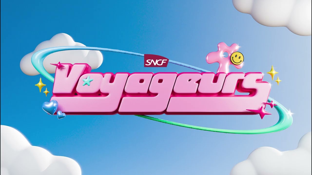
Some of them have got a distinct retro vibe, drawing on some the best typography of previous decades and they range from the cute to the sophisticated,. There are logos that reference some of the best metal band logos, a sweet collection of stickers, Voyageurs written on a book spine and one that must have been crafted with the Barbie aesthetic in mind.

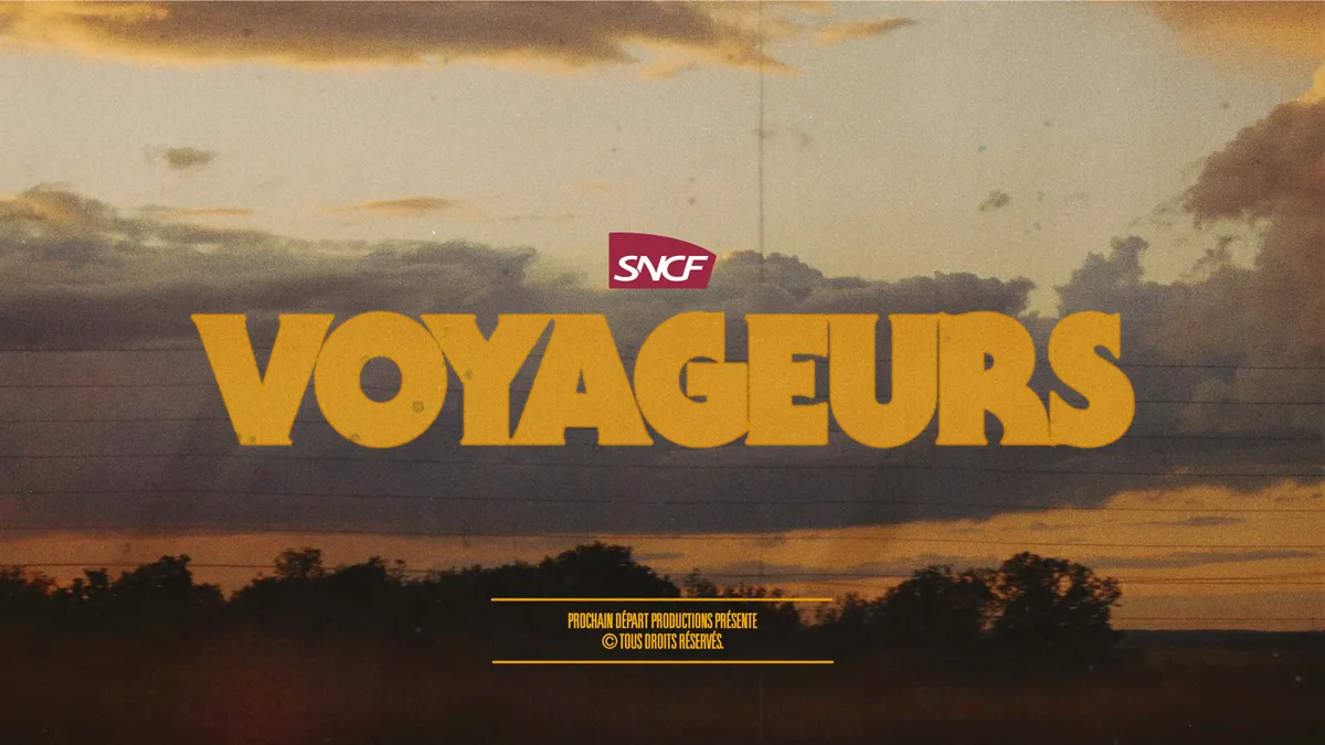

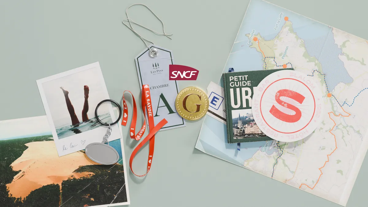

The range of logos aims to reference the range of passengers that the train company transports.
A press release says that there's something for everyone: "the traveler who likes to read, the traveler who misses the 2000s, the one for whom figures and spreadsheets hold no secrets, the dreamer, the snack-loving traveler, and many others." With five million passengers daily I'm not sure that absolutely everyone will find a logo that they like, but there is a good mix for them to choose from.
I personally love the eclectic approach to logo design, though I think the whole idea is slightly dampened when we get the bland corporate logo coming up at the end. I do see that a train company needs one image to use across a range of collateral, and I assume this logo needs to fit in with the rest of SNCF's branding, but does it have to be quite so dull? This seems all the more apparent when the logos presented in the video are so vibrant.
The 25-logo campaign can be seen on FLIGHT, the French channel lTF1, and on social media through the brand’s networks. So next time you're in France, make sure you keep an eye out for it.
For more rebrands that got people talking, see our most read logo and rebrand stories of 2024, or check out our logos of the decade series.

