This finance app rebrand is painfully Gen Z (and I love it)
Koto embraces "Life on Max”

Collaborative earning app Fluz has unveiled a playful new identity that's re-energising the world of financial branding. With a fresh visual revamp packed with personality, the new design aims to capture the imagination of a contemporary audience with its bold design and immersive touch points.
In today's branding climate, it can be tempting to stick to the safety of minimalist design trends, yet Fluz's new look proves that punchy and impactful visuals play a big part in creating a memorable identity. Bursting onto the scene with bold, trailblazing energy, Fluz stands out as a brand that's breaking the mould of the finance sector, injecting a well needed dose of fun, youthful spirit.

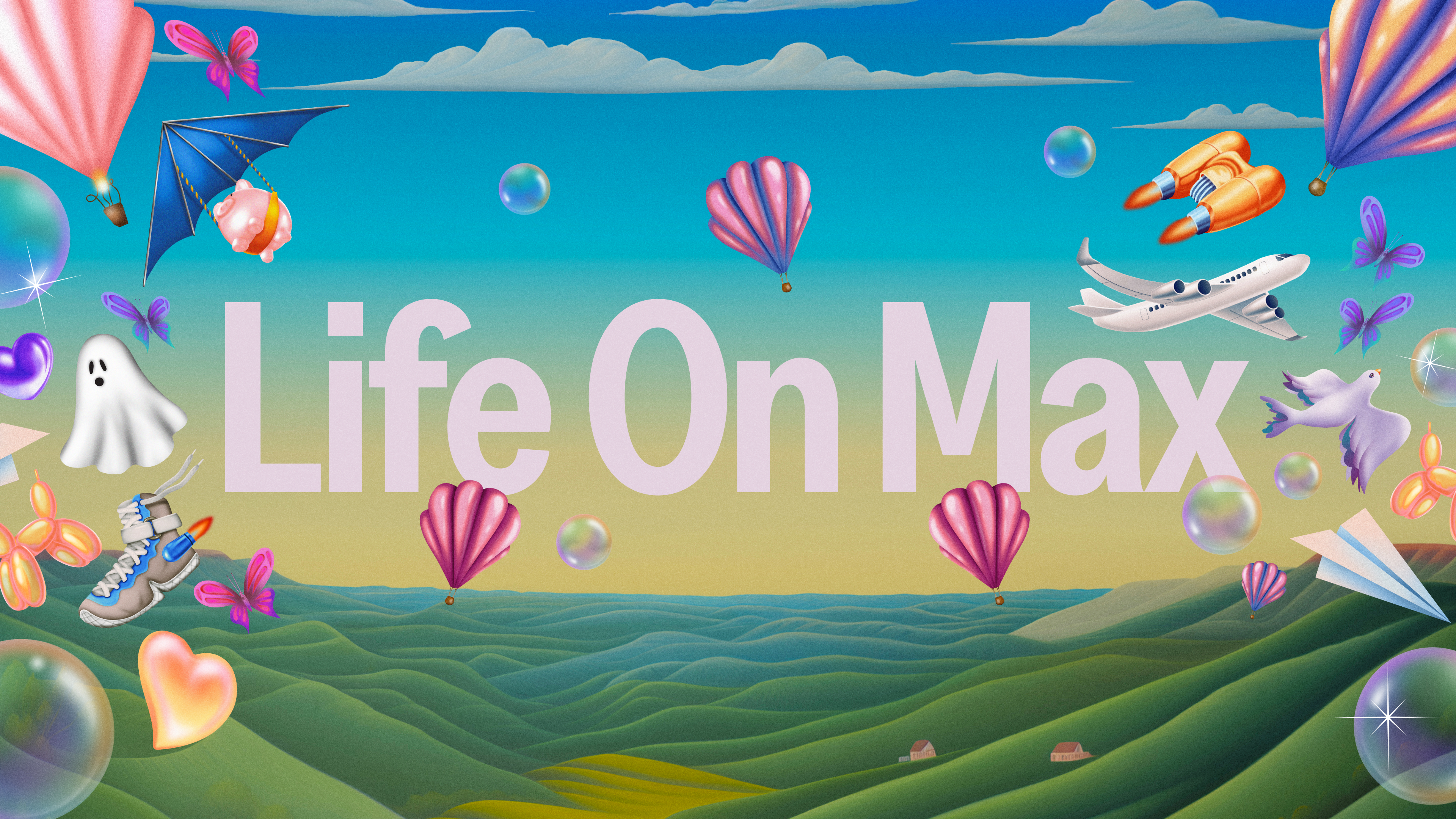
Founded in 2018, Fluz is an app that encourages community, offering cashback on all purchases and an inclusive and accessible platform to complete transactions. Created by design agency Koto Studio, the new identity centres around the concept that "Fluz empowers you to maximize your money." Hinging on this concept, the brand's big personality is reflected in all facets of its identity, from the bold logo to the stylish illustration, embodying a "Life on Max".
"'Life on Max' encapsulates the idea of stretching every dollar to its fullest potential," Arthur Foliard, Executive Creative Director at Koto told Creative Bloq. "It’s an invitation to Fluz users to engage with their finances in a way that is both fun and empowering, amplifying their spending power."

Fluz's maximalist brand personality stems from "Gen Z's influence" which became "pivotal in Fluz's design process." The design team aimed to connect with this audience "by embracing their values of transparency, inclusivity, and financial empowerment." The result is a "playful yet powerful visual identity" that appeals to Gen Z's "sense of creativity and community." Reflecting on this demographic-led design Arthur adds: "This rebrand wasn't just about aesthetics; it was about creating a brand experience that feels authentic and empowering to Gen Z users."
The brand's playful spirit can be seen reflected in its logo – a portal into Fluz's confident and creative spirit. "The Fluz logo was designed to be a bold and confident wordmark, reflecting the brand's mission of maximizing money," Arthur says. "The goal was to create a powerful visual anchor that would resonate at a large scale, helping to build brand equity and connect with both current and potential users effectively. Its design conveys strength and approachability, encapsulating the brand's core values at first glance," he adds.

In addition to the bold logo is the playful mix of typographical styles that capture a sense of contemporary playfulness. With a mix of Greed Condensed Semibold featuring on headlines and sub-headers and the more subdued Area reserved for copy and tags, the typography strikes a masterful blend of dynamic authority and practical style.
Get the Creative Bloq Newsletter
Daily design news, reviews, how-tos and more, as picked by the editors.
While still maintaining a youthful spirit, the colour palette avoids the obvious garish visuals associated with Gen Z marketing, using "ethereal tones contrasted with dark colours." The lighter tones in conjunction with the dark give the identity a sense of depth, accompanied by the secondary palette which introduces three gradients – "Calm, Expressive, and Max", to add a sense of immersion and visual dynamism.

Central to Fluz's identity is the illustration style which gives the brand identity a characterful uniqueness. "Creating Fluz's surreal universe where everyday objects take on a fantastical quality allowed for a lot of creative freedom," Arthur tells Creative Bloq. "This vibrant and imaginative approach perfectly encapsulates the essence of 'Life on Max', making financial empowerment visually engaging and relatable for Fluz users," he adds.
However, it wasn't a project without hurdles, as Arthur explains: "The biggest challenge was ensuring the new identity remained true to Fluz’s mission while appealing to a younger audience." While the team embraced the free-flowing spirit of the younger demographic, Arthur says "Balancing the playful elements with the need for a credible and trustworthy financial platform required careful consideration. Ensuring that every visual element, from typography to colour palette, conveyed both energy and reliability was a complex but rewarding process."

When asked about the most satisfying part of the design process, Arthur said: "We are most proud of the way the entire visual identity comes together to form a cohesive and dynamic brand experience. From the bold logo and energetic typography to the immersive illustrations and vibrant photography, every element works in harmony to tell the story of financial empowerment and inclusivity."
It's no easy task to inject a sense of personality into financial branding, yet Koto has created a standout identity that speaks to its audience in a distinct and playful way. Unafraid to juxtapose maximalist design with a stereotypically reserved marketing field, the new brand identity bursts with personality, warmly inviting a new generation of users.

For more creative inspiration, check out Koto's delightful eco-friendly branding for packaging brand De-extinction. If you're after more rebrand news, check out this joyful milkshake rebrand that's bursting with retro flavour.

Thank you for reading 5 articles this month* Join now for unlimited access
Enjoy your first month for just £1 / $1 / €1
*Read 5 free articles per month without a subscription

Join now for unlimited access
Try first month for just £1 / $1 / €1

Natalie Fear is Creative Bloq's staff writer. With an eye for trending topics and a passion for internet culture, she brings you the latest in art and design news. Natalie also runs Creative Bloq’s Day in the Life series, spotlighting diverse talent across the creative industries. Outside of work, she loves all things literature and music (although she’s partial to a spot of TikTok brain rot).
