The new Goldsmiths' Company logo is a roaring success
Heritage design gets a modern refresh.

The Goldsmiths' Company has unveiled a striking new visual identity, updating its rich heritage for a fresh contemporary audience. With almost 700 years in the jewellery and silversmith industry, the trade guild's legendary influence has continued to support craftspeople across the centuries, cultivating creative brilliance for generations to come.
In keeping with the best rebrands of all time, the new Goldsmiths' Company identity is a masterful blend of heritage and contemporary design, showcasing the guild's flair for traditional timelessness with a dynamic modern twist. Debuting a sleek new logo and fresh visual language, the new visual identity is a testament to the captivating power of symbolism, heritage and legendary craftsmanship.

Created in collaboration with branding agency Steve Edge Design, the new visual identity centres around a bold new logo featuring a contemporary reimagining of a leopard's head. An iconic symbol in the Goldsmiths’ Coat of Arms, the leopard's head was the first British hallmark – originally known as the King’s mark – and is still used today by the London Assay Office.
Due to its rich pervading heritage, the leopard was a natural choice for the new logo representing Goldsmiths' family of brands – the London Assay Office, the Goldsmiths’ Foundation and the Goldsmiths’ Centre. “The leopard’s head is a visual expression of our past, our present, and our future, and of the creative industry we champion and support," says Prime Warden of the Goldsmiths’ Company, Richard Reid. "It is a timeless icon, interpreted in hundreds of ways by different craftspeople over the centuries. It felt only right to explore and build upon this legacy, by ‘leading with the leopard’ in our new brand designs.”


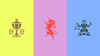
Refining Goldsmiths' iconic coat of arms, a new vibrant visual language was created, evoking a re-energised and playful contemporary style. Senior Design Director Tom West notes, “Each of these symbols can be used on their own, separate from the Coat of Arms, providing freedom of expression through silhouettes and graphic shapes."
Each detail of the new visual identity is thoughtfully adapted from Goldsmiths' heritage, even down to the colour palette. "They can also be layered alongside the new, distinctive, brand colour combinations that we developed, inspired by the colours present in Goldsmiths’ Hall, from the carpets and furnishings to the sandstone and bricks on the Hall’s façade and the gilded Corinthian columns in its rooms,” Tom adds.

Tying the new visual identity together, the updated typeface, Romie, adds a refined embellishment to the new identity, bringing a timeless quality to the contemporary redesign. Richard Reid concludes “Our new visual identity is beautiful, modern and distinctive and also honours and reflects the pride and passion in our company, its history and cultural heritage. It signals a moment of evolution for the Goldsmiths’ Company as we look ahead to the next 700 years.”
Get the Creative Bloq Newsletter
Daily design news, reviews, how-tos and more, as picked by the editors.
For more design inspiration check out Wieden+Kennedy's wild logo designs that celebrate London's eclectic creative talent. If you're after more playful rebranding, take a look at Texas Tack's fun new visual identity.

Thank you for reading 5 articles this month* Join now for unlimited access
Enjoy your first month for just £1 / $1 / €1
*Read 5 free articles per month without a subscription

Join now for unlimited access
Try first month for just £1 / $1 / €1

Natalie is Creative Bloq's staff writer. With an eye for trending topics and a passion for internet culture, she brings you the latest in art and design news. A recent English Literature graduate, Natalie enjoys covering the lighter side of the news and brings a fresh and fun take to her articles. Outside of work (if she’s not glued to her phone), she loves all things music and enjoys singing sweet folky tunes.
You must confirm your public display name before commenting
Please logout and then login again, you will then be prompted to enter your display name.


