Branding is a tricky business. On the one hand, you spend years, decades even, establishing your brand in the public mind. On the other, if your brand seems too outdated, people may drift away, and towards the new shiny thing. Which is exactly where the best rebrands come in.
Rebranding has the power to breathe new life into established names, reposition it within the current zeitgeist, and attract fresh, younger audiences without alienating or losing current fans. Over the decades, iconic brands ranging from Pepsi to Apple have all managed to redefine themselves in this way; whether through reinventing their logos, updating their visual aesthetics, crafting new messaging strategies, or a combination of all three.
Following on from our best rebrands of the decade series, in this article, we look back at the best rebrands of all time. Here, we explore the creative strategies behind each transformation, their cultural impact, and the lessons they offer for brands navigating a rapidly changing marketplace today. See the video below, then read all about the expert's decisions.
01. Kodak (1971)
To some youngsters today, the idea of capturing images on physical film is a hipster novelty. But for the entirety of the 20th century, it was the main game in town, and Kodak, founded in 1892, was as synonymous with photography as Coke was for soft drinks and McDonald's was from fast food.
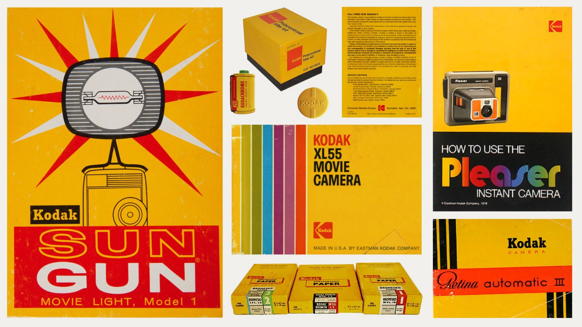
And yet even the most ubiquitous of brands can't rest on its laurels. And it was a major rebrand in 1971 that truly helped Kodak imprint itself on the camera-carrying consciousness. Central to this reinvention was the distinctive Kodak 'K' logo in the now-famous yellow and red colour scheme.
This new visual identity went on to have remarkable staying power. The marketing materials created during this era, characterised by their bold geometric shapes, clean lines and striking yellow-red colour palette, have a contemporary feel even by today's standards.
02. Pepsi (1973)
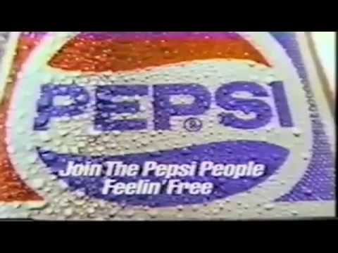
The Cola Wars of the 1970s marked a pivotal period of fierce rivalry between Pepsi and Coca-Cola, one that's continued unabated to this very day. Pepsi was pretty much lagging behind, but a defining moment came in 1973 when it underwent a transformative rebrand by Lippincott & Margulies.
Get the Creative Bloq Newsletter
Daily design news, reviews, how-tos and more, as picked by the editors.
This strategic design shift abandoned Pepsi's traditional script logo, overlaid onto a literal representation of a bottle cap, in favour of a bold, modernised 'Pepsi Globe' symbol.
This confidence and ambitious new look helped bring in a new, younger audience while signaling their aspirations for global market dominance; a significant move in the ongoing competition between the two beverage giants.
03. NASA (1975)
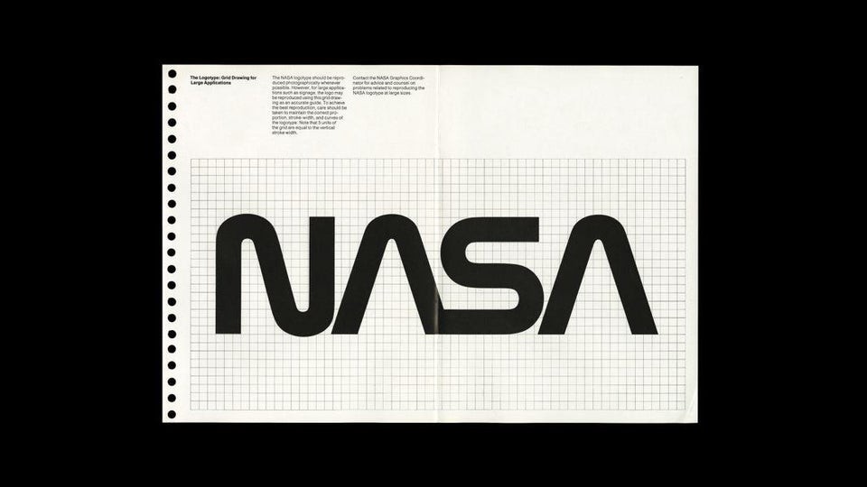
Spearheaded by Richard Danne and Bruce Blackburn as part of the US Federal Design Improvement Program, the NASA rebrand of 1975 centred around a minimalist, futuristic logo nicknamed "The Worm"; a distinctive red wordmark with curved lines that embodied NASA's innovative spirit.
Notable for its unconventional choice to omit cross-strokes in the letter A, the design required careful negotiation with NASA administrators. To ensure consistency across all NASA applications, from uniforms to vehicles, a detailed standards manual was developed which has become something of a design industry classic, and has been republished several times since.
The Worm served as NASA's official logo for 17 years (1975-1992) before being replaced by the original "meatball" logo (see our meatball vs worm NASA logo history), a decision that generated controversy in the design community. The Worm's influence has endured, though, despite its official retirement. Its timeless, sophisticated design continued to garner admiration among design professionals, and the logo experienced a revival in 2020 when it appeared on a SpaceX rocket.
04. British Airways (1982)

In 1974 British Airways was created as a result of the merger of two state-owned airlines, BOAC and BEA. But it did not get its reputation for luxury travel until a pivotal transformation in 1982. In this year Landor Associates gave British Airways a new identity featuring refined typography (a marked improvement on the previous mixed-case styling), a new logo, and a carefully chosen colour scheme that conveyed speed and sophistication.
This sophisticated yet understated design approach helped position the airline as a premium brand in international aviation, creating a legacy of prestige that continues to influence its identity and operation today.
05. Apple (1984)
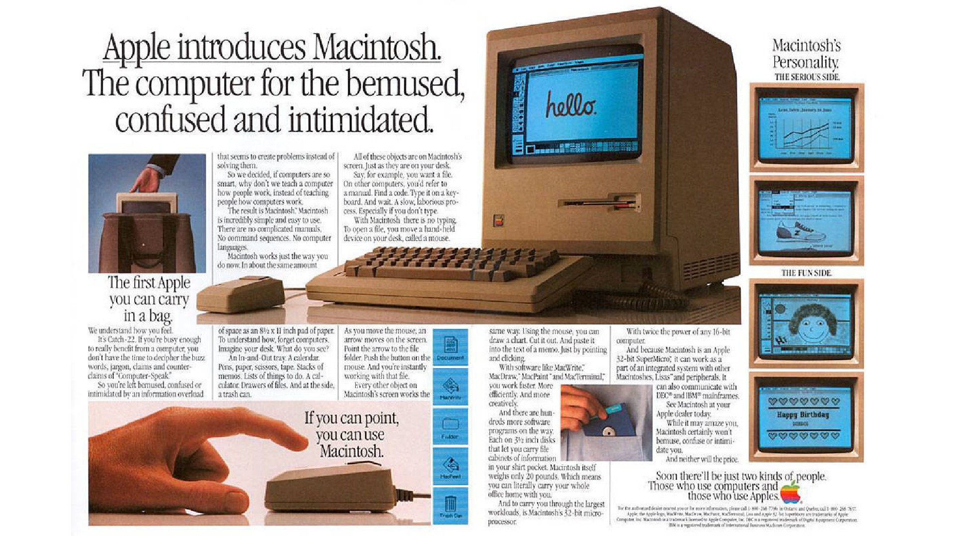
In the early 1980s, Apple faced an uncertain future as a desktop computer manufacturer. But in retrospect, the 1984 launch of the Macintosh proved to be a defining moment, revolutionising personal computing with its groundbreaking graphical user interface, featuring windows, icons and mouse functionality.
The accompanying rebrand by Regis McKenna played a crucial role in shifting public perception of computers from complex scientific tools to accessible consumer devices. The campaign's centrepiece was the legendary 1984 commercial – number 8 on our list of the best ads of all time – which portrayed Apple as a revolutionary force challenging technological conformity.
This strategic rebranding effort not only established Apple's identity as a pioneer in user-friendly technology but also laid the foundation for its enduring brand identity, which continues to shape the tech industry four decades later.
06. Champions League (1992)

The UEFA Champions League underwent a significant transformation in 1992, evolving from its 1955 origins as the European Cup (officially Coupe des Clubs Champions Européens). To represent this change, UEFA worked with Television Event and Media Marketing (TEAM) to develop a new brand identity.
The rebrand introduced several elements that remain synonymous with the tournament today: the black and white/silver colour scheme, a new logo, the 'starball' symbol created by Phil Clements of Design Bridge, and a signature anthem. All of these elements appeared consistently across all venues and broadcasts, whether matches were held in Moscow or Milan.
These standardised elements, which also included stadium dressing and the ceremonial 'starball' centre circle presentation, helped establish the Champions League as a premium global sporting brand.
07. FedEx
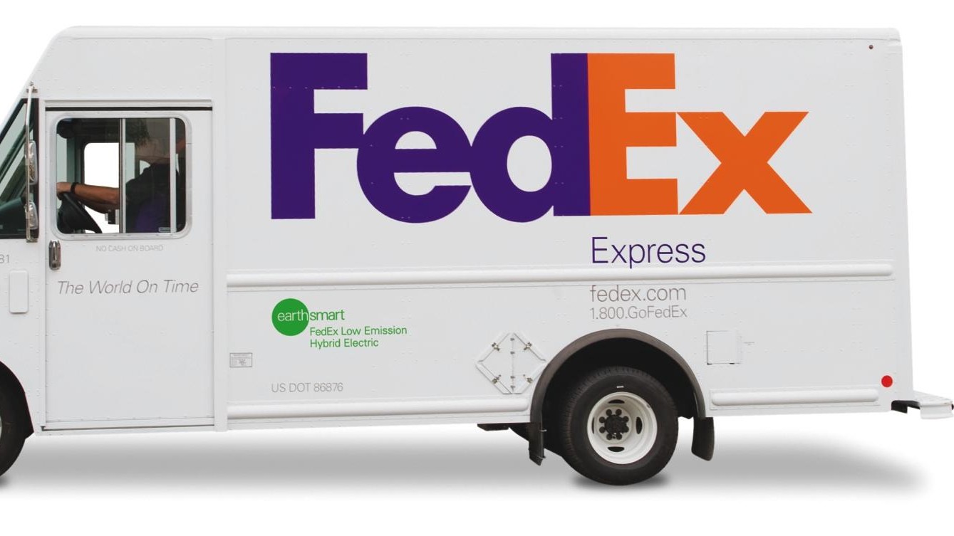
Founded in in 1971, Federal Express offered people an innovative model based on centralising package sorting in Memphis, Tennessee for next-day delivery. However, for a long time the company faced a branding challenge: its name worked against its core value proposition of speed and efficiency. The word 'Federal' inadvertently associated it with government bureaucracy and slowness; the antithesis of their actual offering.
Consequently, the company underwent a strategic rebrand in 1994, simplifying its name to FedEx. Landor Associates created an innovative logo design featuring a cleverly concealed arrow between the 'E' and 'x', symbolising forward momentum and precision (it's number one on our list of best logos of all time). They also created a new tagline, 'The World On Time', which succinctly captured the company's mission and global ambitions.
This redesign has since become a benchmark in branding excellence, praised for its bold design and versatility across different business divisions while maintaining brand consistency.
08. Uniqlo (2005-6)
First established in 1984, Japanese clothing retailer Uniqlo was popular at home, but in the 2000s was experiencing mixed success in its international expansion. This was despite the Western fascination with Japanese pop culture, which was exploding at the time due to the global rise of manga, anime and video games.
This all changed, though, after Uniqlo underwent a significant rebrand in 2005-6 under creative director Kashiwa Sato. This repositioned the brand's focus from trend-driven fashion to high-quality basic clothing.
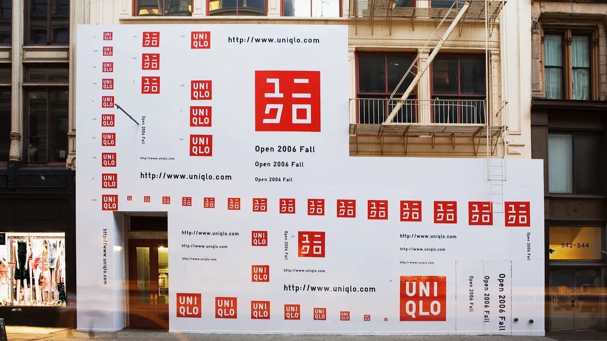
A new logo was designed too, with a more vibrant red colour, reflecting the colour of the Japanese flag. This was integrated across various touchpoints including construction panels and taxi roofs, even before stores reopened, to build brand awareness. Another key element was the addition of a version of the logo in the Japanese Katakana script, which is specifically used for foreign words. Overall, the redesign did a great job of reflecting Uniqlo's Asian heritage while appealing to an international audience.
09. Pantone (2006)

Pantone established itself as a global authority on colour in the early 2000s with several landmark initiatives, including the annual Colour of the Year announcement and creating its first trademarked colour for Tiffany & Co. The company then underwent a notable rebrand in 2006, executed by G2, Grey Global Group's branding division.
This rebrand transformed Pantone's logo from a wordmark with fanned-out colour swatches to a simpler design, featuring a window-like element with the wordmark positioned at the bottom. This was accompanied by the tagline 'The colour of ideas'. This new design proved highly versatile and effective, particularly in product applications where different Pantone colours could be showcased within the window element. For more on Pantone's branding decision, see our piece on the six times that Pantone nailed branding.
10. Old Spice (2010)
Old Spice, a male grooming brand founded in 1937, had enjoyed decades of success. But both its long pedigree and having the word 'Old' in its name were limiting its ability to attract younger consumers.
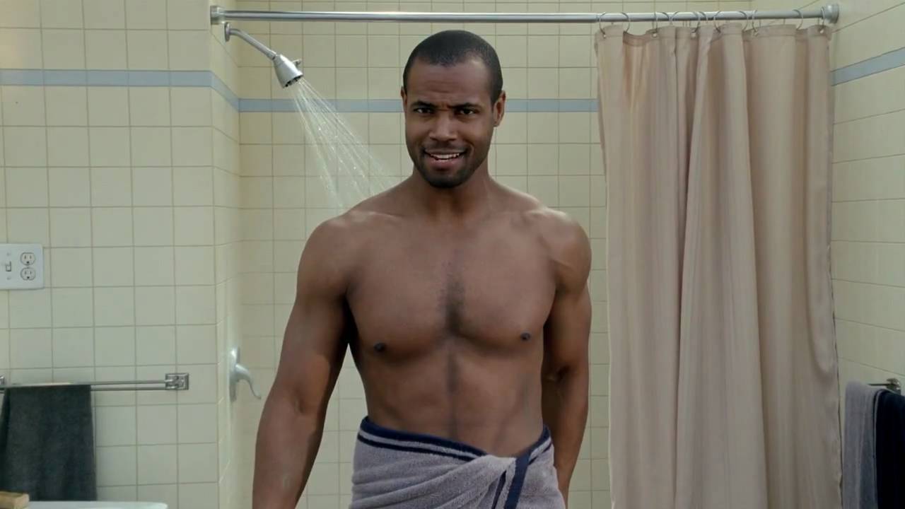
So in 2012, the brand adopted a radically fresh voice, humorously challenging traditional masculinity through a fun campaign featuring actor and former sports star Isaiah Mustafa titled 'The Man Your Man Could Smell Like'. The quirky, confident brand tone was reinforced by bold red packaging and a modern design.
This innovative approach transformed Old Spice from a declining concern into a multi-billion-dollar global success, making it one of the most commercially successful rebrands in recent history.
11. Oatly (2014)
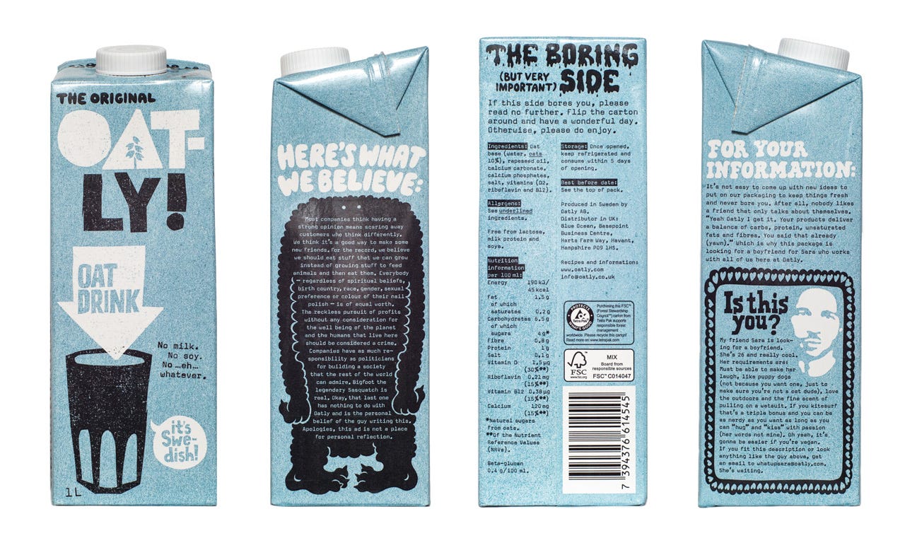
Originally founded in the 1990s, oat milk brand Oatly became popular in the 2010s as consumers began interested in plant-based dairy alternatives. In 2014, a bold new rebrand under the direction of CEO Toni Petersson helped transform it from a niche product into a mainstream one.
The core of this rebrand involved defying traditional branding norms, critiquing the dairy industry, and embracing a playful, irreverent style. Its irregular logo, quirky packaging and large street-art style ads all helped Oatly stand out in a sea of competitors. A series of unconventional tactics, such as sharing a critical customer review ('It tastes like sh*t') on packs and in ads, and turning a lawsuit with the dairy lobby into a badge of honour, further helped solidify its appeal.
These moves helped Oatly double its sales by the end of the decade, and yet even as the brand gained mainstream popularity, it retained an authentic, edgy voice that continues to engage audiences today.
12. Budweiser (2016)
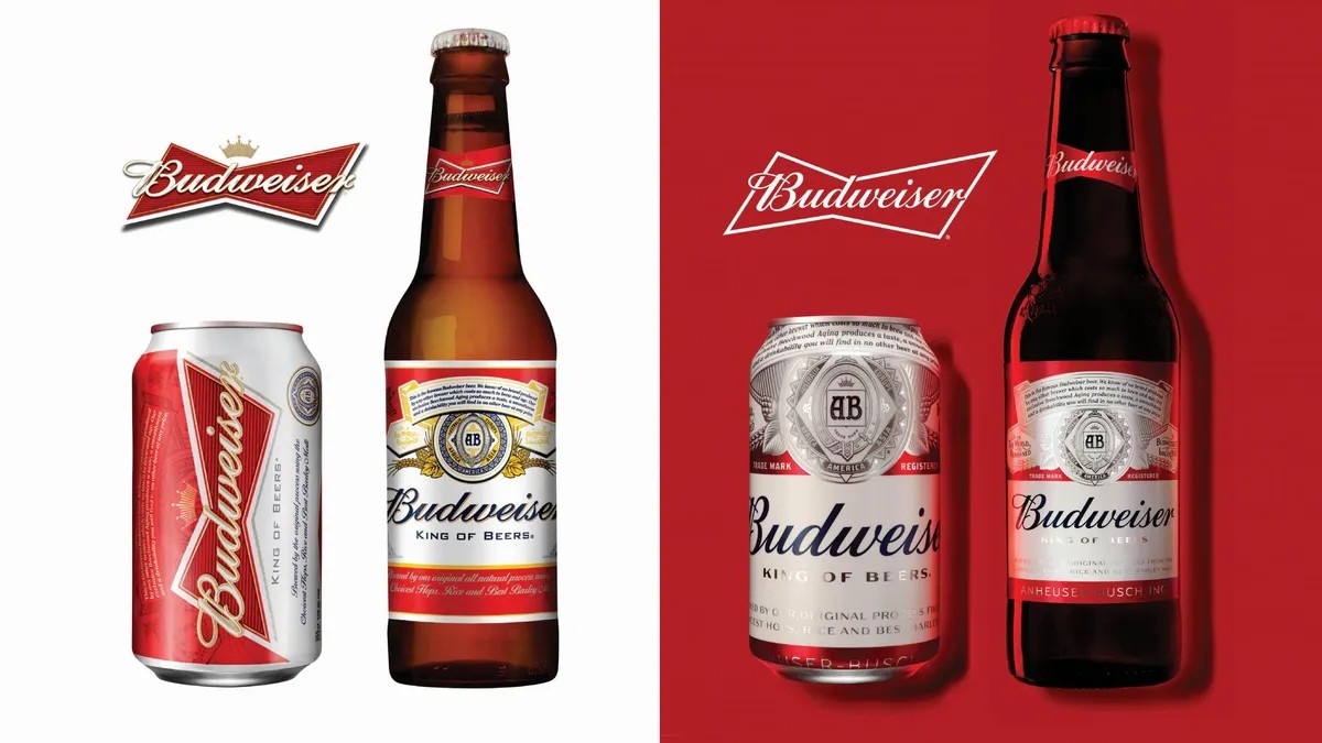
Many rebrands have to pull off a tricky balance, between respecting a brand's heritage while making it look fresh and modern. The 2016 Budweiser rebrand is a great example of how to do it right.
Originally founded in 1876, Budweiser was facing an increasing challenge from the rise of craft breweries and microbreweries. Its redesign returned the brand to its roots while incorporating a modern edge. This was achieved through a combination of elevated and refreshed heritage design elements, with key iconography hand-recreated to maintain a sense of craftsmanship.
The rich red backdrop extended beyond the packaging, creating a full-bleed effect, while the iconic red, white, and blue colour scheme was preserved. This approach involved stripping away unnecessary elements to retain the essence of the brand, balancing traditional iconography with bold modern undertones. The design was cropped at the top and bottom for a fresh appearance, which stood out against prevailing design trends of the time.
13. Premier League (2016)
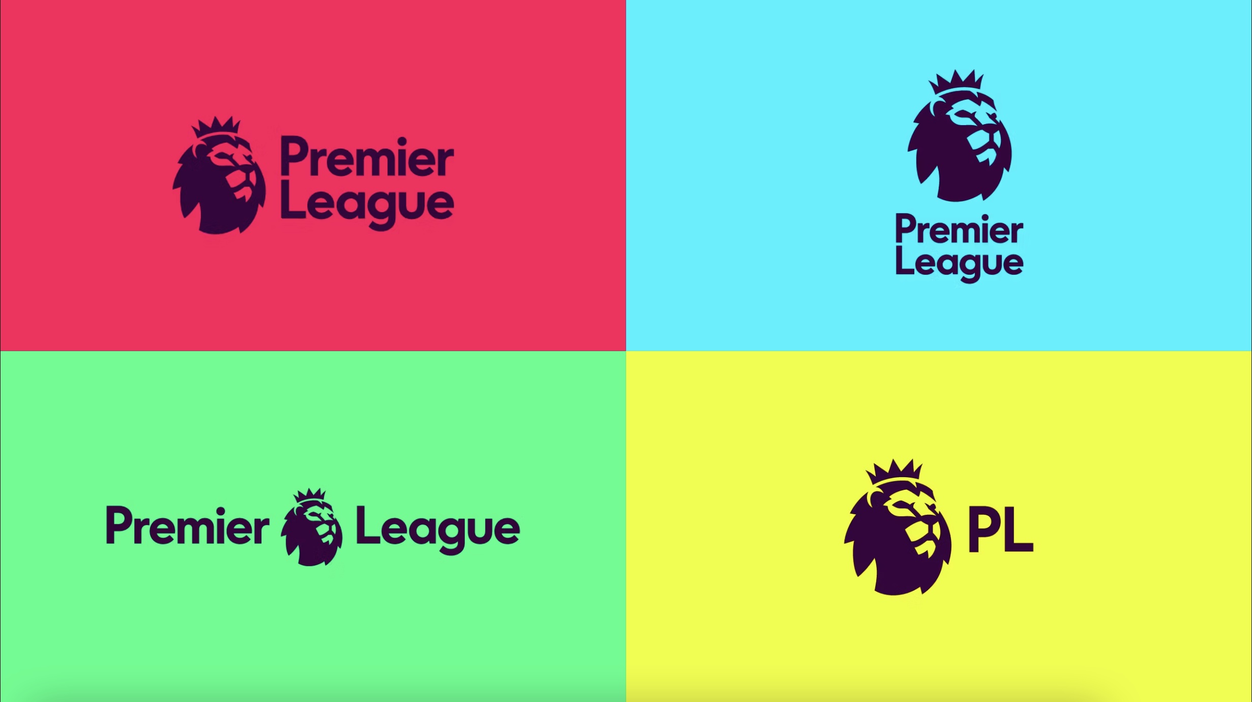
For the 2016/17 season, the Premier League – the top-level English professional football association – introduced a reimagined brand identity, featuring a modernised lion icon and vivid colours designed for digital and broadcast environments.
Created by DesignStudio with Robin Brand Consultants, the rebrand emphasised a flexible, informal design system and marked a shift away from heavy gradients and metallic aesthetics in favour of a clean, crisp look.
This change reflected a broader trend in sports branding, blending heritage with a contemporary approach to appeal to the evolving media landscape.
14. Tiffany (2021)
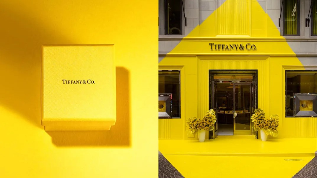
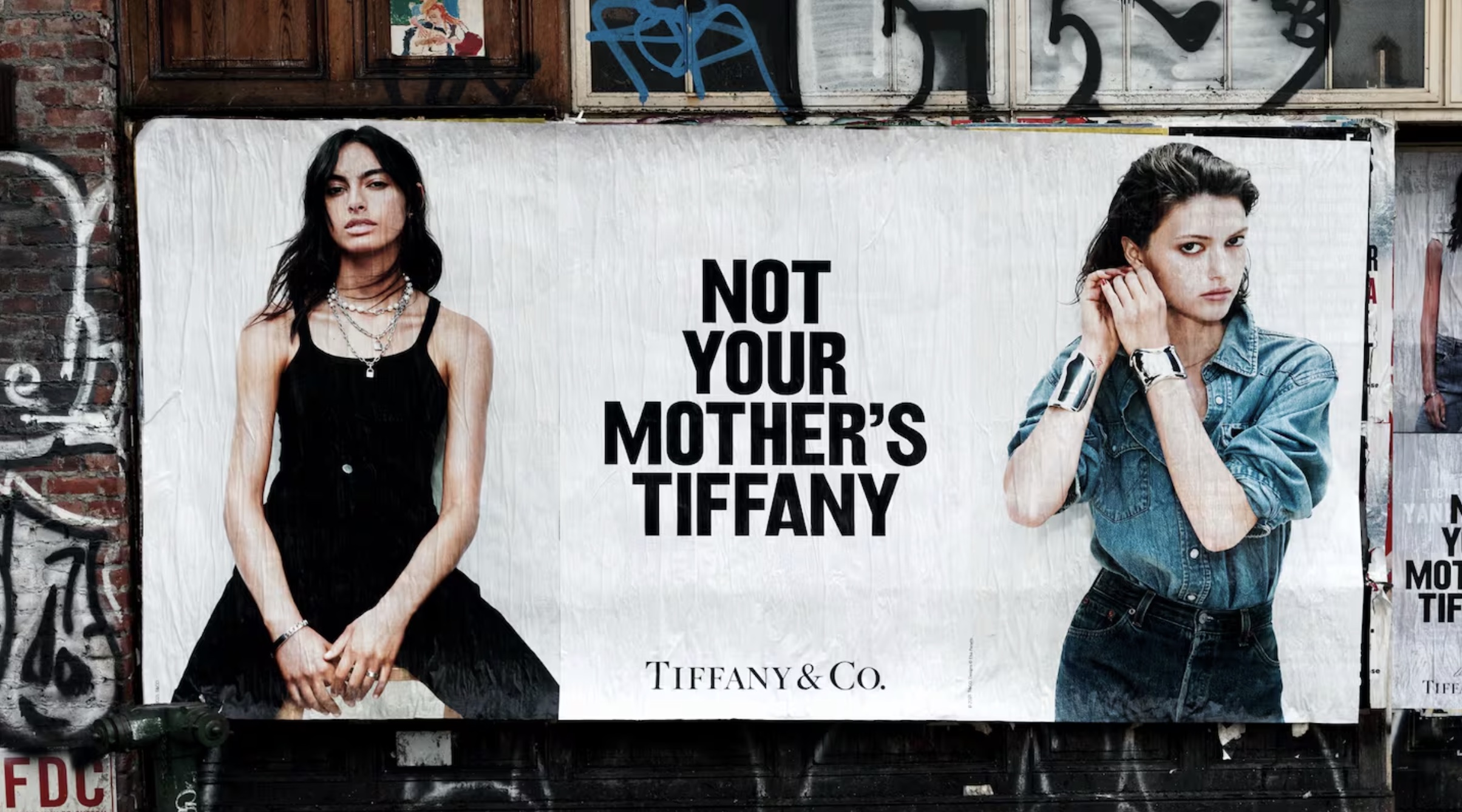
Before its $16.2 billion acquisition by LVMH in 2021, the iconic jewellery brand Tiffany & Co. beginning to feel quite outdated. LVMH’s rebrand helped turn that around. The design made a bold statement, introducing a new house colour, Tiffany Yellow, which was initially met with skepticism but created significant buzz on social media.
Following this, the 'Not Your Mother’s Tiffany’s' campaign pushed the brand further into contemporary relevance, using playful, confrontational messaging that referenced Tiffany’s past while inviting a younger audience.
This campaign aimed to dispel the perception of Tiffany’s as overly delicate and traditional, positioning it as both culturally relevant and aspirational. The rebrand was successful in revitalising Tiffany’s image, integrating it into modern luxury and boosting sales.
15. Channel 4 (2023)

Channel 4 is an odd entity. Founded in 1982, it's owned by the UK government but unlike the BBC gets no subsidy and is run as a commerical entity. In the years leading up to 2023, controversial plans to privatise it were being hotly debated, but these were formally called off at the start of the year. Finally, after years of uncertainty, the channel could now confidently focus on the futuere.
Consequently a new rebrand, led by Pentagram, revitalised the channel’s rebellious and bold identity, unifying all sub-brands under an acid green rework of its original logo. The refreshed look featured vivid gradients, abstract idents, and clever use of iconography inspired by emojis, making the channel visually distinctive and conversational.
Designed to appeal to both new and younger audiences, the rebrand balanced Channel 4's historic character with a fresh, modern aesthetic, capturing attention with dynamic screen layouts and a playful, engaging tone.
For more on branding, see our best logos of the decade and best adverts of the decade series.

Thank you for reading 5 articles this month* Join now for unlimited access
Enjoy your first month for just £1 / $1 / €1
*Read 5 free articles per month without a subscription

Join now for unlimited access
Try first month for just £1 / $1 / €1

Tom May is an award-winning journalist and editor specialising in design, photography and technology. Author of the Amazon #1 bestseller Great TED Talks: Creativity, published by Pavilion Books, Tom was previously editor of Professional Photography magazine, associate editor at Creative Bloq, and deputy editor at net magazine. Today, he is a regular contributor to Creative Bloq and its sister sites Digital Camera World, T3.com and Tech Radar. He also writes for Creative Boom and works on content marketing projects.
You must confirm your public display name before commenting
Please logout and then login again, you will then be prompted to enter your display name.
