"Such a downgrade": Apple fans aren't loving the new Siri icon
The slow Apple Intelligence rollout continues.

When Apple announced its own take on AI (hilariously titled Apple Intelligence), it was the generative models and ChatGPT integration that hogged headlines. But one thing had longtime Apple users excited was an upgraded Siri – that is, a Siri that's actually useful.
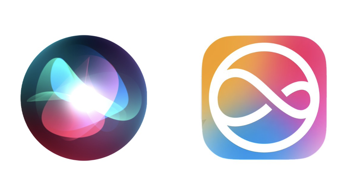
While that might sound a little harsh to Apple's voice assistant, first introduced in 2010, Siri has arguably fallen behind the likes of Amazon's Alexa and Google Assistant. But Siri is (eventually) getting a lot of love in iOS 18 and macOS Sequoia, including a brand look. The new Siri icon just arrived in macOS 15.1 Beta 6 – but not everybody's loving it. (For the lowdown on the latest iPhone, check out our iPhone 16 Pro review.)
If it ain't broke, don't fix it.The new Siri icon is such a downgrade. pic.twitter.com/2gmRmZVECMJune 12, 2024
The rollout of Apple Intelligence has been slower than Apple would probably have liked, with most features not arriving in time for the launch of iOS 18 last month. That's why we're only just seeing the new icon appear on macOS – and while we've already seen it pop up in keynote presentations, this is the first time users have seen it on their own screens.
They finally updated it in macOS 15.1 Beta 6 and ummmmmm why is this so ugly... https://t.co/Ud6LaJN2Qu pic.twitter.com/vCQ2wmOrQeOctober 9, 2024
"This icon is kind of a downgrade," one X user comments, while another adds, "It needs a drop shadow to match the Big Sur style". Indeed, Apple kind of made a return to skeuomorphism a few years ago, with shadows and textures making a subtle return. So it's odd to see this new icon look so... flat. As another X user puts it, "This feels rushed as hell."
Of course, the previous Siri logo was about as extra as it gets; all gradients and lens flares, to the point that the basic 'infinity' symbol was pretty hard to make out. So perhaps part of the surprise here is that we're seeing the icon in such a basic form for the first time.
Either way, we wouldn't be surprised to see Apple tweak the icon over the next few months – after all, the company has form when it comes to making design changes in response to beta feedback. And besides, when it comes to iOS 18, users have the power to make their homescreen look as ugly as they like.
Get the Creative Bloq Newsletter
Daily design news, reviews, how-tos and more, as picked by the editors.

Thank you for reading 5 articles this month* Join now for unlimited access
Enjoy your first month for just £1 / $1 / €1
*Read 5 free articles per month without a subscription

Join now for unlimited access
Try first month for just £1 / $1 / €1

Daniel John is Design Editor at Creative Bloq. He reports on the worlds of design, branding and lifestyle tech, and has covered several industry events including Milan Design Week, OFFF Barcelona and Adobe Max in Los Angeles.


