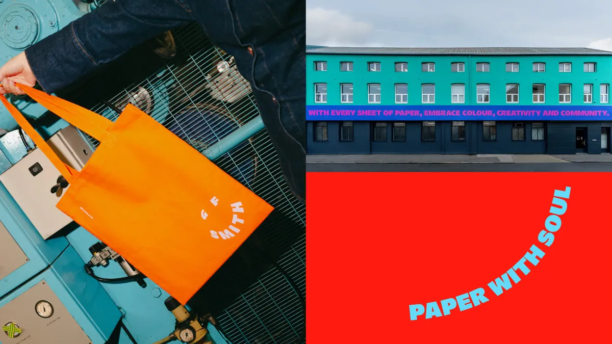
GF Smith is a much-loved British paper company and rebranding it was always going be tricky. The paper suppliers had had the same identity since 2014, and their previous wordmark was refined and classic, with a focus on heritage ('from 1885 onwards'). The joyful new look, created by cause-led branding agency TEMPLO, is a radical departure from what came before and brings GF Smith firmly into the present. But of course, designers are picky people (sorry, not sorry), and reactions have been rather mixed.
I've been watching the conversation unfold for the past few days and like with many rebrands throughout the decades, have seen comments ranging from "a significant misstep" and "this is visually quite upsetting," to "so simple yet so dynamic, and "absolutely love it... it’s not try hard, it’s confident in its playful adaptable image."
To find out more about the new identity, I caught up with founders of TEMPLO, Pali Palavathanan and Anoushka Rodda, and global brand director of GF Smith, Ben Watkinson.
Latest Videos From Creative Bloq
(Image credit: GF Smith)
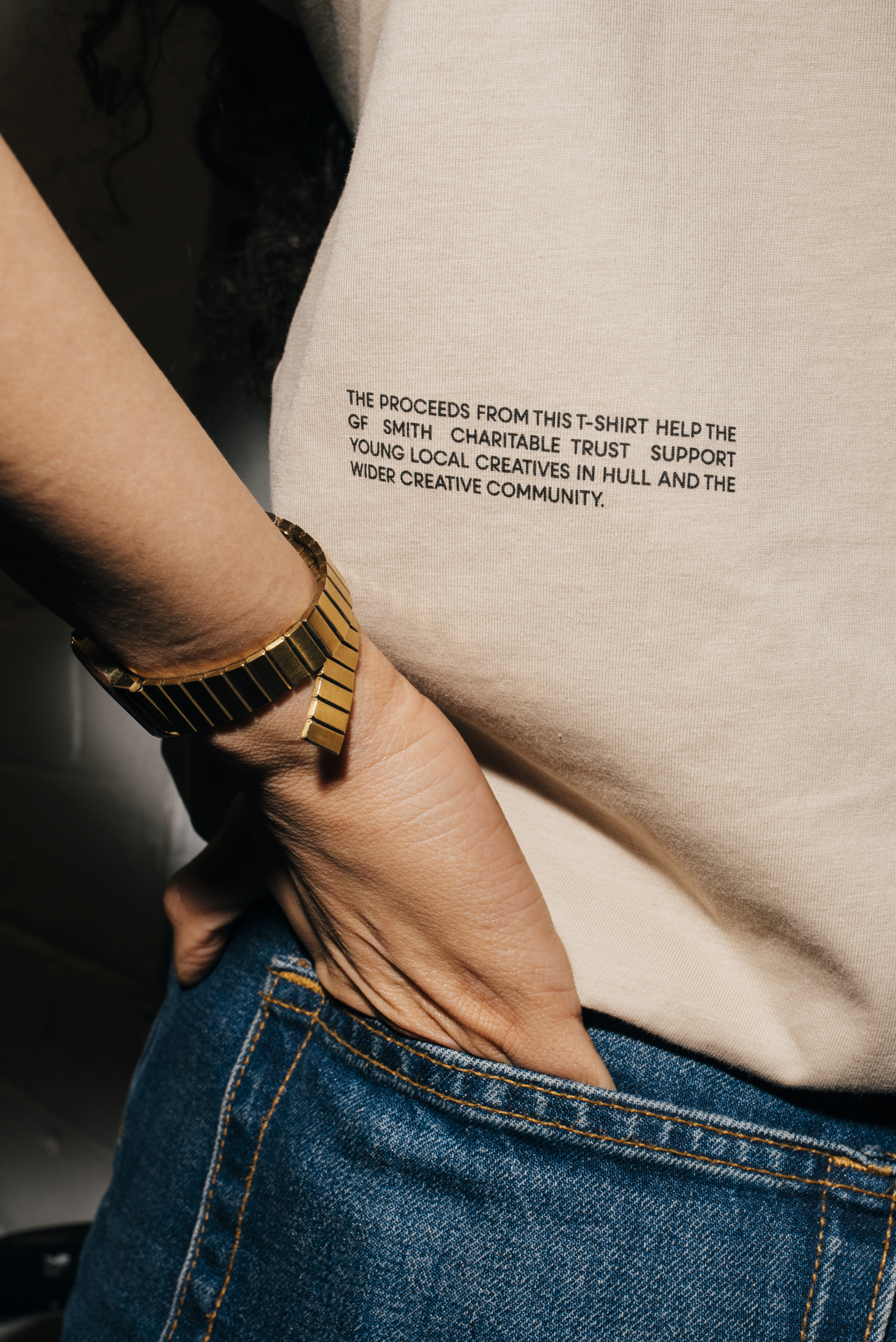
TEMPLO always approaches ethical commercial brands with care, and only works with brands that share its values. And as Ben explained that GF Smith is truly committed to local community, charitable initiatives, education and sustainability, Pali knew that GF Smith were going to be "an incredible client to work with"...."All of this had been under the surface and we had no idea," he says.
The task then, was to "bring all of this to the surface with the new brand". But of course, it wasn't a rebrand without risk. As Ben points out, the existing identity was "right for the time in which it was created and rightfully won a strong following. But it no longer reflected the reality of our business and the sector we operate in."
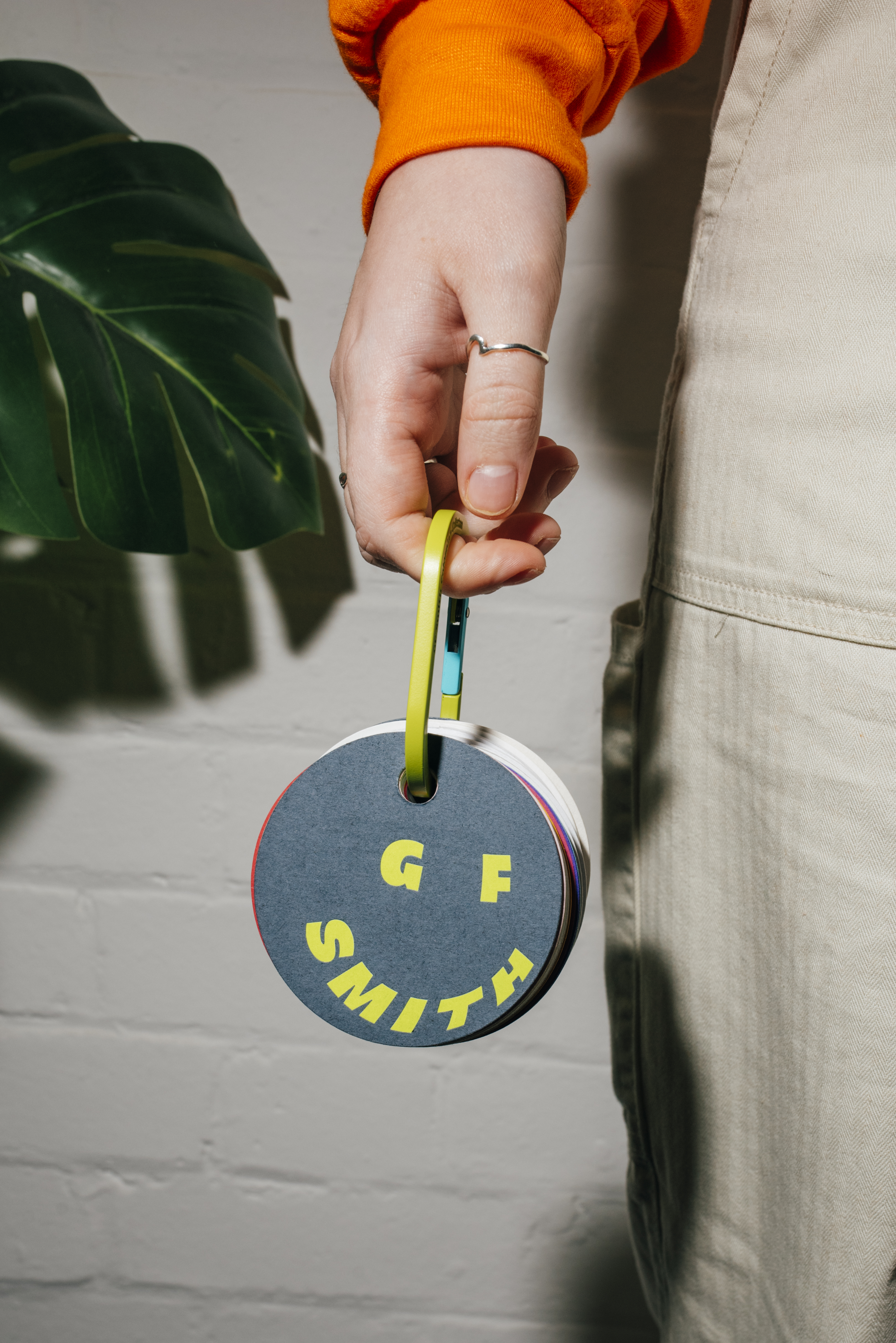
The new brand is based around three building blocks: 'Why paper? Why GF Smith paper? and Why GF Smith?' – put these together and you get the new strapline: 'GF Smith. Feel good papers'. The new logo sees the letters of the name formed into a smiley face, which allows for some fun animations (and if you look at it long enough, it winks at you). A bespoke sans-serif, GF Smith Homie by Blaze Type, adds to the friendly feel.
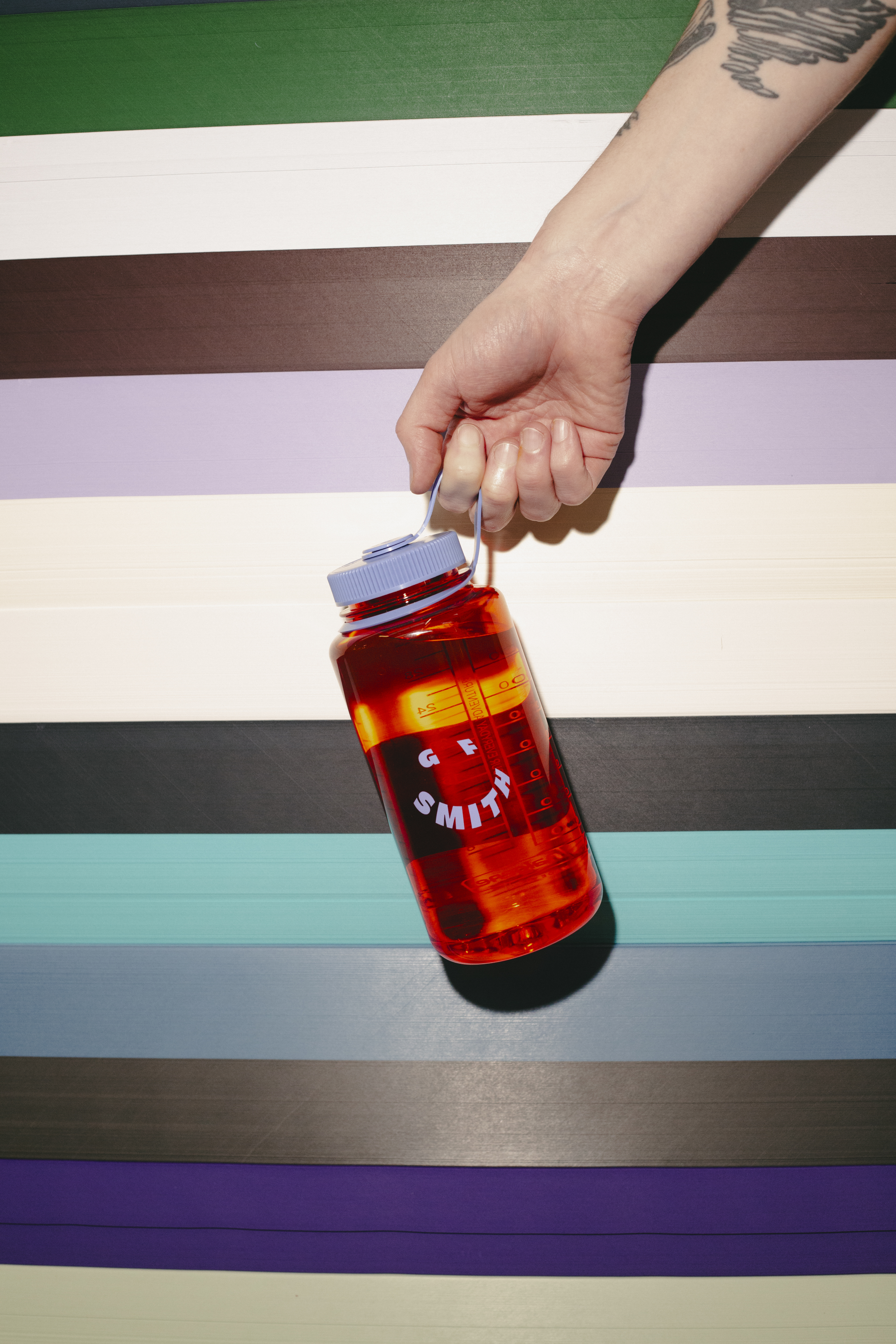
There are plenty of elements to get your teeth into, and I particularly like the GF Smith Colorplan carabiner, which reimagines the swatch to make it wearable and versatile. "It’s designed as a quick-access tool in the studio, at home, at the printers, or in a client meeting – the perforation allows colour samples to be easily used on mood boards, for example," says Pali. "It’s something that can be used purposefully, played with, and torn apart, rather than being a decorative item, or an unwieldy swatch that spends most of its time sitting on a shelf. We wanted the carabiner to be something practical, accessible and fun – always on hand and ready to use."
Get the Creative Bloq Newsletter
Daily design news, reviews, how-tos and more, as picked by the editors.
Image 1 of 3
(Image credit: GF Smith)
(Image credit: GF Smith)
(Image credit: GF Smith)
Both client and agency are keen to stress that the new identity was a true team effort. “Collaboration was an essential part of our brief, and why we wanted to work with TEMPLO," explains Ben. "It was important for us to ensure our whole team was part of the journey.”
"A big part of the process was simply listening – not just to the marketing team, but to the whole company," says Anoushka, who adds that they worked closely with all departments – from the warehouse and accounts teams, to the paper consultants and delivery drivers. "It’s rare to see such a broad spectrum of people on the same call," she says.
"The most important and challenging thing for us was to ensure that the whole team were on board with the transformation and excited about the change," explains Ben.
The new brand was bound to cause a stir, Pali explains: "GF Smith is a brand with the eyes of the creative community on it, so we also knew that there would be a high degree of scrutiny on the results – we knew whatever we did there would be a reaction."
“We knew that some people would love it. We knew some people wouldn’t. And we knew there were others it would grow on over time," says Ben. "Bold creative steps always stir strong emotions, and we’ve been ready for them. There was a wide range of reactions, as expected, but we’ve been bowled over by the overwhelmingly warm welcome our rebrand announcement has been met with.”
Over the last few days, GF Smith and TEMPLO have been diligently replying to comments on social media, both good and bad. I asked them whether they felt this level of engagement was important. "We’re happy to engage with different responses and reactions on social media. I think having the conversation is important – there’s a tendency for online debate to become intensified by detachment, so engaging honestly with the discussion underlines the fact that this is all about people.... we’re proud of the work we’ve done together, and we’re happy to talk about it,” says Ben.
Whether you like it or not, you have to admire GF Smith's bravery for shaking up such a well-respected identity. "I’m proud that we made the decision to be bold together, that we found a way to share the big-picture vision, and followed the path that best brings GF Smith’s true voice to life," says Ben.
What do you think of GF Smith's new identity? Let us know in the comments below:
Thank you for reading 5 articles this month* Join now for unlimited access
Rosie Hilder is Creative Bloq's Deputy Editor. After beginning her career in journalism in Argentina – where she worked as Deputy Editor of Time Out Buenos Aires – she moved back to the UK and joined Future Plc in 2016. Since then, she's worked as Operations Editor on magazines including Computer Arts, 3D World and Paint & Draw and Mac|Life. In 2018, she joined Creative Bloq, where she now assists with the daily management of the site, including growing the site's reach, getting involved in events, such as judging the Brand Impact Awards, and helping make sure our content serves the reader as best it can.
You must confirm your public display name before commenting
Please logout and then login again, you will then be prompted to enter your display name.