Meghan Markle's classy rebrand shines in its simplicity
As Ever is a stylish evolution for the brand.

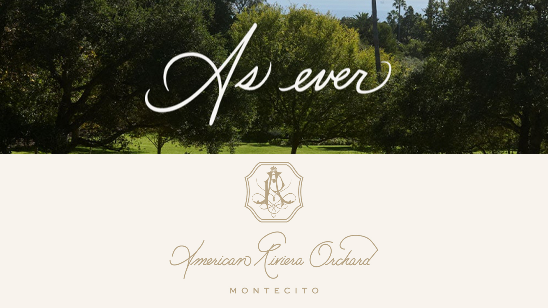
Meghan Markle has relaunched her lifestyle brand under a new name, introducing a fresh new era that captures the brand's original bespoke charm. Taking a more personal branding approach, As Ever is a refined evolution complete with a sleek new crest and classy calligraphic wordmark that celebrates the Dutchess' creative side.
After the original brand name 'American Riviera Orchard' was subject to a rejected logo trademark application back in September, the latest evolution takes a more simplified approach to branding, combining sleek design with heartfelt personal flourishes. Following on from the Duchess' early online blogging roots running The Tig, As Ever's candid appeal bursts with authenticity and passion at its core.
A post shared by Meghan, Duchess of Sussex (@meghan)
A photo posted by on
Announcing the new brand in an Instagram post, Meghan shared "This new chapter is an extension of what has always been my love language, beautifully weaving together everything I cherish – food, gardening, entertaining, thoughtful living, and finding joy in the everyday." While the design aesthetics remain similar to American Riviera Orchard, the Duchess claims the new title is less restrictive, allowing for a more fluid brand.
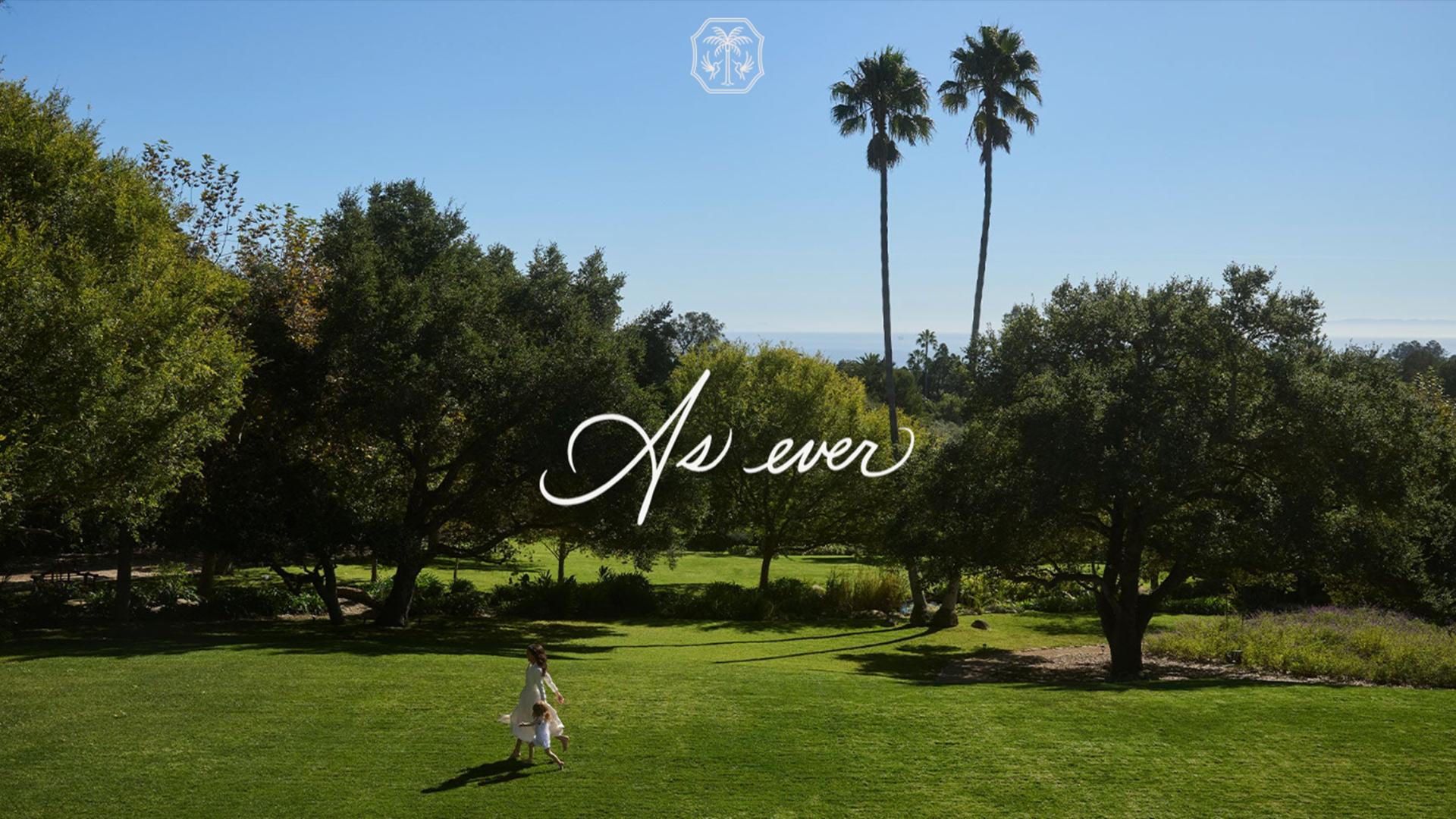
The highlight of the rebrand is the As Ever website featuring a new wordmark logo and intricate crest. The handwritten calligraphy-style logo has a soft romantic feel, complemented by a lush Californian backdrop featuring the Dutchess and her daughter Lilibet running through their garden. Two hummingbirds frame a delicate palm tree on the brand's new crest, pairing minimalist illustration with elegant linework to create a classy, scaleable design.

As Ever shines in its simplicity – an unfussy yet refined brand built upon passion and bespoke creativity. Despite its rocky beginnings, the Duchess' lifestyle brand has evolved into a charming identity rooted in stripped-back style dripping in minimalist class. For more design inspiration take a look at paper brand GF Smith's vibrant new identity or check out OpenAI's bold new rebrand that's surprisingly human.
Get the Creative Bloq Newsletter
Daily design news, reviews, how-tos and more, as picked by the editors.

Thank you for reading 5 articles this month* Join now for unlimited access
Enjoy your first month for just £1 / $1 / €1
*Read 5 free articles per month without a subscription

Join now for unlimited access
Try first month for just £1 / $1 / €1

Natalie Fear is Creative Bloq's staff writer. With an eye for trending topics and a passion for internet culture, she brings you the latest in art and design news. Natalie also runs Creative Bloq’s Day in the Life series, spotlighting diverse talent across the creative industries. Outside of work, she loves all things literature and music (although she’s partial to a spot of TikTok brain rot).
You must confirm your public display name before commenting
Please logout and then login again, you will then be prompted to enter your display name.
