(Image credit: Bo Zaunders via Getty Images / Culture Critic via X)
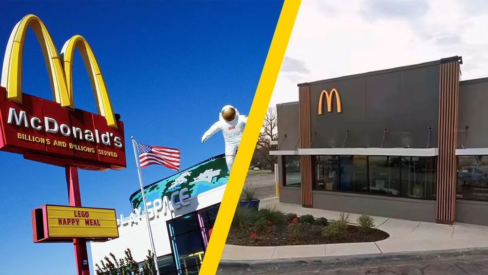
What happened to McDonald's restaurant designs? That's what people are asking on social media as they share then-vs-now images comparing the colourfuly branded McDonald's restaurants of old alongside the fastfood giant's more understated contemporary look.
McDonald's restaurants have naturally changed over the decades, but the transformation since the mid-2000s has been stark, culminating in 2019 with Landini Associates' all-glass design for Times Square.
The traditional red and yellow brand colours have been replaced with muted tones, mansard rooves gave way to flat geometry, and characters like Ronald McDonald are nowhere to be seen. I always thought it was a bid to appeal to adults rather than kids in order to compete with the likes of Starbucks. But social media users have more interesting theories.
Over on X, Culture Critic sees the change in direction of the McDonald's branding as part of a broader trend in which "every aspect of life is being stripped of color." The rumoured new HBO Max logo design is cited as another example, and they could probably add the new Facebook Messenger logo.
Rather than seeing this as a fleeting trend, the publication suggests that "something deeper is going on." It cites a study of photos of 7,000 objects in the UK Science Museum, which shows that colours in all objects have become gradually more neutral since way back in 1800.
It offers a few possible explanations for this, including the use of materials like plastic and metal instead of wood. But the post suggests the endless pursuit of minimalism isn't just about materials or even only physical design. It identifies a comparable movement from complexity to simplicity n music.
Every aspect of life is being stripped of color.What is causing this? pic.twitter.com/p5YNYKChNFMarch 3, 2025
See more
Culture Critic notes that Plato and Aristotle associated colour with chaos and form with order, and that brands therefore think simplicity is needed to be taken seriously. It also suggests that there's a commercial incentive in appealing to the broadest possible tastes by offending no one.
Get the Creative Bloq Newsletter
Daily design news, reviews, how-tos and more, as picked by the editors.
Every aspect of life is being stripped of color.Many have noticed this trend — but why exactly is it happening?Something deeper is going on… (thread) 🧵 pic.twitter.com/CFSKmgWgqOFebruary 19, 2025
See more
The thread on X already has over 200,000 likes and 8,800 comments. And other users have their own theories, connecting the dullness of McDonald's restaurant designs to everything from profitability to politics.
"Interior designers have convinced everyone that neutrals and minimalism are sophisticated but in reality I suspect it's cheaper with a higher profit margin," one person writes. "The modern design is to sell to customers and boost efficiency, not provide a good overall experience for the whole family," someone else suggests.
"As tyranny rises in the culture everything loses its color. The art dies. The world becomes grey," another comment suggests, turning the mood more pesimistic. "Birthrates plummet. Depression and anxiety skyrocket. Everyone becomes scared to speak the truth. Everyone enters their inner citadel and tried to wait out the pain," is another comment.
Someone even suggests that modern McDonald's were made "in preparation for communism." "It reminds me of Soviet brutalist architecture. Bull, plain, devoid of beauty and hope," another person wrote.
Contemporary McDonald's restaurant designs certainly seem to have departed from Dick and Mac McDonald's original belief that restaurants should be 'attention catching' when they hired architect Stanley Meson to create the McDonald's signature red and white design of the 1950s. Interestingly, the design from the 50s in the Reddit post below is the most futuristic looking of them all.
Joe is a regular freelance journalist and editor at Creative Bloq. He writes news, features and buying guides and keeps track of the best equipment and software for creatives, from video editing programs to monitors and accessories. A veteran news writer and photographer, he now works as a project manager at the London and Buenos Aires-based design, production and branding agency Hermana Creatives. There he manages a team of designers, photographers and video editors who specialise in producing visual content and design assets for the hospitality sector. He also dances Argentine tango.
You must confirm your public display name before commenting
Please logout and then login again, you will then be prompted to enter your display name.