League of Legends developer Riot Games unveils punchy new brand evolution
It’s a fresh design system “infused with references".
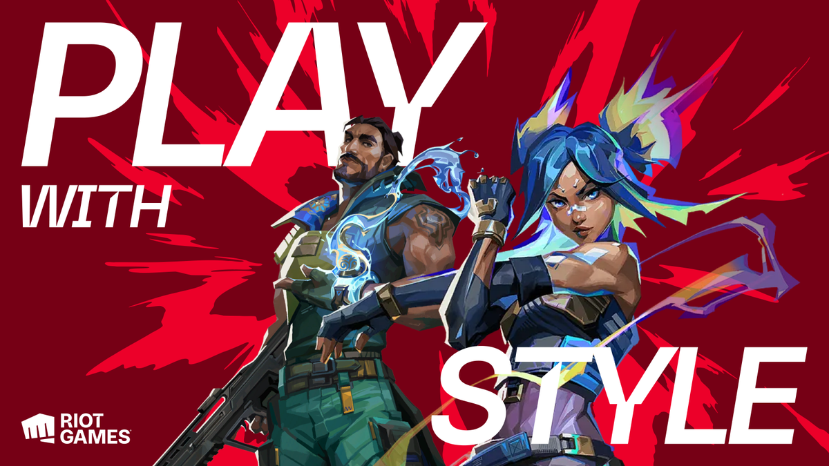
Developer Riot Games has unveiled a fresh design system, unifying its diverse entertainment portfolio into an evolved master brand. Created to connect Riot's fans with its immersive world of games, music, comics, and television, the new design system is a flexible tool that "puts player passion front and centre".
Iconic brands all have a strong sense of identity and Riot's new design system is no different. From in-game visuals to live events, the new diverse design system is built to be an adaptable and dynamic tool with a playful spirit at its core, never losing sight of Riot's unique identity.
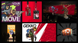
Created by Stink Studios, the new design system began by defining Riot's brand purpose. "From the start everything had to be about improving player experience," Cameron Temple, executive creative director at Stink Studios tells Creative Bloq. "We looked closely at what makes Riot, Riot. The culture, the gaming worlds, the characters, and all the little details in between. From this we developed a single minded strategy - Riot is a creator of worlds, in service to players. From here our design focus became about capturing the spirit of the games and reflecting that in the work."
Central to the new design system is Riot's iconic fist bump logo, which has been part of its identity from the very start. The updated design system uses the company’s Riot Sans typeface designed by Colophon and its fist-bump logo, animated logos, and custom fists, designed by Ilovedust. "Elevated to a living symbol of approval, and a fist bump to the community," the motif is just one of many references to Riot's brand, including characters from its iconic IPs like League of Legends and Arcane.
Flexibility was a key component in designing the new brand system, ensuring that the Riot team could easily adopt and adapt the new style. "It was key for the brand to be used by anyone working at Riot Games, not just designers. So our design needed to be flexible for people who wanted to be more creative with it, while also working for those who needed more prescriptive guidance," Cameron says.
"We started the project by conducting a series of stakeholder interviews to get to the bottom of what the system needed to achieve, both from a creative point of view, but also a functional one. Striking this balance while retaining the creative ambition was a good challenge," he adds.
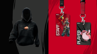
The core colour palette uses the brand's signature 'Riot Red' alongside complimentary tones to add a sense of depth, while the secondary palette has a more expressive feel representing Riot's diverse creative worlds. "Creating design examples and seeing it all come together in different expressions was a really satisfying moment. Applying the thinking to social posts, flags, merch and so on was a lot of fun," Cameron says.
Get the Creative Bloq Newsletter
Daily design news, reviews, how-tos and more, as picked by the editors.
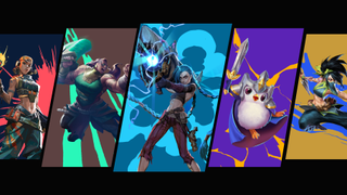
When asked what his favourite part of the design process was, Cameron reflects "seeing it work together as a system that captures the spirit of the brand is really satisfying. No one element does the lot, but when it locks together, I get a proper feel of who Riot are and what they stand for."He continues "The system covers everything a modern brand should, but importantly, the results feel impassioned and authentic, like it comes from a company that makes games”.
For more creative inspiration, check out the best rebrands of all time from Apple to Oatly. If you're after more gaming news, take a look at the PS5 Pro games available at launch this week.

Thank you for reading 5 articles this month* Join now for unlimited access
Enjoy your first month for just £1 / $1 / €1
*Read 5 free articles per month without a subscription

Join now for unlimited access
Try first month for just £1 / $1 / €1

Natalie is Creative Bloq's staff writer. With an eye for trending topics and a passion for internet culture, she brings you the latest in art and design news. A recent English Literature graduate, Natalie enjoys covering the lighter side of the news and brings a fresh and fun take to her articles. Outside of work (if she’s not glued to her phone), she loves all things music and enjoys singing sweet folky tunes.
