I love the adorable illustrations in this dairy brand’s new identity
Freshways proves that personality packs a punch.
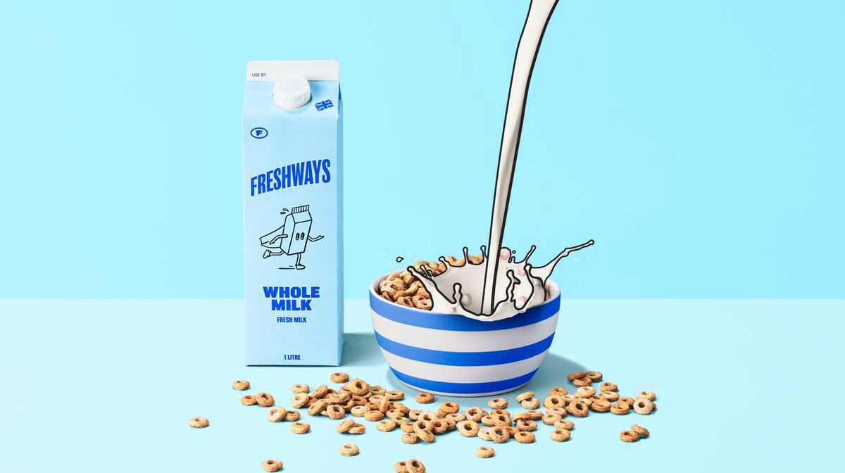
Cruising under the radar for some time now, UK-based dairy supplier Freshways was in need of a revamp that could showcase its unique identity in the milk manufacturing industry. Recently unveiling a playful new look, the refreshing rebrand is packed with personality, bringing the brand into a stylish new era with speed and innovation at its core.
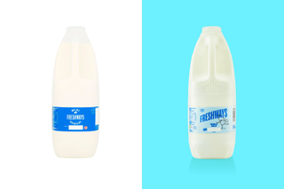
The best rebrands bring a brand to life by showcasing its unique appeal, and Freshways charming new identity is no different. With a new logo, vibrant colour palette and revamped packaging, Freshways demonstrates how breaking away from conventional design can shake things up for the better.
When branding agency White Bear set about reinvigorating the brand, the immediate challenge was finding a way "to bridge the gap between Freshways’ popularity and its brand awareness" while transcending its humble dairy origins. "The design deliberately avoided the traditional imagery of cows in fields, instead using illustration, pastel colours, and a playful tone of voice to create something fresh and unique," Kelly Mackenzie, creative director at White Bear tells Creative Bloq. "Where competitors often take a more serious approach, this rebrand embraced challenger thinking to stand out," Kelly adds.
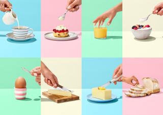
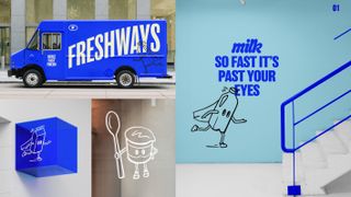
Rooted in the concept “Think Fresh, Act Fresh, Sell Fresh.”, the new identity features a full suite of creative elements from packaging, app design, website, digital communications and merchandise. At the centre of the rebrand is the new logo featuring a dynamic reimagining of the brand's sans serif typeface. "The new logo was designed to feel dynamic and modern, moving towards the top-right corner in the style of a superhero emblem. This contrasts with the previous static, uppercase logo, bringing energy and relevance to the brand identity," says Kelly
"A new marque was also introduced: a small ‘f’ within a roundel used across packaging and uniforms to create standout visuals. This detail, uses the Superman logo for inspiration, reinforcing the superhero theme while adding a cohesive element to the brand’s visual language," she adds.
Bringing a playful characterisation to Freshways' unique branding is a series of charming illustrations. "The superhero characters were developed to give Freshways a distinctive identity and a strong personality that extends beyond just being a dairy brand. The concept leverages Freshways’ core strengths: speed and reliability, reimagining these features as those of a superhero team," Kelly explains.
"This creative direction communicates the brand’s commitment to keeping shelves stocked with fresh milk and saving customers from milk shortages, providing a memorable way to communicate its values and point of differentiation," she continues.
Get the Creative Bloq Newsletter
Daily design news, reviews, how-tos and more, as picked by the editors.
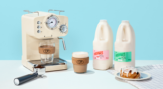
The fresh brand identity will be rolled out across all key touchpoints while revamps to the website and Freshways app make it easier for wholesalers, retailers, independents, and cafe chains to place orders quickly and efficiently.
Reflecting on the most rewarding part of the design process, Kelly tells Creative Bloq "The collaborative process with Freshways really enabled us to push creative boundaries and deliver a disruptive brand identity that remains true to the company’s core values. The new identity not only reinforces Freshways’ commitment to growth but also provides a fresh approach within the category."
For more design inspiration check out Bose's new rebrand that showcases its hand-drawn heritage logo. If you're after the latest rebrand news, take a look at why people are starting to suspect the controversial Jaguar rebrand could be a hoax.

Thank you for reading 5 articles this month* Join now for unlimited access
Enjoy your first month for just £1 / $1 / €1
*Read 5 free articles per month without a subscription

Join now for unlimited access
Try first month for just £1 / $1 / €1

Natalie is Creative Bloq's staff writer. With an eye for trending topics and a passion for internet culture, she brings you the latest in art and design news. A recent English Literature graduate, Natalie enjoys covering the lighter side of the news and brings a fresh and fun take to her articles. Outside of work (if she’s not glued to her phone), she loves all things music and enjoys singing sweet folky tunes.
